
As a designer I work on commissioned and self-initiated projects ranging from the creation of logos, typefaces, identities, branding, campaigns, websites, record covers, books, catalogues, publications, posters, flyers, (music) videos, illustrations and exhibition designs. I have experience in commissioned projects for both analogue and digital projects in different kind of fields such as education, sports, arts & music.
I am available for new projects and collaborations. For inquiries please send an email to info@daankars.com
My designers creed in the form of J.G. Ballard’s ‘What I Believe’:
I believe in concept. I believe in statement. I believe in boldness and in character. I believe in humour. I believe in honesty. I believe in the black sheep rather than the herd.
Education
2006–2010 VMBO
Saenredamcollege
(Graduated)
VMBO-4 Diploma
Zaandijk, NL
2010–2014 MBO
Mediacollege Amsterdam
(Graduated)
MBO-4 Diploma
Amsterdam, NL
2014–2018 BA
The Royal Academy of Art
(Graduated)
Bachelor of Art
The Hague, NL
Experience
2014–2015 LEMZ
Graphic Designer
Amsterdam, NL
2018–2019 Nofrontiere
Junior Art Director
Vienna, AT
2019–2023 Bureau F
Senior Art Director
Vienna, AT
2018–Today Independent & Freelance Designer
Art Director & Designer
Global, HQ in Antwerp, BE
2021–Today Kollektiv RAAR
Founder, Art Director & Designer
Global, Vienna/Antwerp, AT/BE
2026–Today Brandkast Studio
Founder, Art Director & Designer
Global, Paris/Antwerp, FR/BE
Internships
2009–2009 Mezzaluna
Graphic Designer
Duration of 3 weeks
Zaandam, NL
2012–2013 Skybox
Graphic Designer
Duration of 6 months
Amsterdam, NL
2013–2013 LEMZ
Graphic Designer
Duration of 6 months
Amsterdam, NL
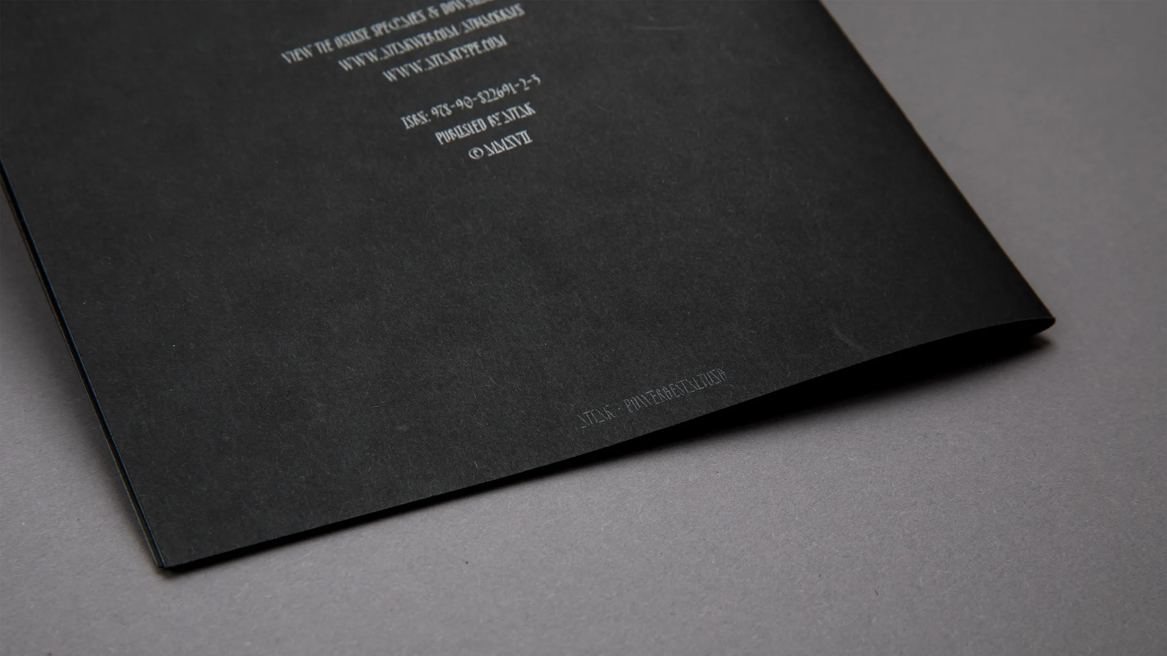
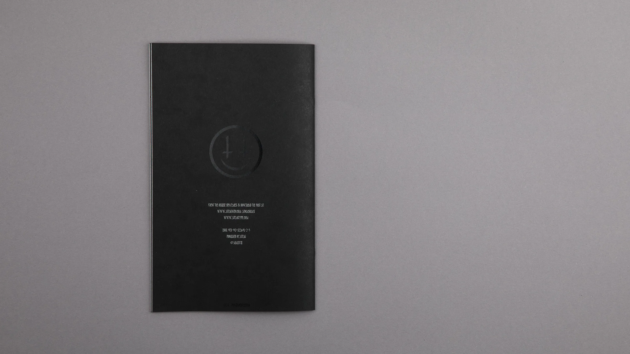
2017–2017 ATTAK • Powergestaltung
Graphic Designer
Duration of 5 months
’s-Hertogenbosch, NL
Copyright This website and its content is protected by international copyright laws. No part of this website or its content may be reproduced, distributed, or transmitted in any form or by any means, including photocopying, recording, or other electronic or mechanical methods, without the prior written permission of the designer.
© Daan Jesper Kars. All rights reserved. The photos of the following projects on this website are made by Daniël Siegersma: AT Violent Youth Specimen, Best Dutch Book Designs 2016 (SE), Police. Support. Control.
Imprint Daan Jesper Kars
info@daankars.com
Lappersbrug 3 / 101
2600 Antwerp
Belgium
VAT-Nr.: BE0804.892.835
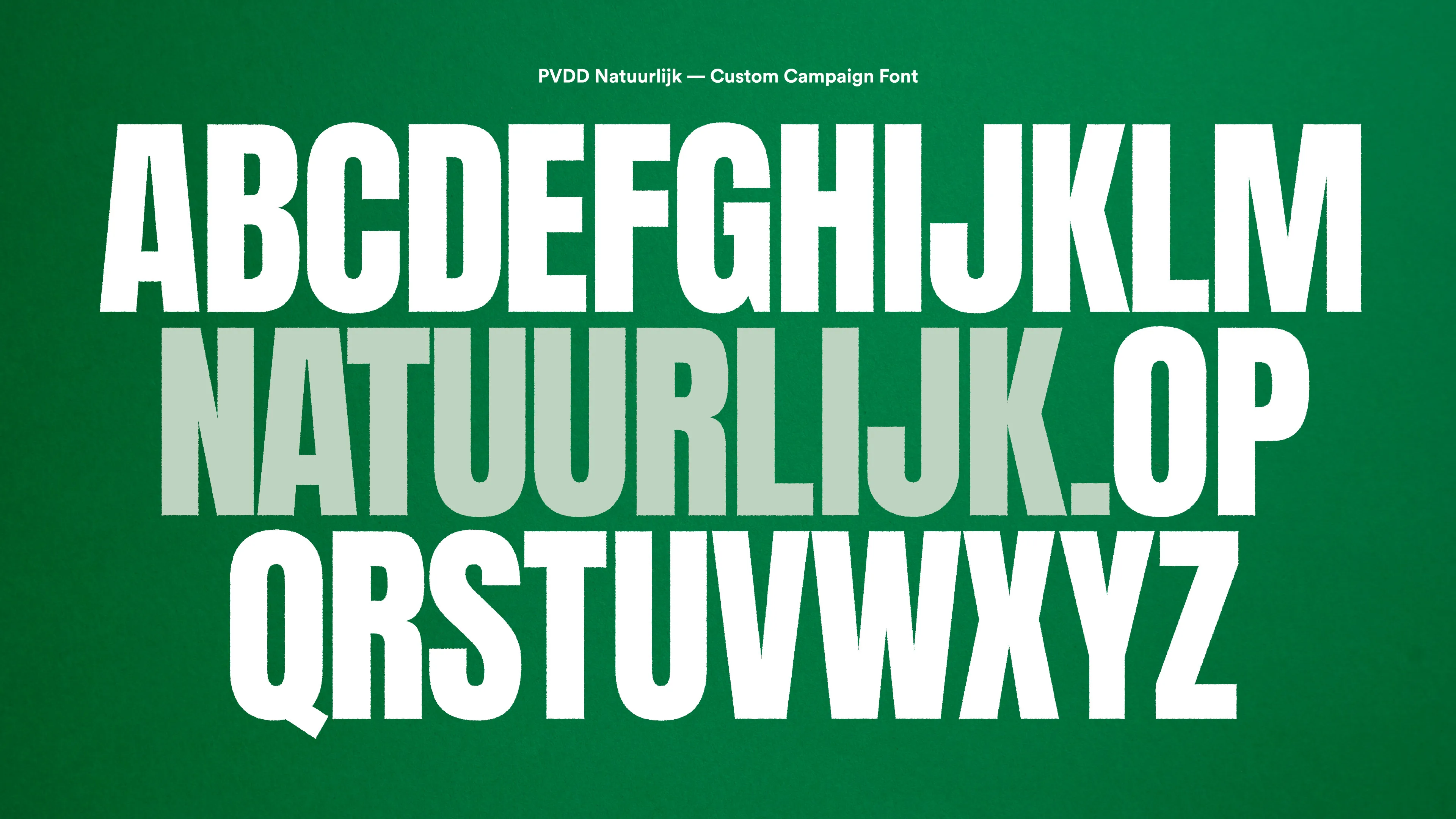
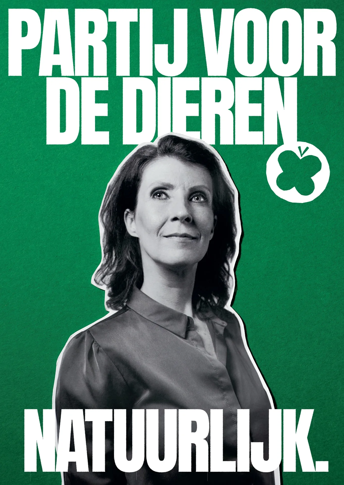
Partij voor de Dieren
Act Accordingly
Campaign for the Party for the Animals turns radical ideas into an equally bold and energetic voice. A belated recap from months of campaigning, cuteness and chaos. People vote with their instinct. So we deliberately aimed this political campaign at the gut, not the intellect. Embracing the party’s core identity: radical, green, and combative. With 80s aesthetics, a punk soundtrack, and analog stop-motion we want to create a spark. Start a fire, convey a feeling of hope and perhaps give insight in the dawn of a new era.
For those who dream radically.
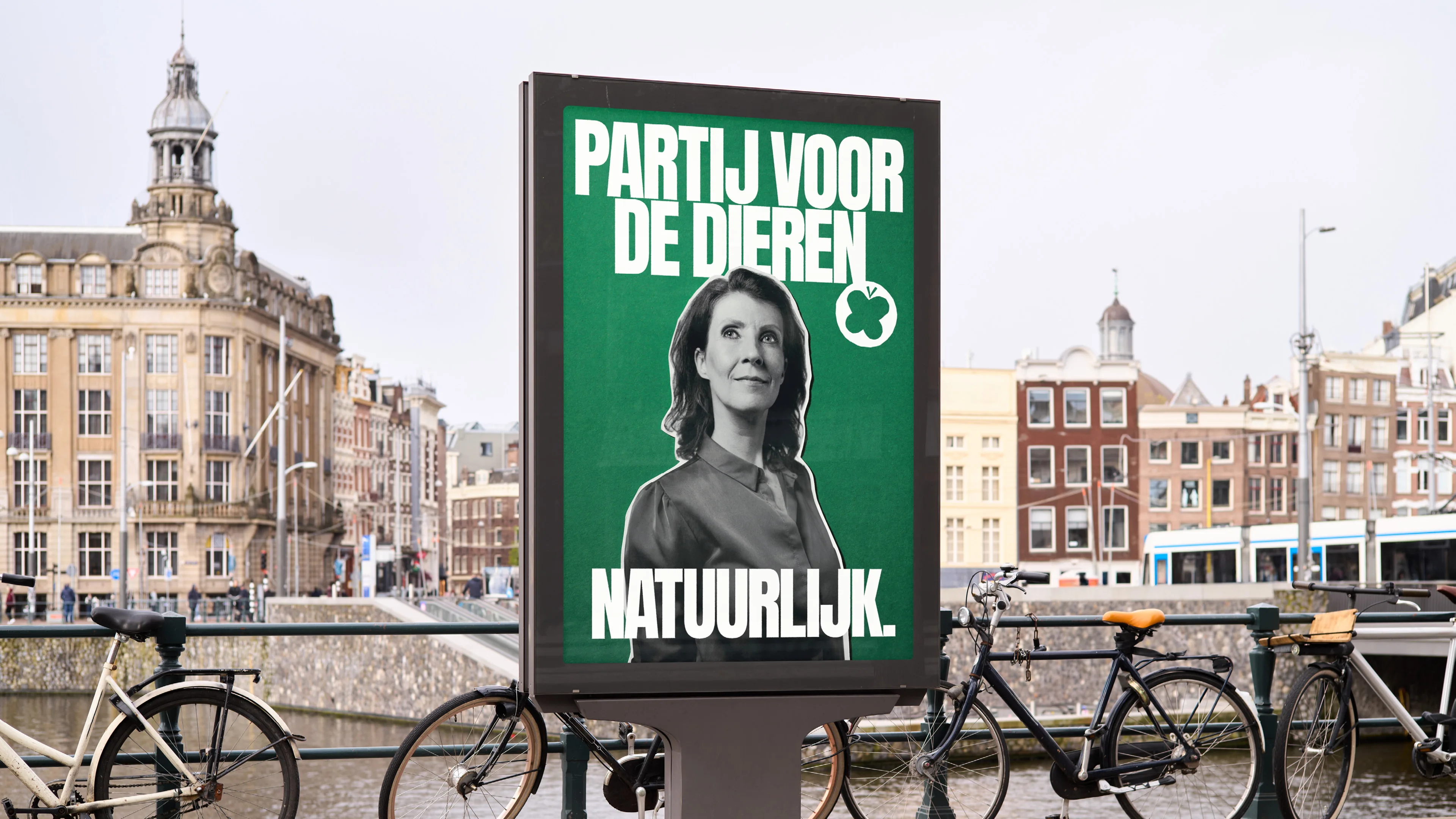
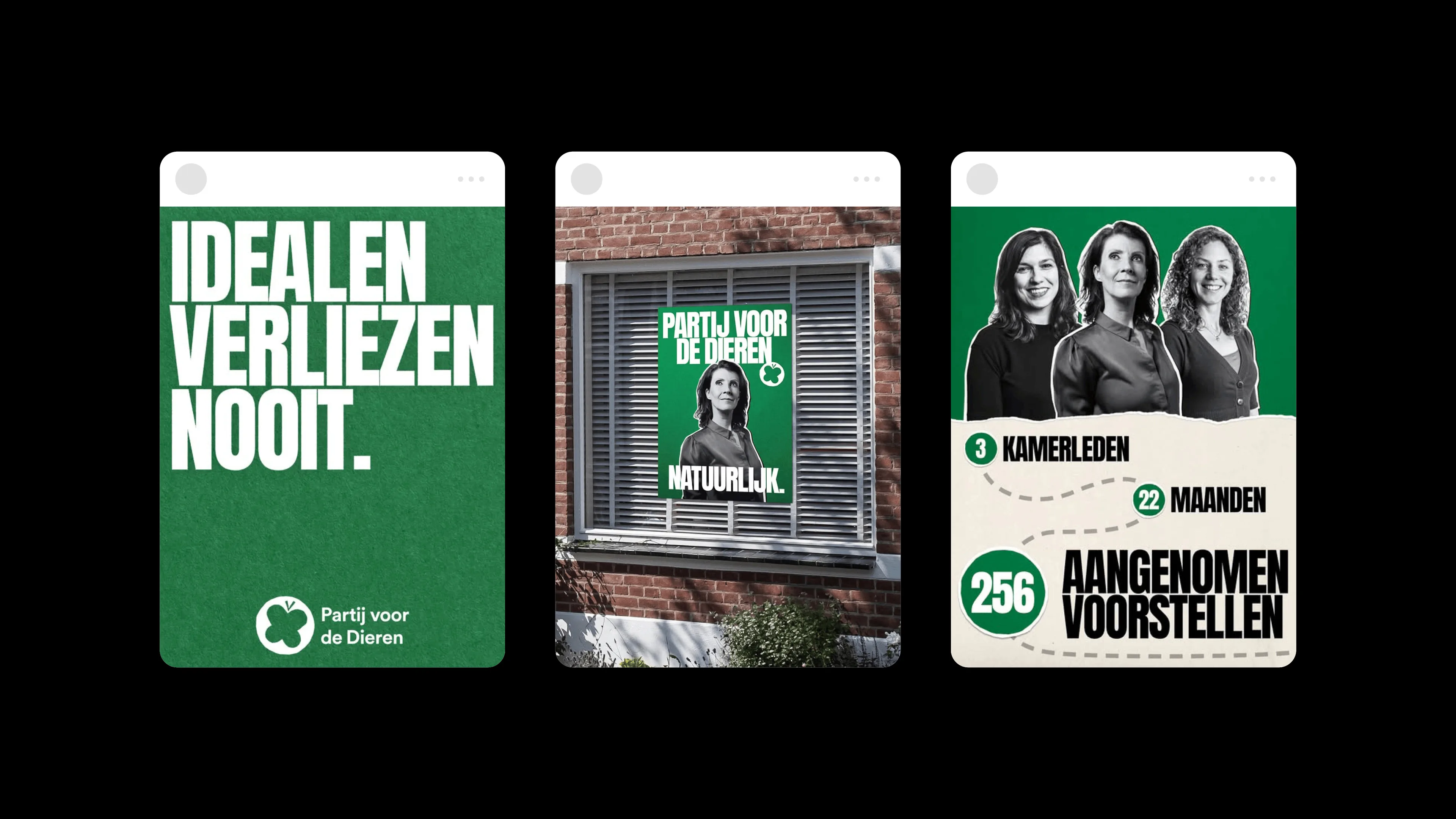
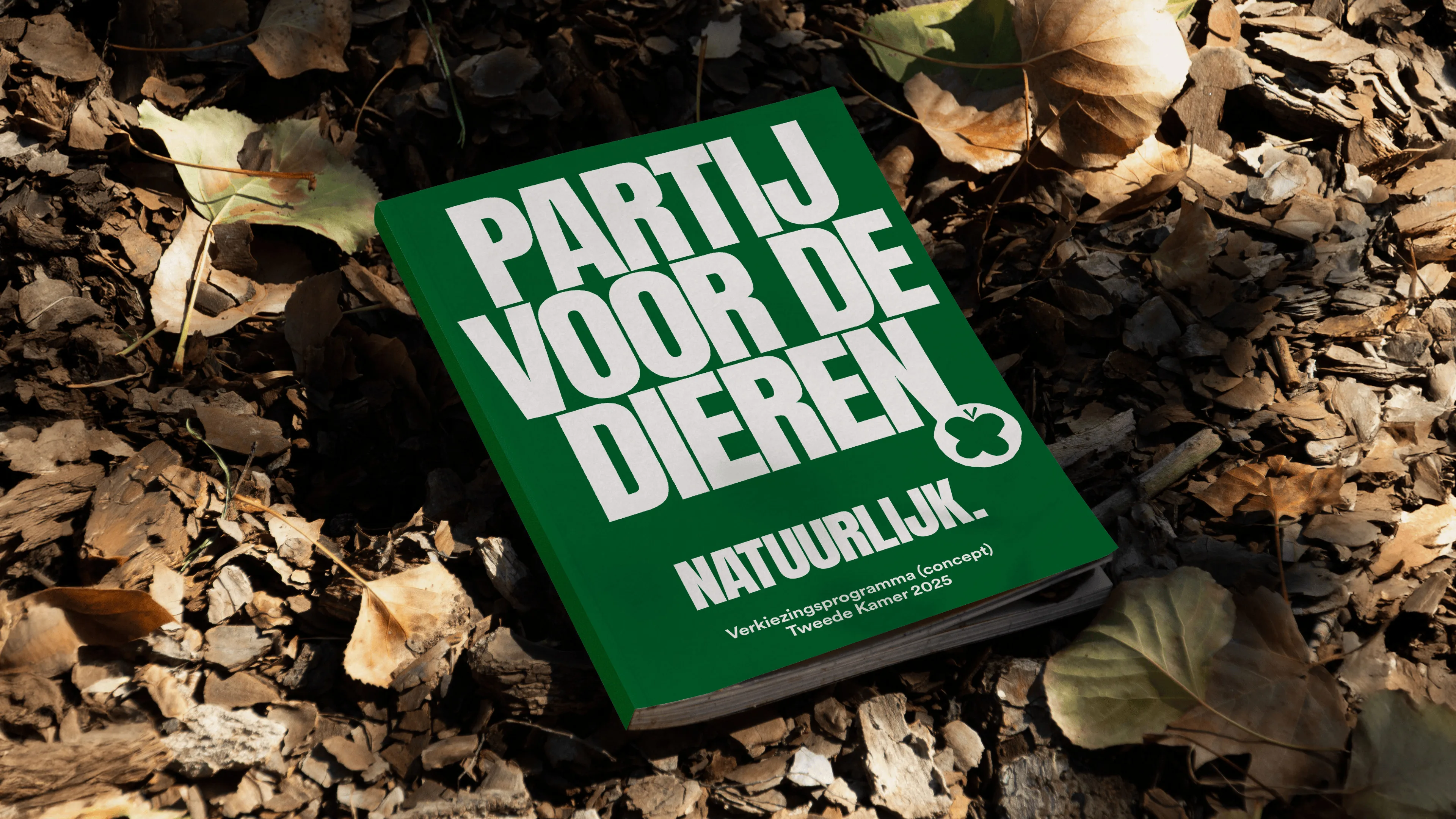
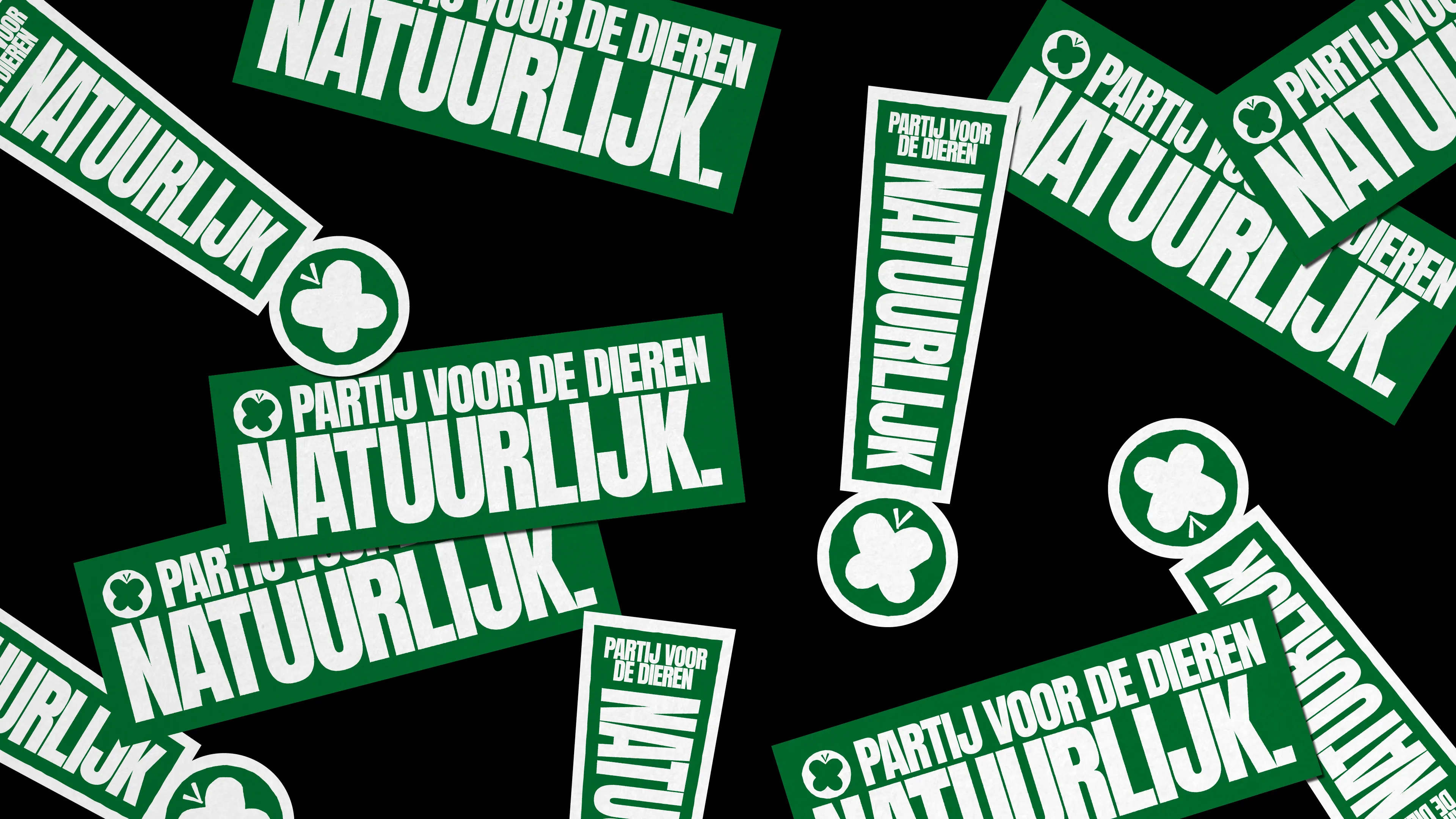
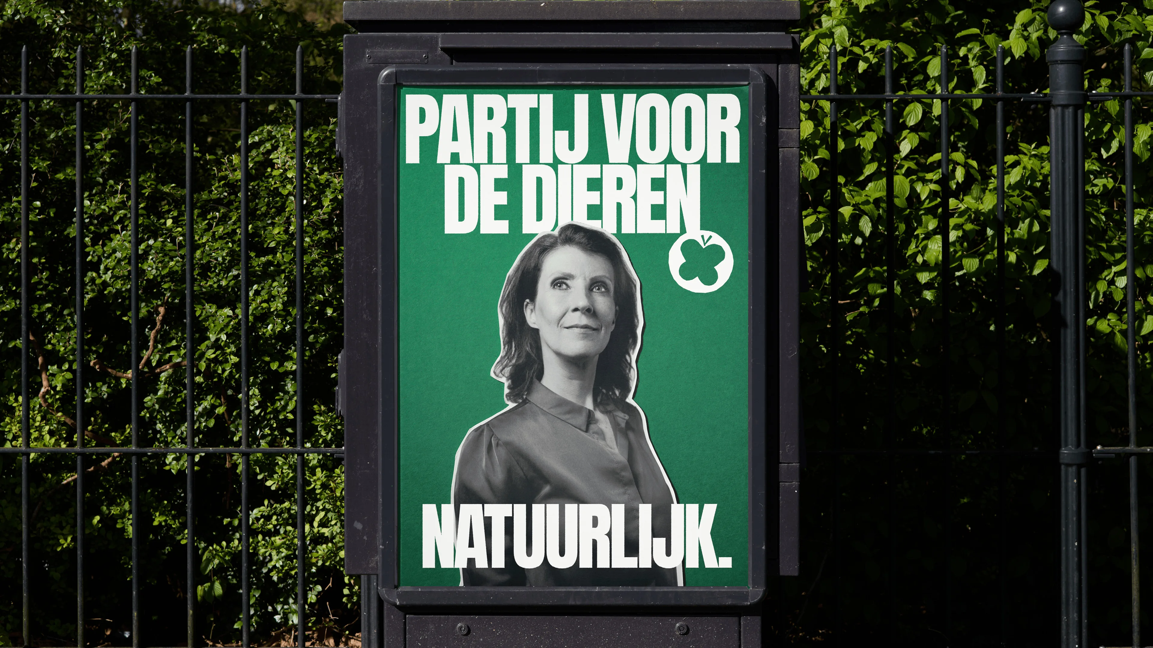
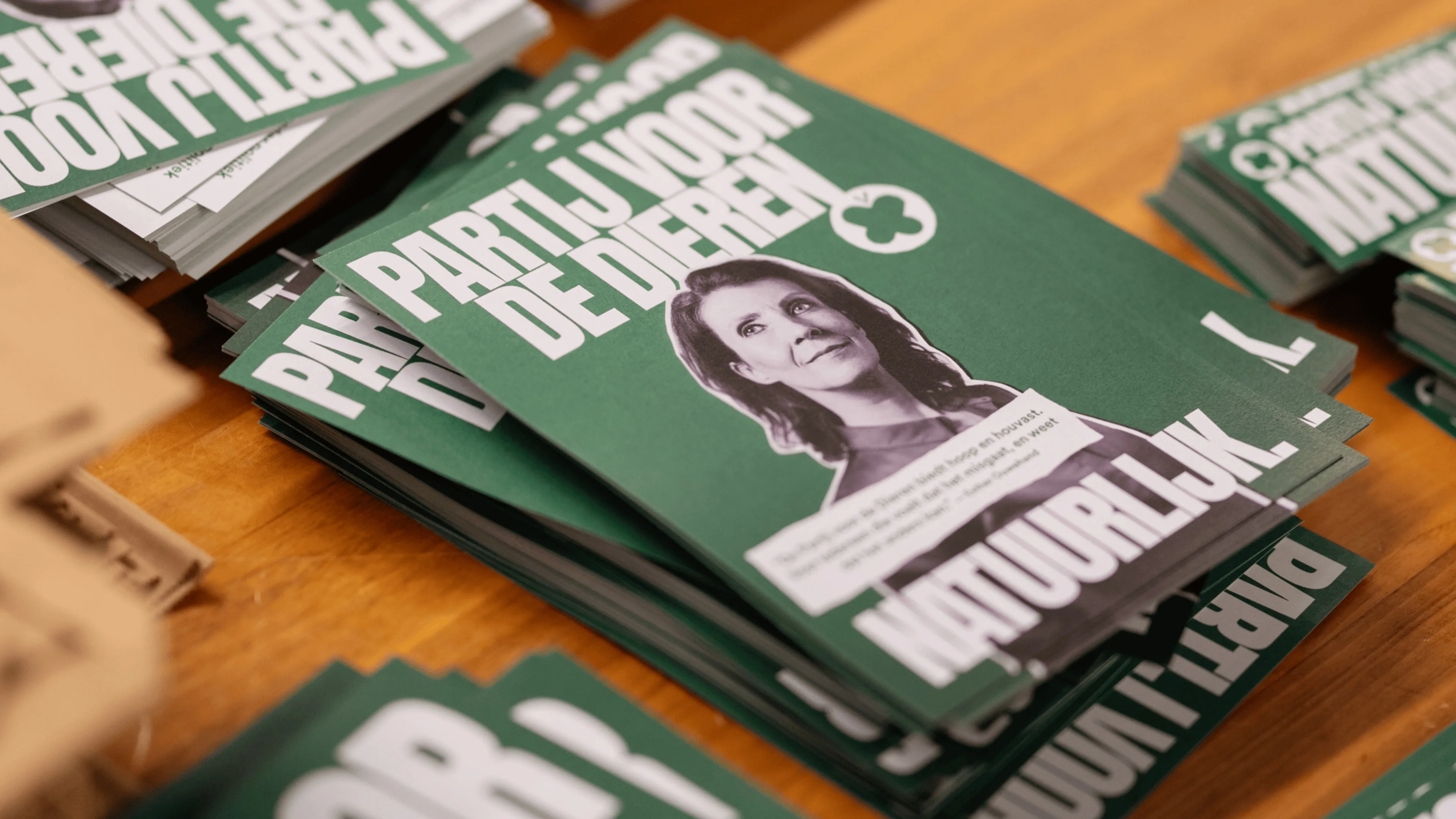
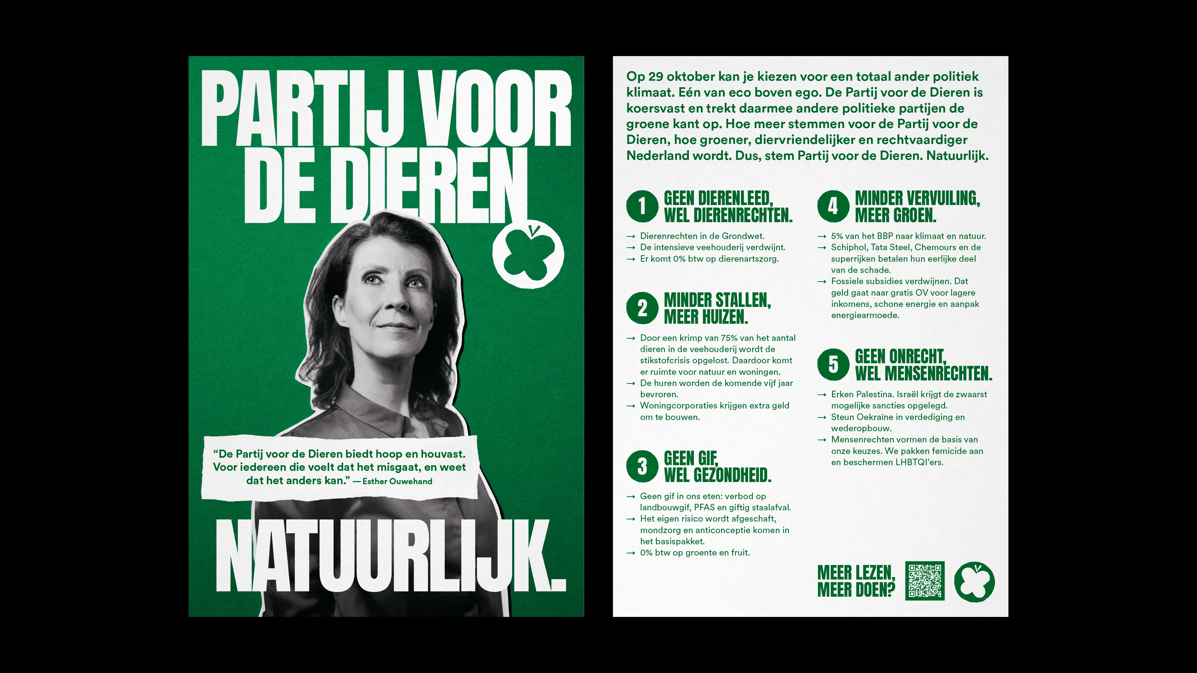
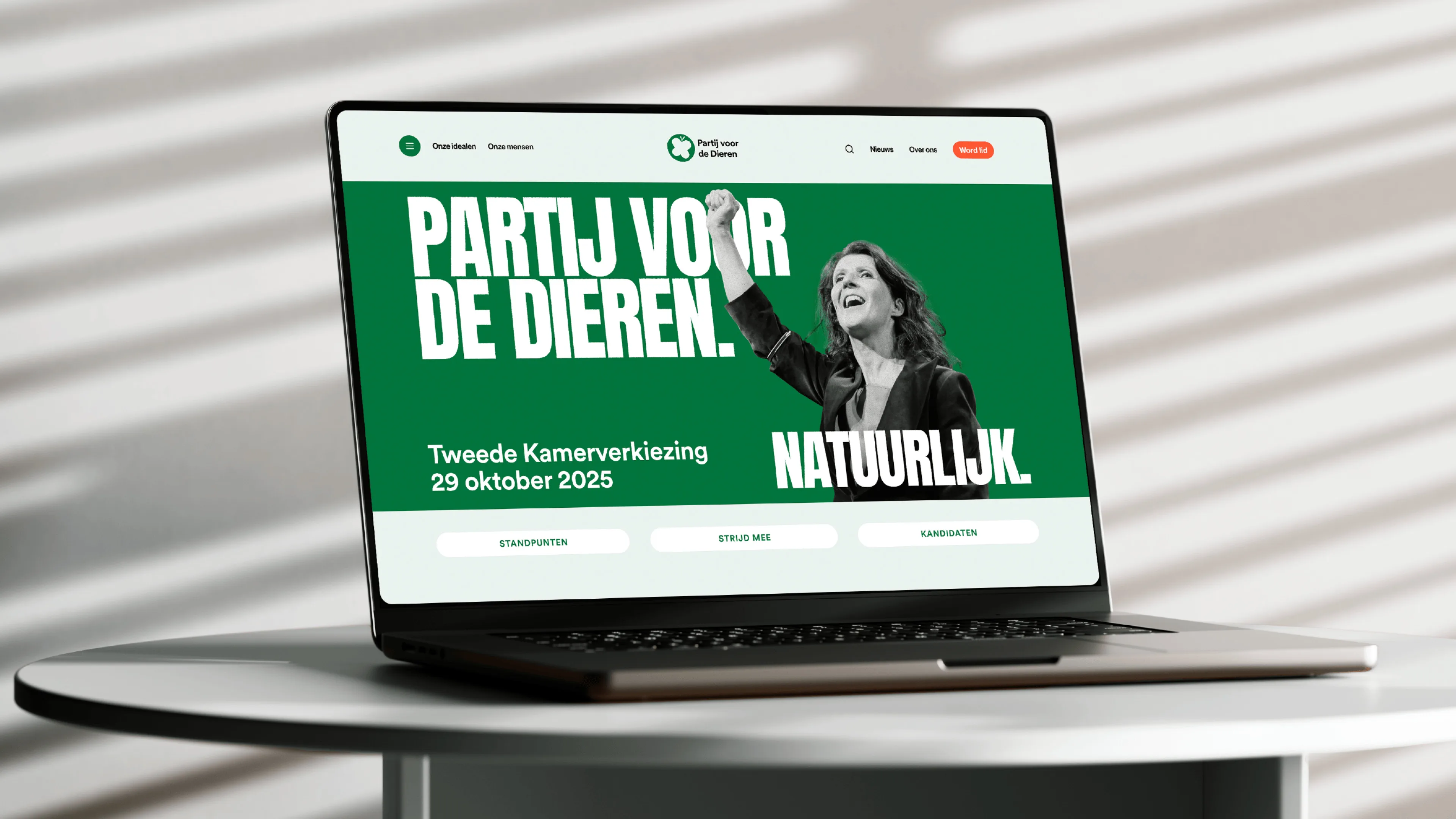

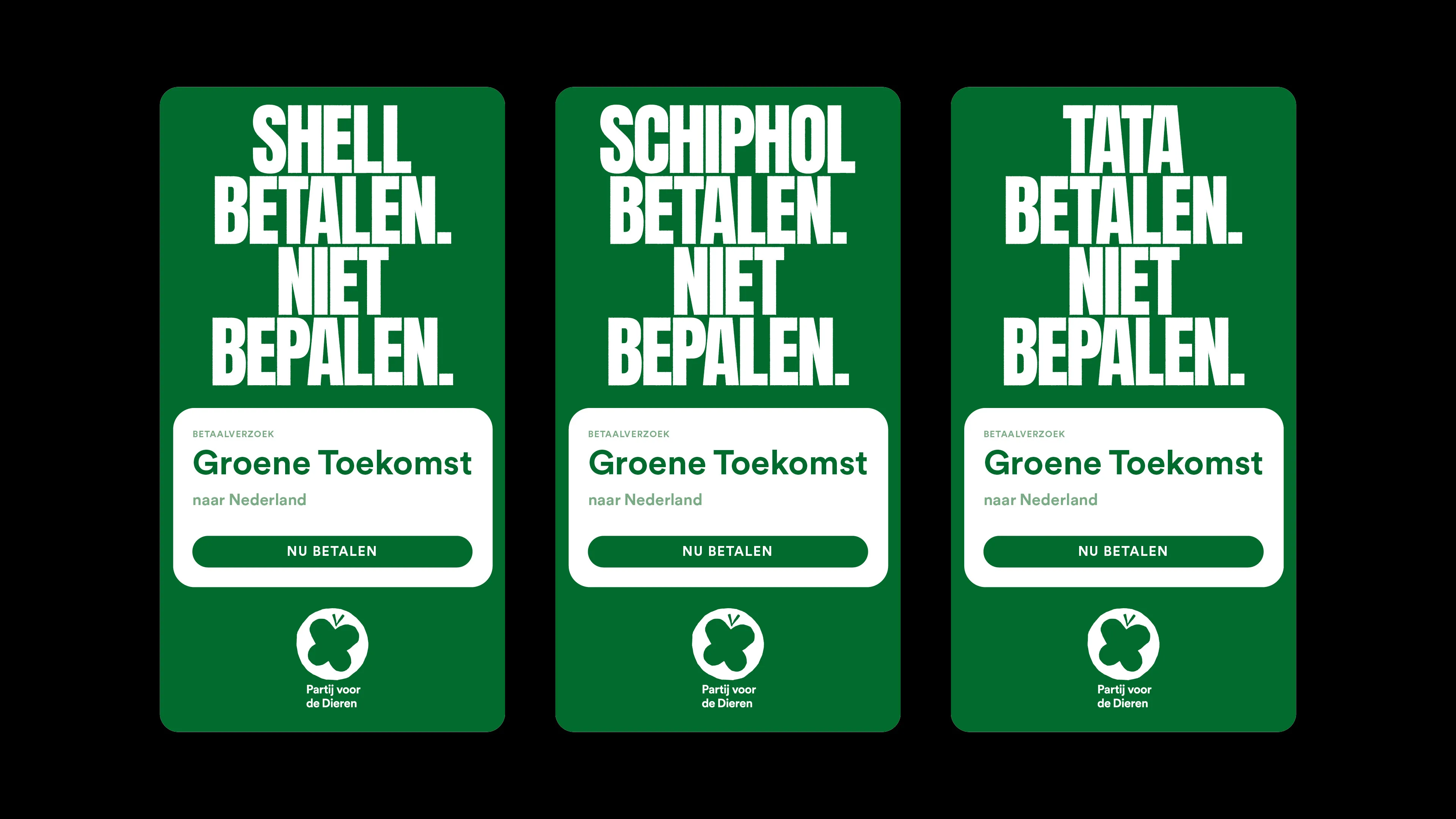
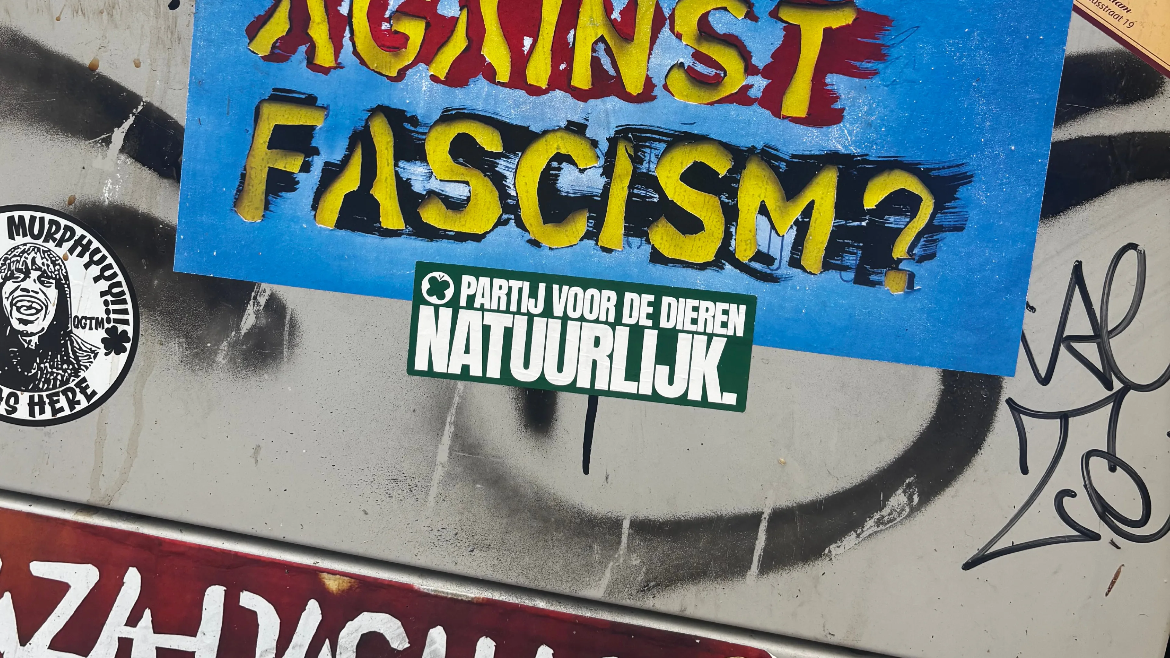
Partij voor de Dieren. Natuurlijk.
Act Accordingly
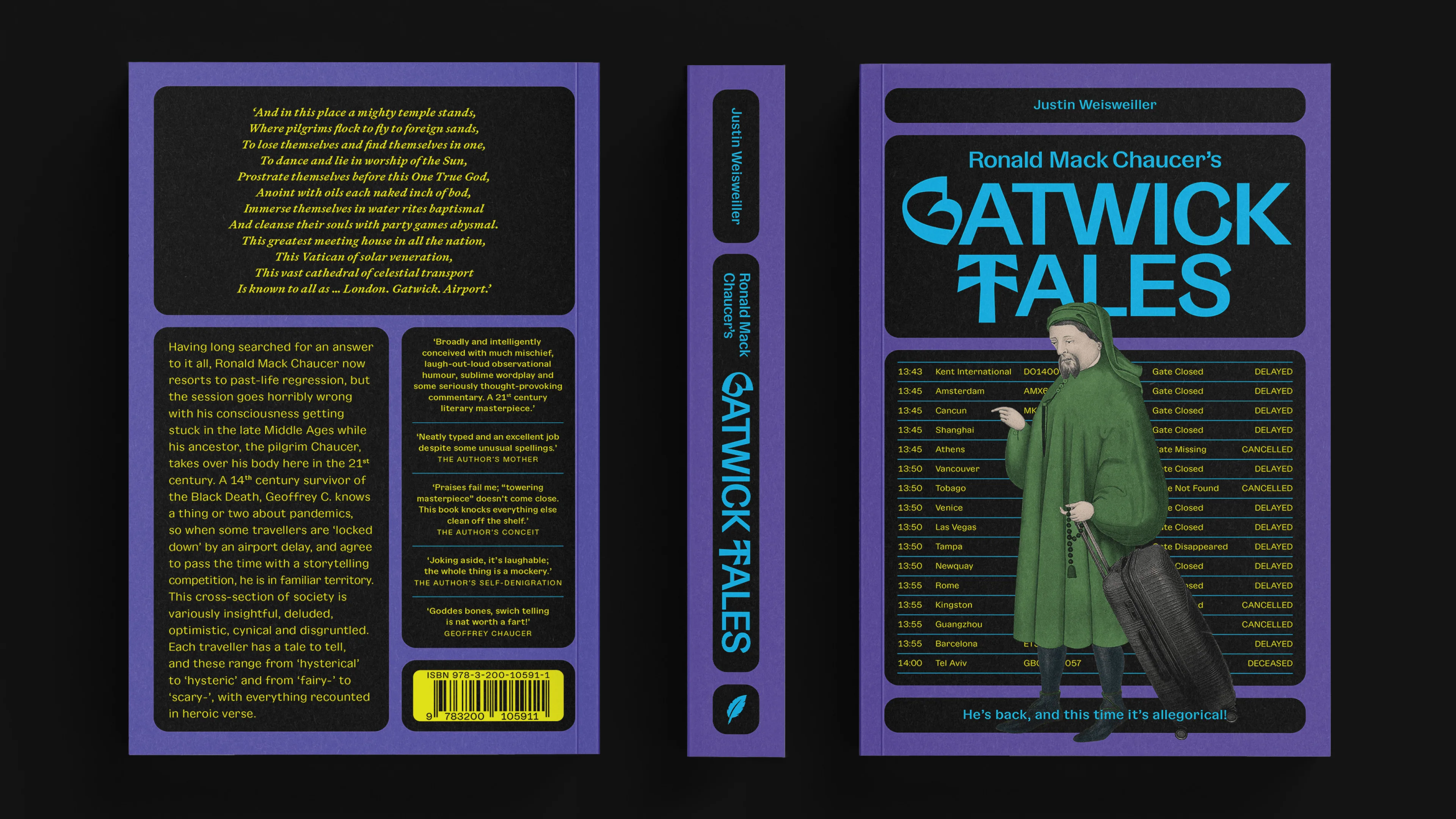
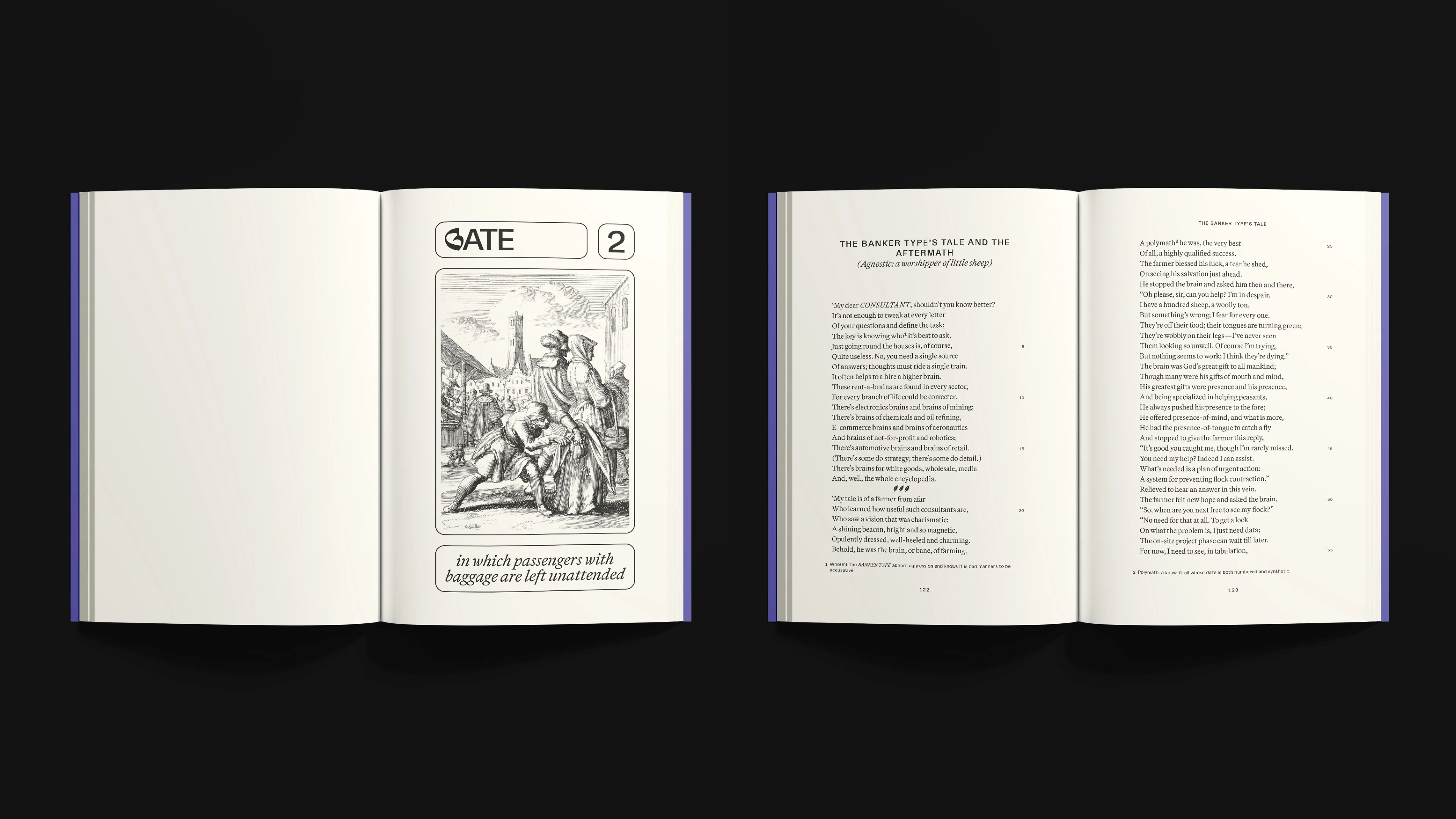
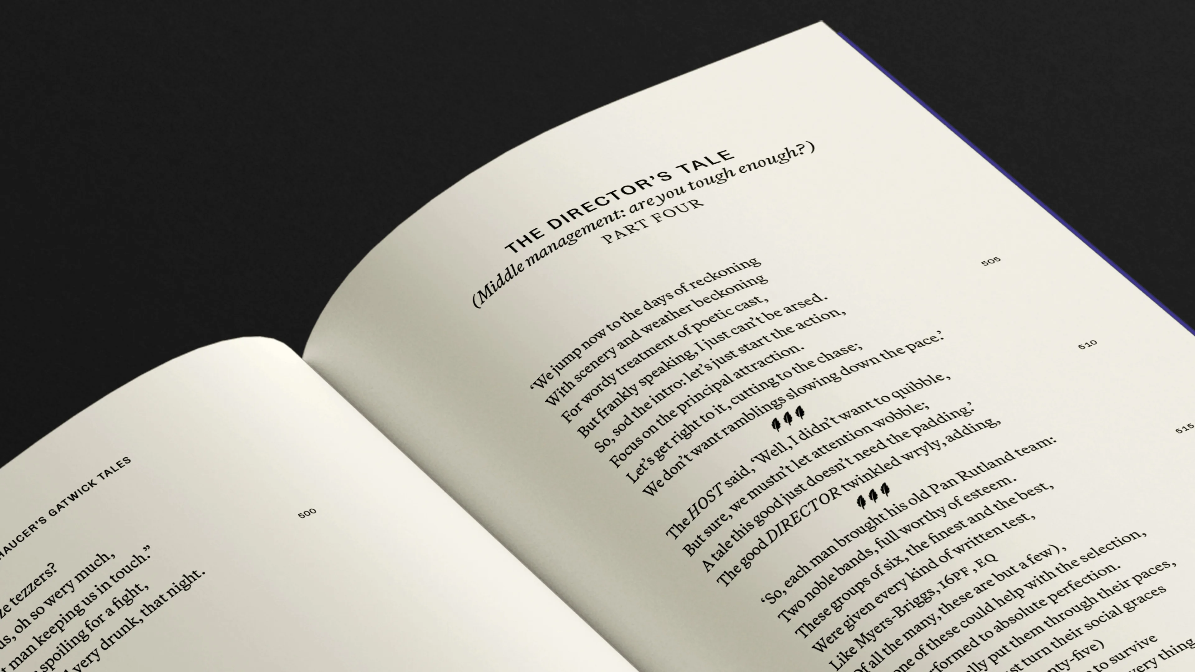
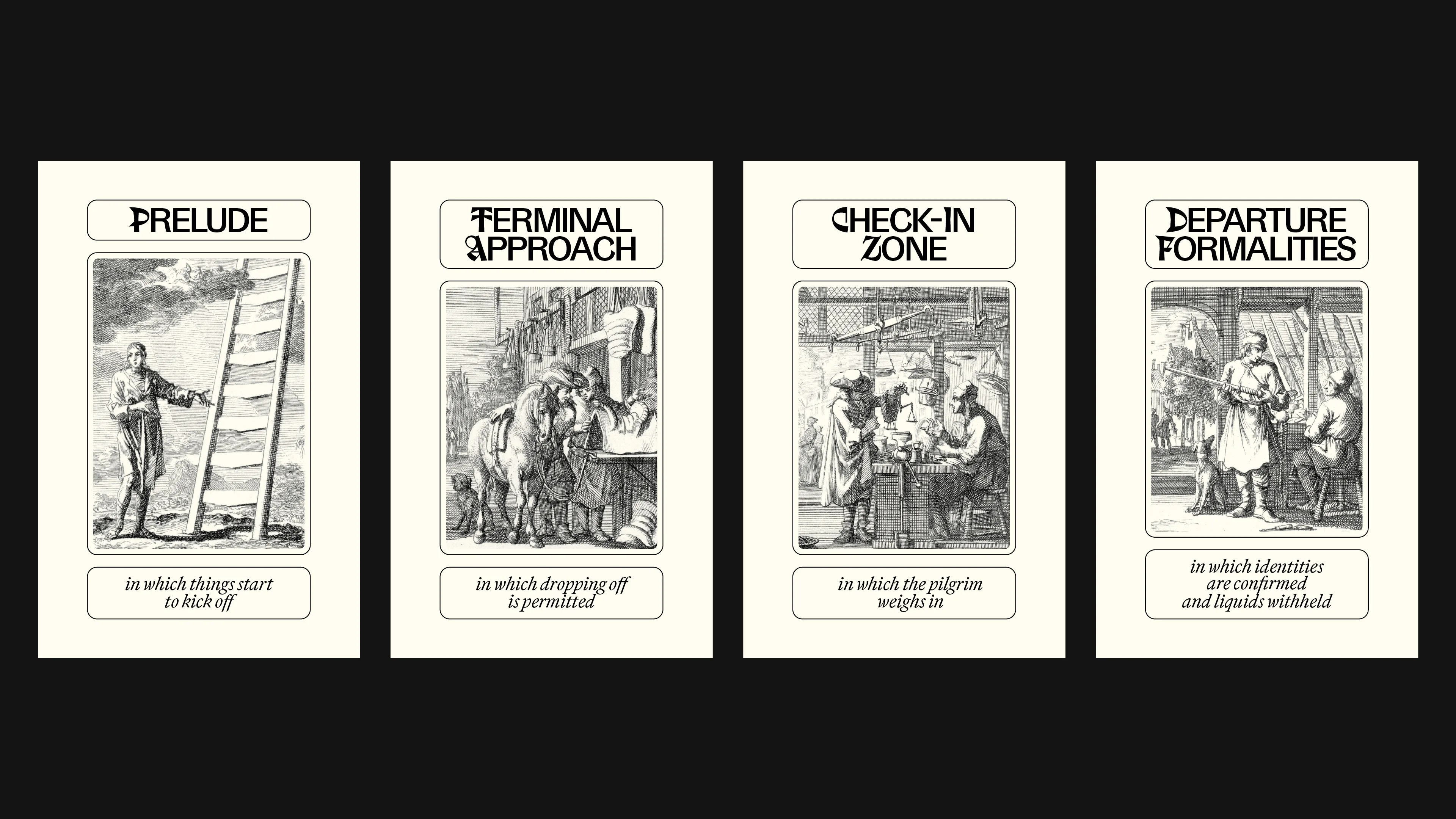
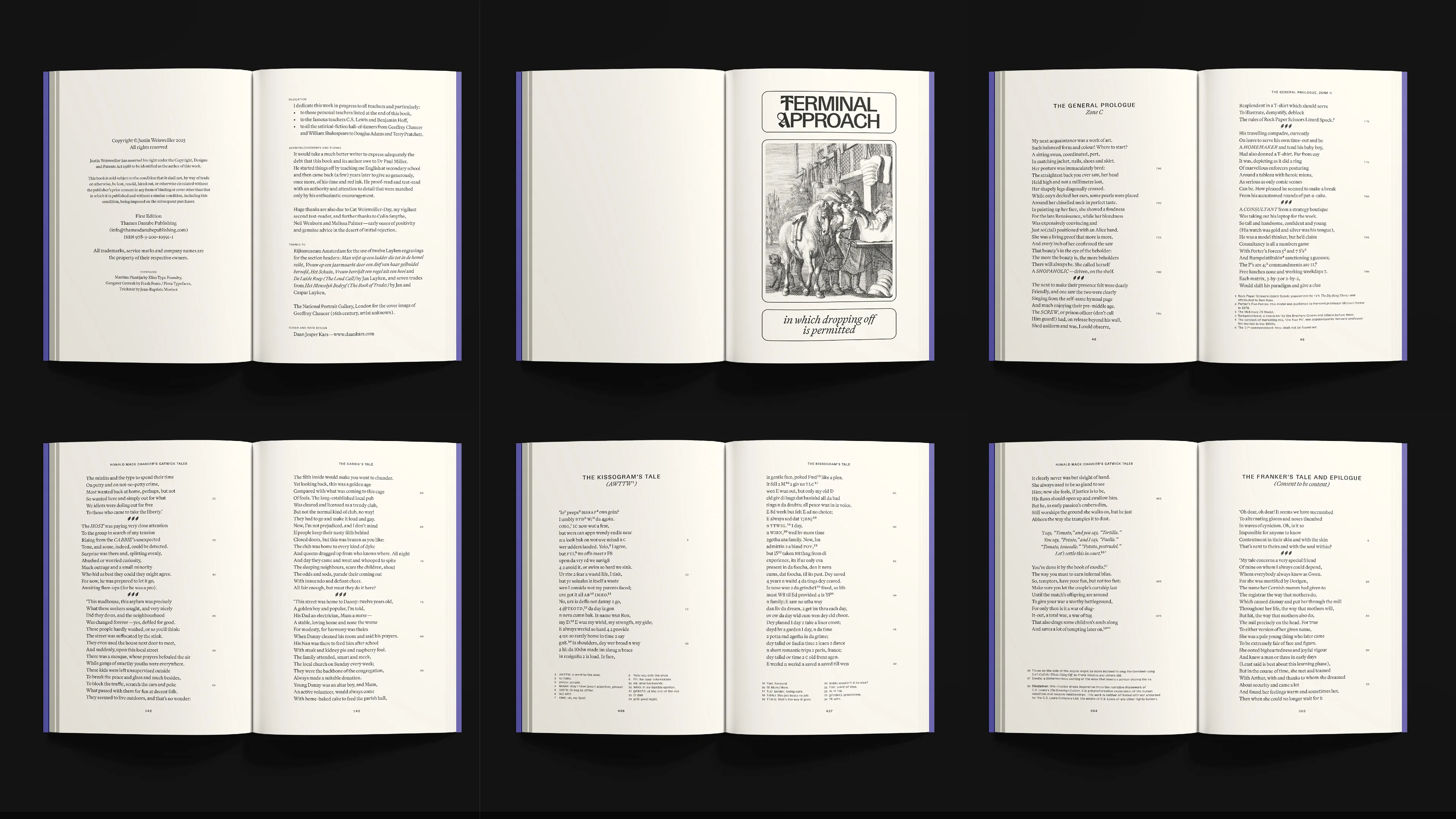
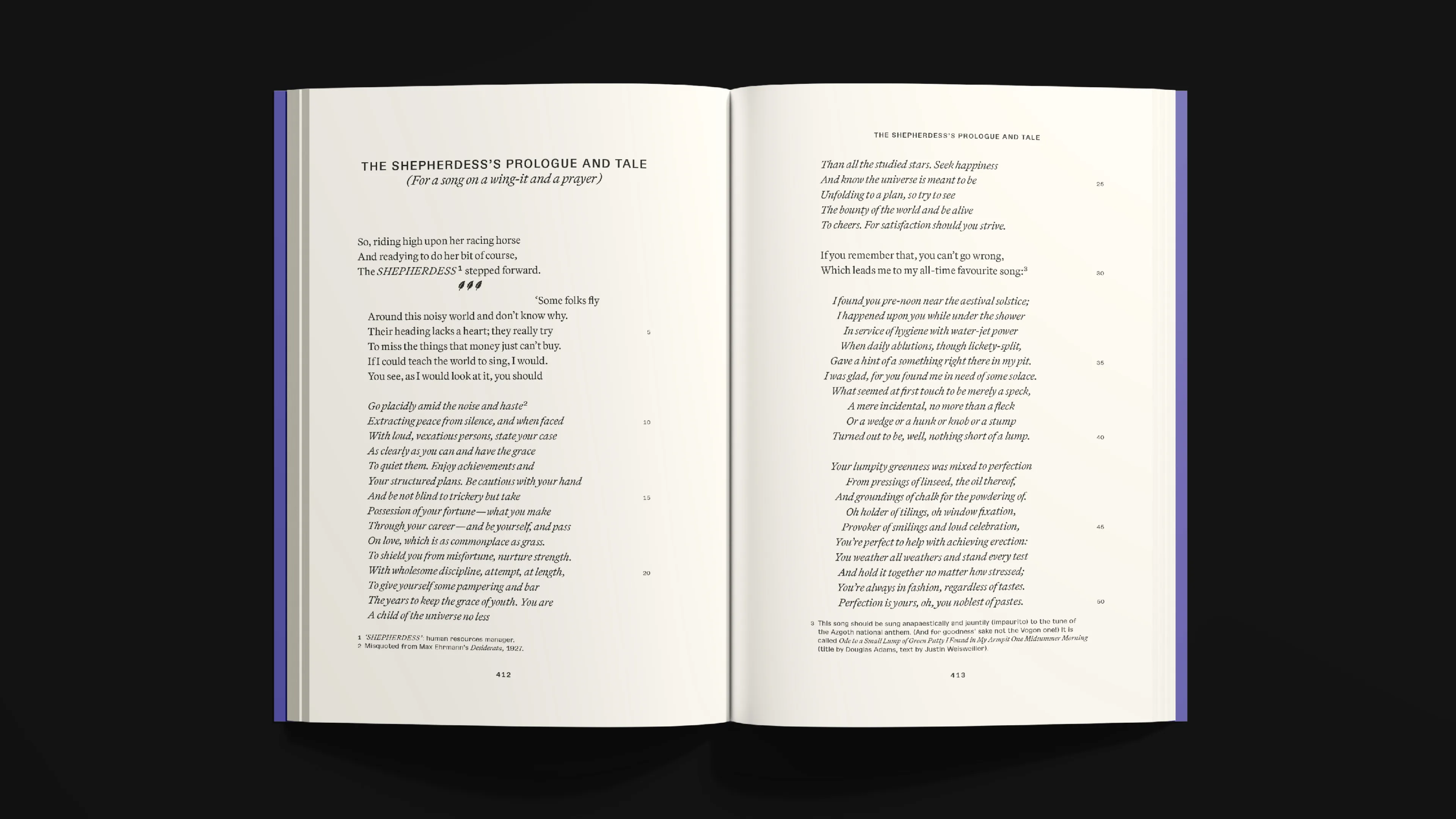
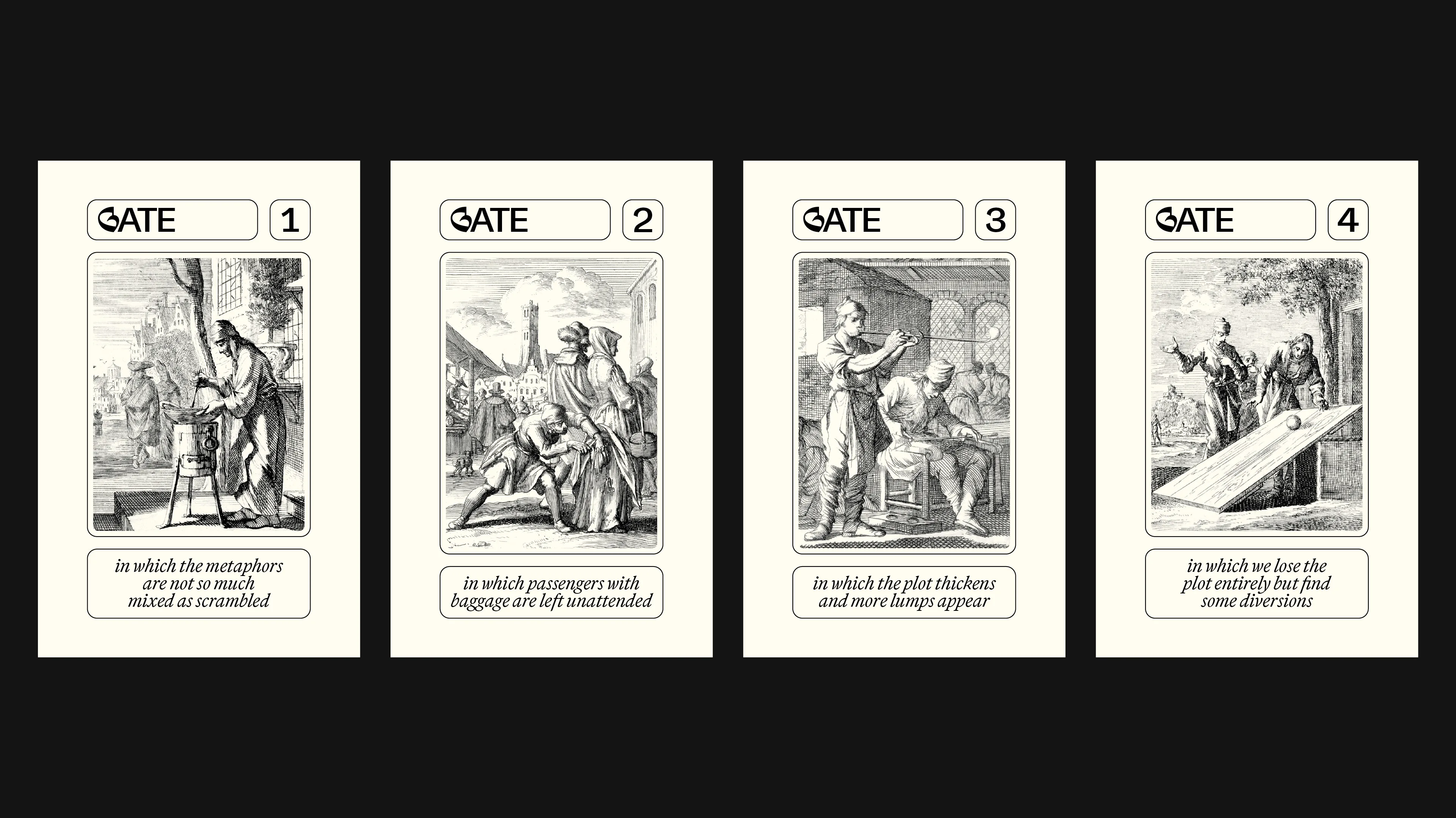
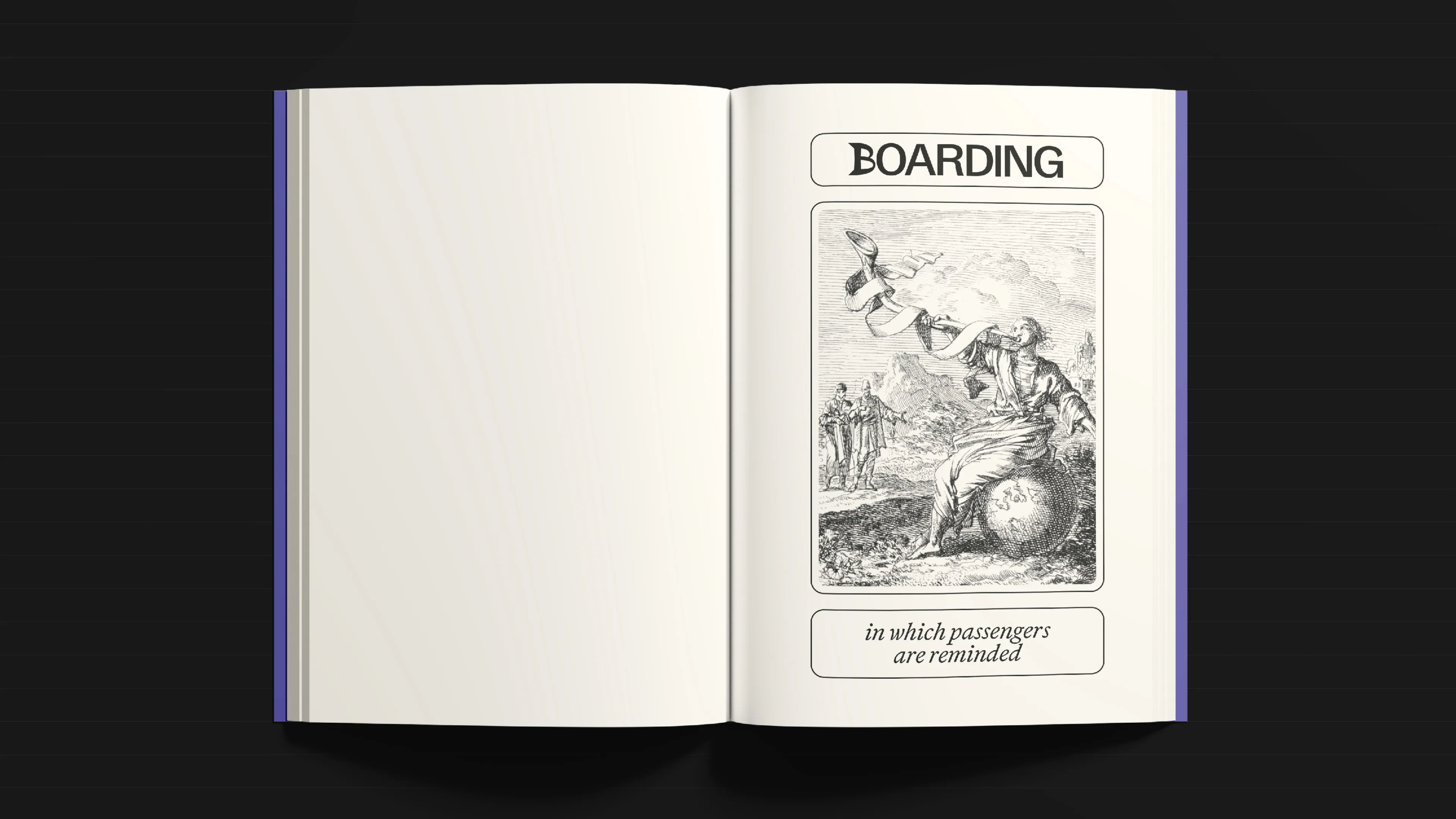
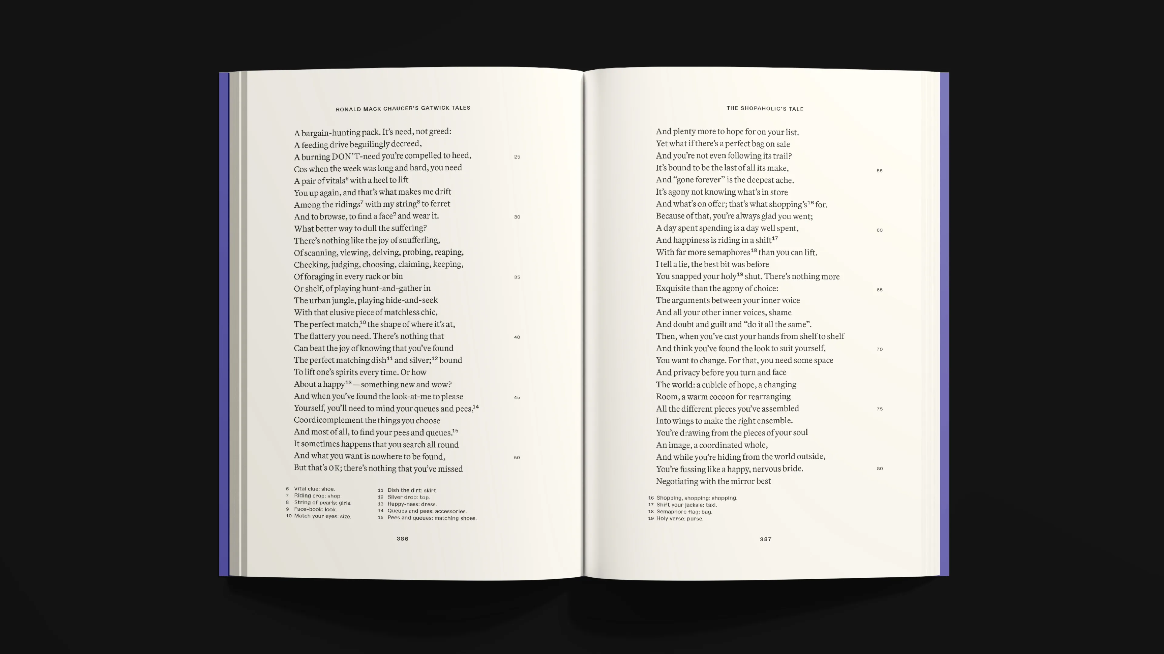
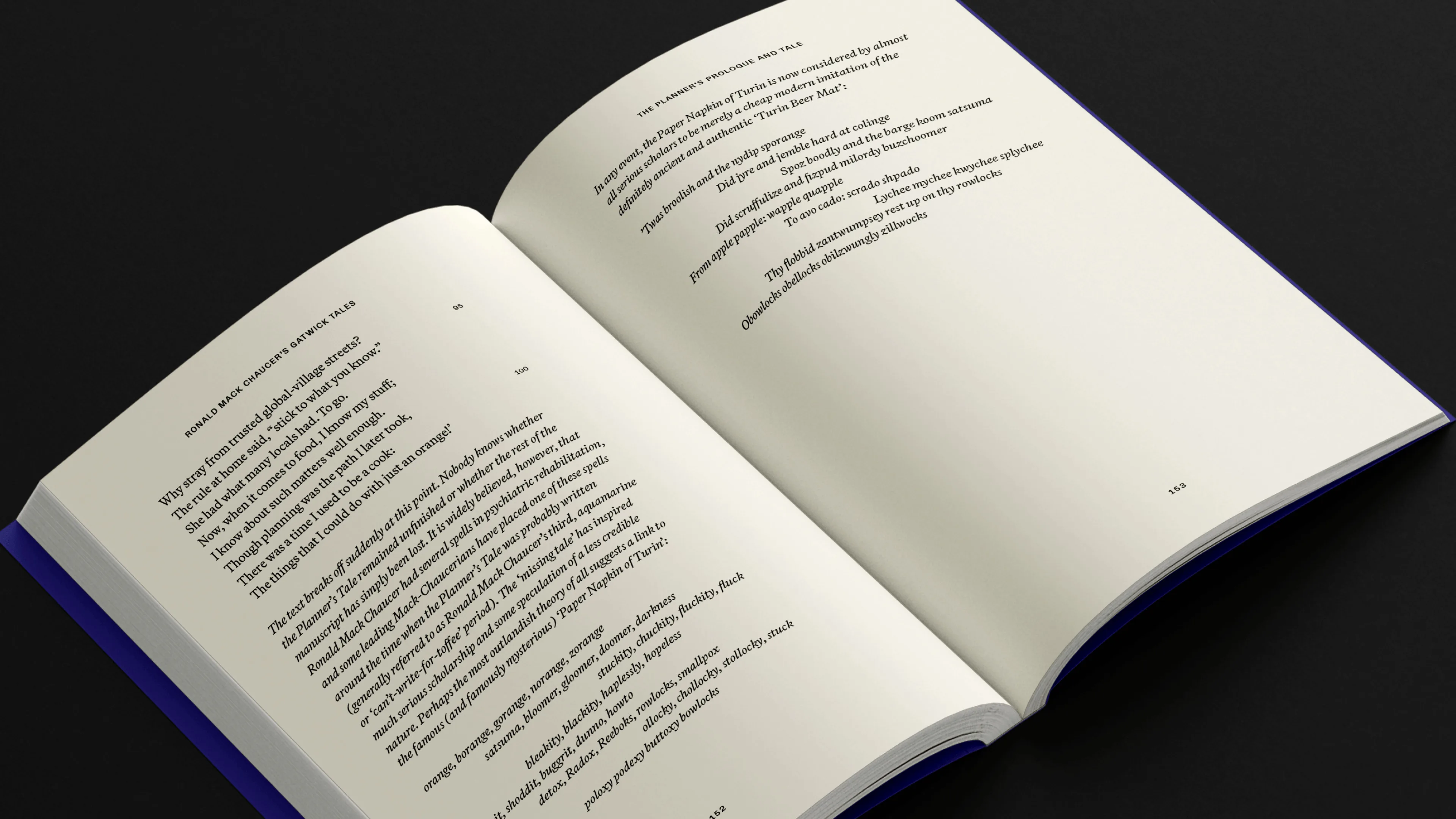
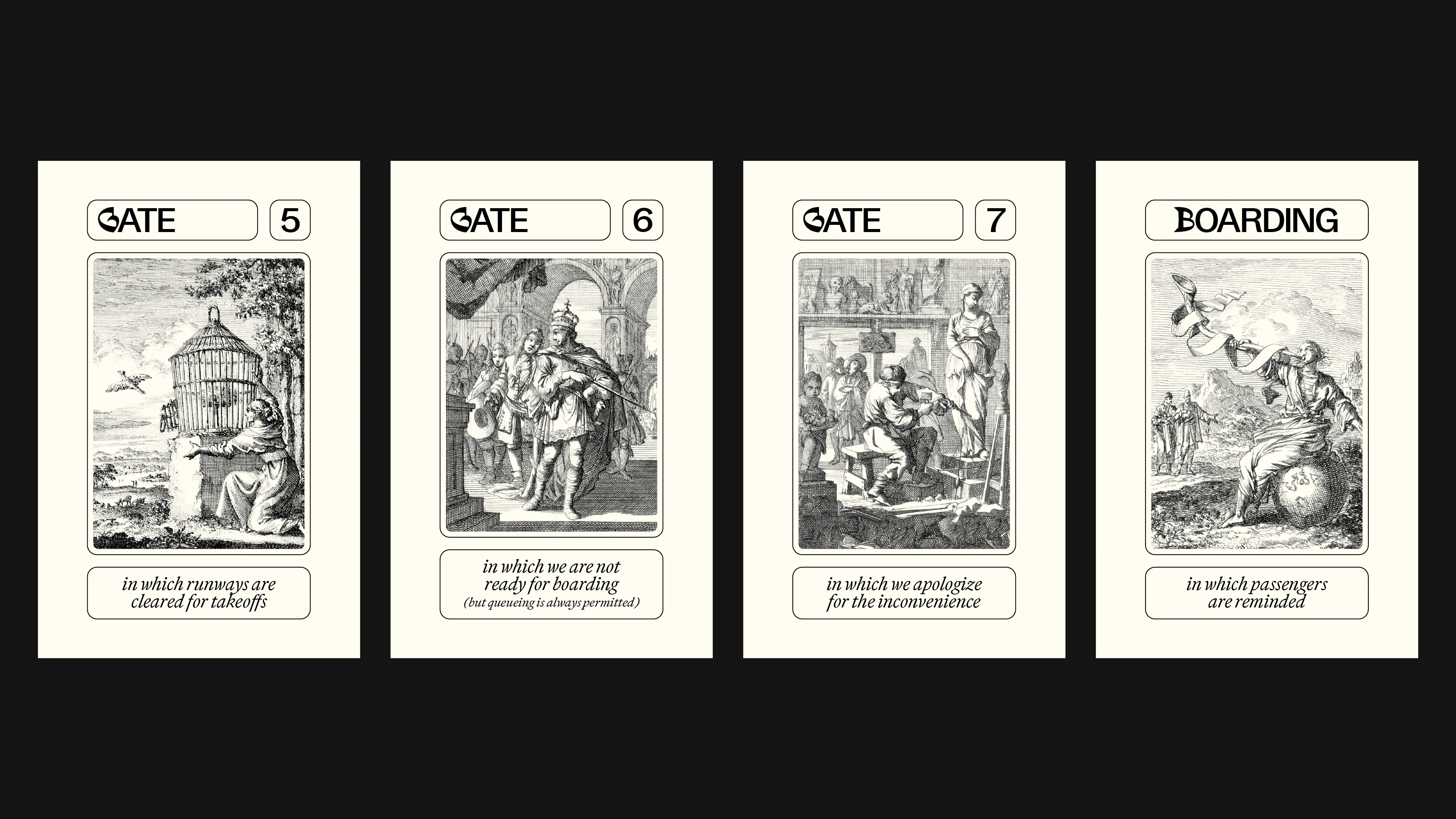
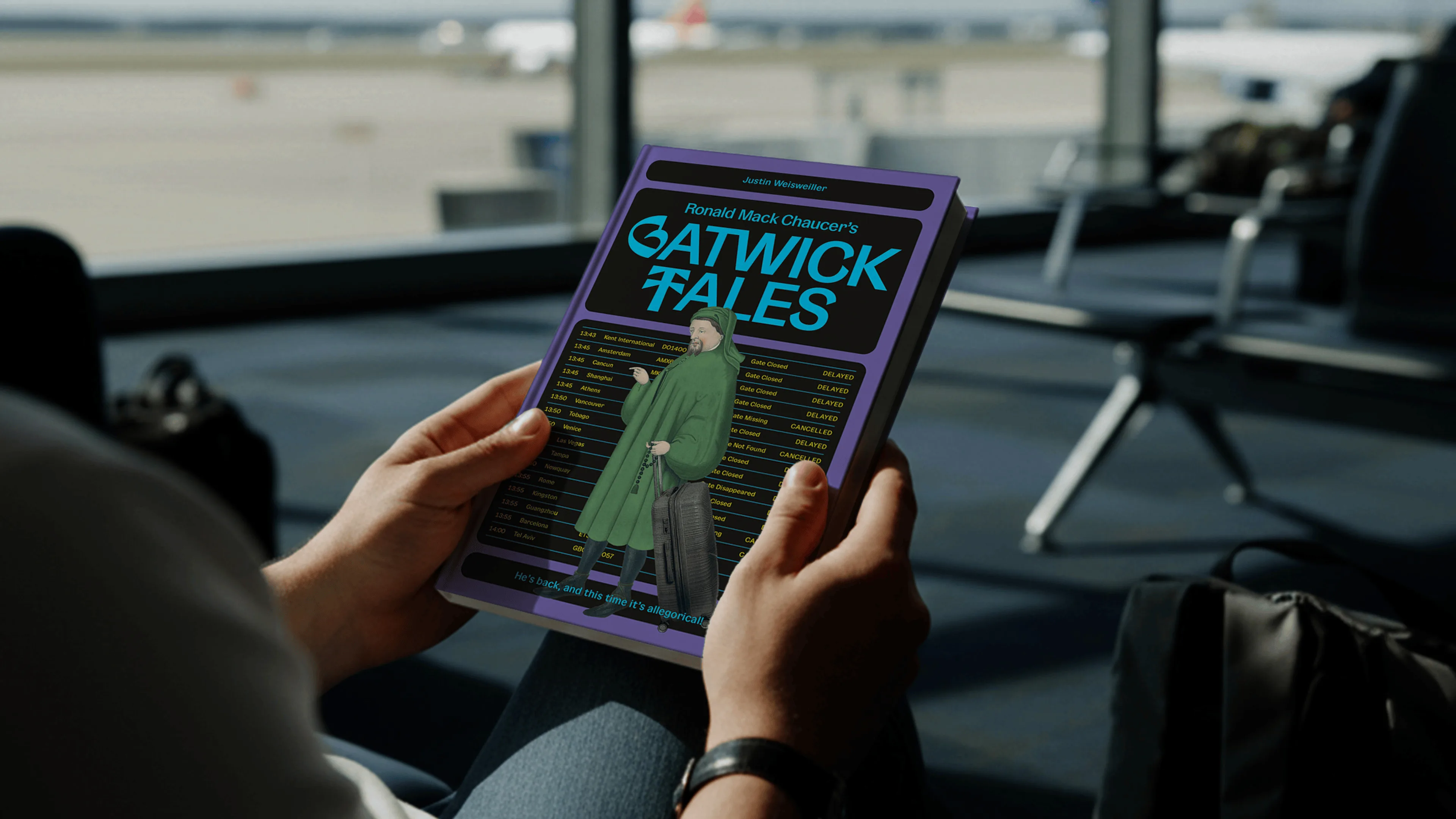
Gatwick Tales
This book of humorous and satirical short stories in verse is a modern reimagining of Geoffrey Chaucer’s Canterbury Tales. The cover brings medieval Chaucer into a modern airport; strong colours represent the richness of human experience; purple particularly represents imagination and introspection. Old and new are also humorously linked by 17th century engravings on section-header pages. The text is mostly iambic pentameter, but 10% is in other verse forms requiring different page formats. As well as graphic design, the project included text formatting and upload preparation for paperback and Kindle.

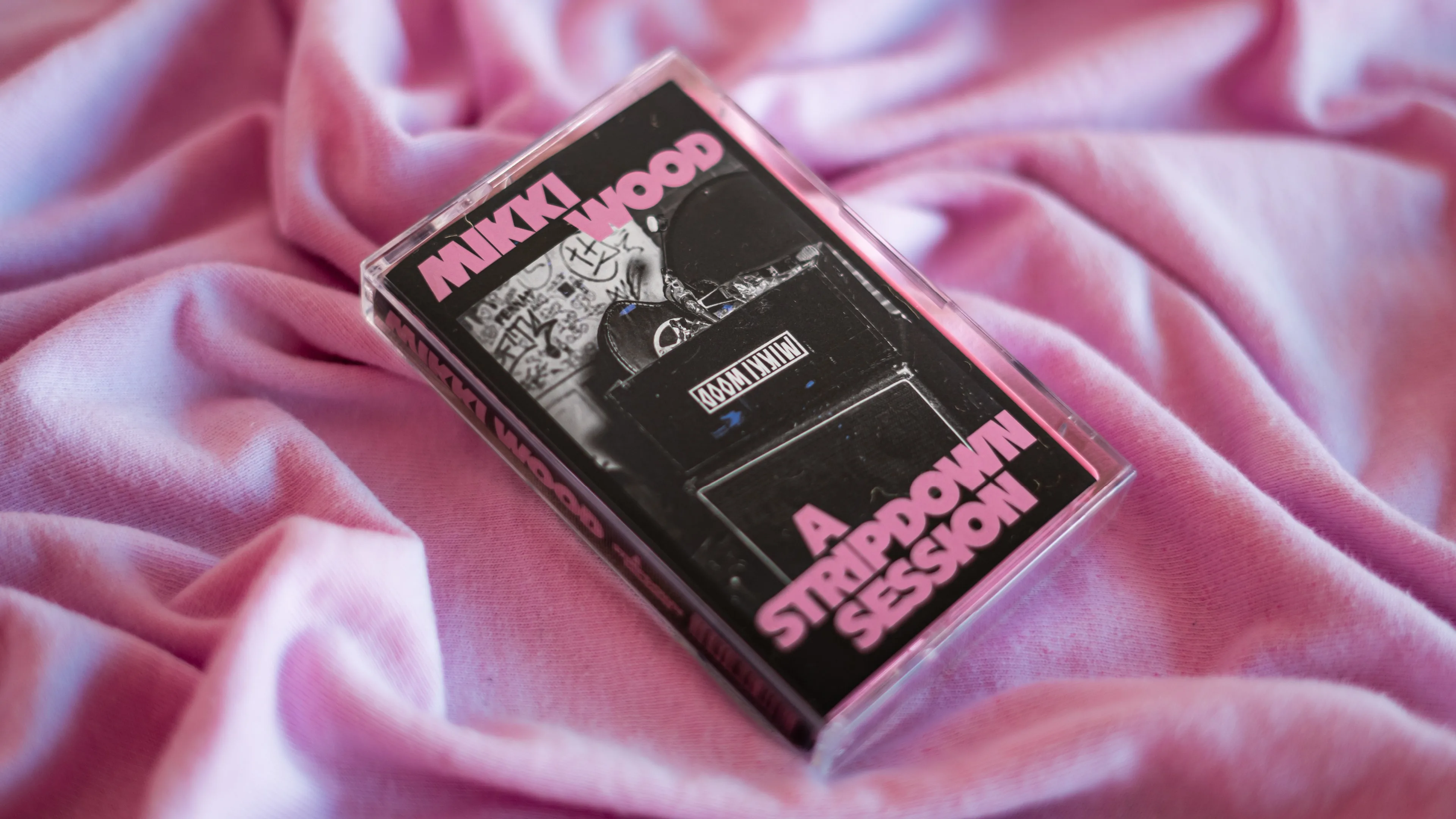
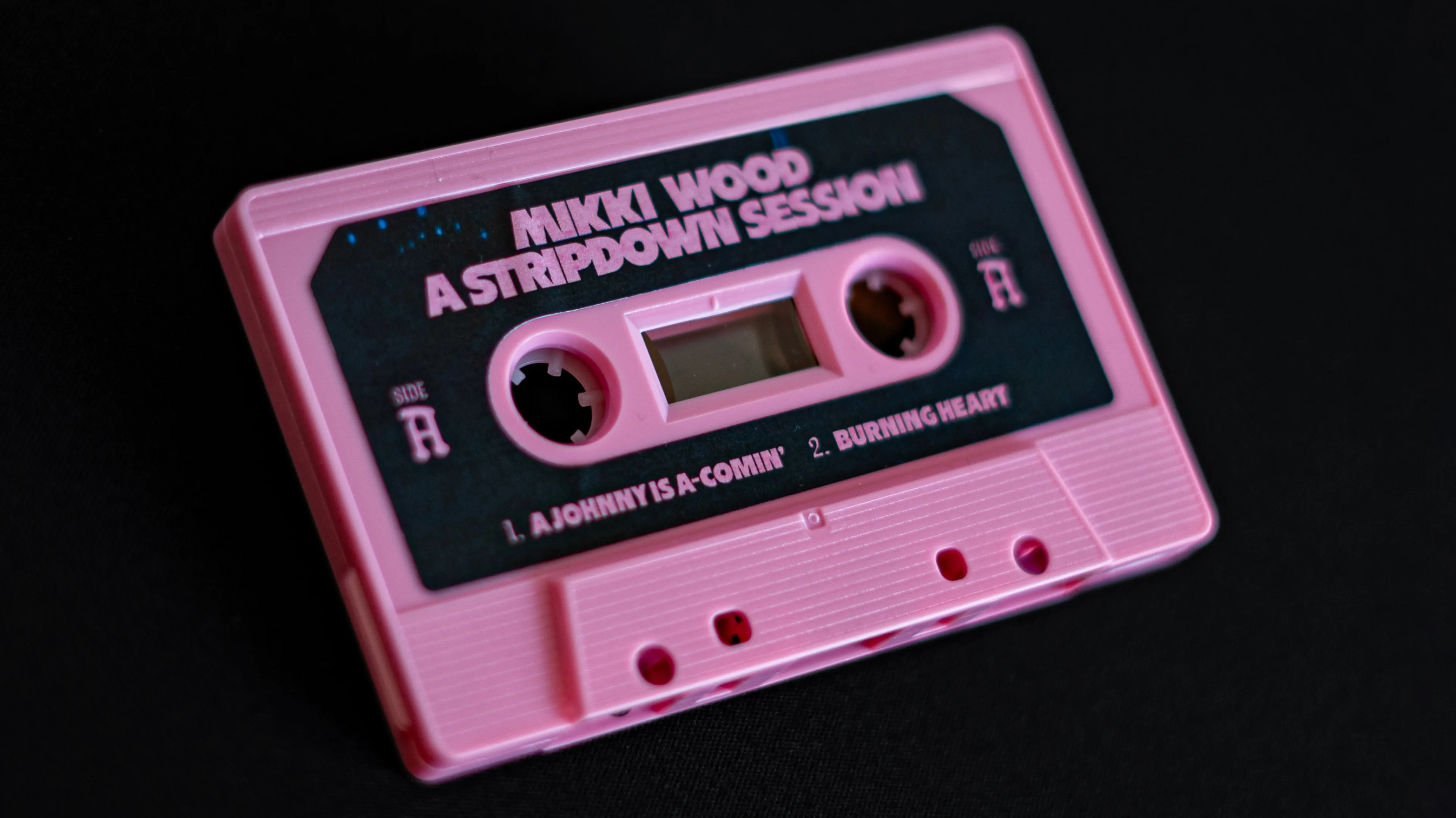
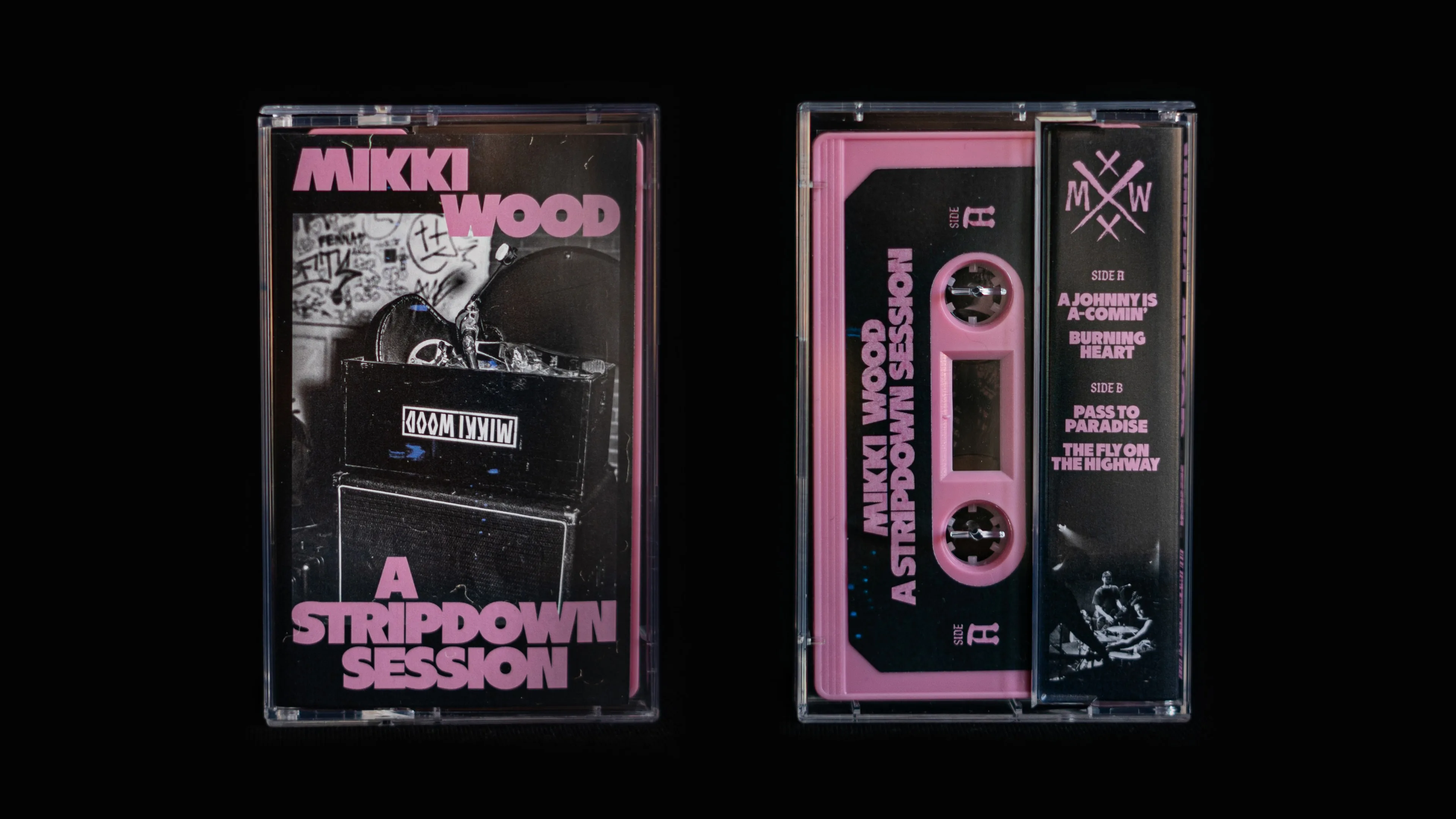
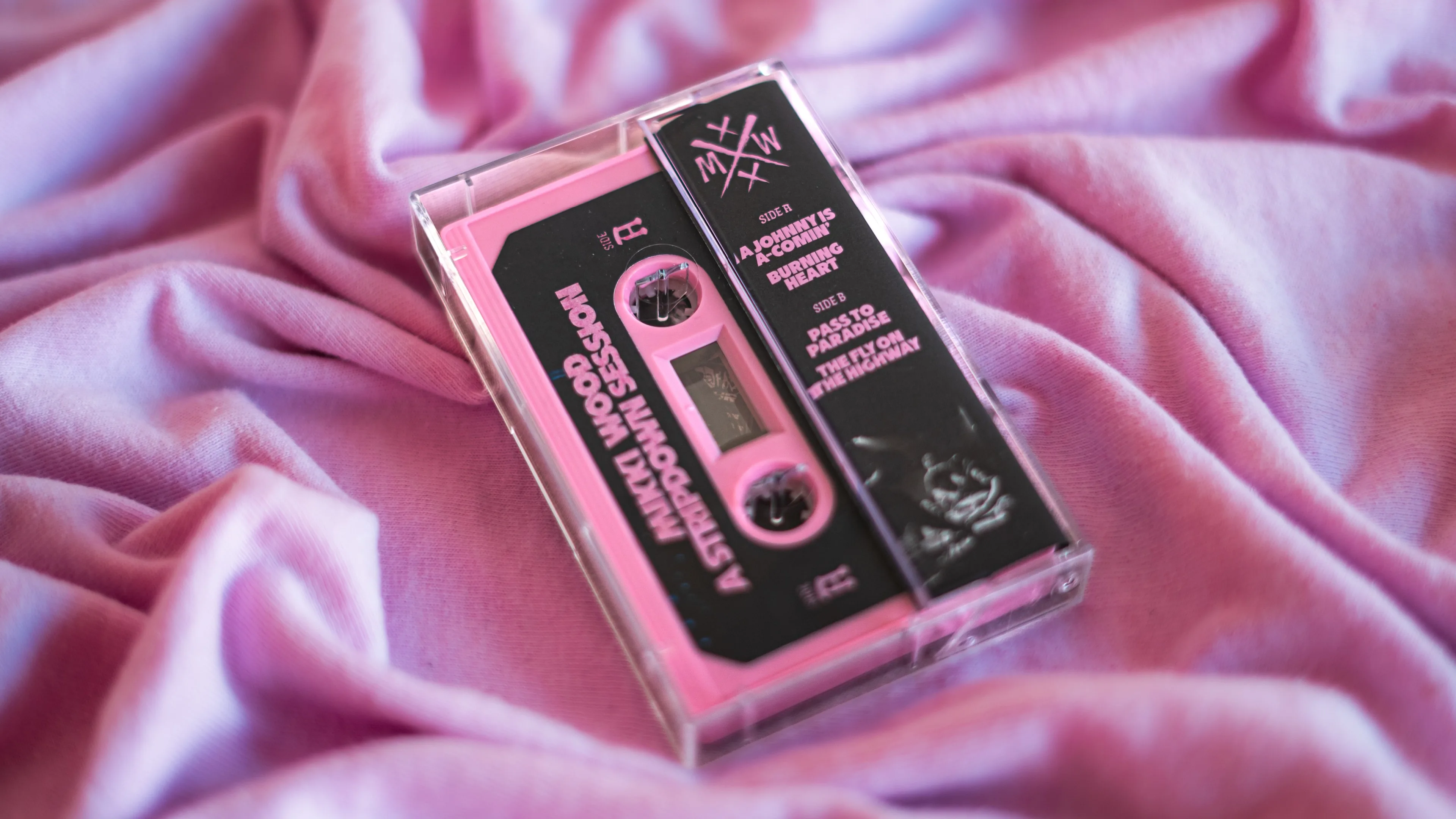
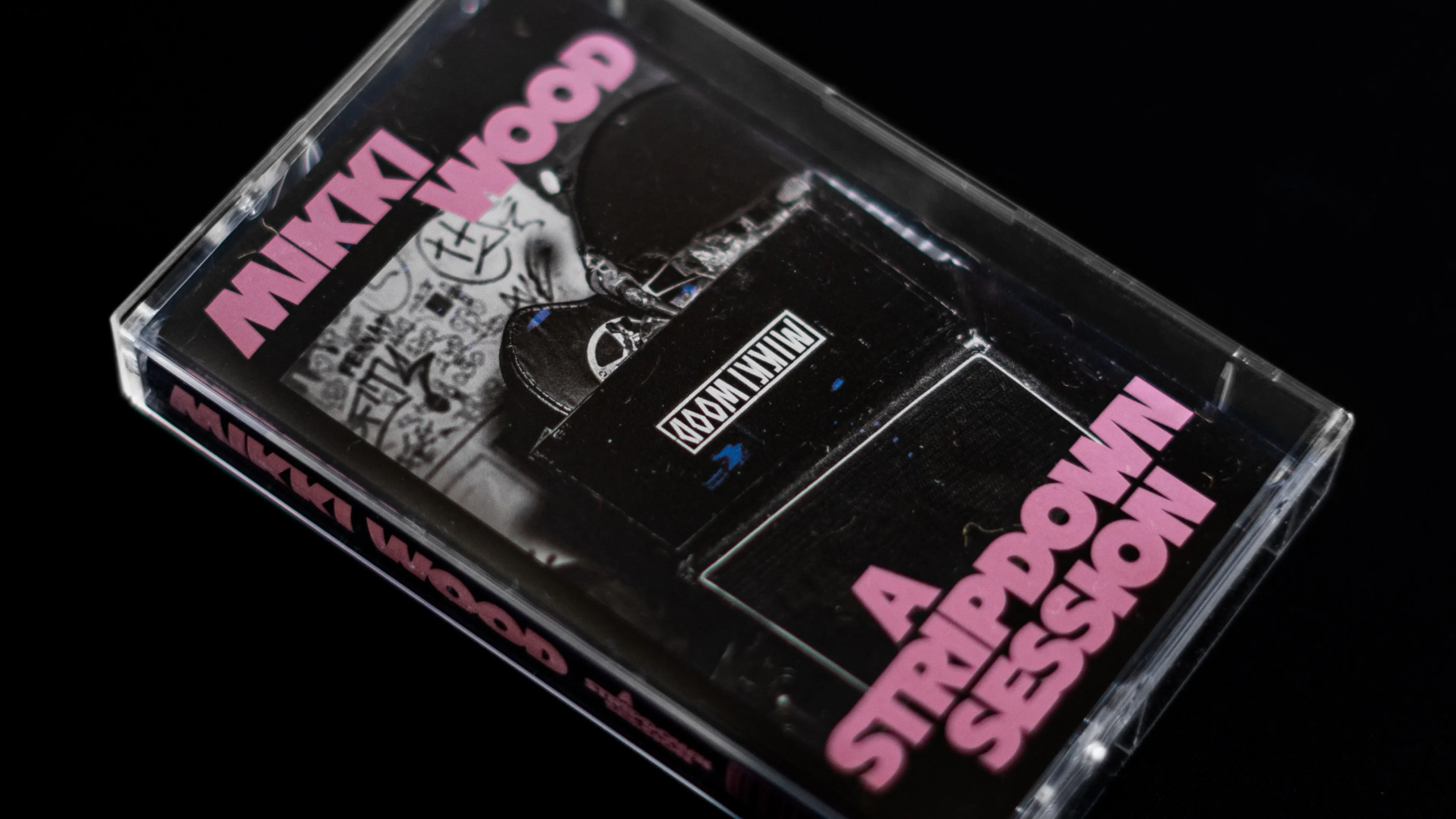
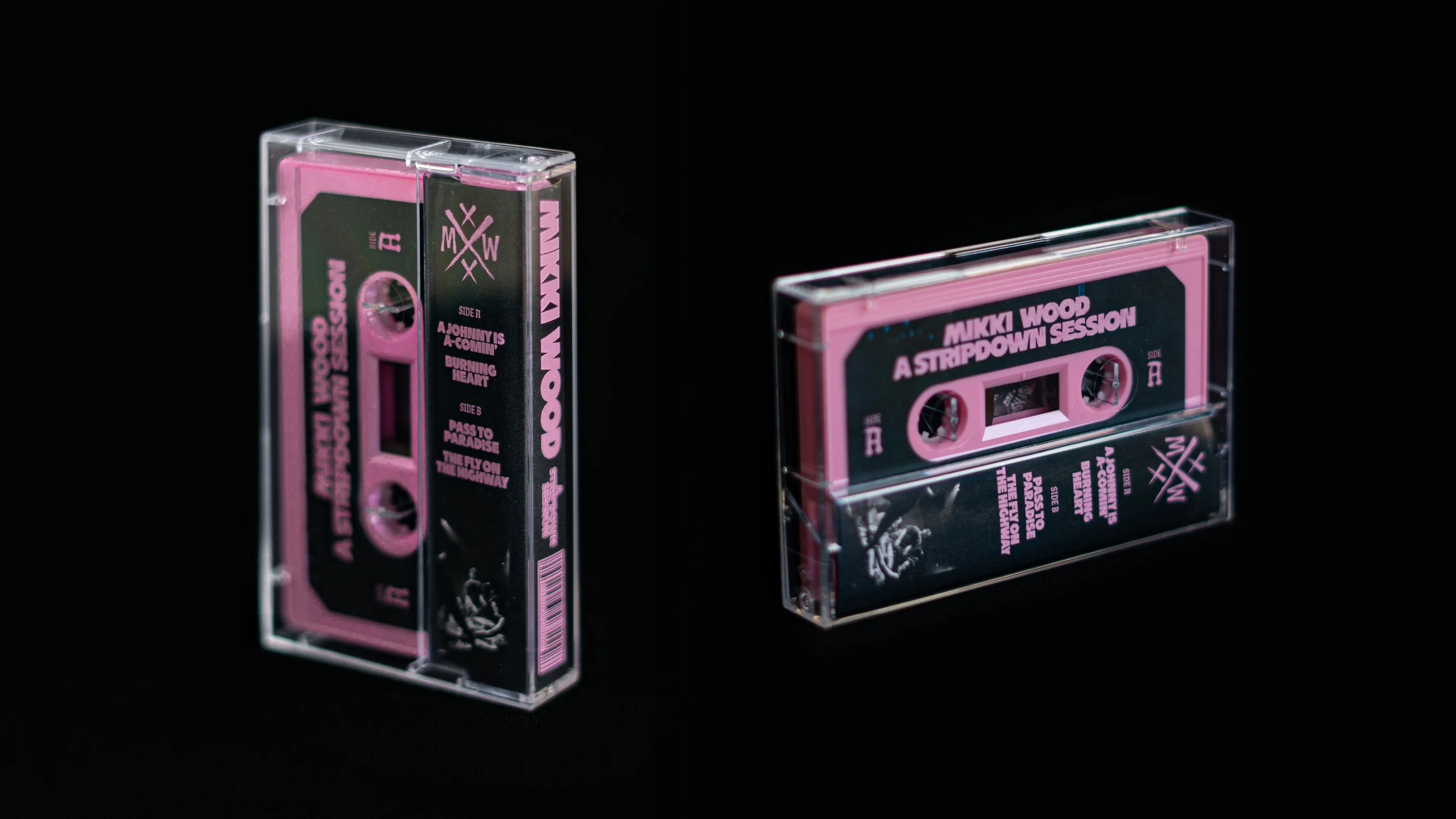
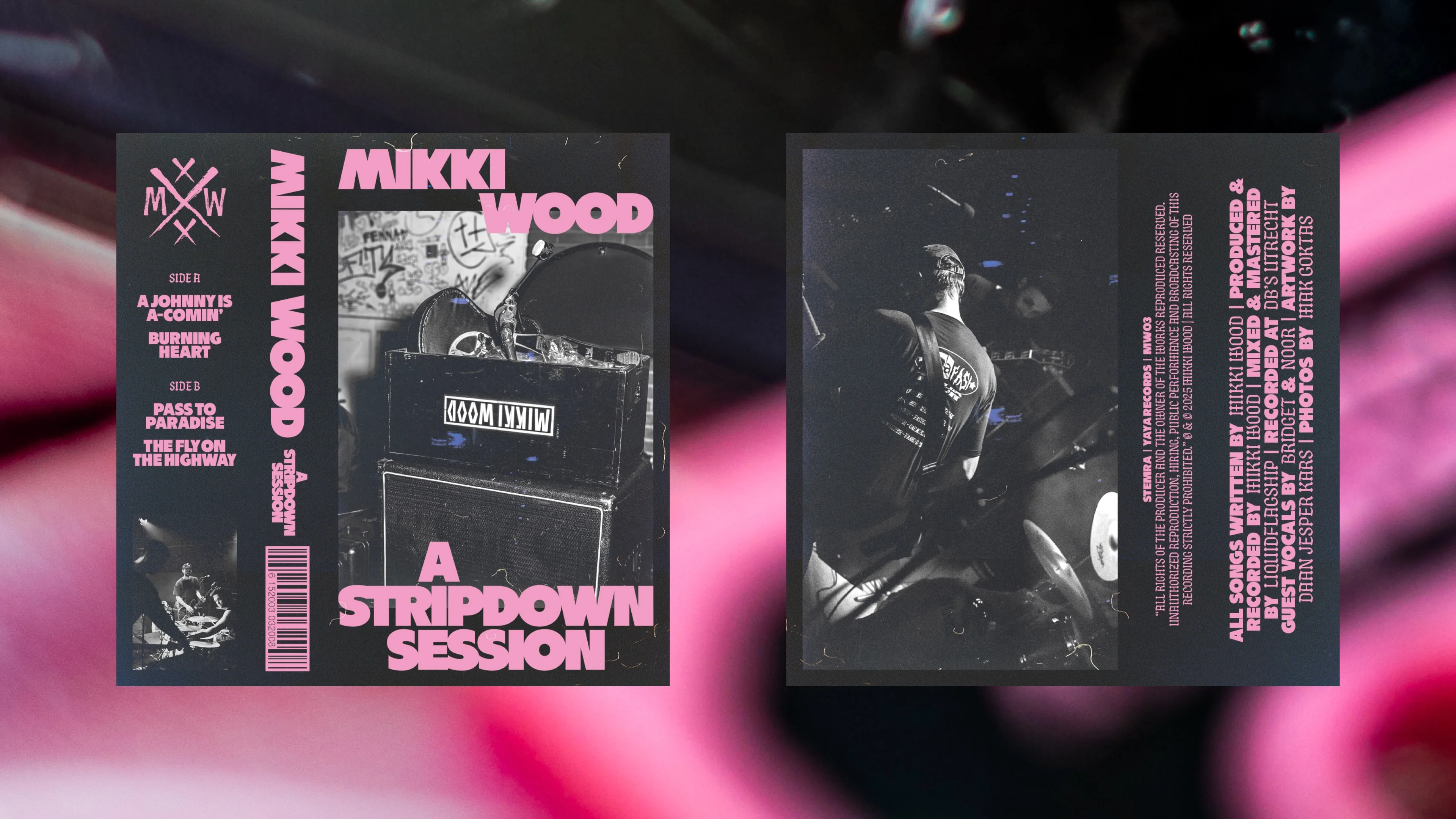
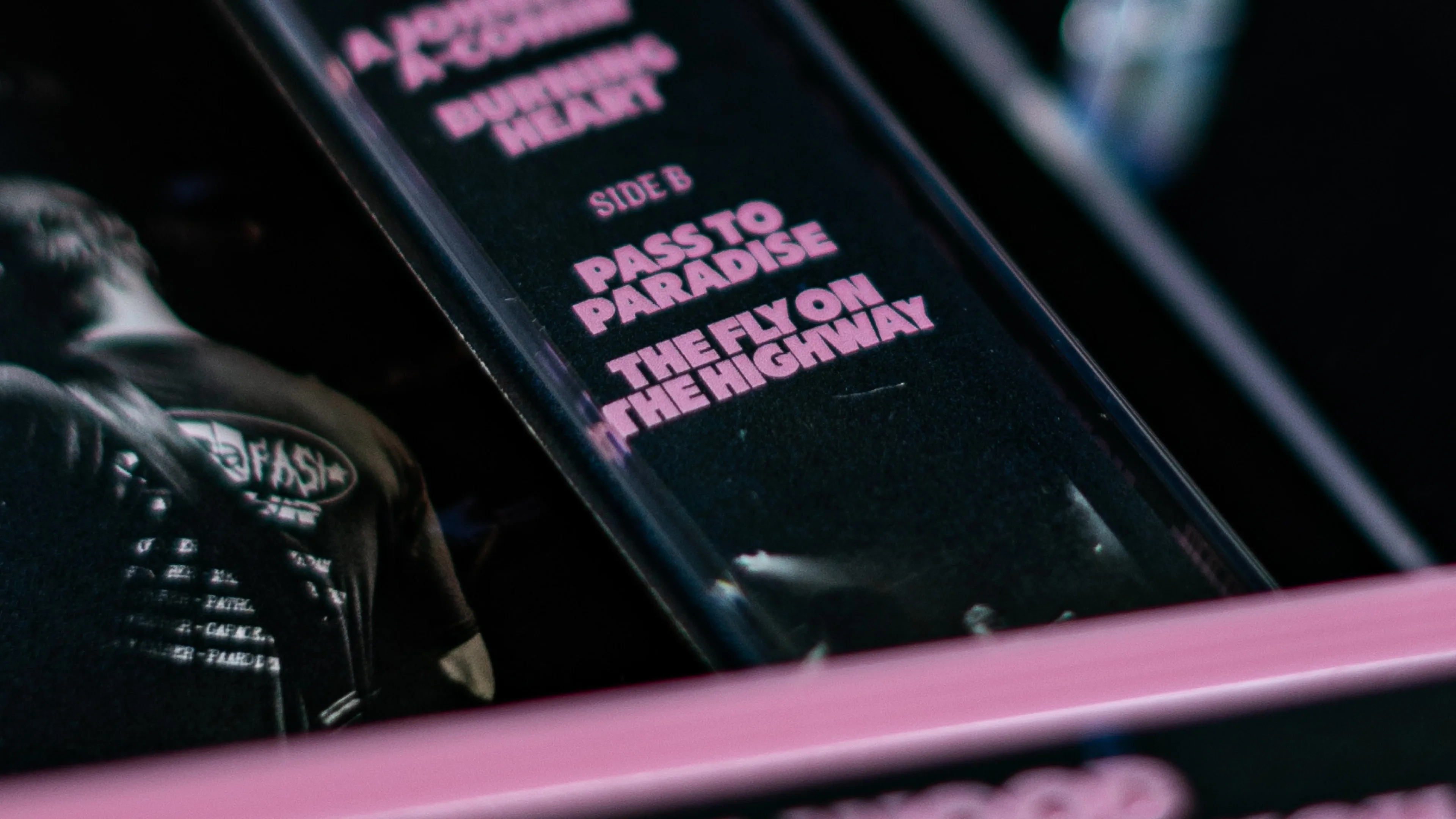
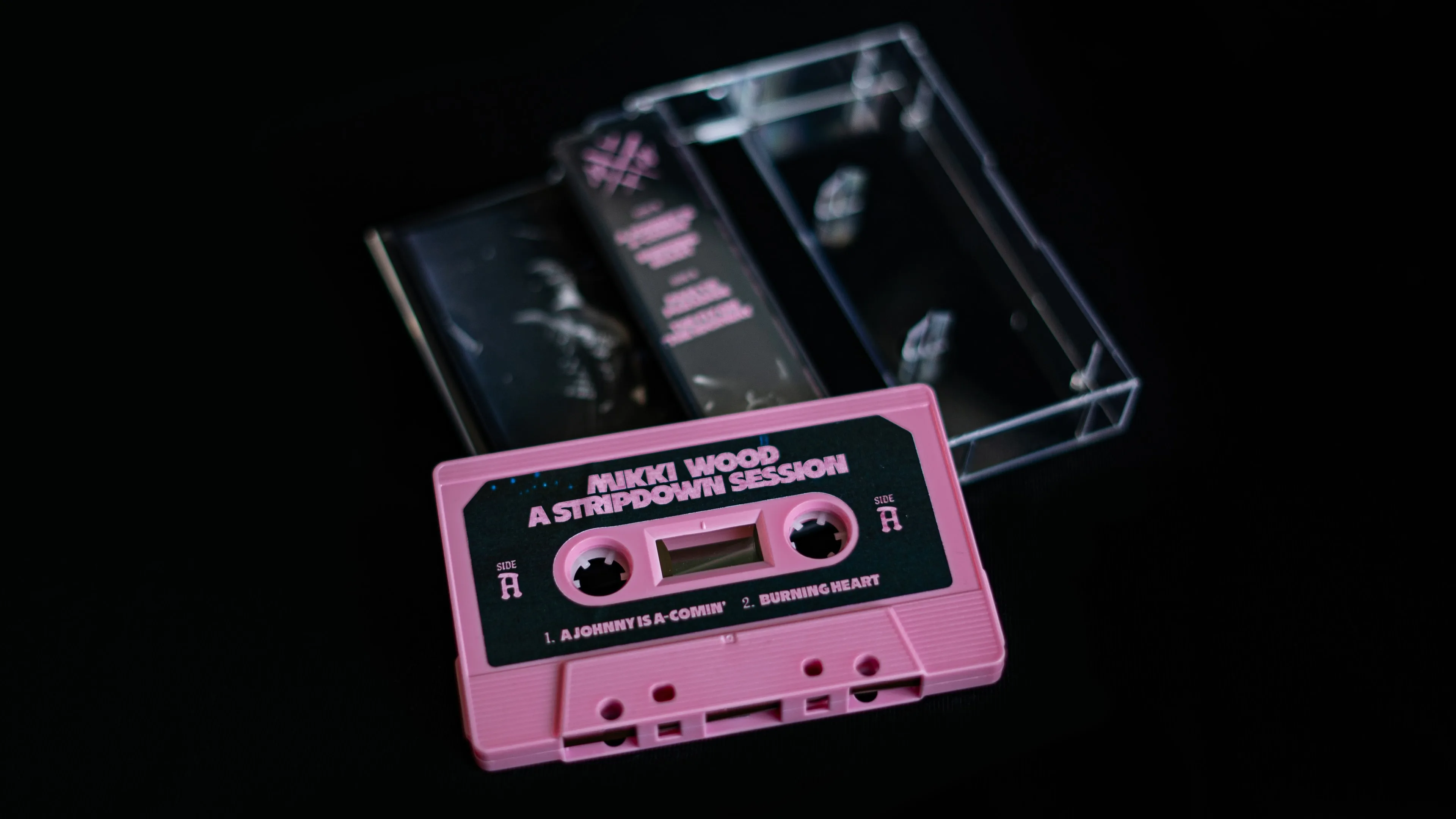
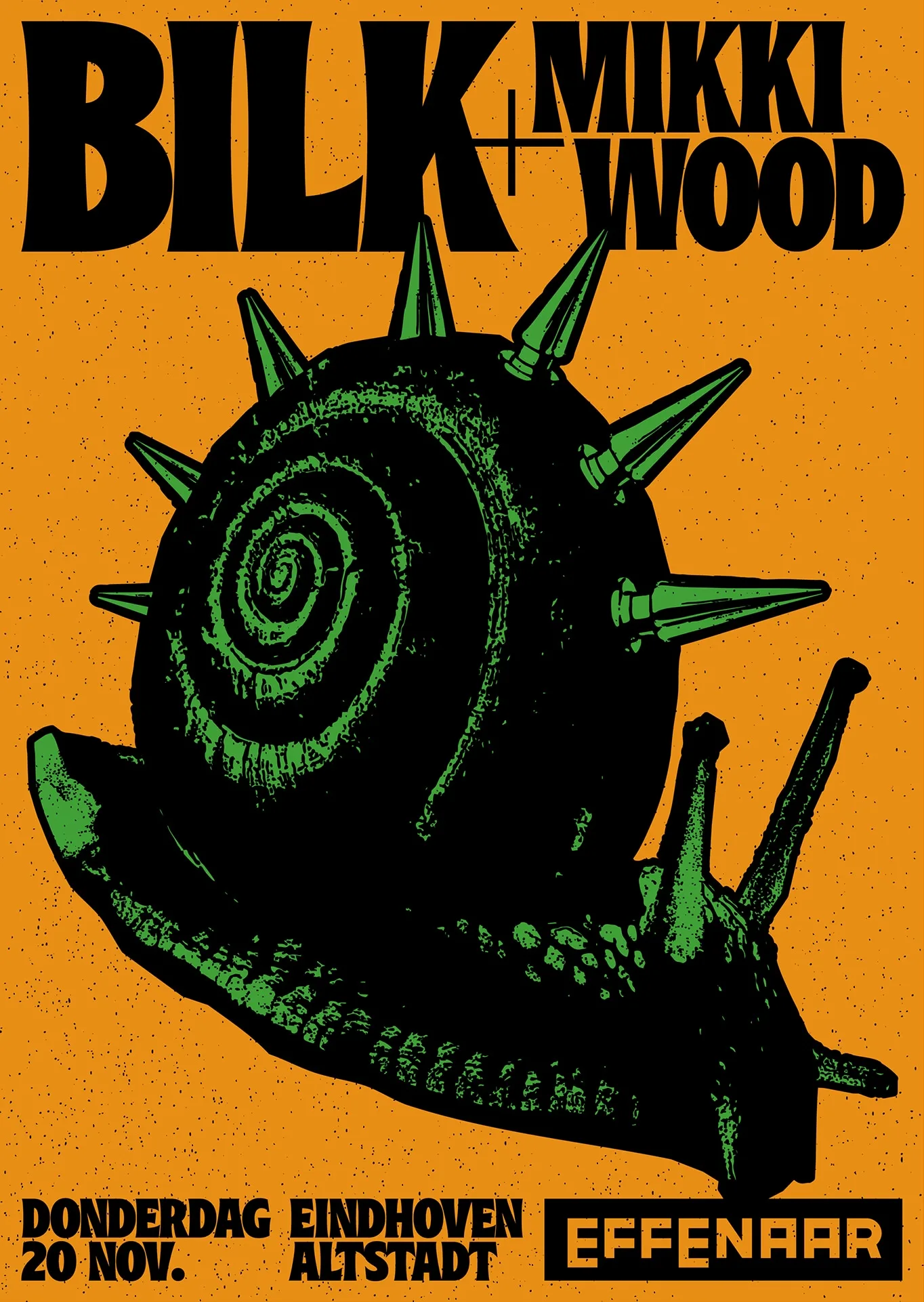
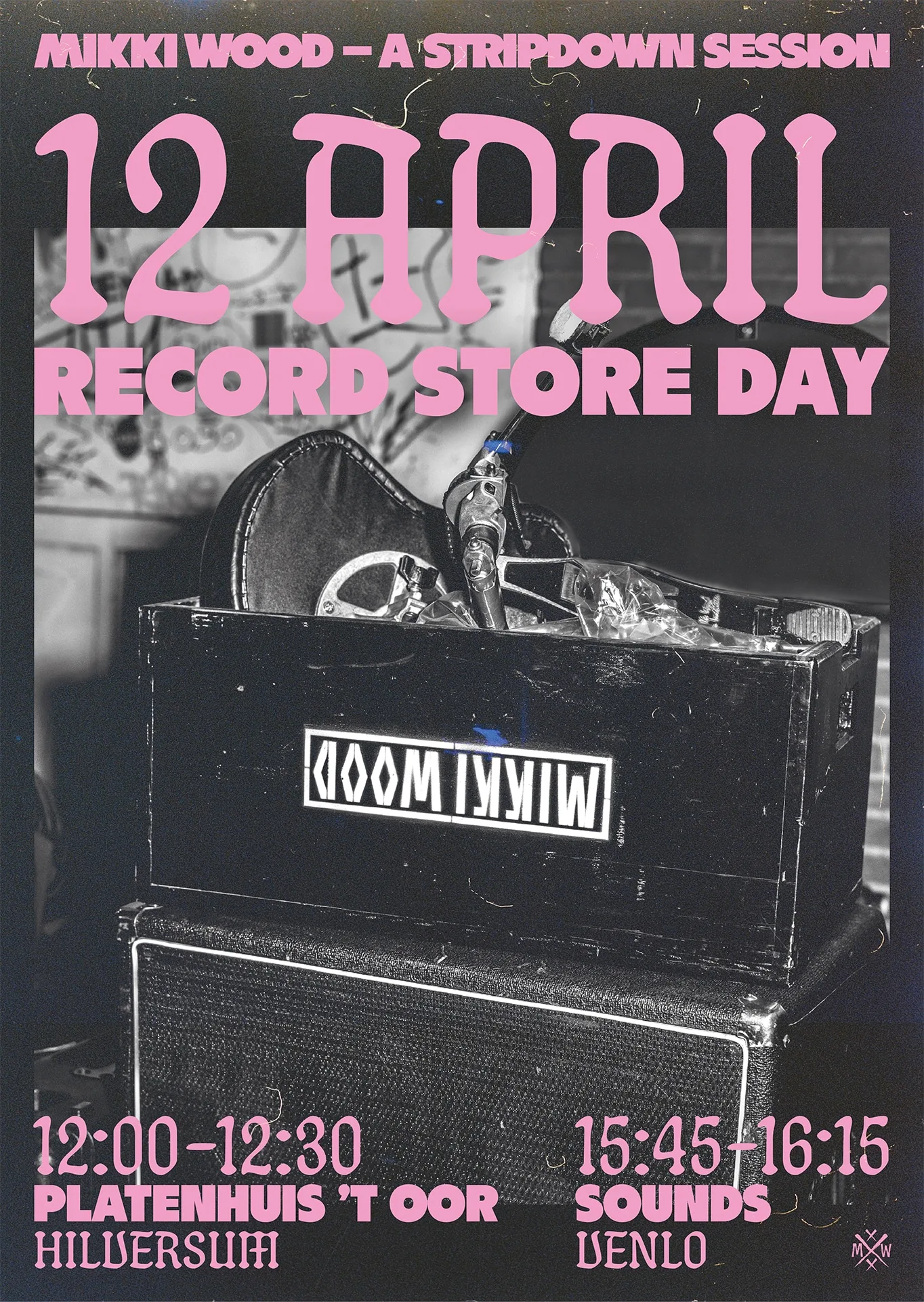
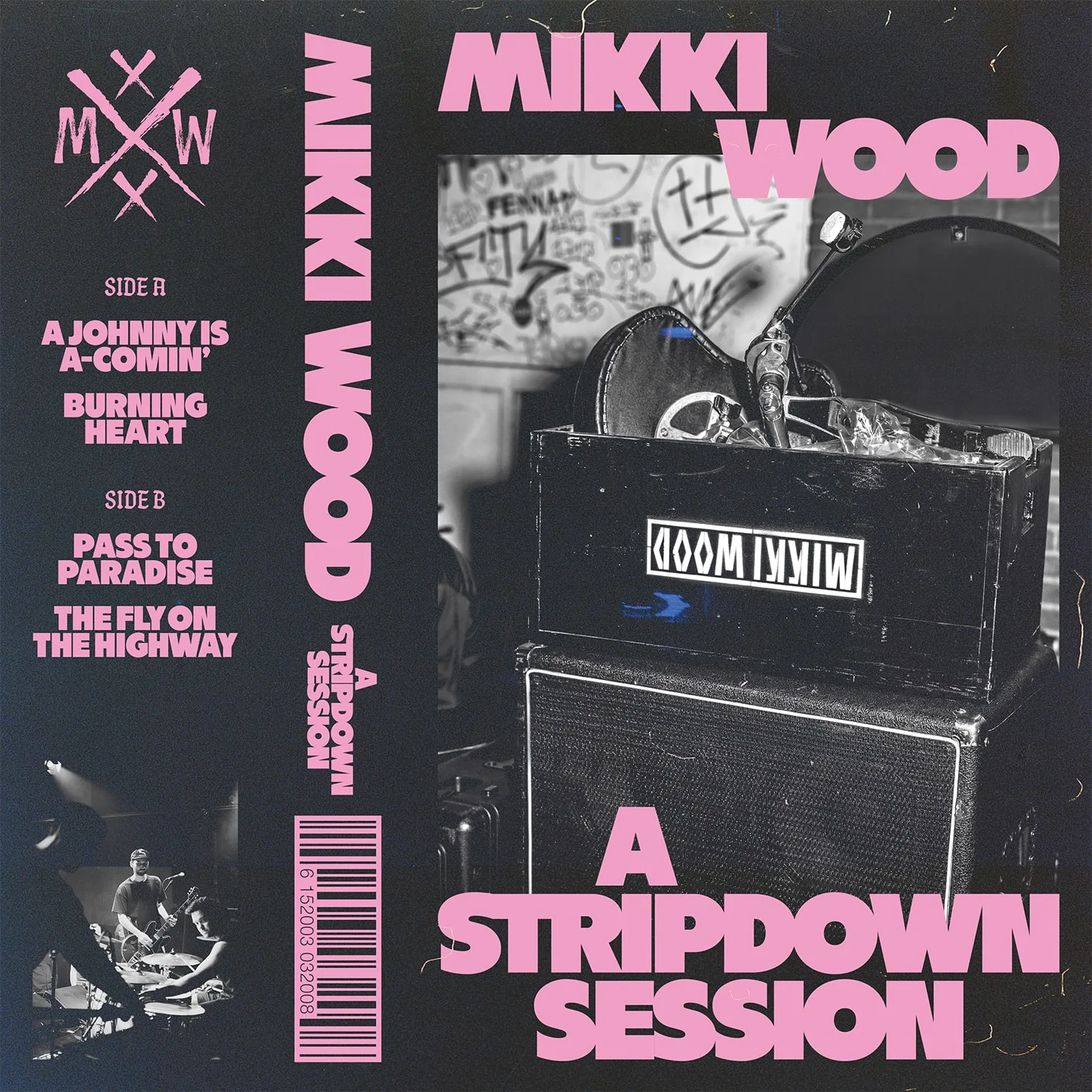
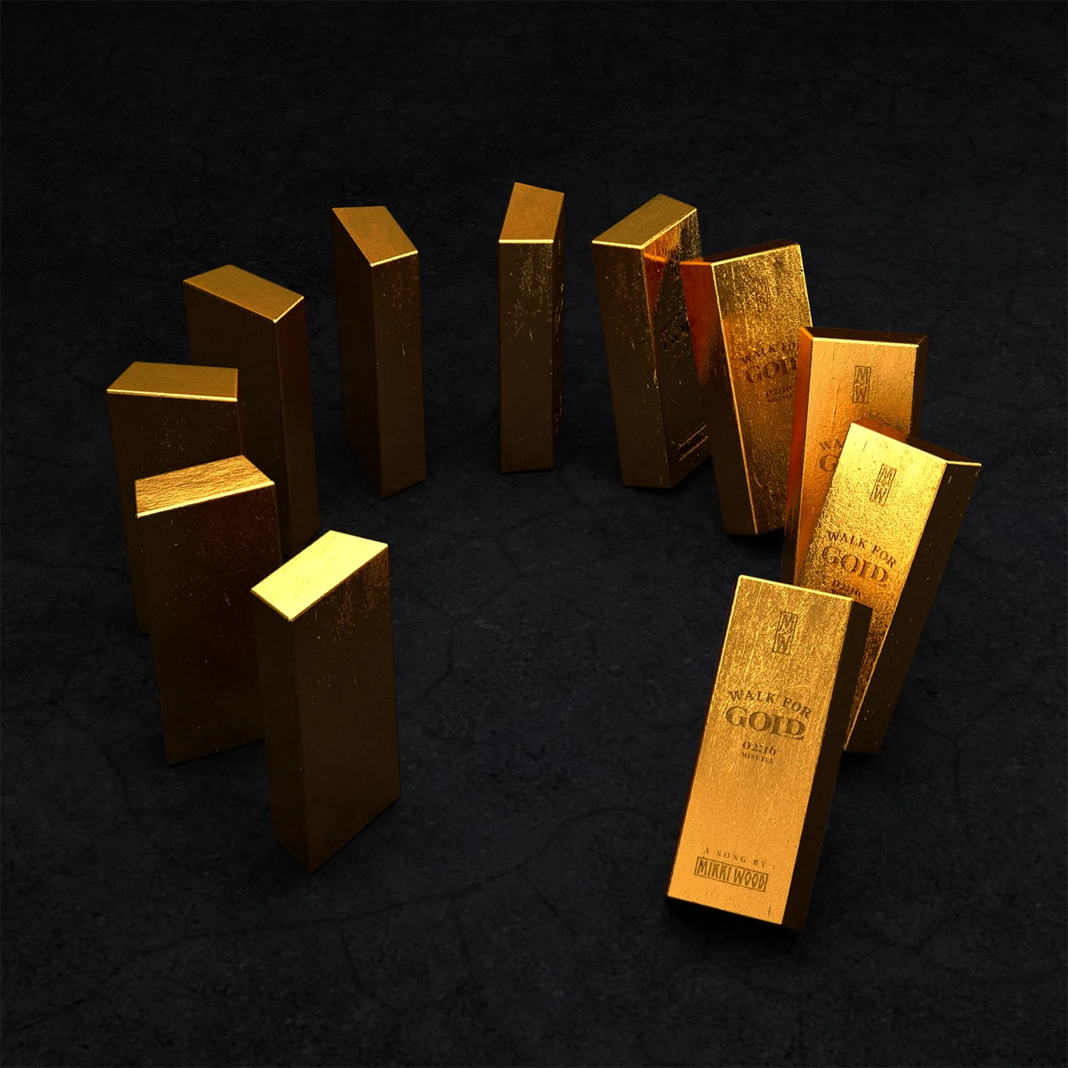
Mikki Wood — A Stripdown Session
Mak Goktas
Artwork for Mikki Wood’s acoustic EP on cassette. The EP features 4 stripped-down versions of songs from their first single “Mikki Wood” and their debut album “High on the Moon”. During their one-day-tour through the Netherlands, a limited amount of cassettes have been produced and sold during the Record Store Day on the 12th of April.
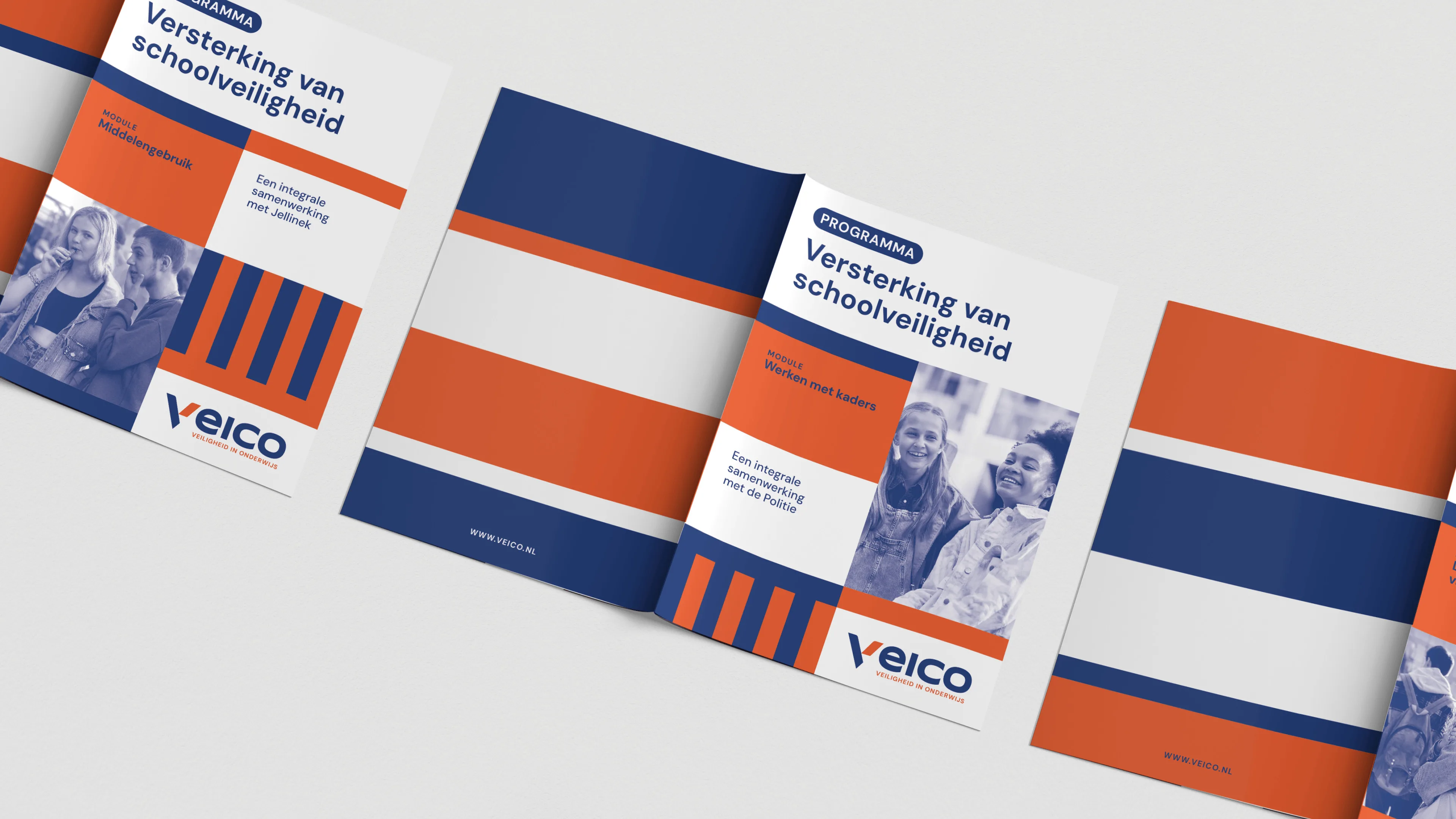
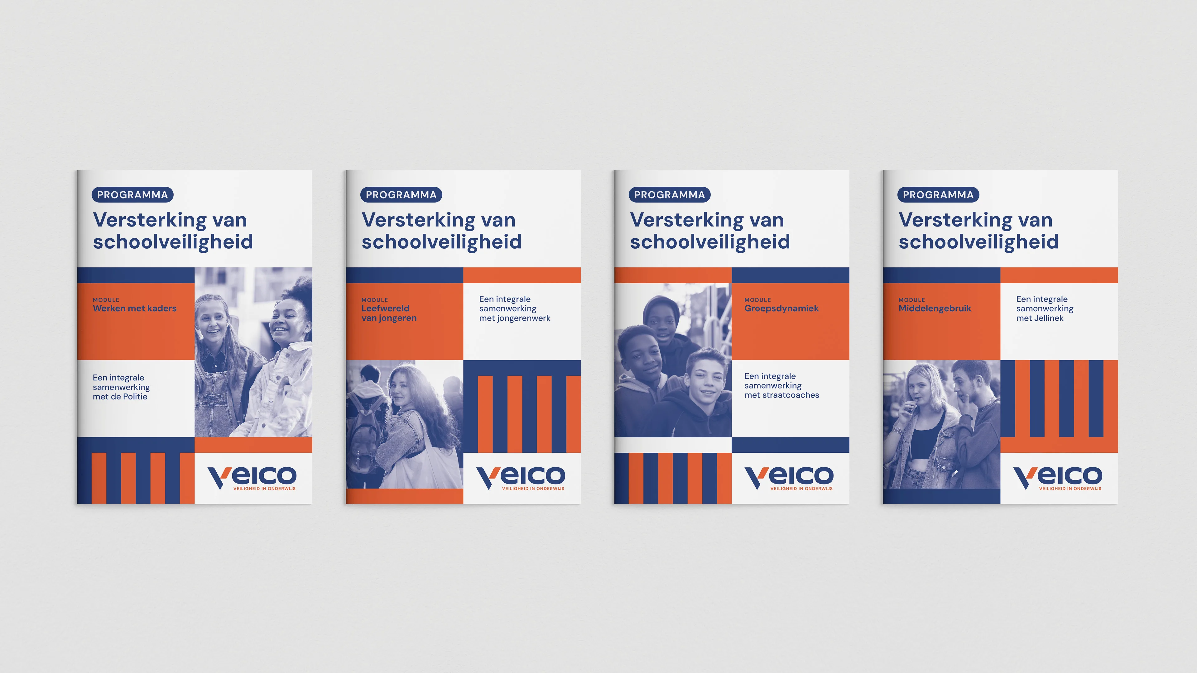
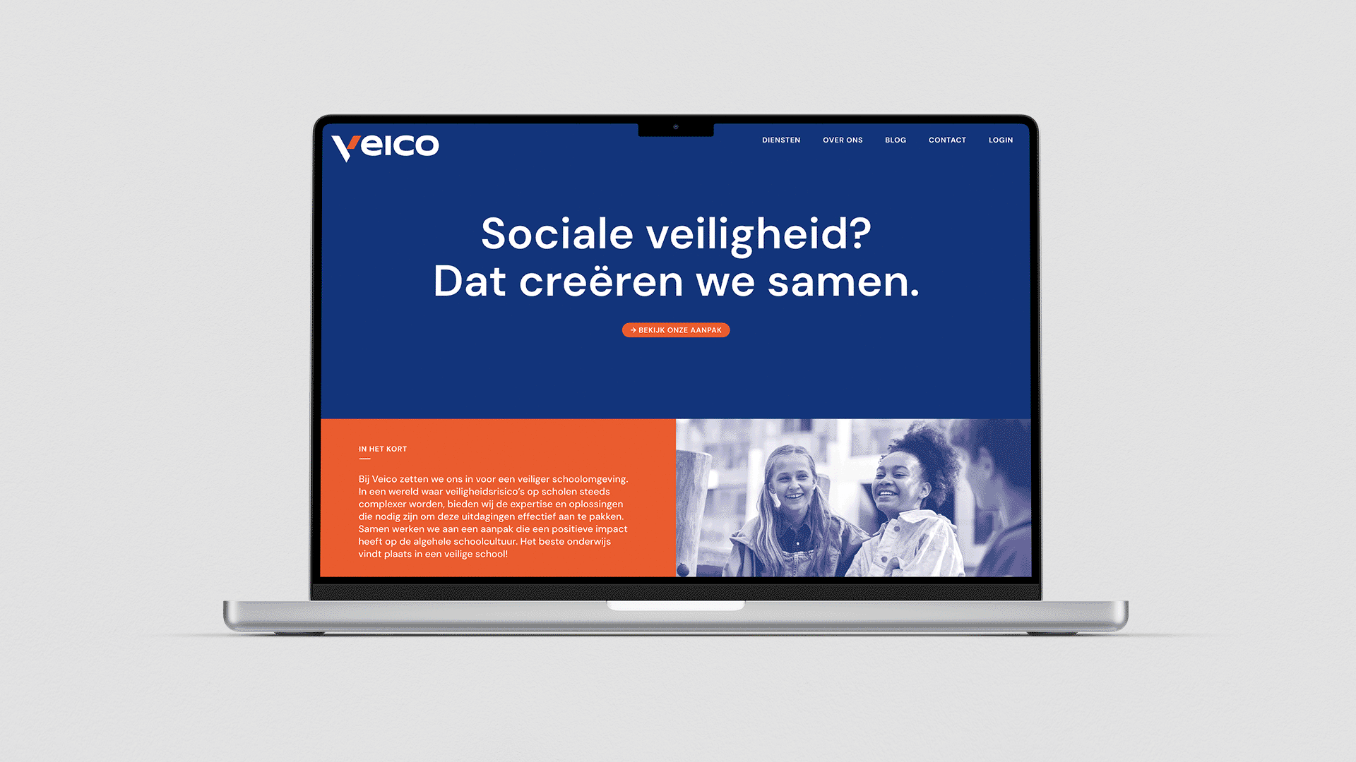
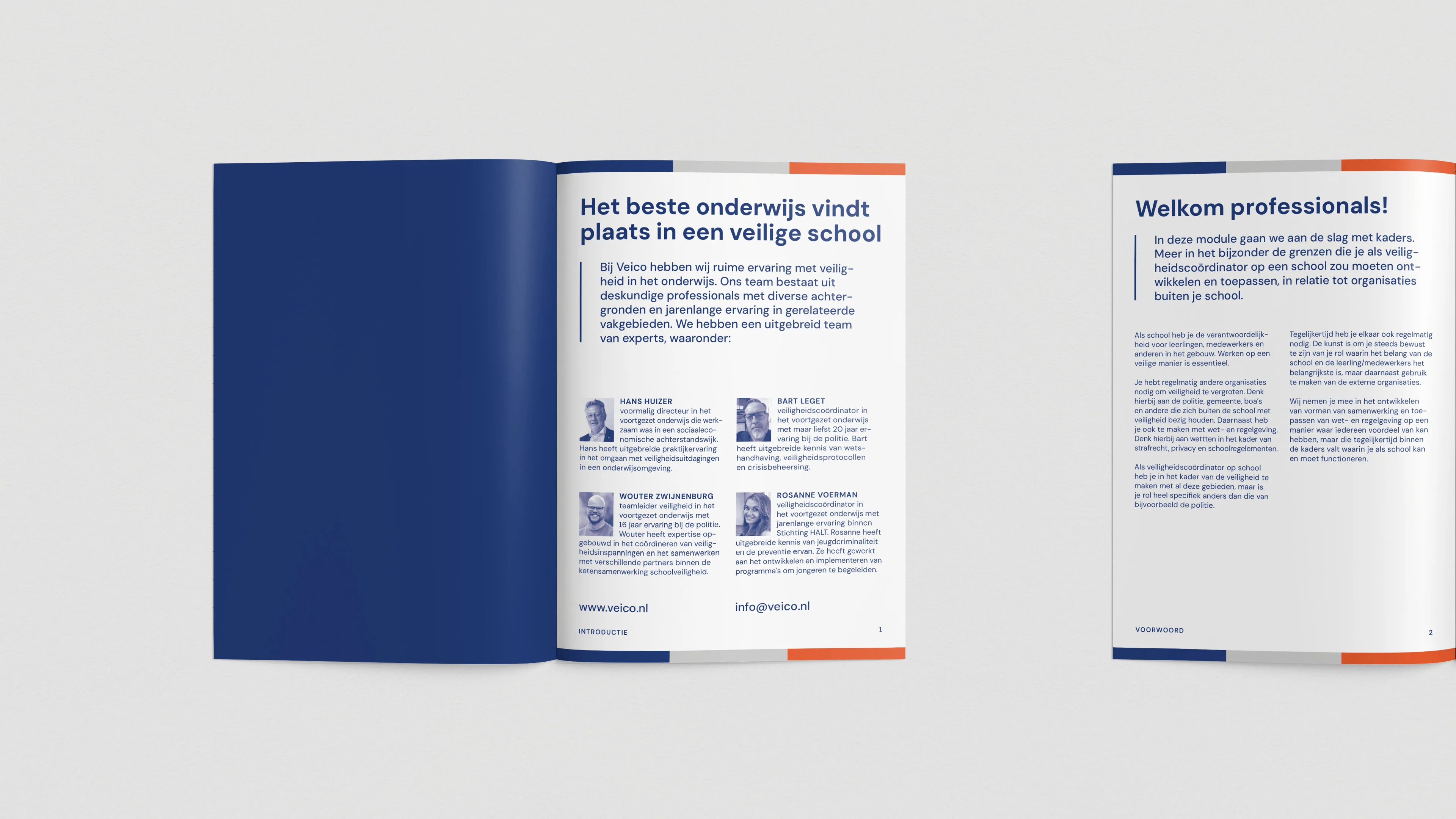
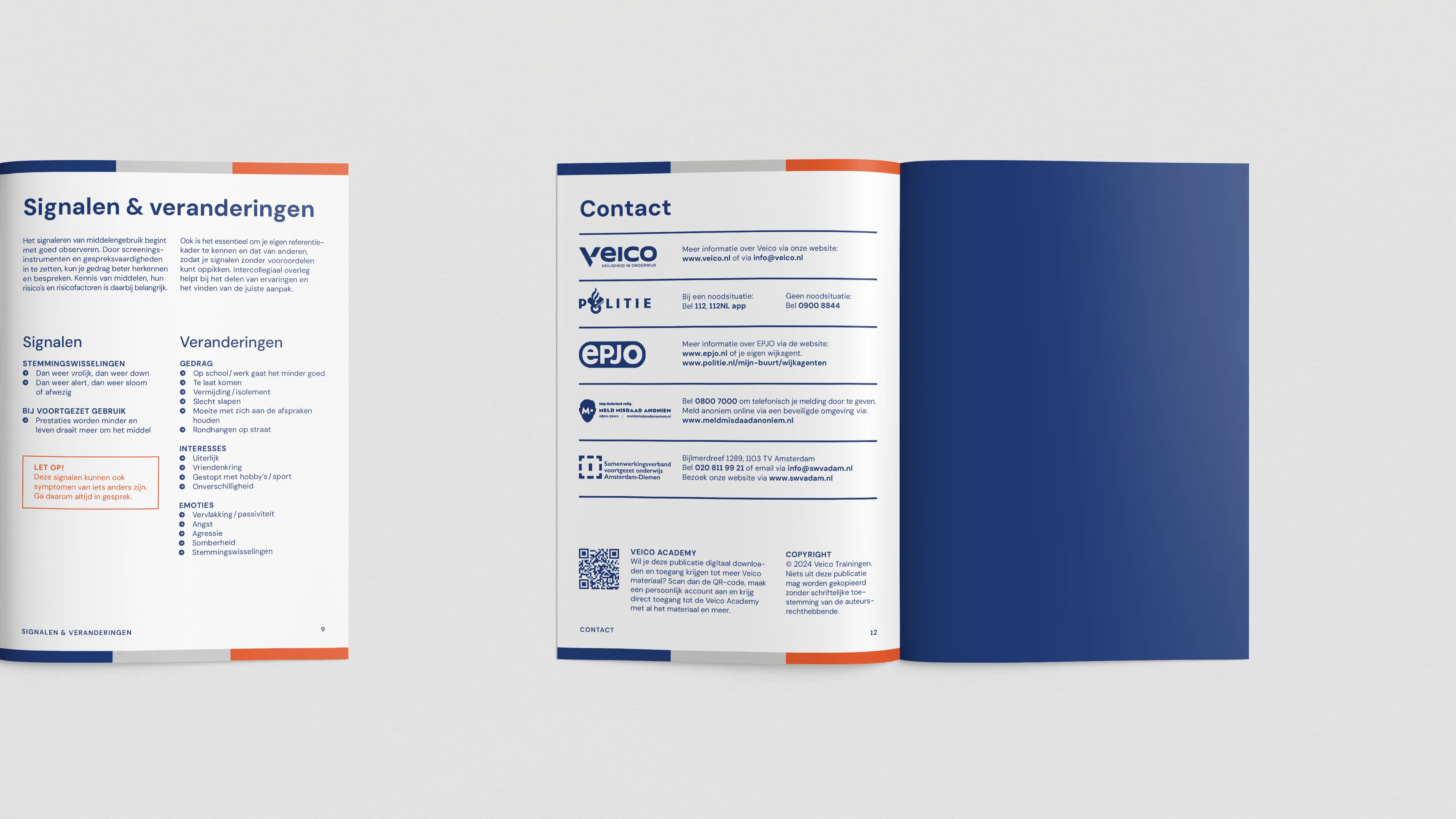
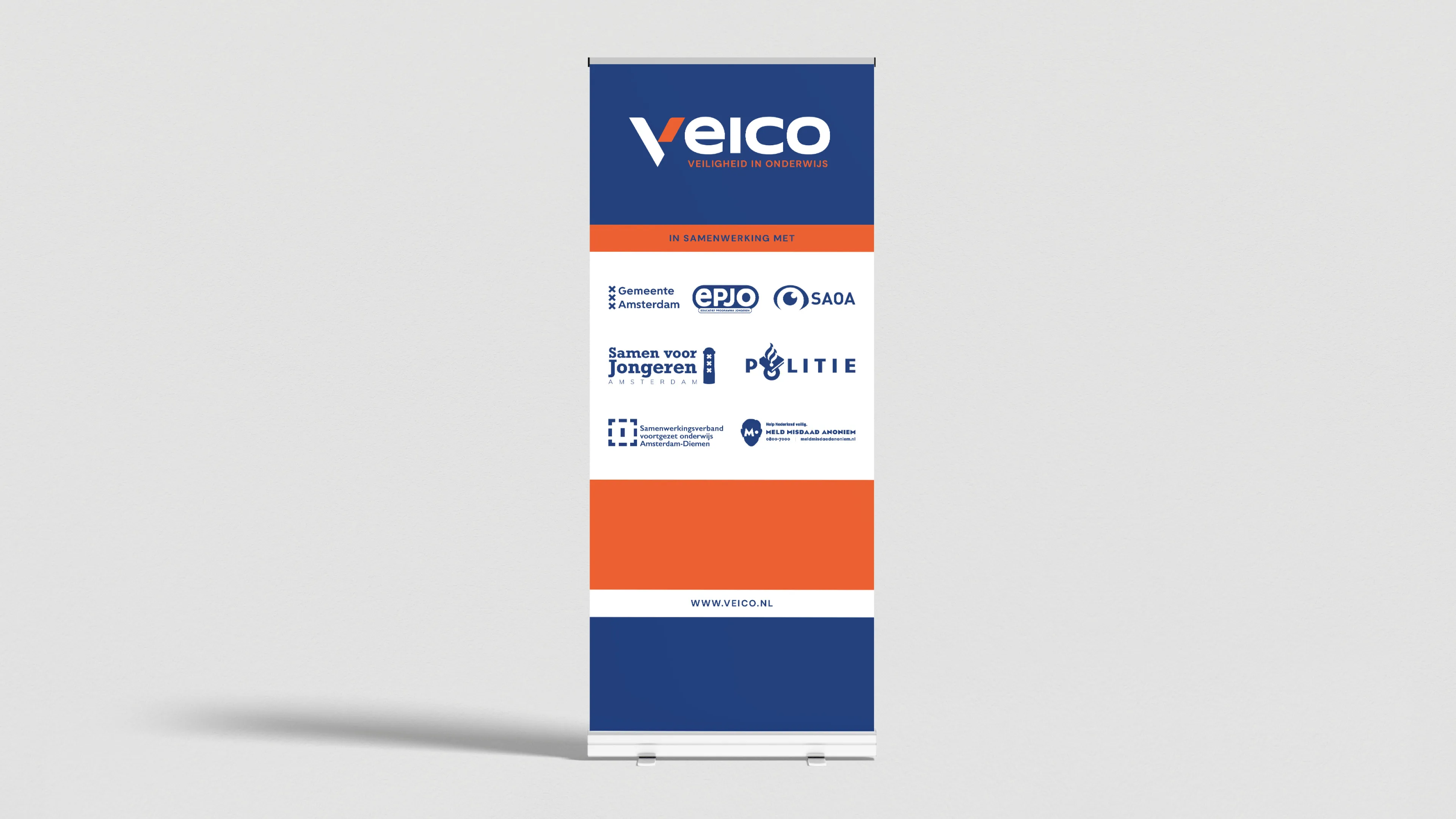
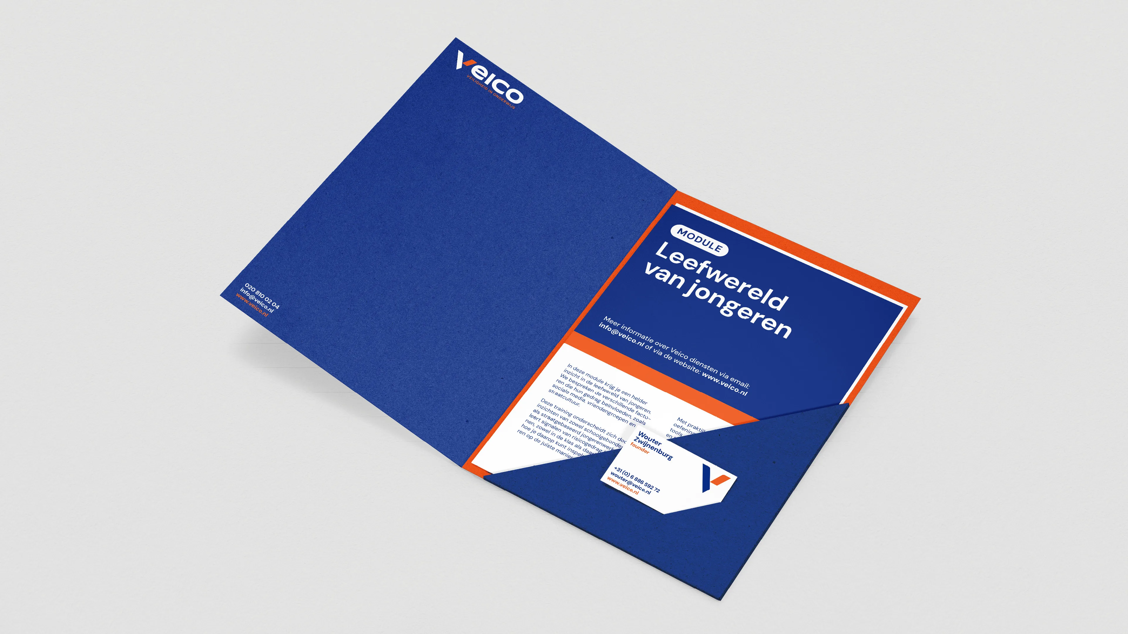
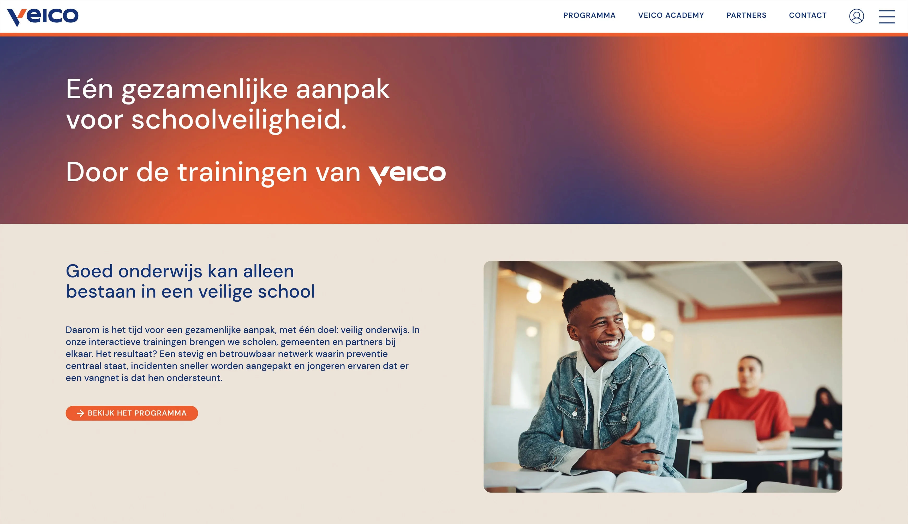
Veico
Brandkast Studio
Veico is a company committed to increasing social safety at school. In a world where safety risks at schools are becoming increasingly complex, Veico offers the expertise and solutions needed to effectively address these challenges. The whole branding is defined by two bold colours and sharp graphic shapes. Throughout the whole design, the informative aspect always comes first.
www.veico.nl


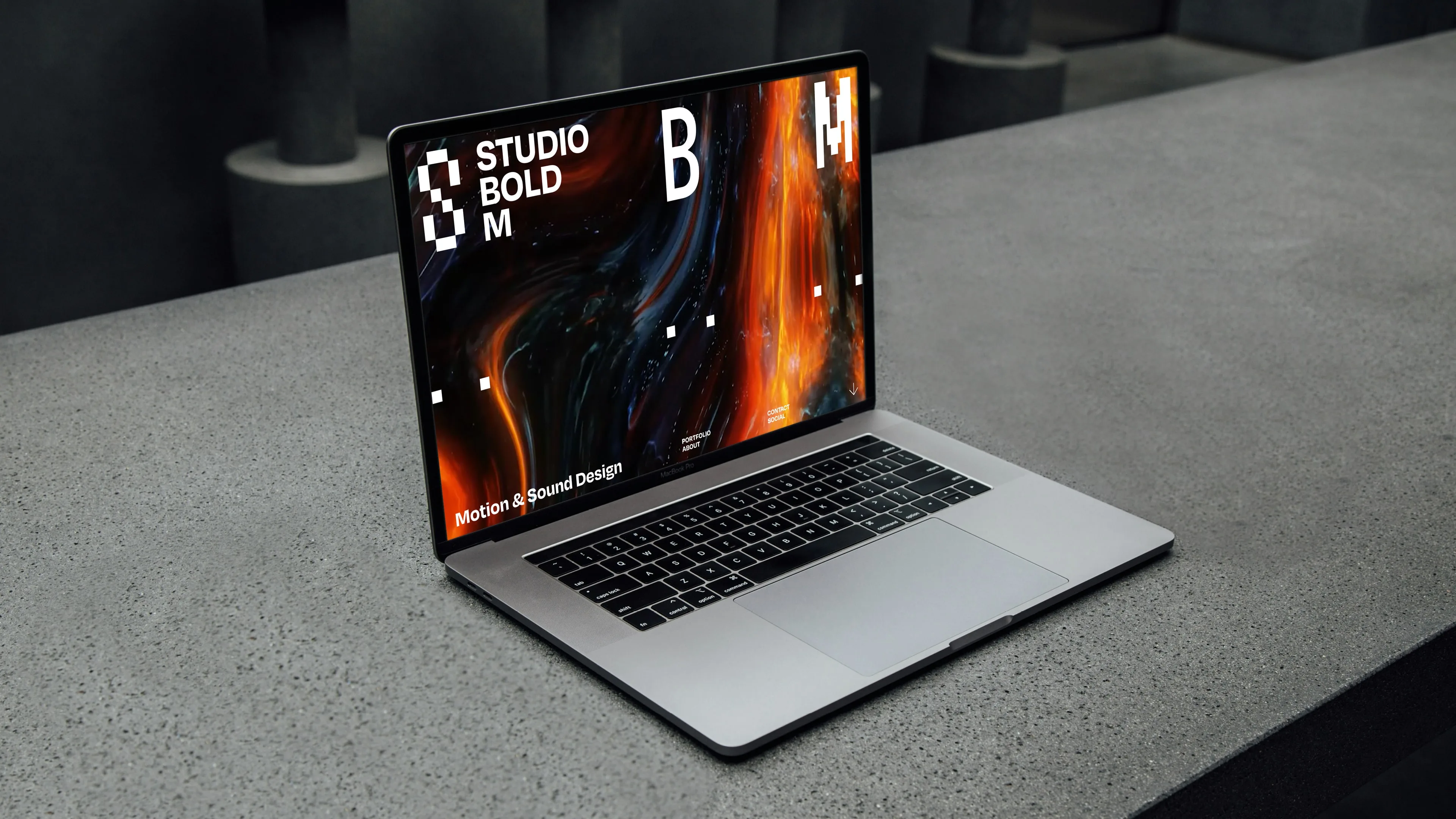
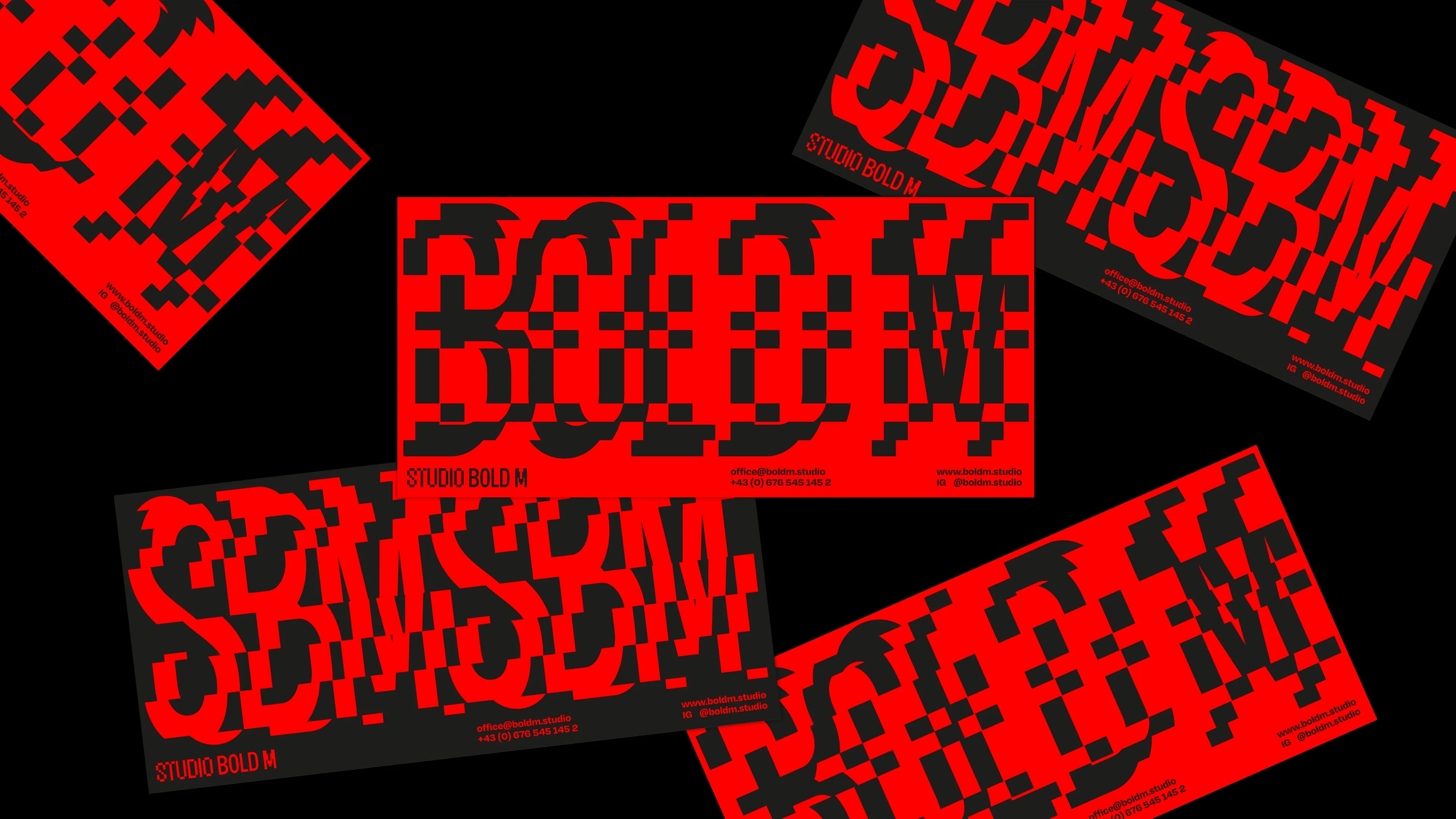
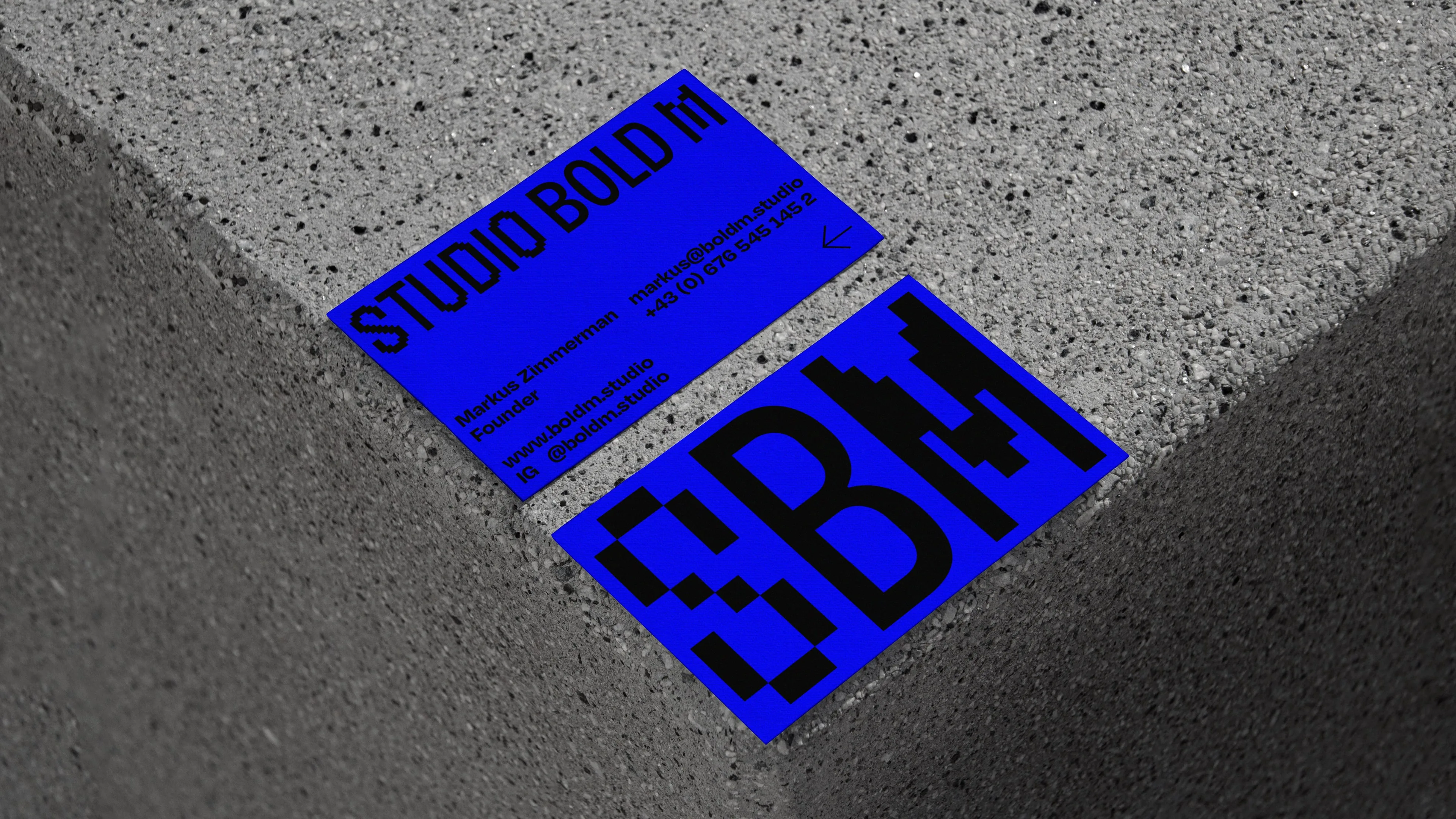
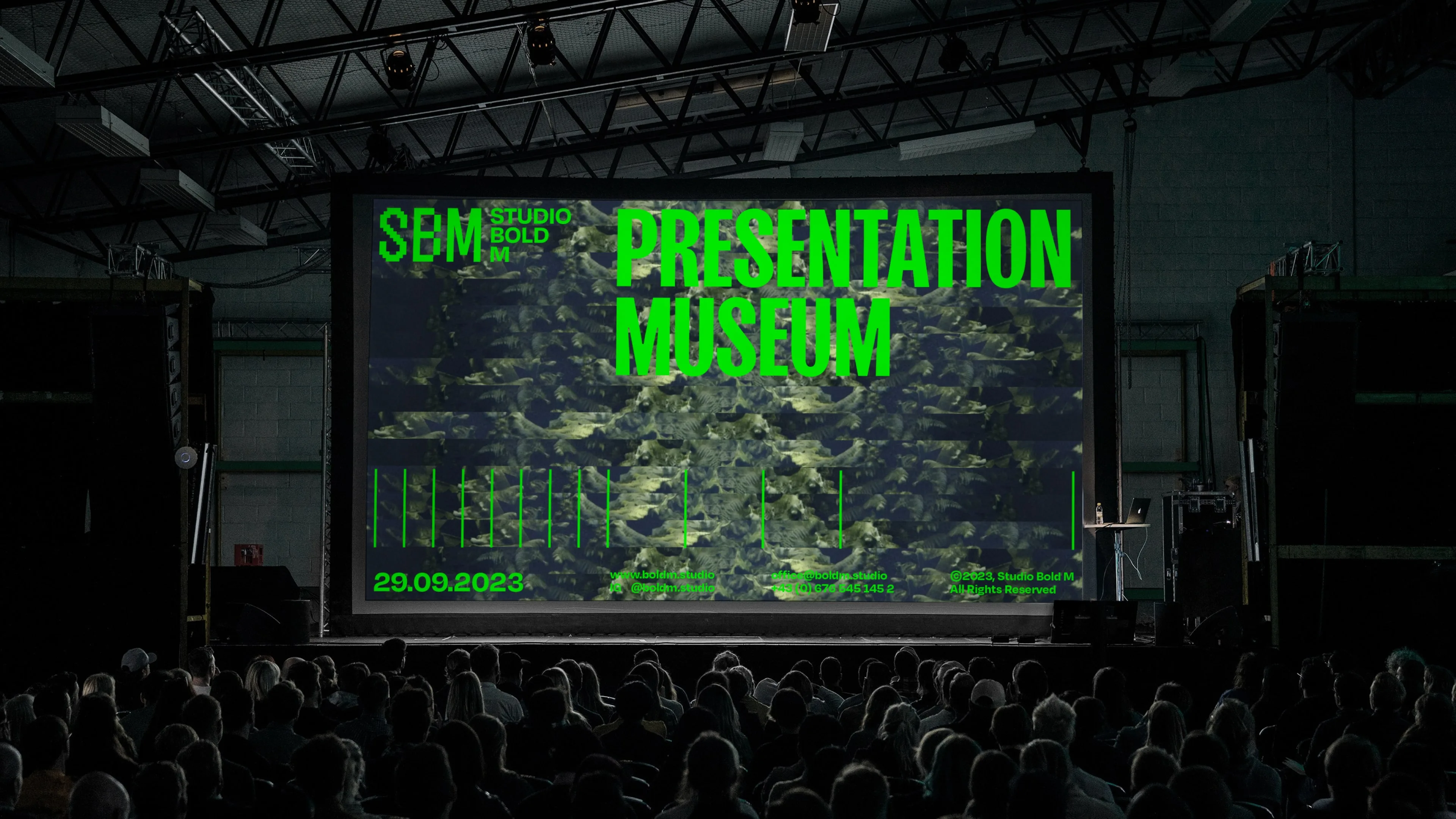
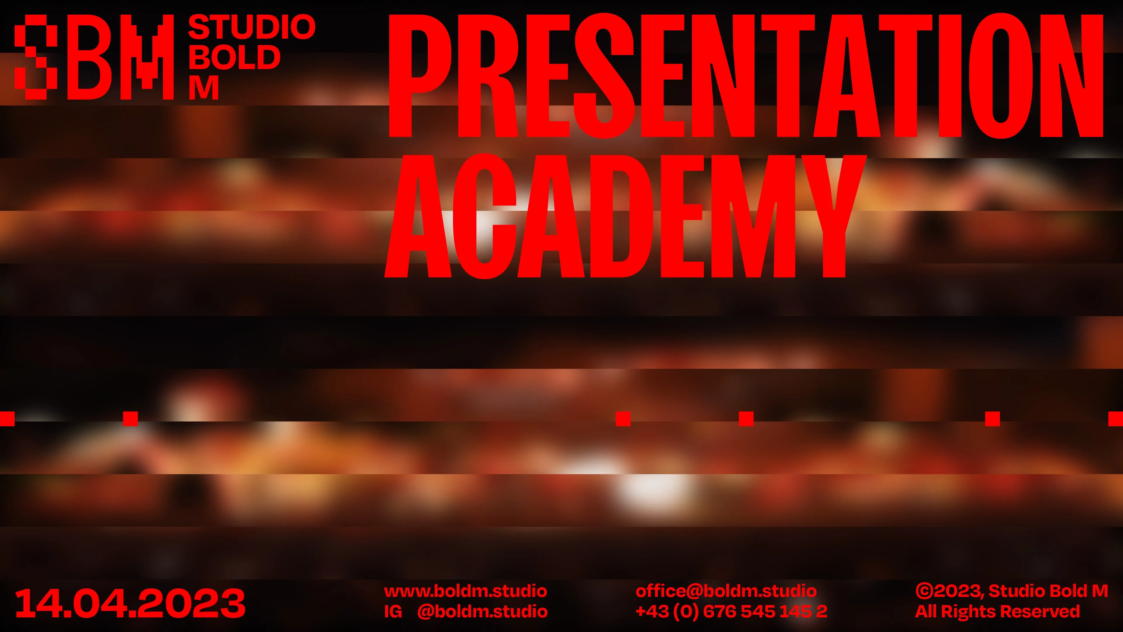
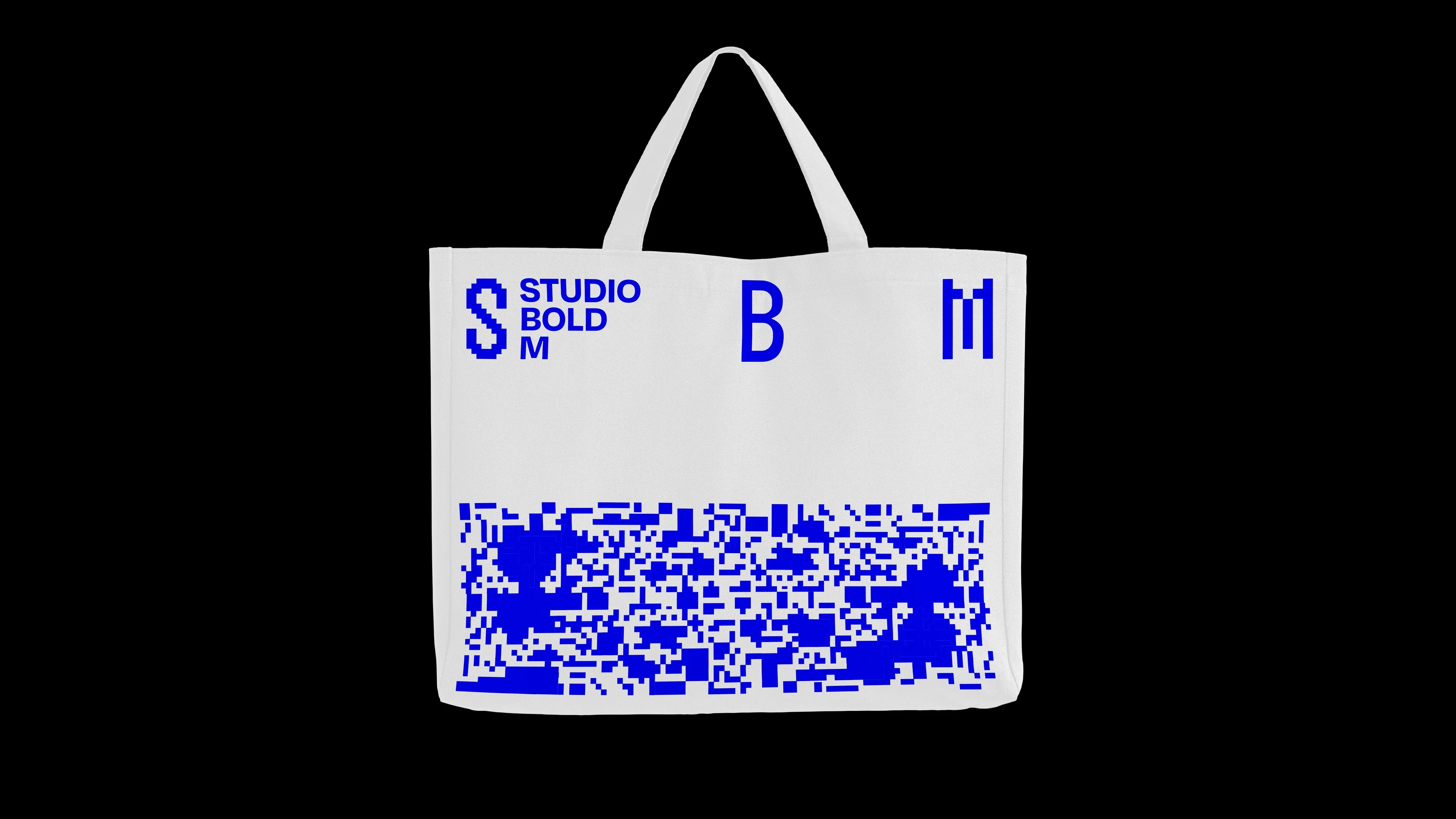
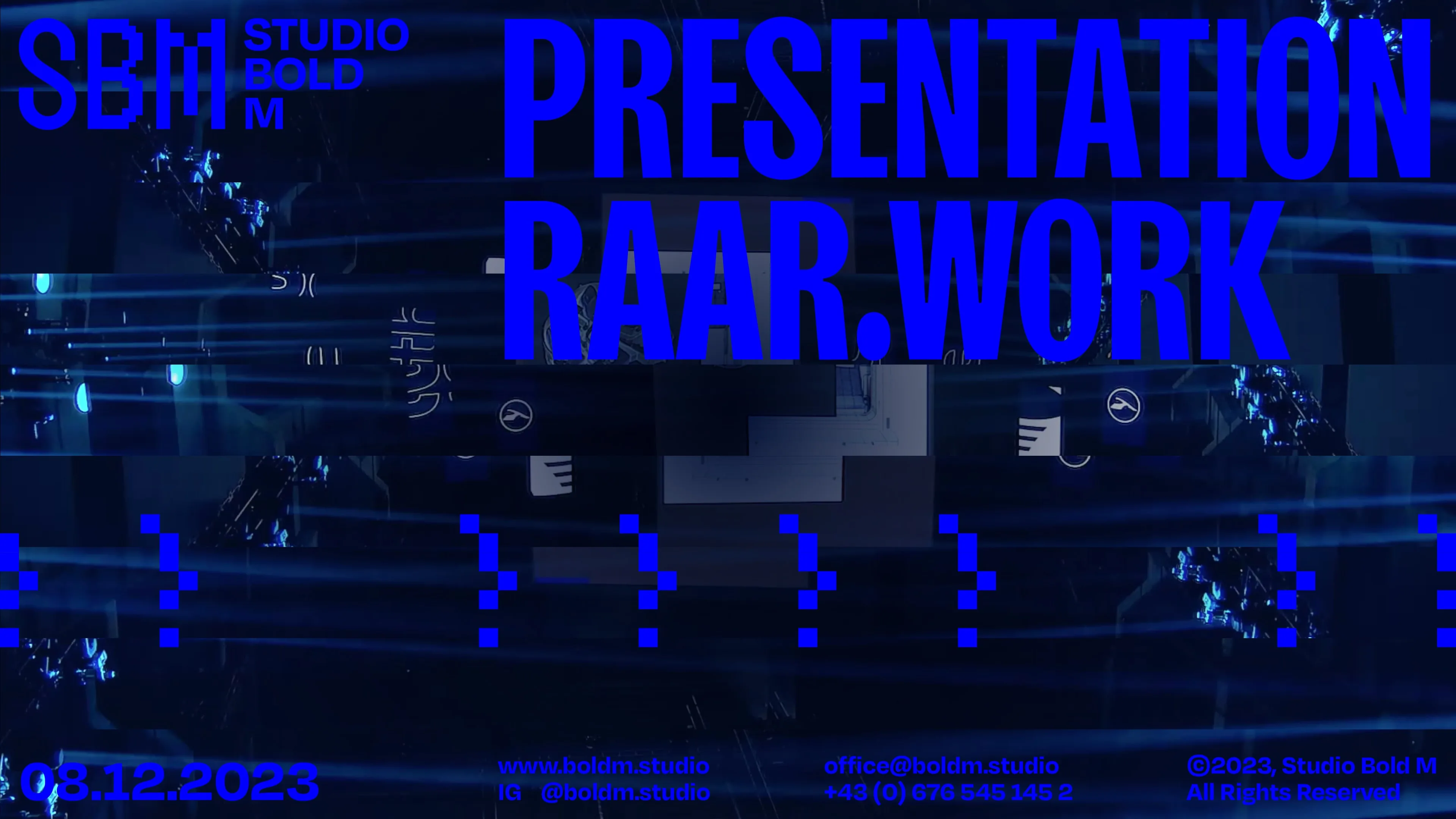
Studio Bold M
Lukas Ullsperger at RAAR
The branding for Studio Bold M focuses on a bold and modern identity that reflects the dynamic approach of motion design. The logo is linked to the rendering process from low- to high-poly, revealing a slight inside of the profession Studio Bold M practises. Using only black, white and RGB colours, the link is made to the digital services the studio offers. From business cards to digital assets, the branding ensures a cohesive visual language that speaks to Studio Bold M’s overall aestethic.
www.boldm.studio


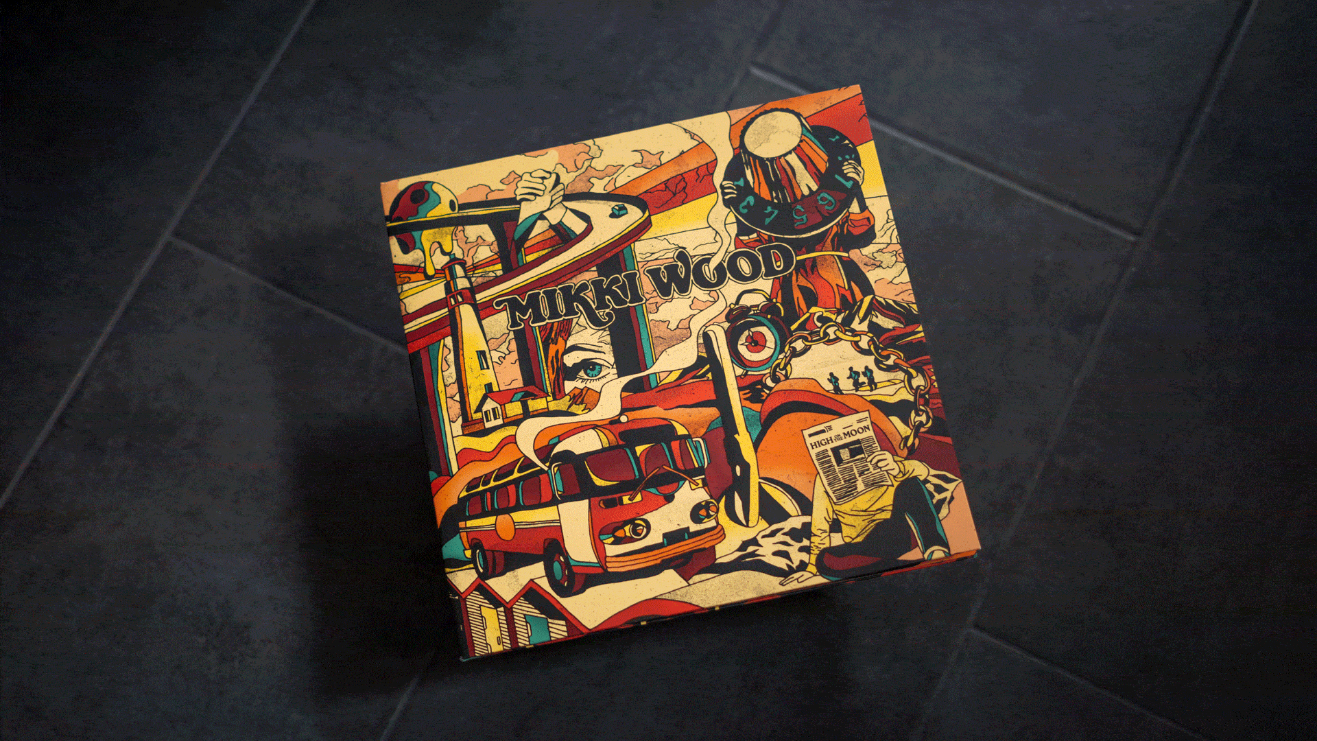
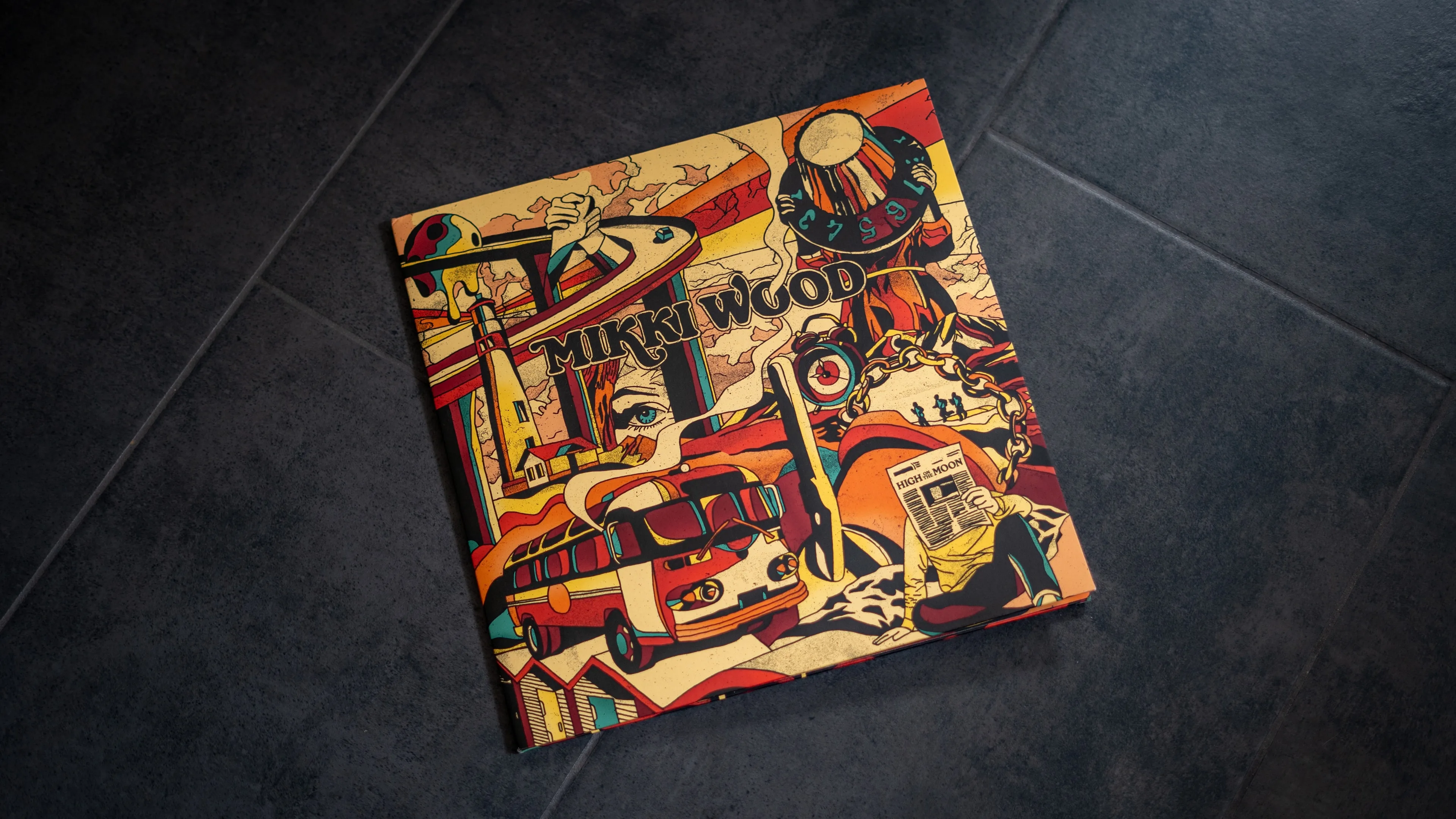
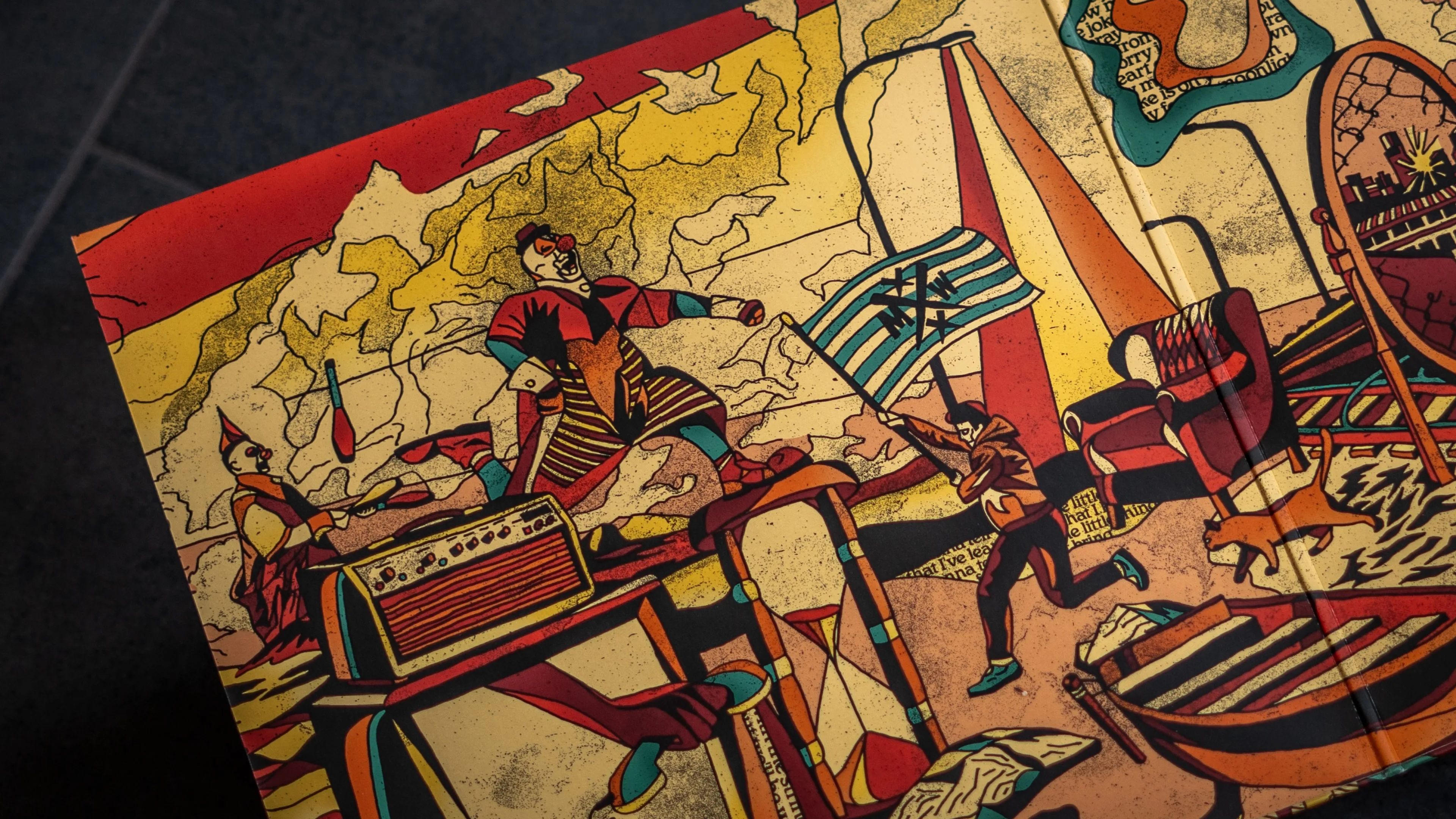
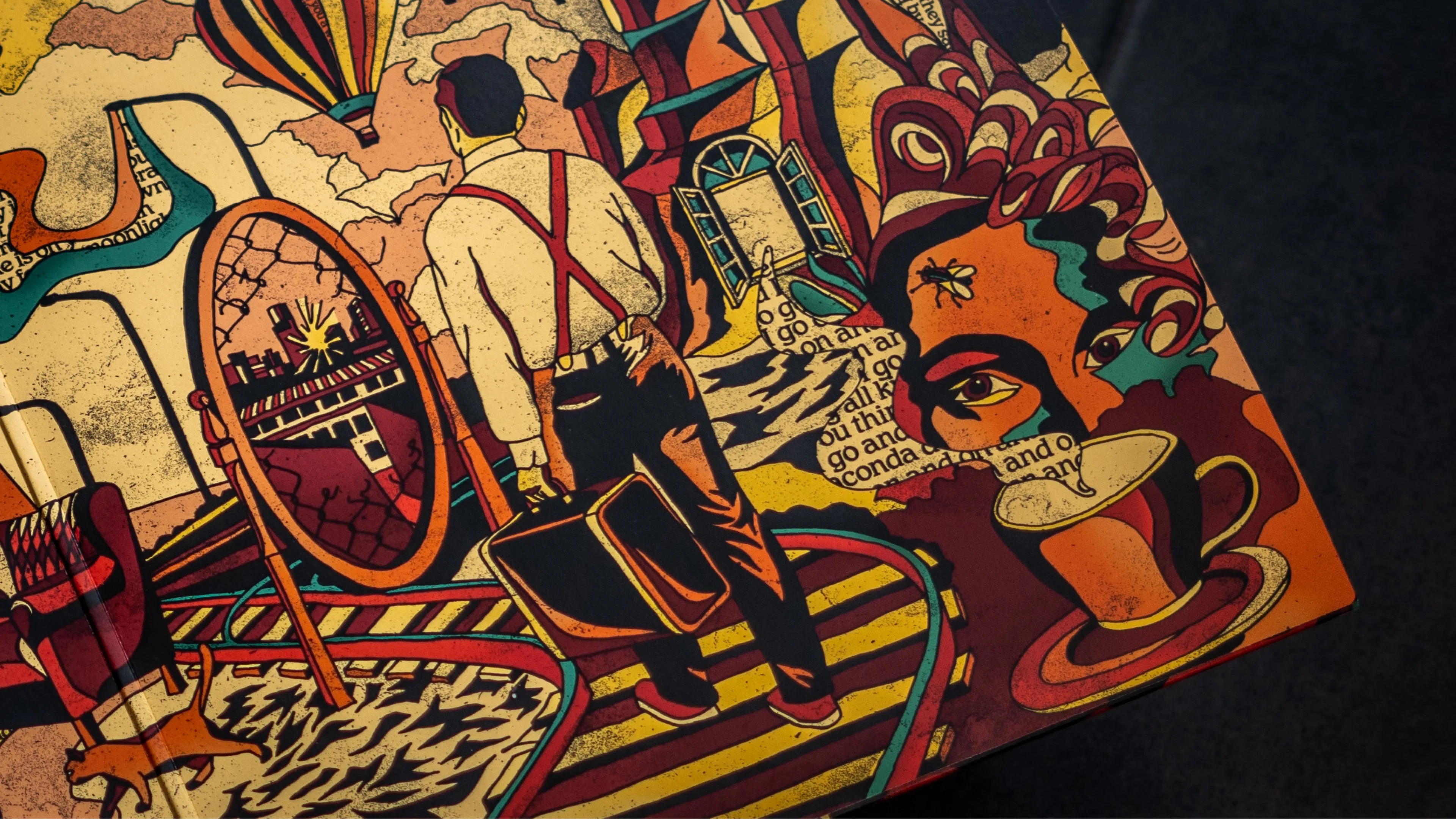
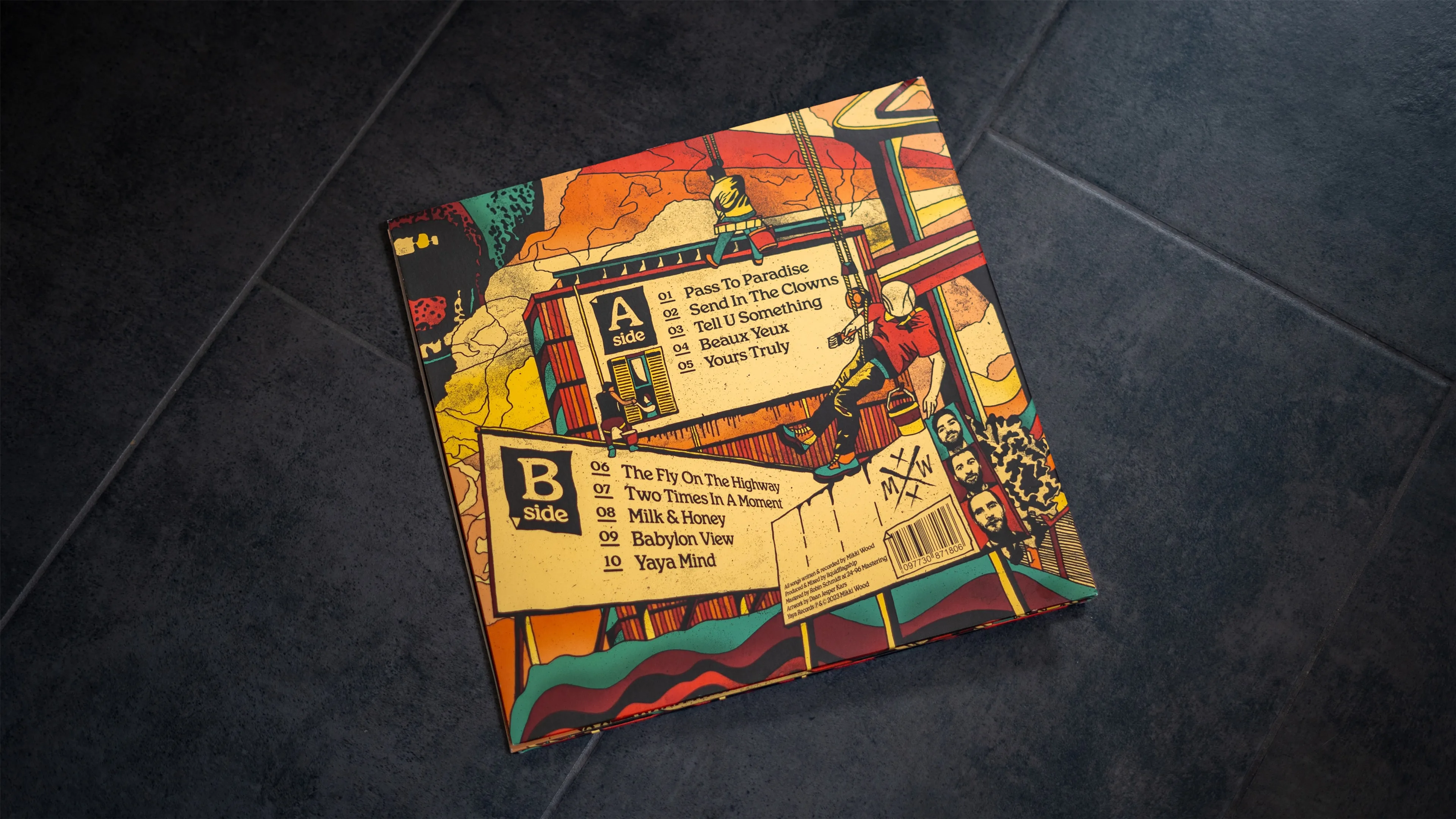
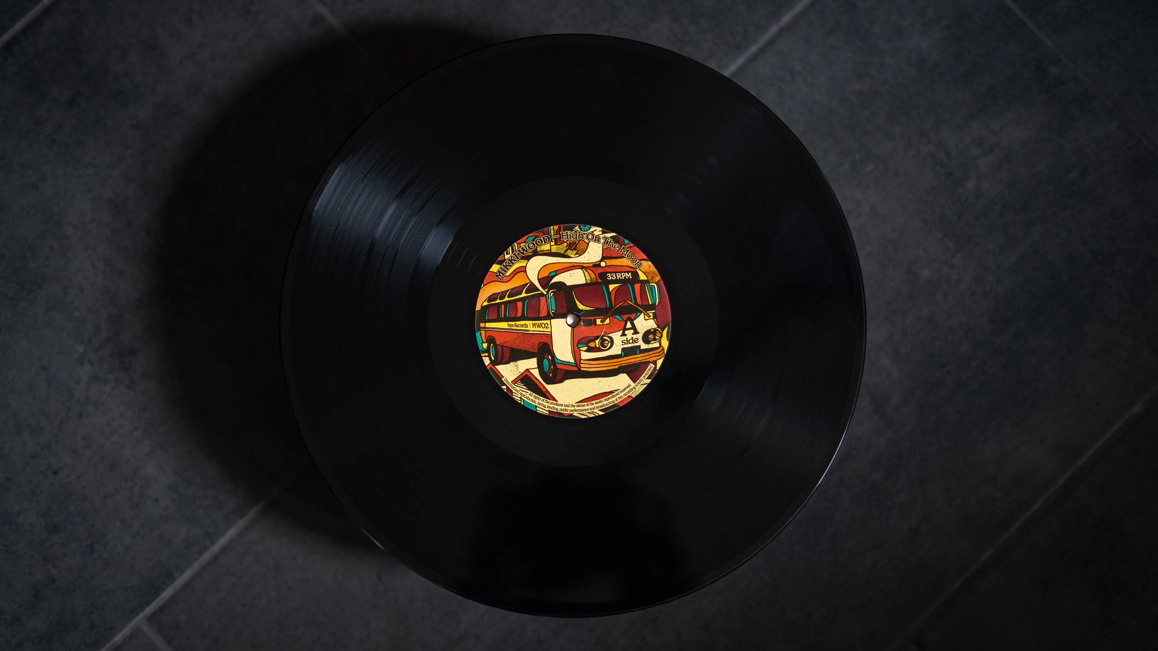
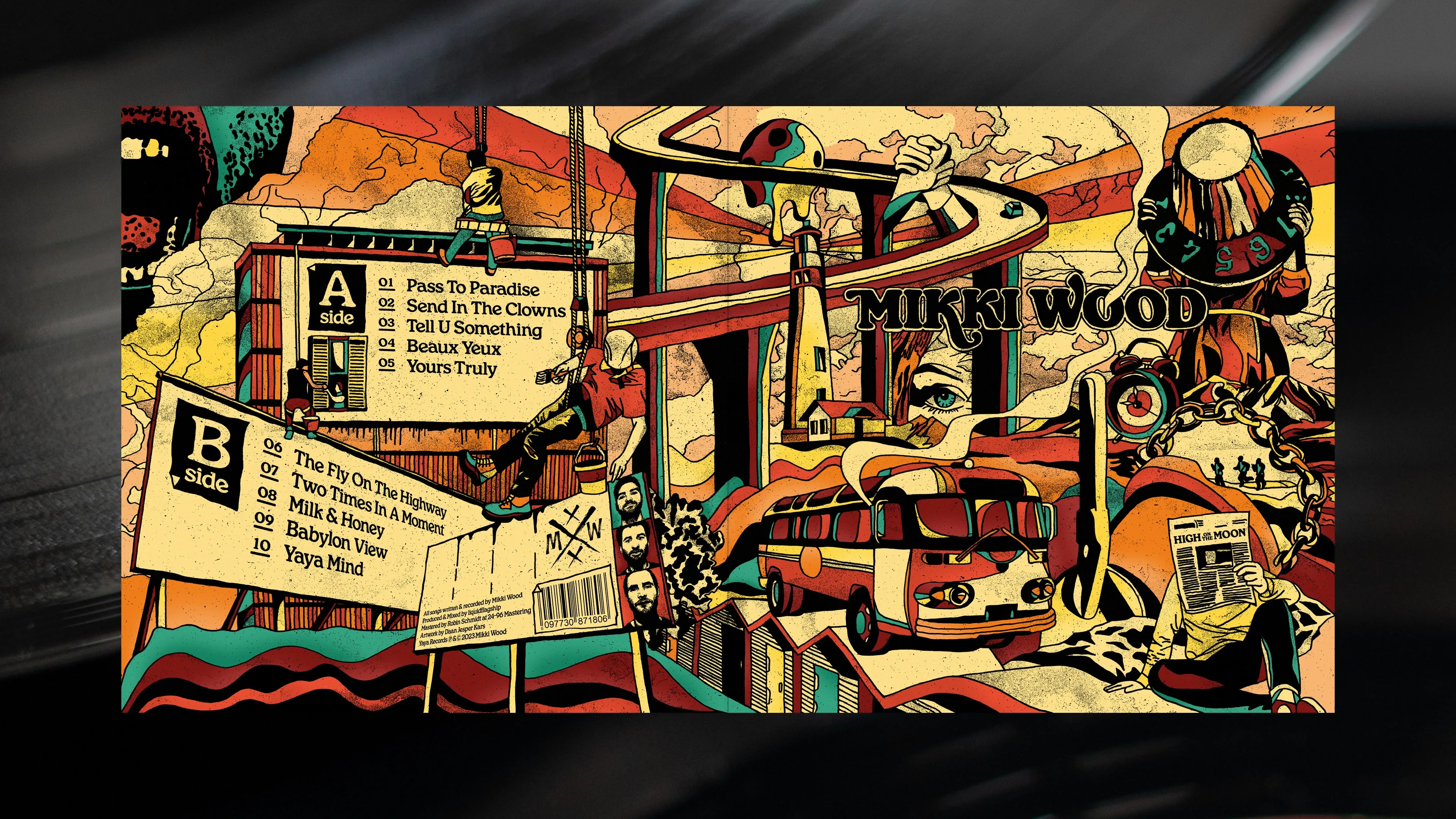
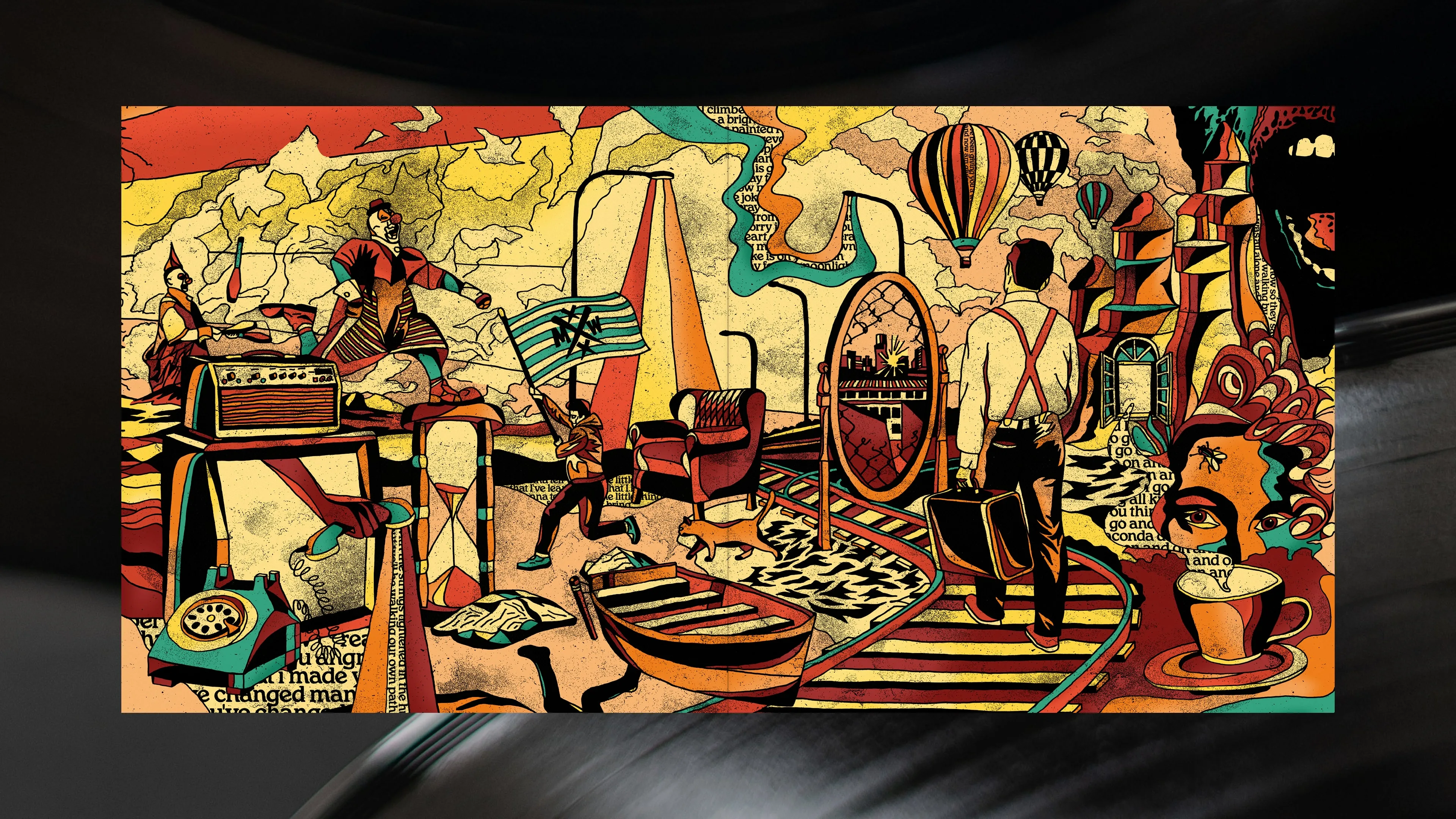
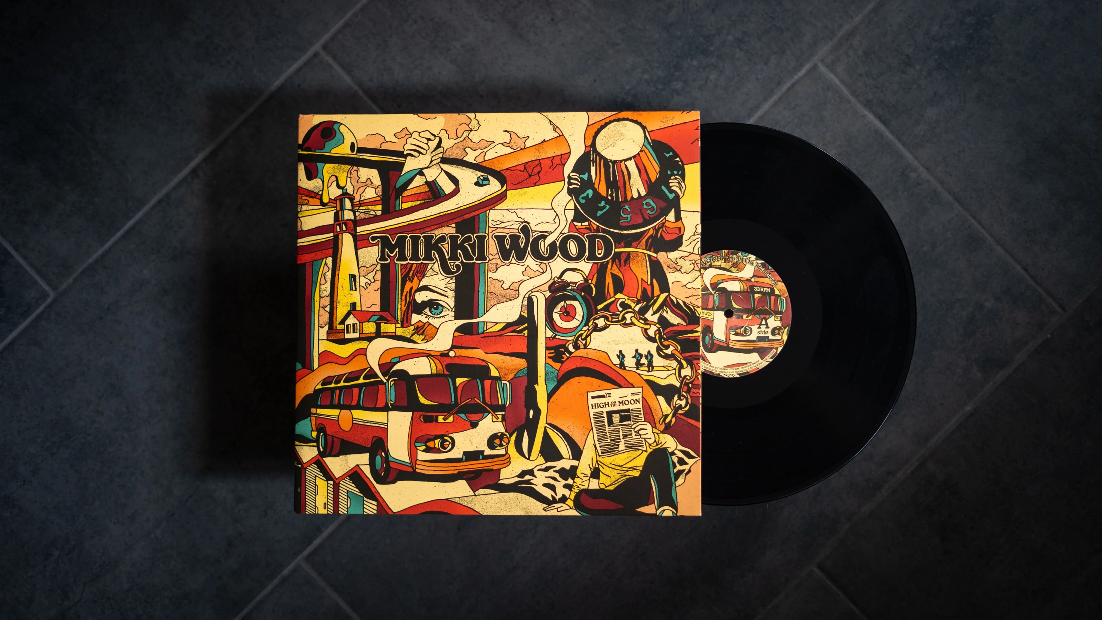
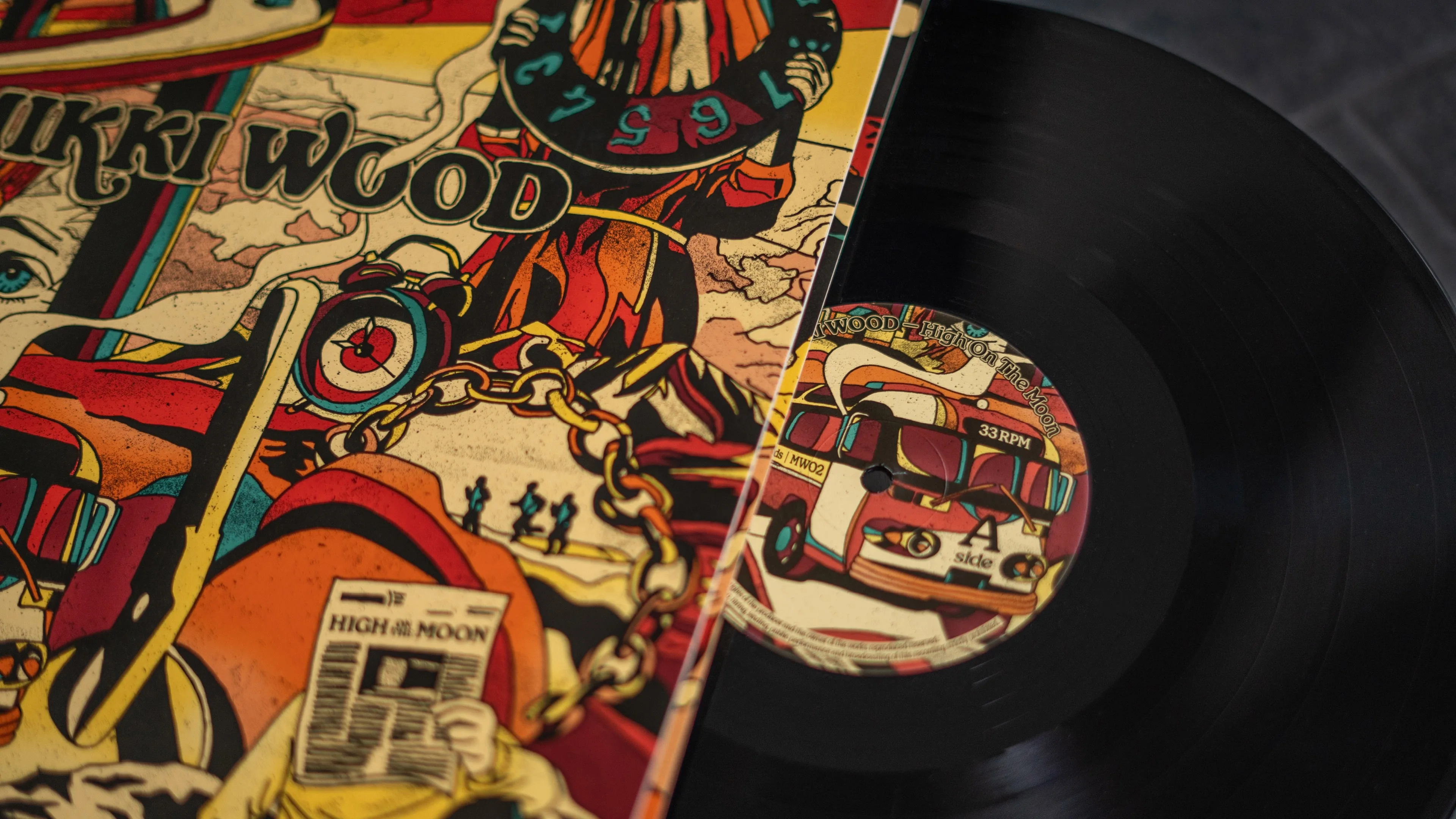
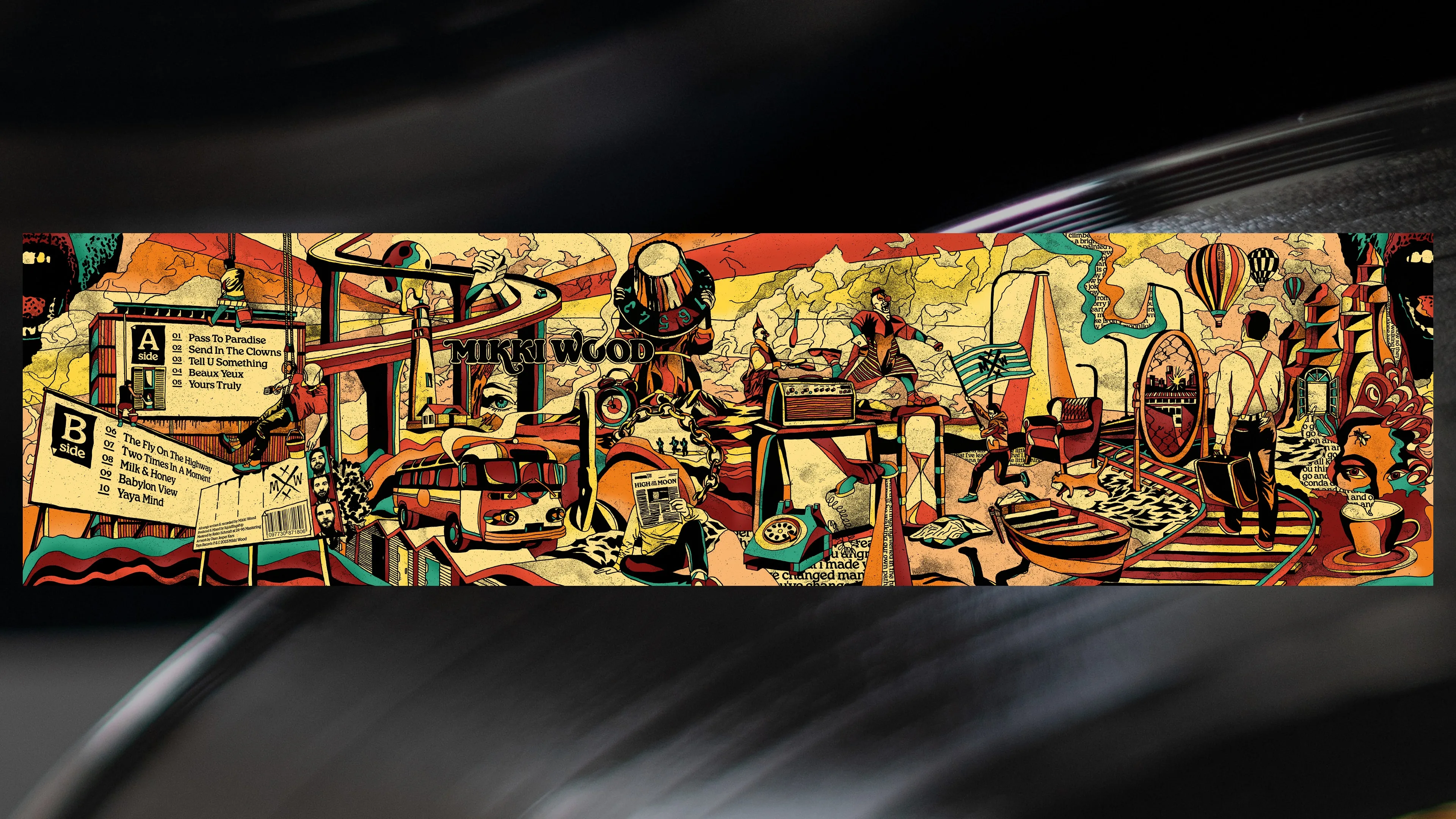
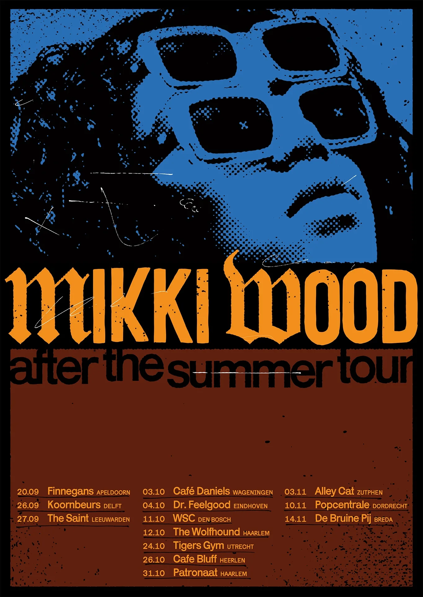
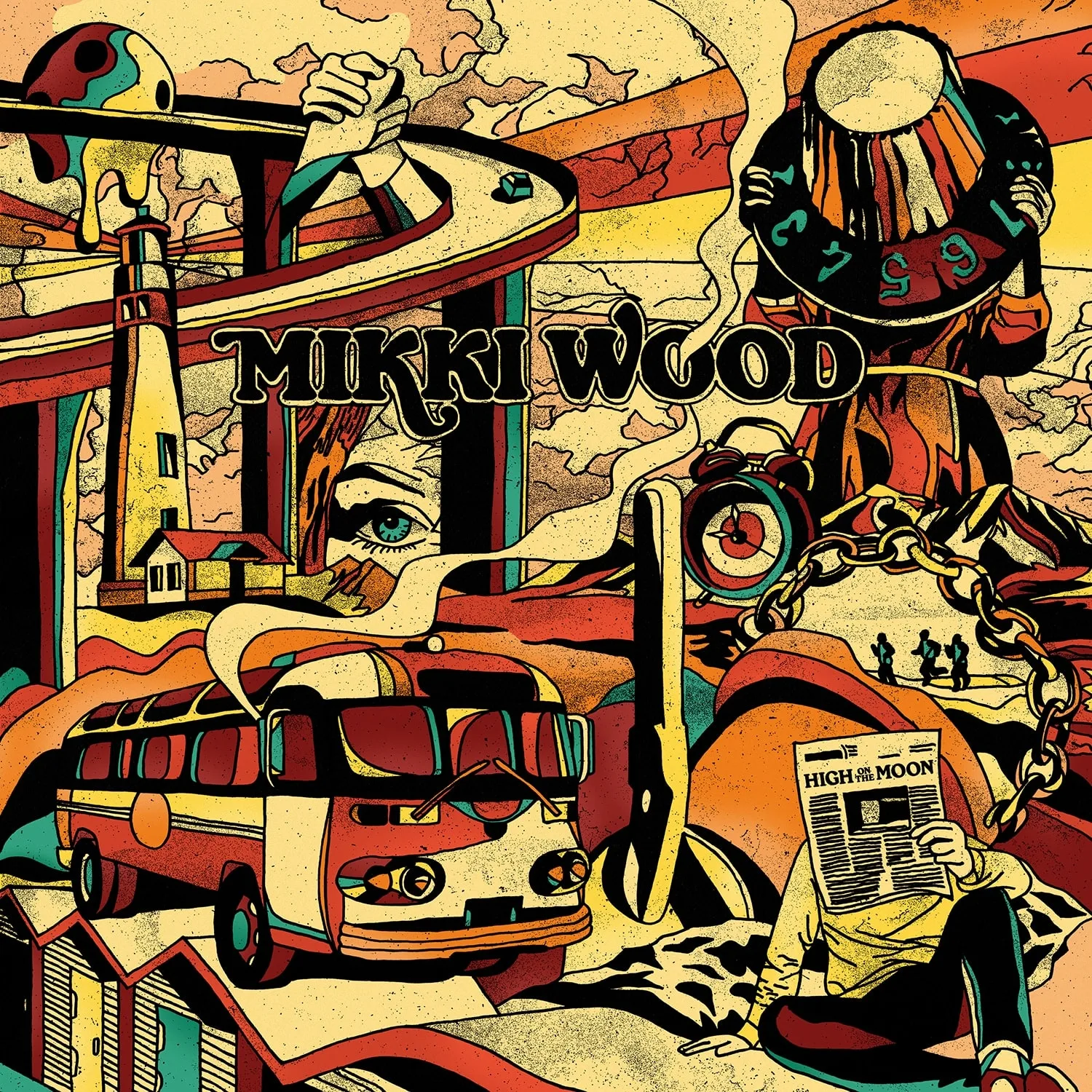
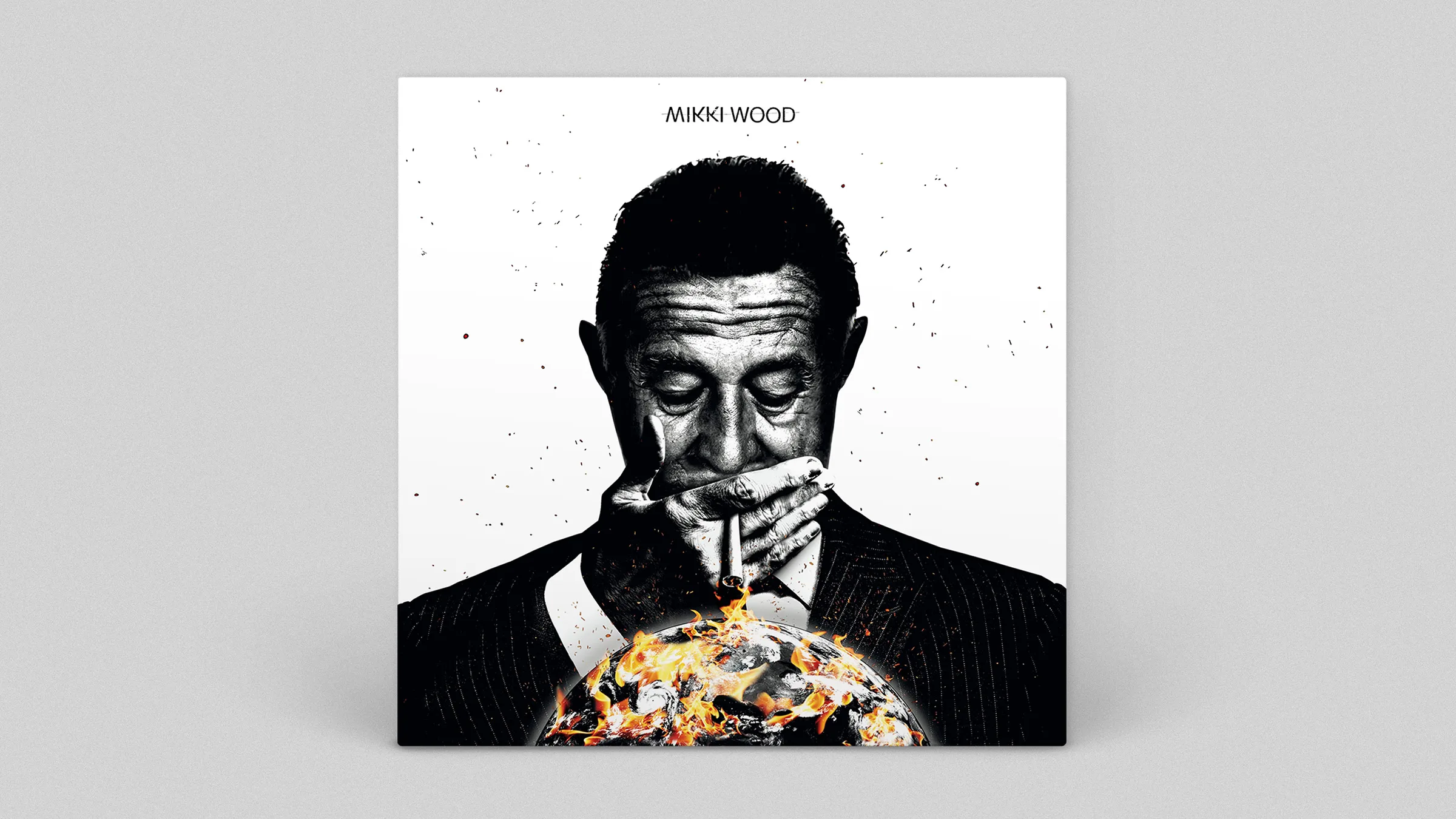
Mikki Wood — High On The Moon
Mak Goktas
Artwork for Mikki Wood’s 12″ debut album High On The Moon, which perfectly captured the raw energy of their live shows. All the illustrations represent little parts of all the 10 tracks on the album. From cover to cover the illustration loops seemlessly. On stage, the band creates an atmosphere of total surrender, whether they’re playing in a small café or a larger venue. They always manage to bring the crowd into their performance. Since its formation, Mikki Wood has firmly embedded itself in the underground music scene, and the band continues to push new boundaries.

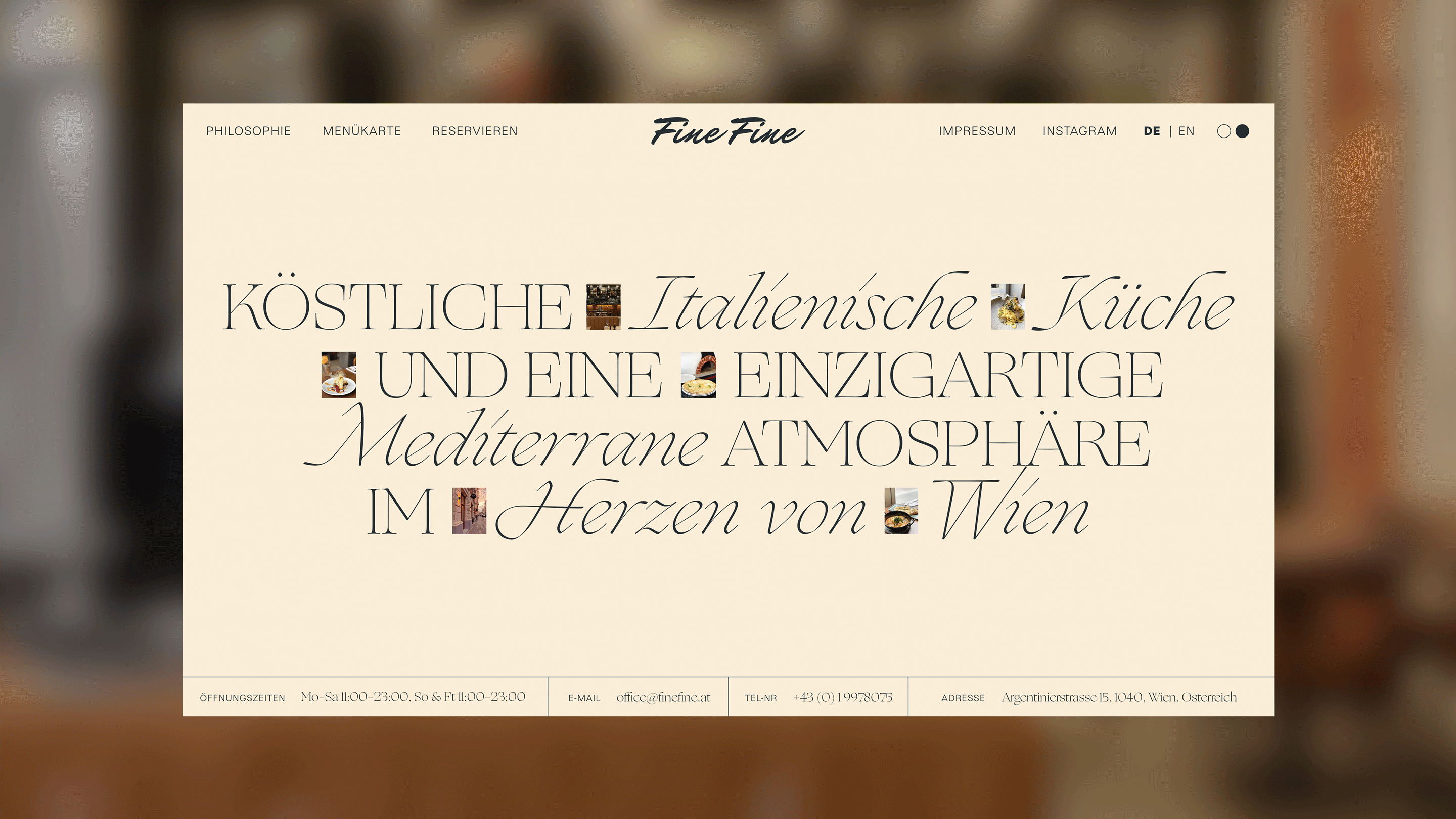
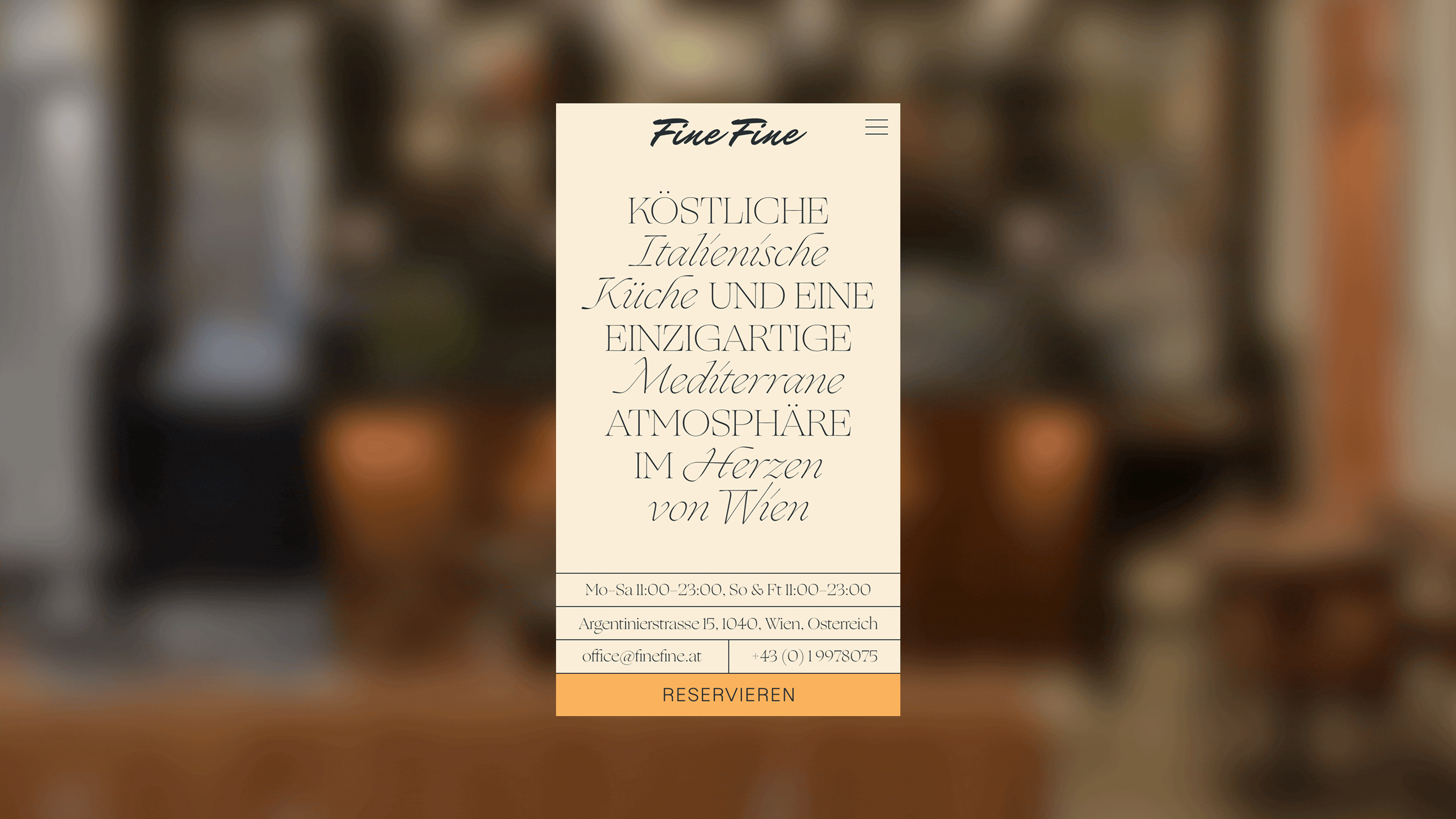
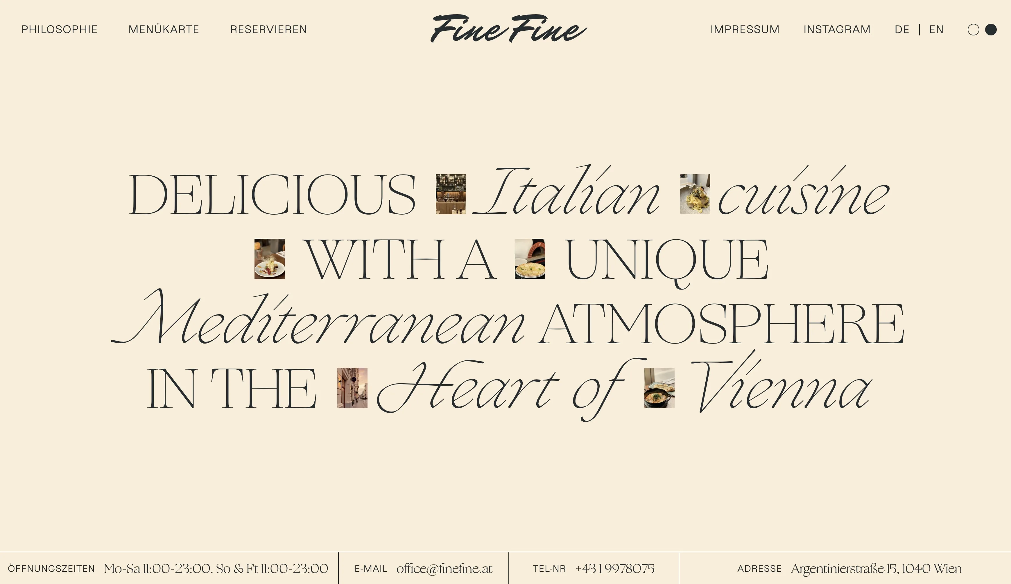
Fine Fine
Lukas Ullsperger at RAAR
Website developed by Wolfgang Schnellnast
Web design for the Vienna based Italian restaurant and pizzeria Fine Fine. In a very short time, Fine Fine all’ Italiana, which offers delicious dishes every day and conveys a distinctive Mediterranean atmosphere, has established itself as a well-attended restaurant and a fixture of Italian cuisine in Vienna. A suiting website which represents the restaurant’s quality food and stylish interior was requested and delivered.
www.finefine.at
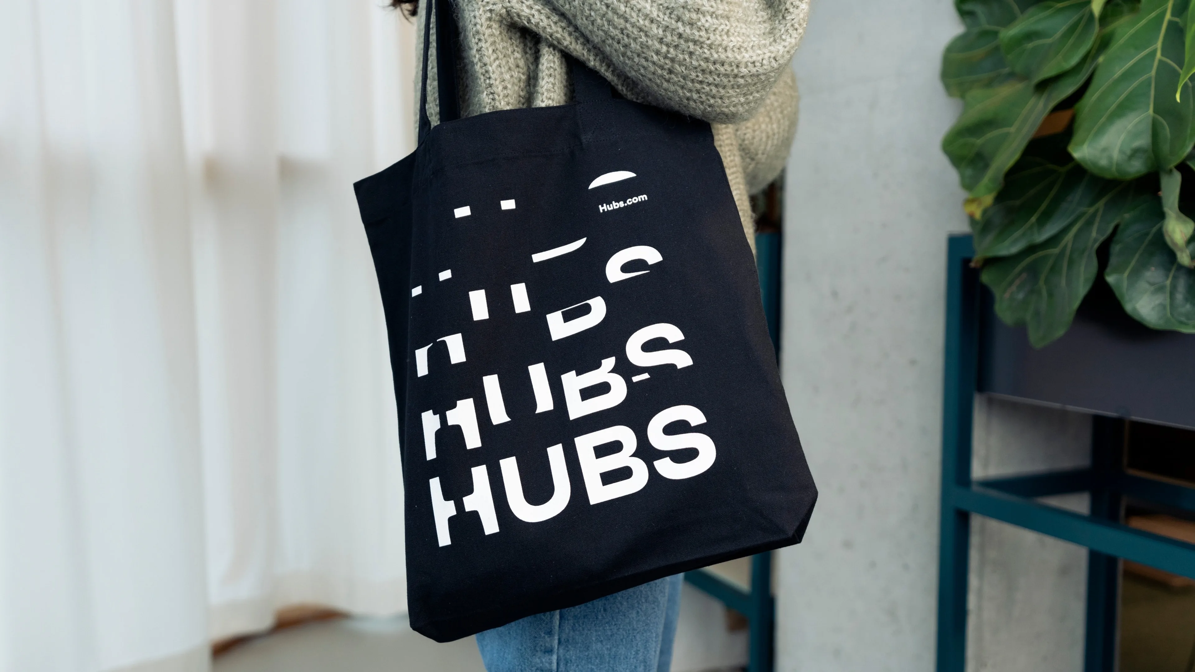
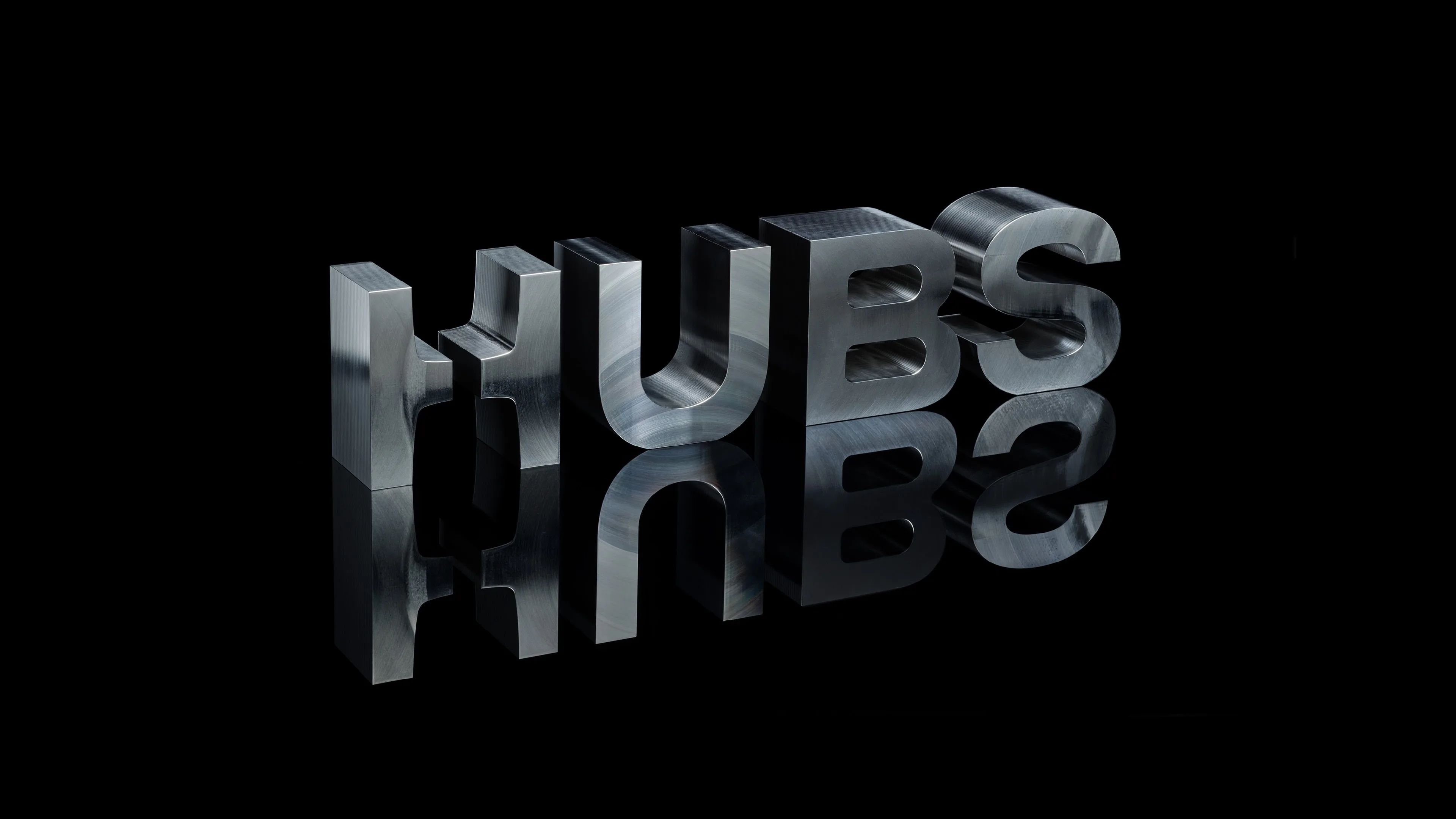
Hubs
Jungeun Lee
Logotype drawing for Hubs (previously known as 3D Hubs and currently known as Protolabs Network).
Art Direction & Graphic Design: Jungeun Lee
Motion Graphics: Kay Pisarowitz
Photos by Eline Verdonk & About.Today
The design and all images are copyrighted and the property of 3D Hubs B.V.


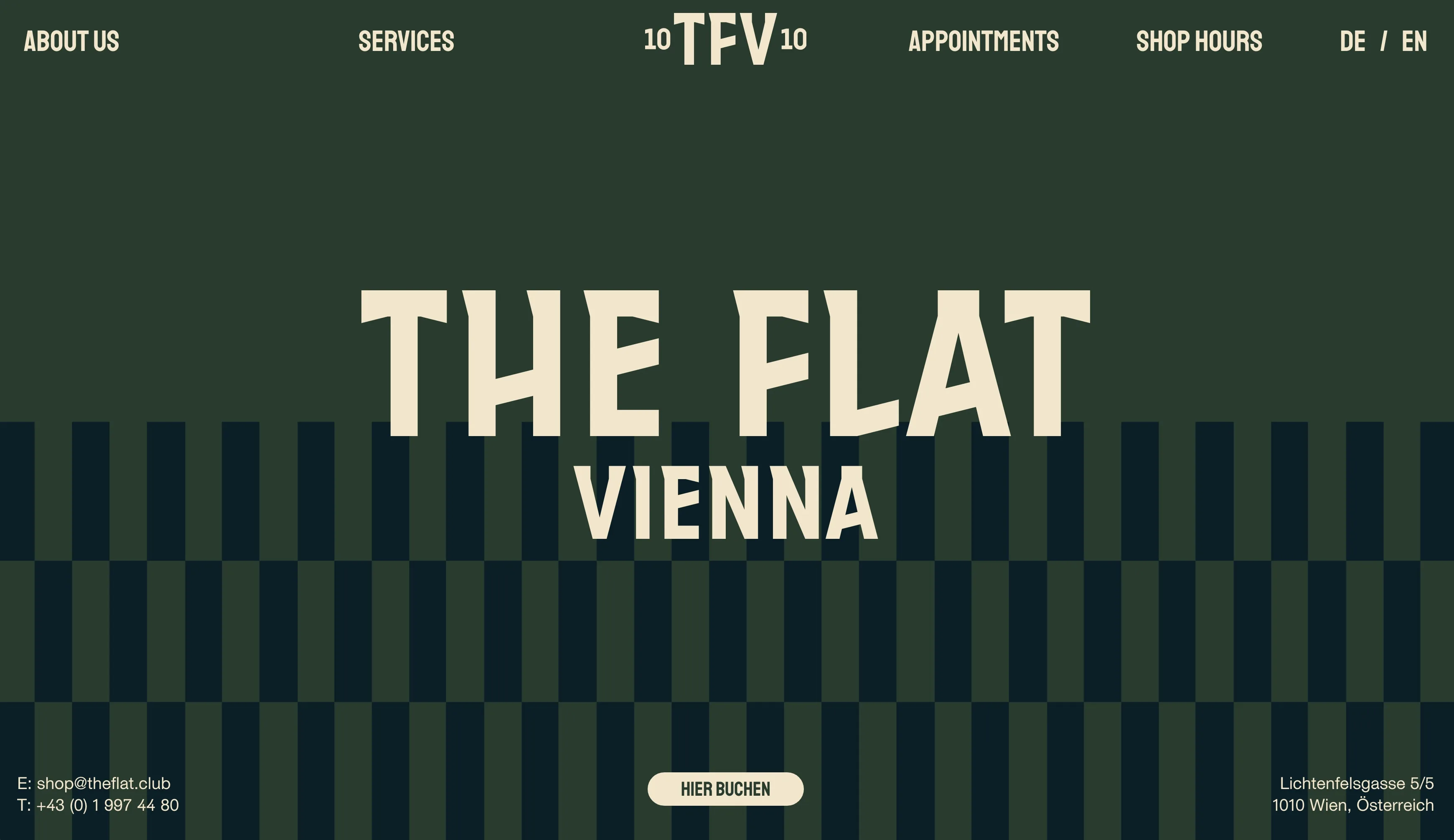
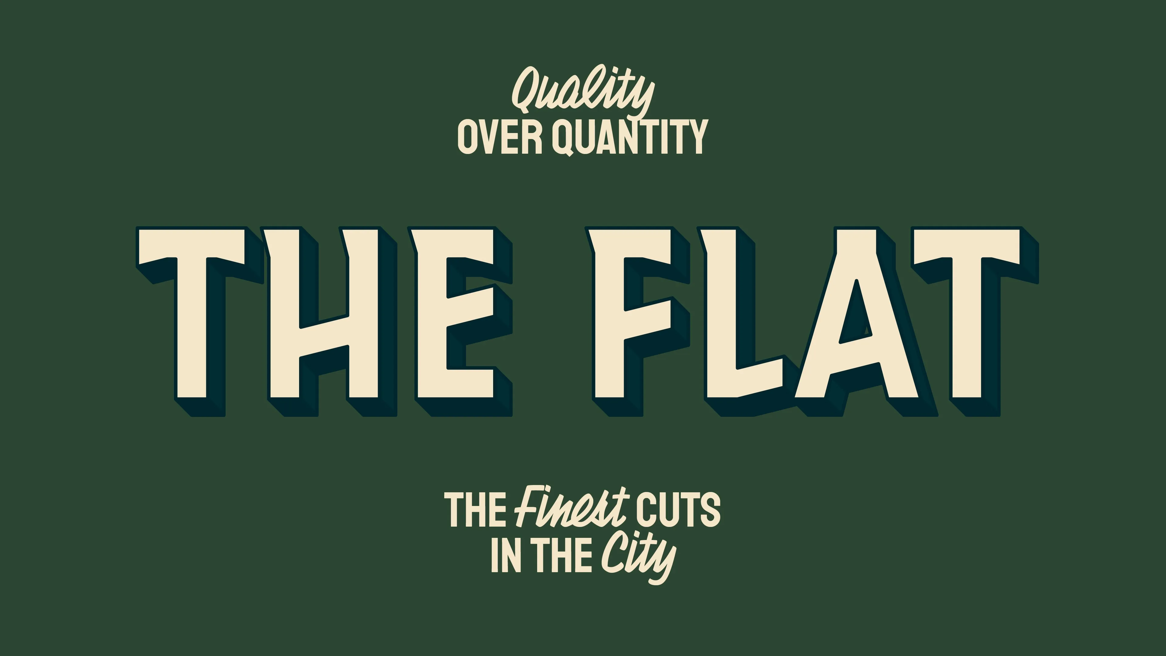
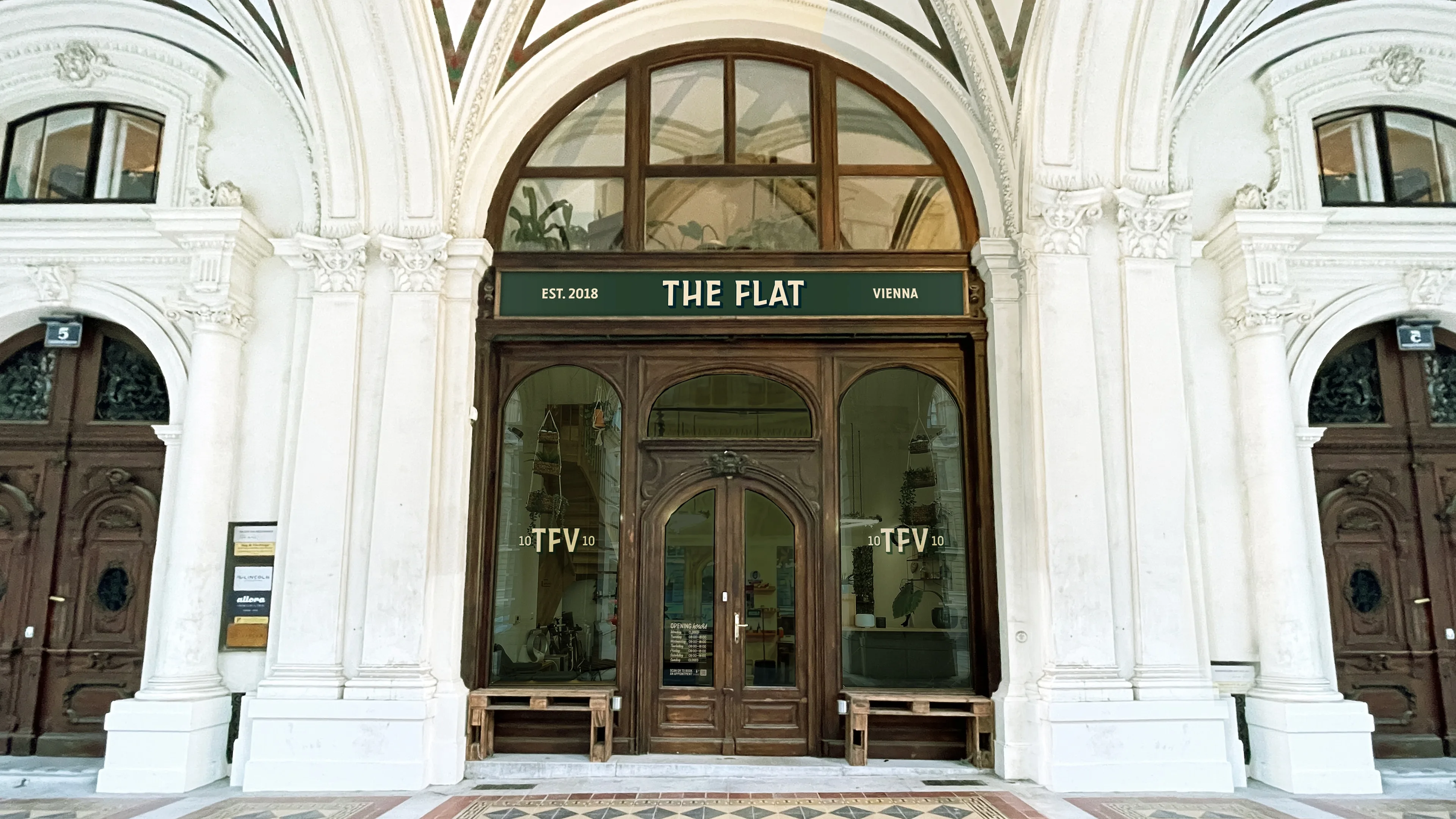
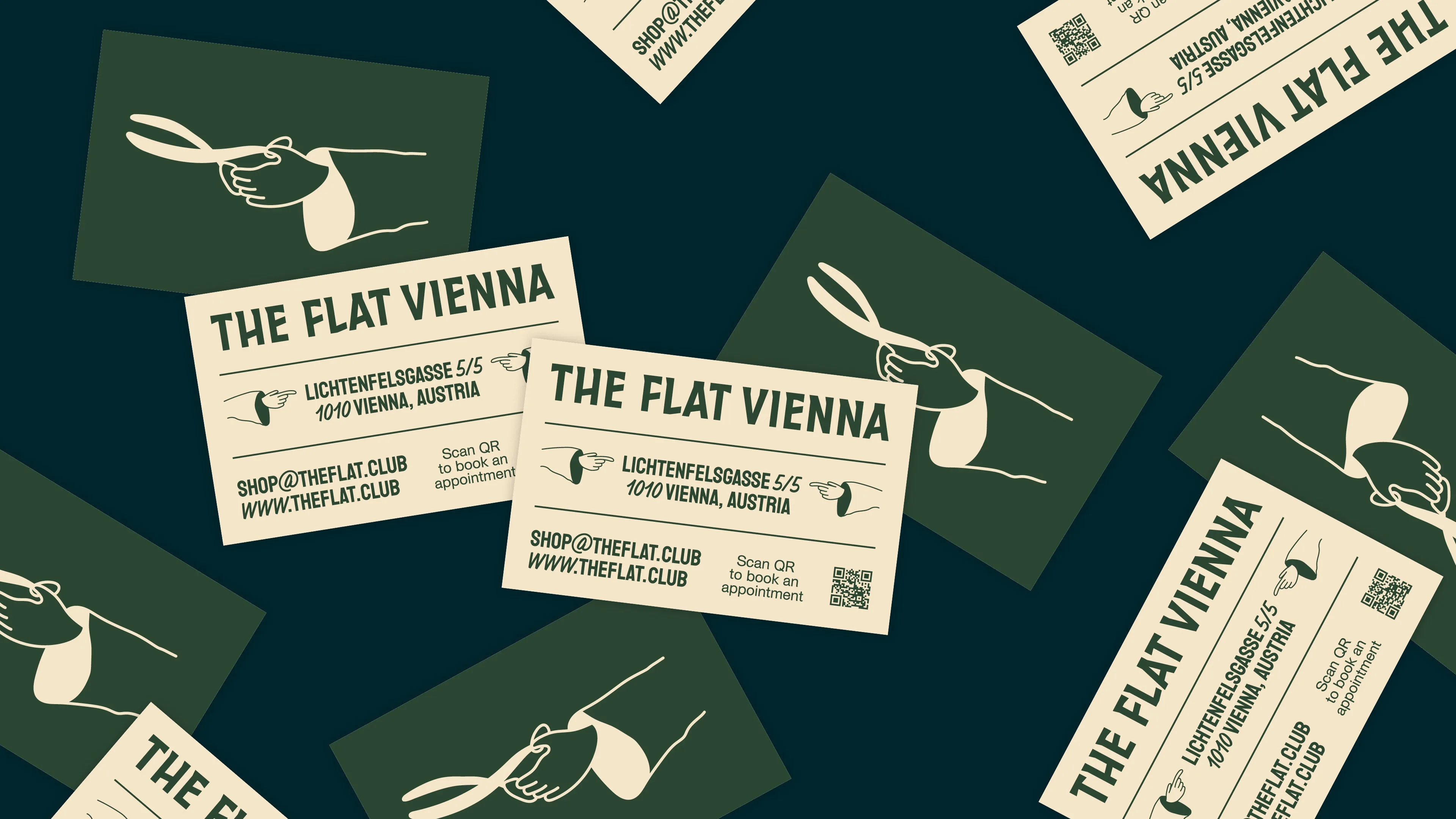
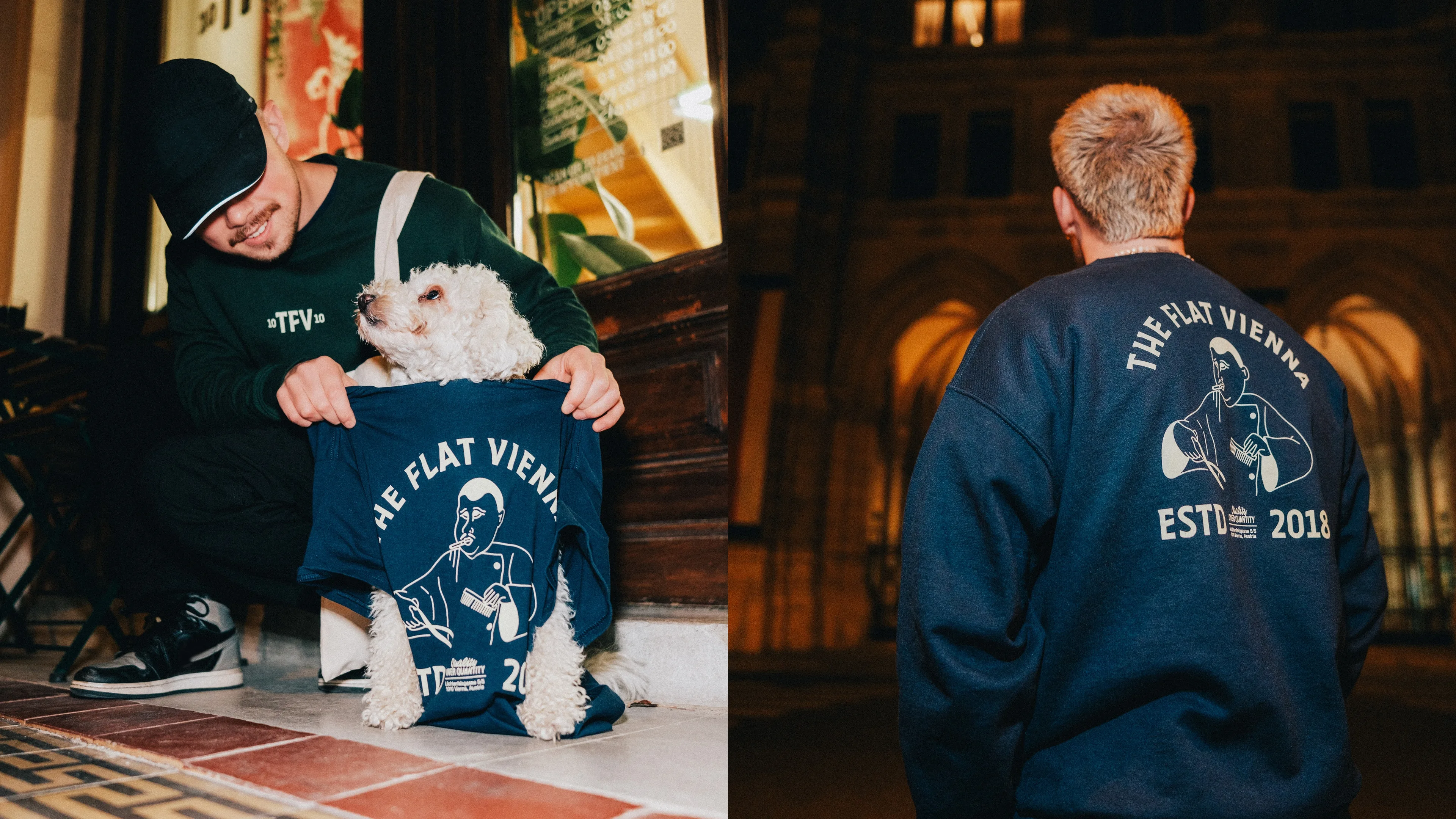
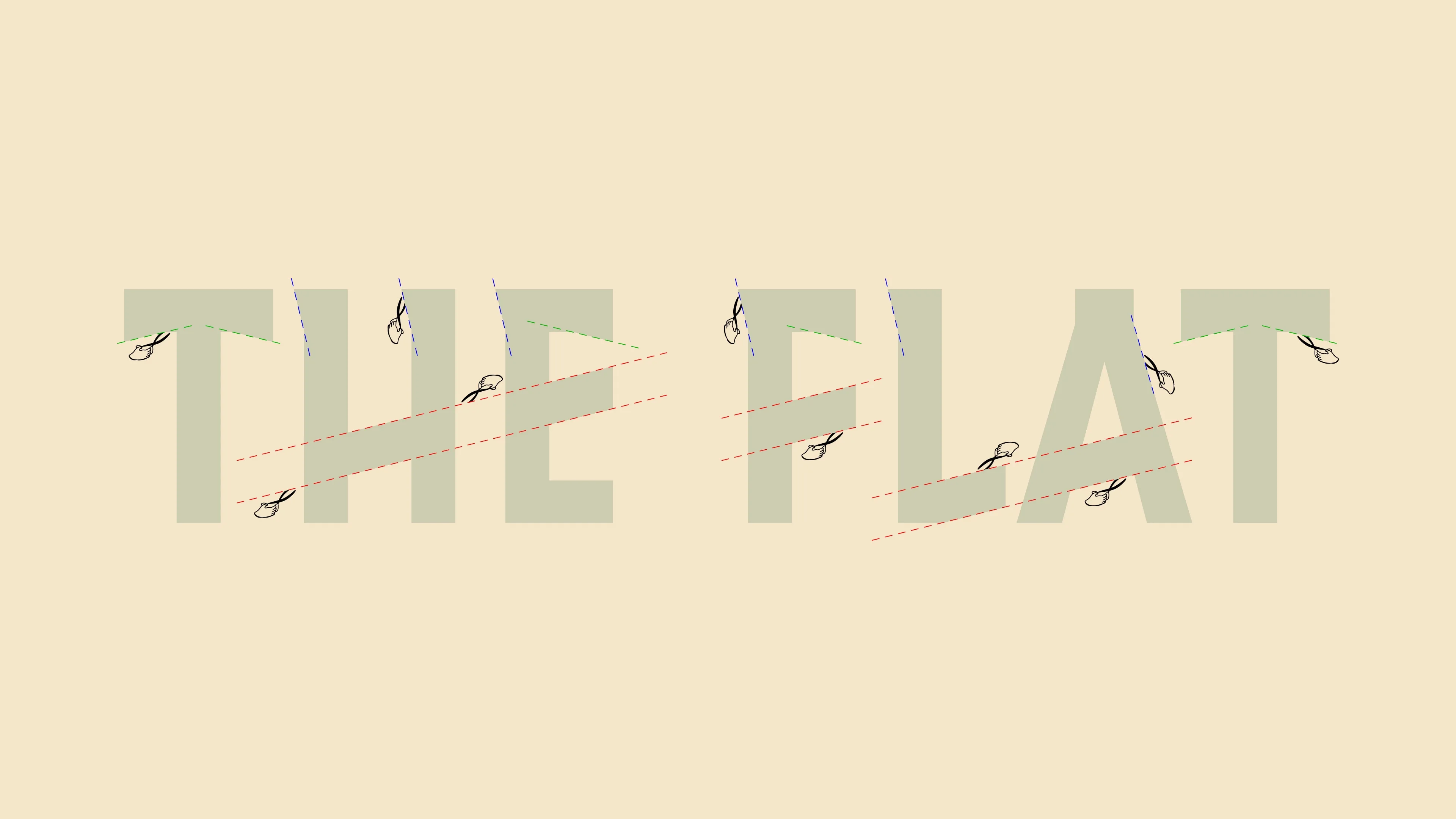
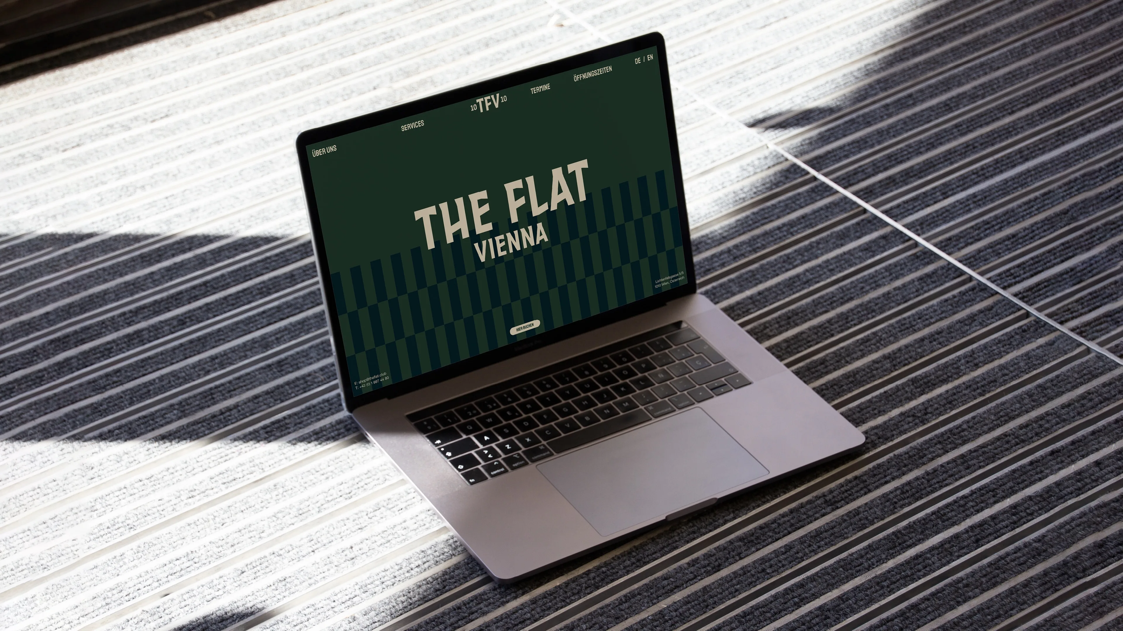
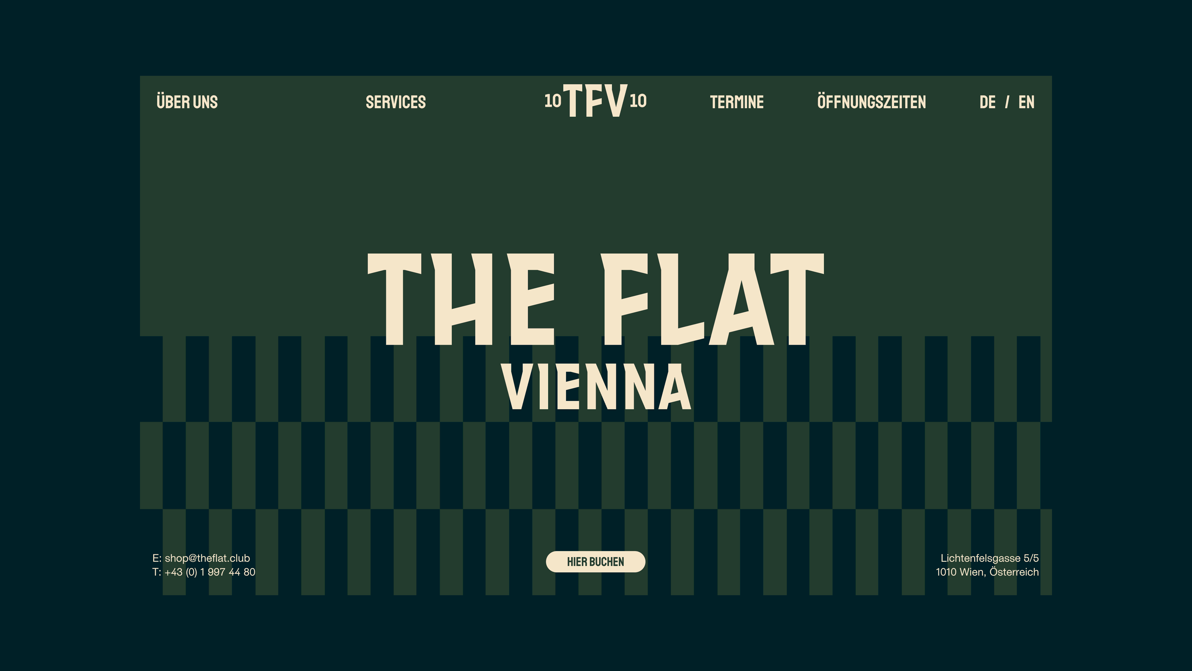
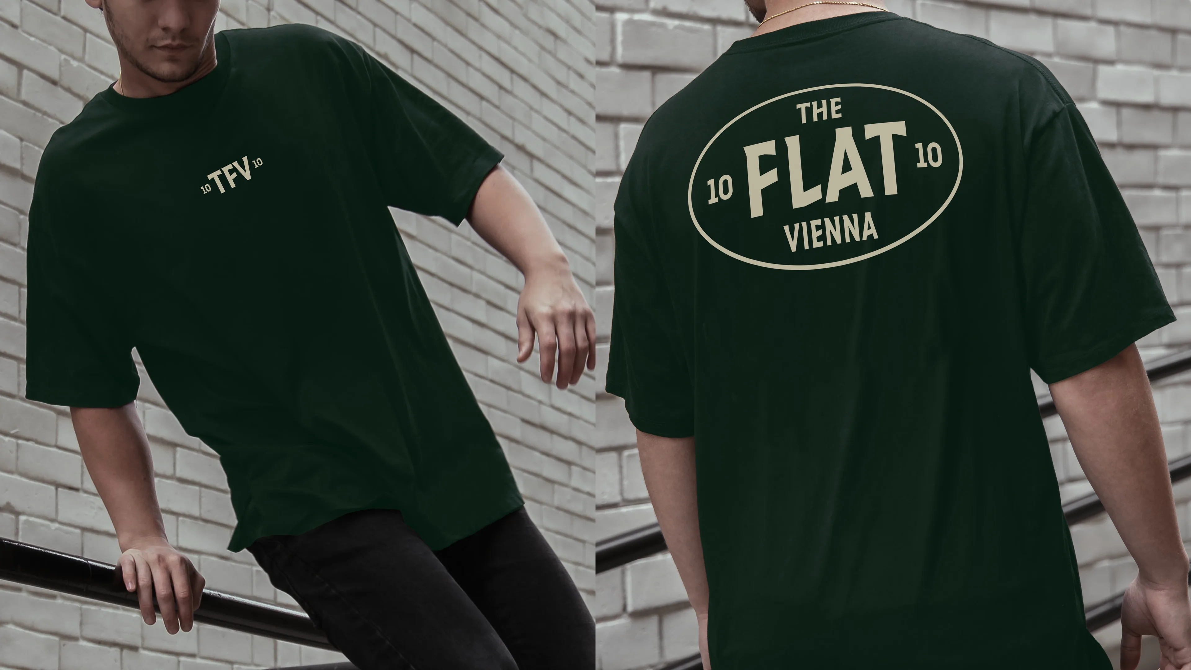
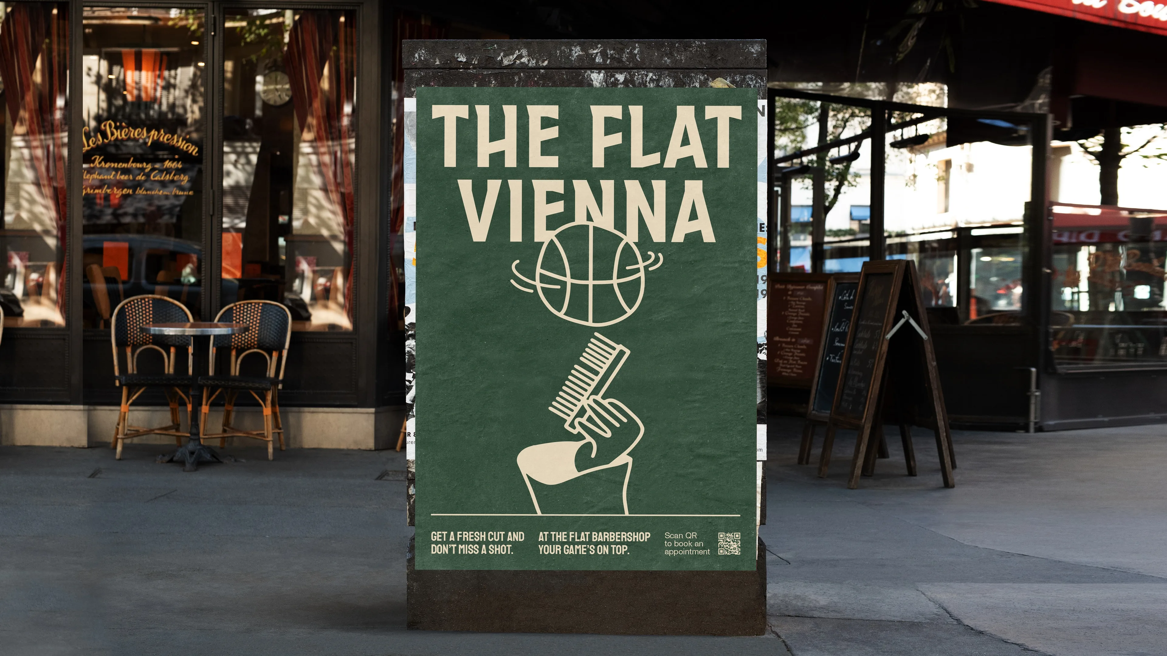
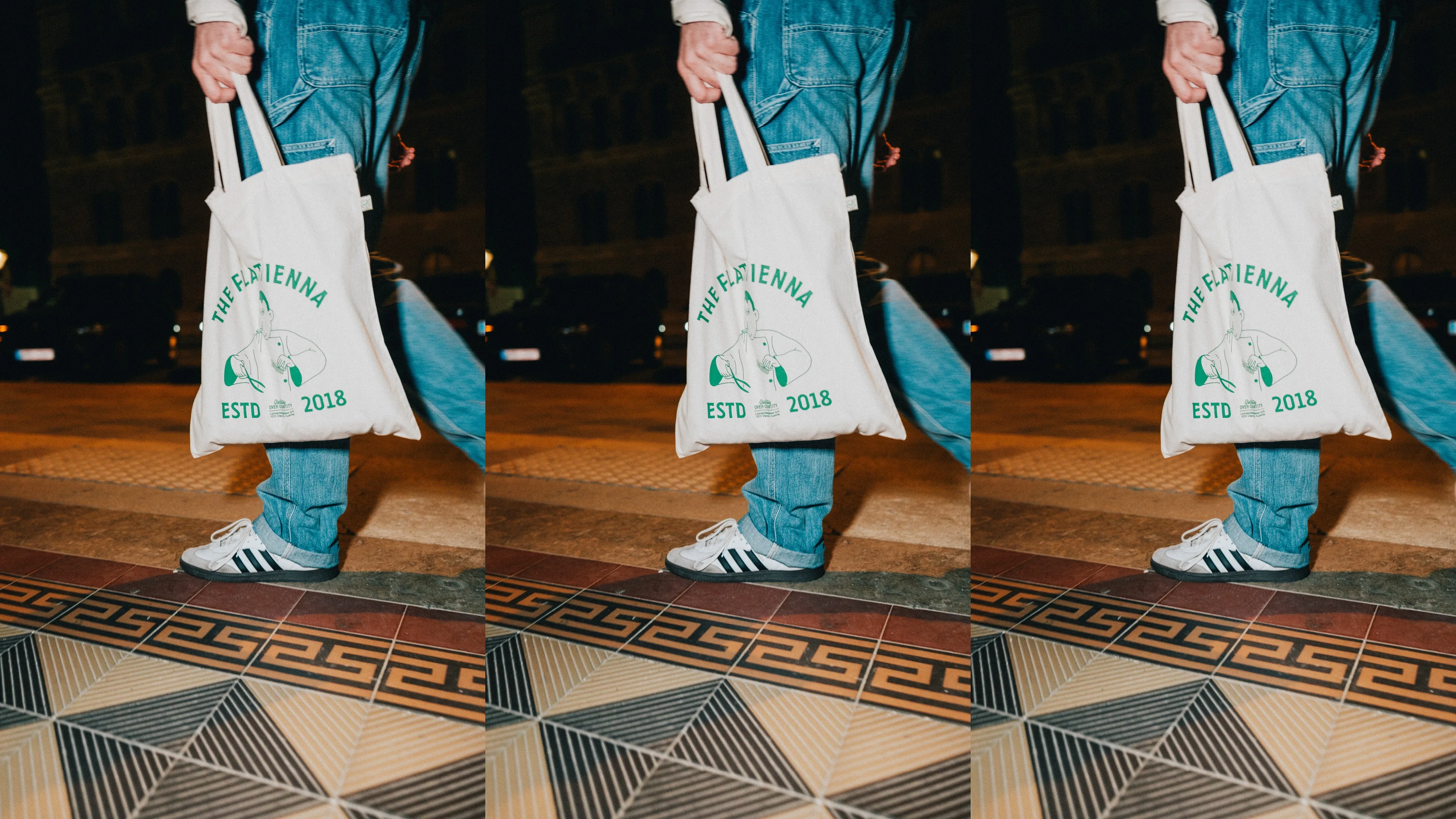
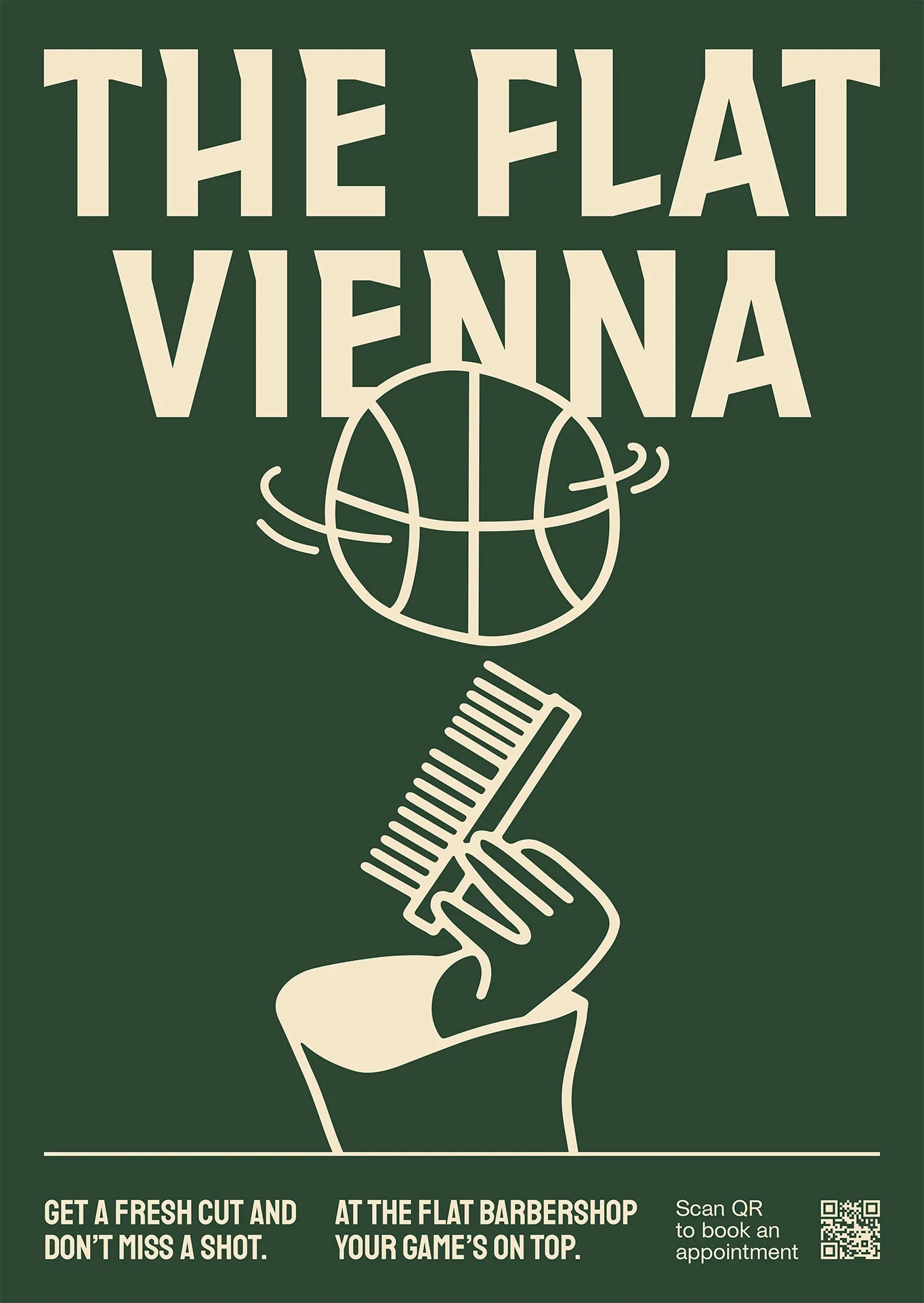
The Flat Vienna
Wolfgang Schnellnast
Branding and web design for the fresh barbershop The Flat Vienna. A hand-cut logotype and matching identity. As they say themselves, it’s much more than just a barbershop, it’s a community. If you’re ever in Vienna and want to be Frisch & Fesch, just visit the shop. Picture No. 04 & 12 made by Carlos Dominguez
www.theflat.club


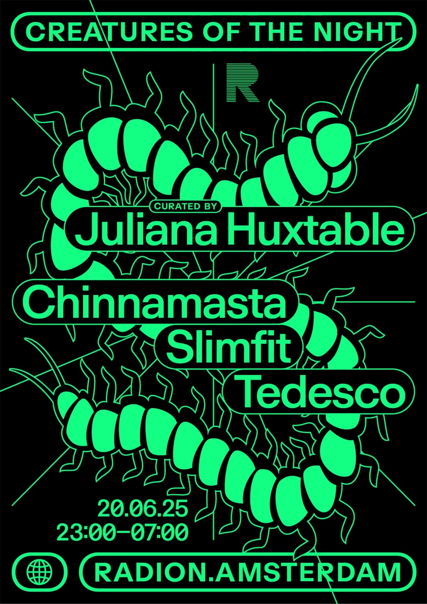
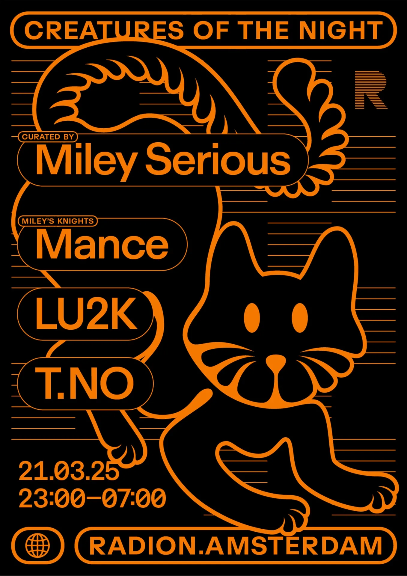
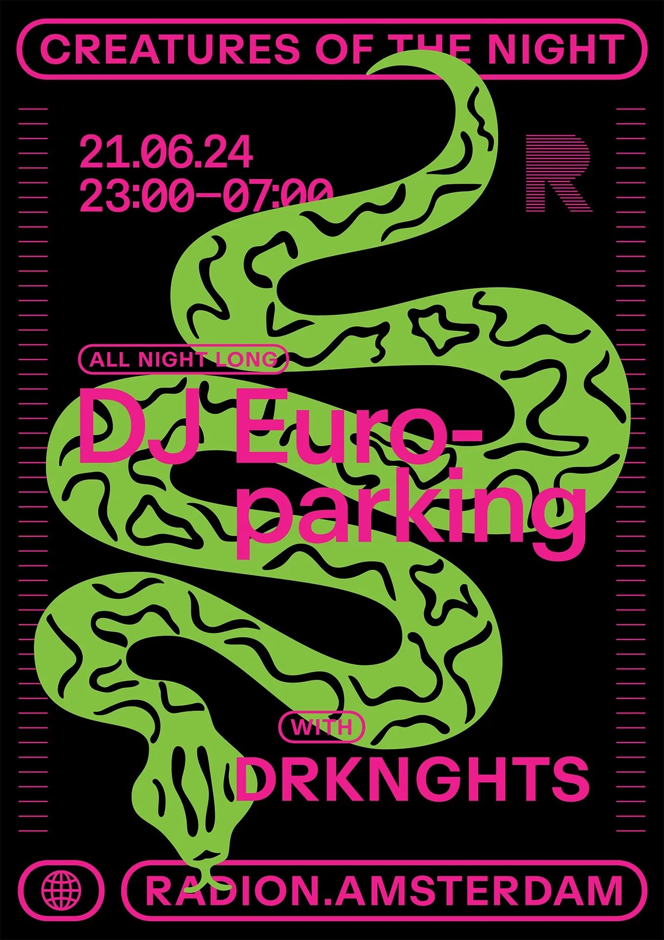
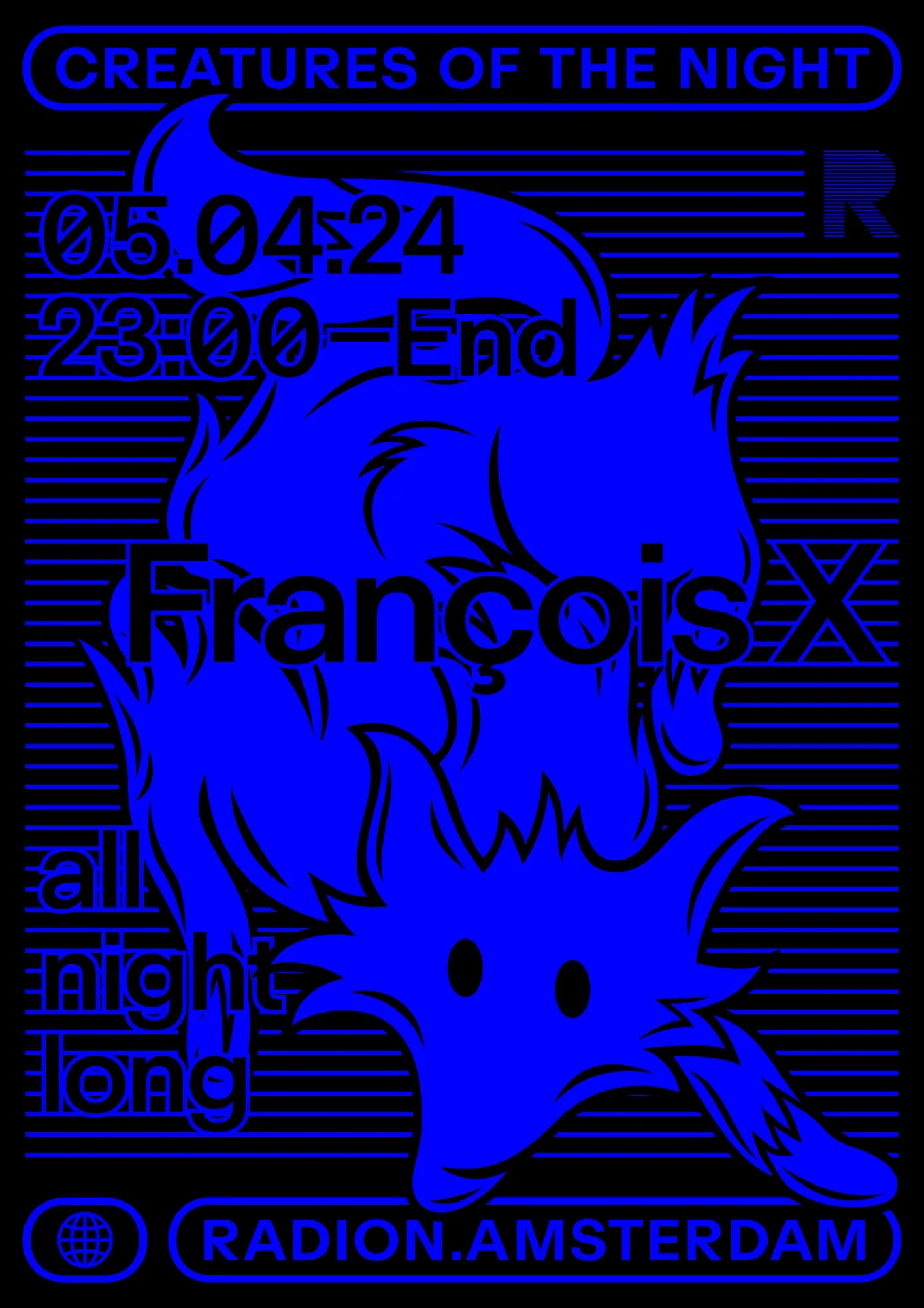
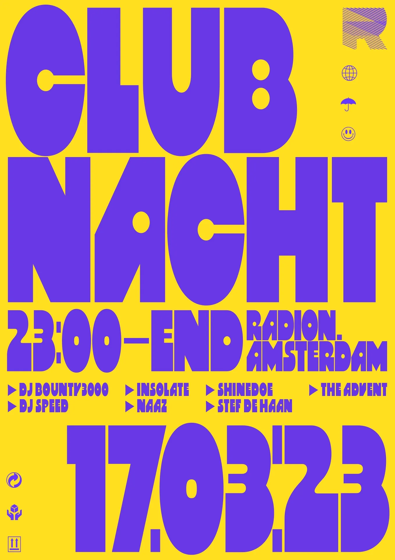
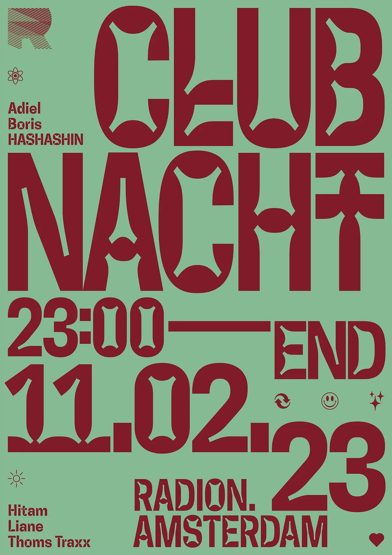
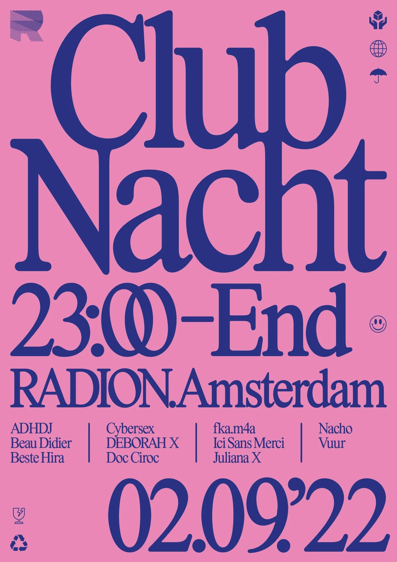
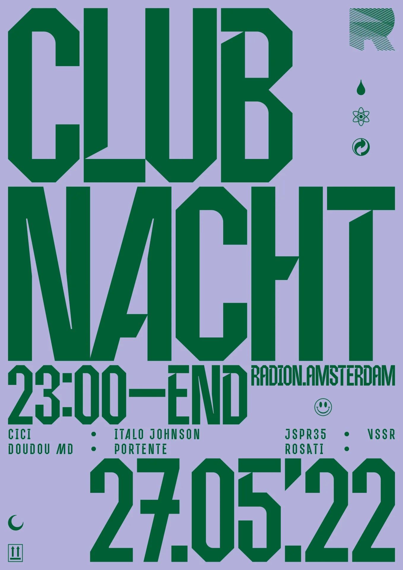
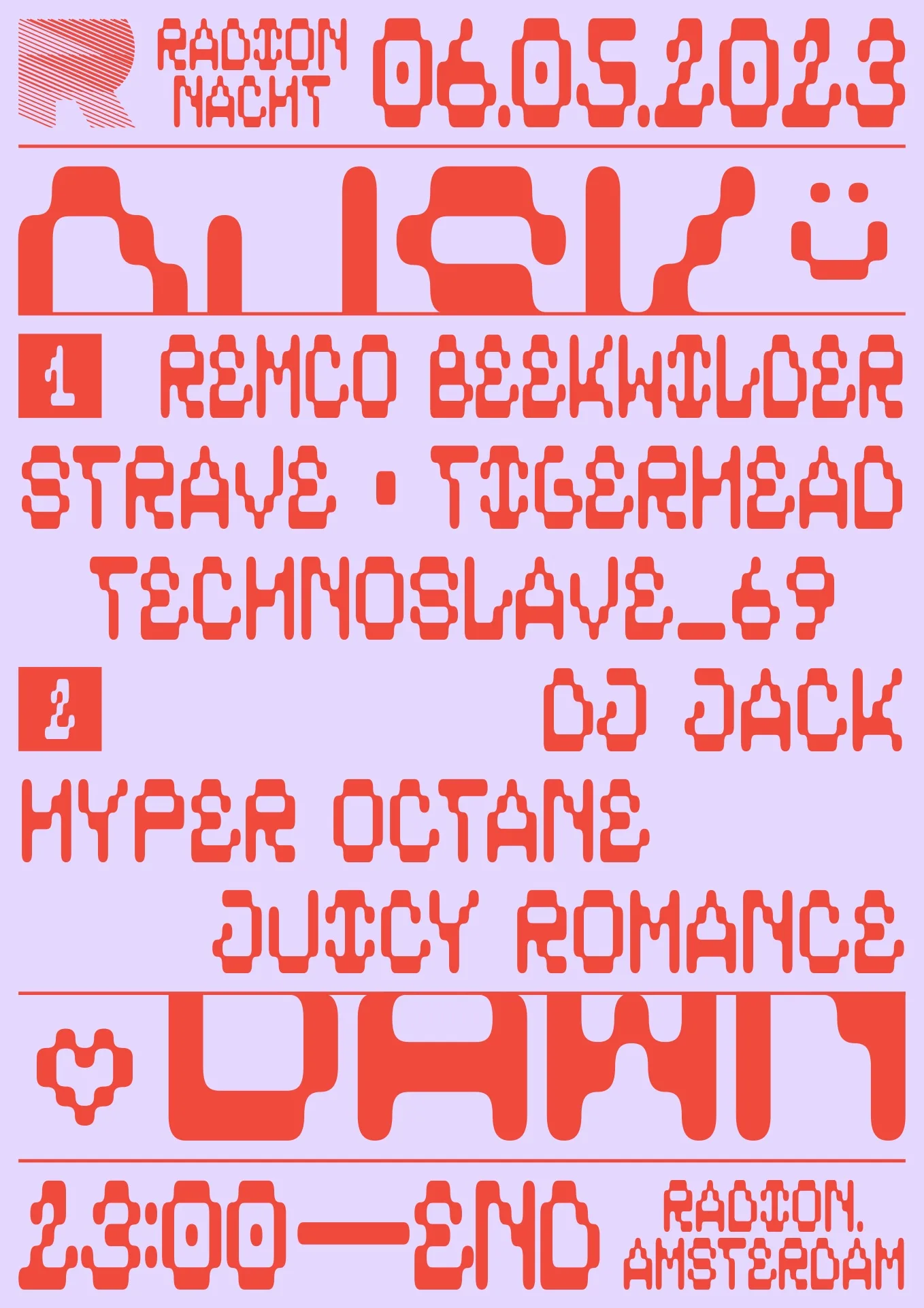
RADION Posters
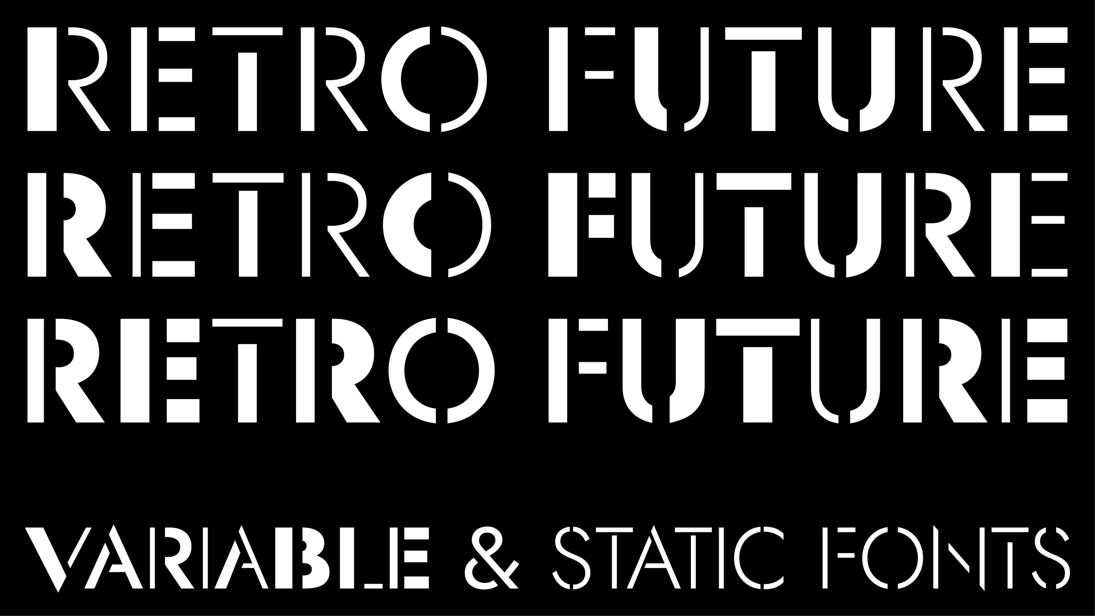
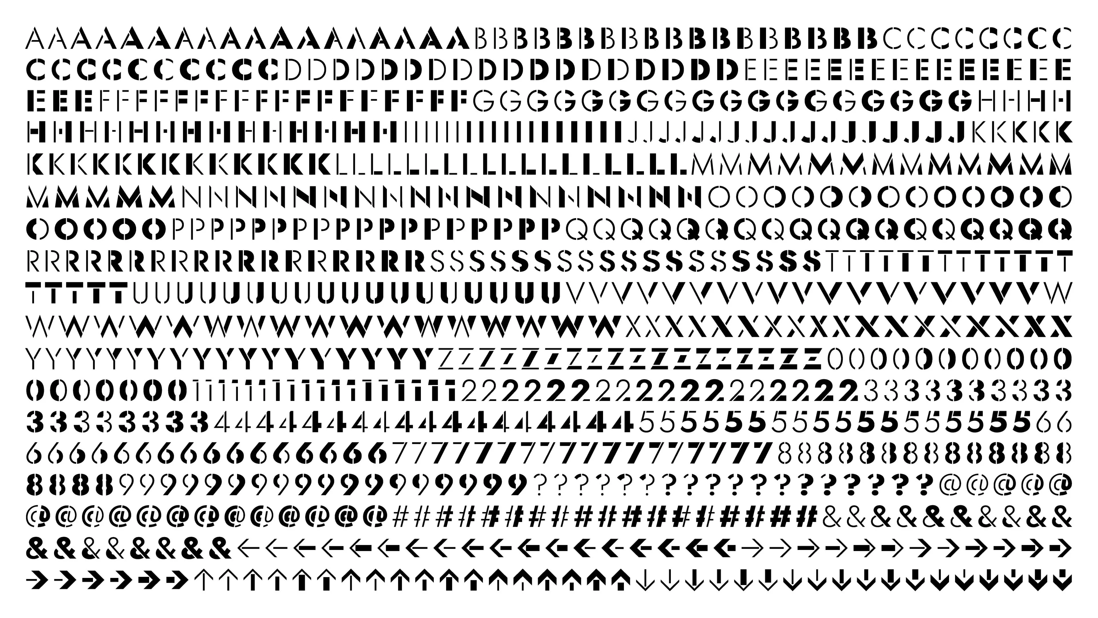
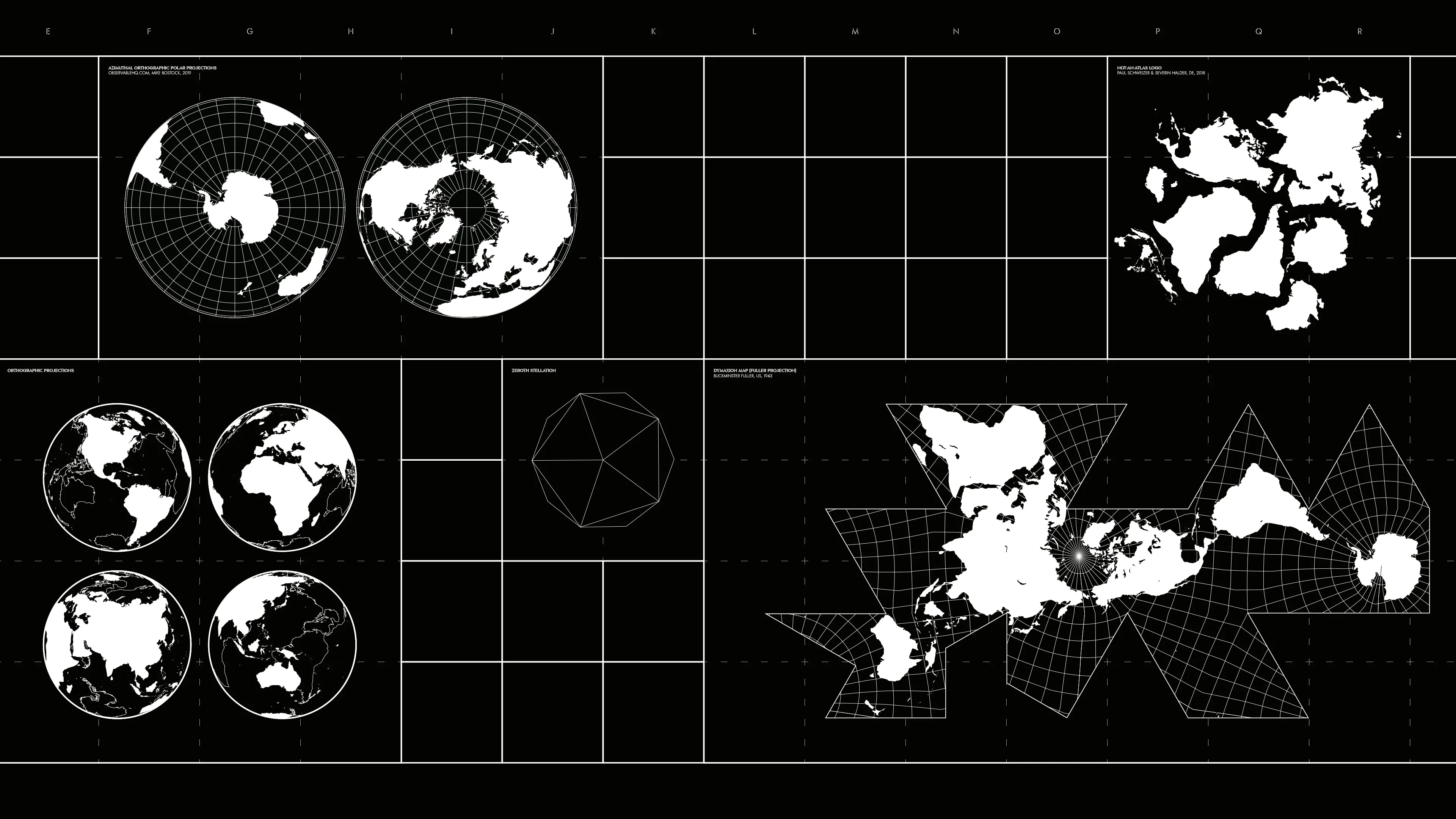
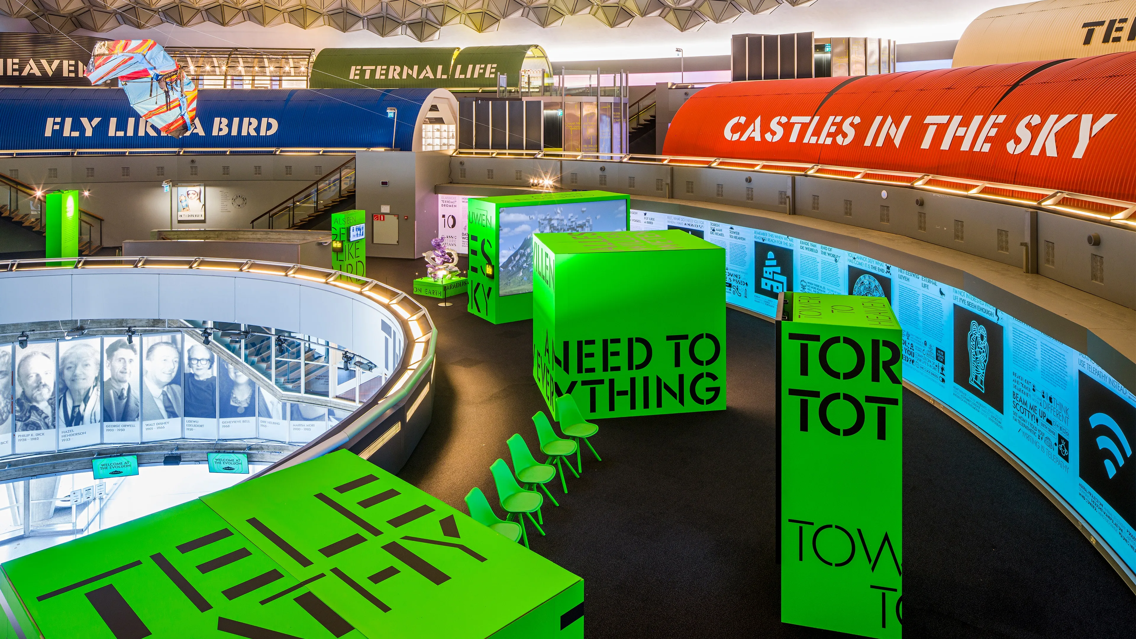
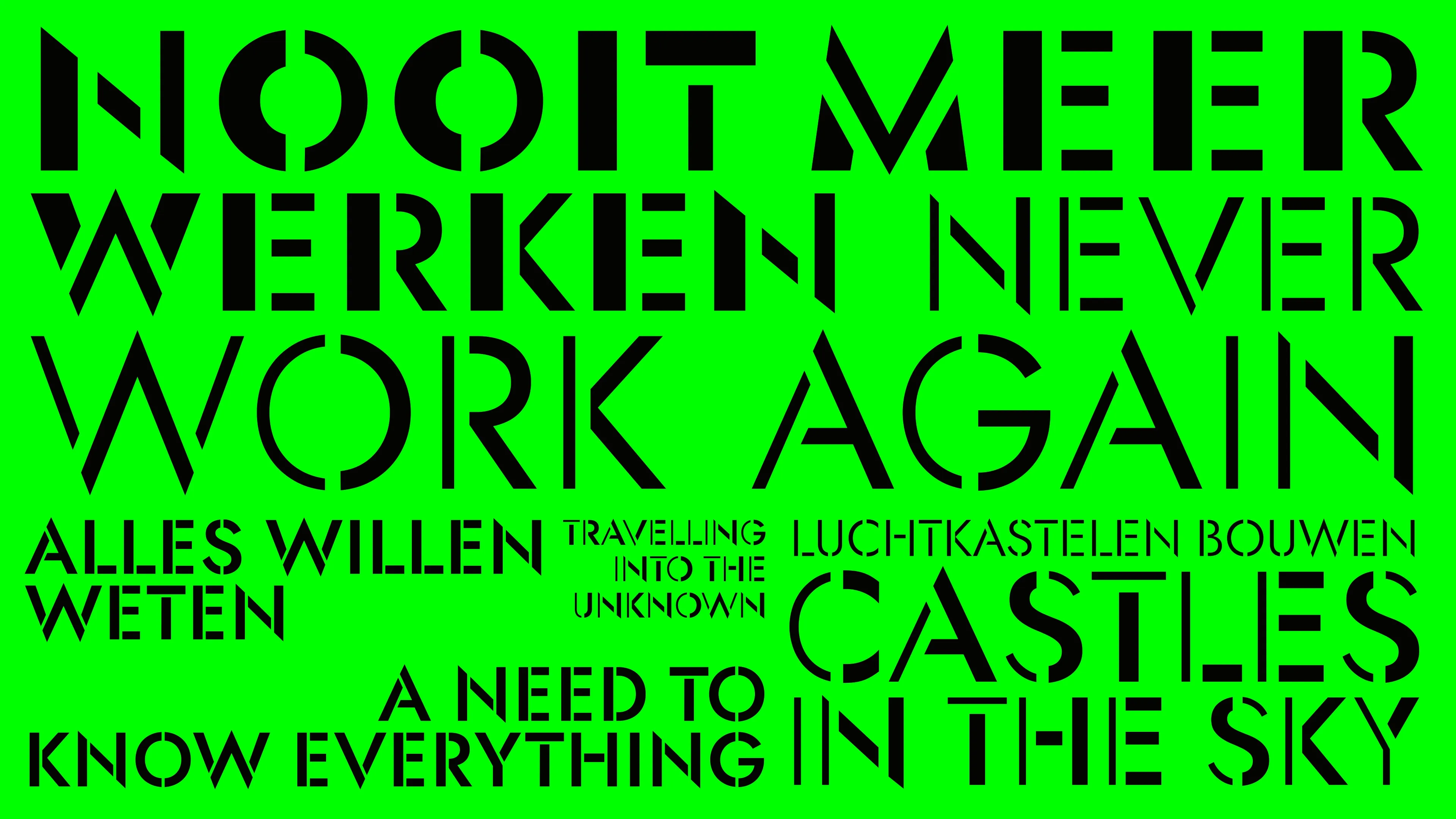
Retro Future Font
Variable typeface for the exhibition Retro Future in Eindhoven, The Netherlands. Based on the open-source font Jost by Indestructible Type.
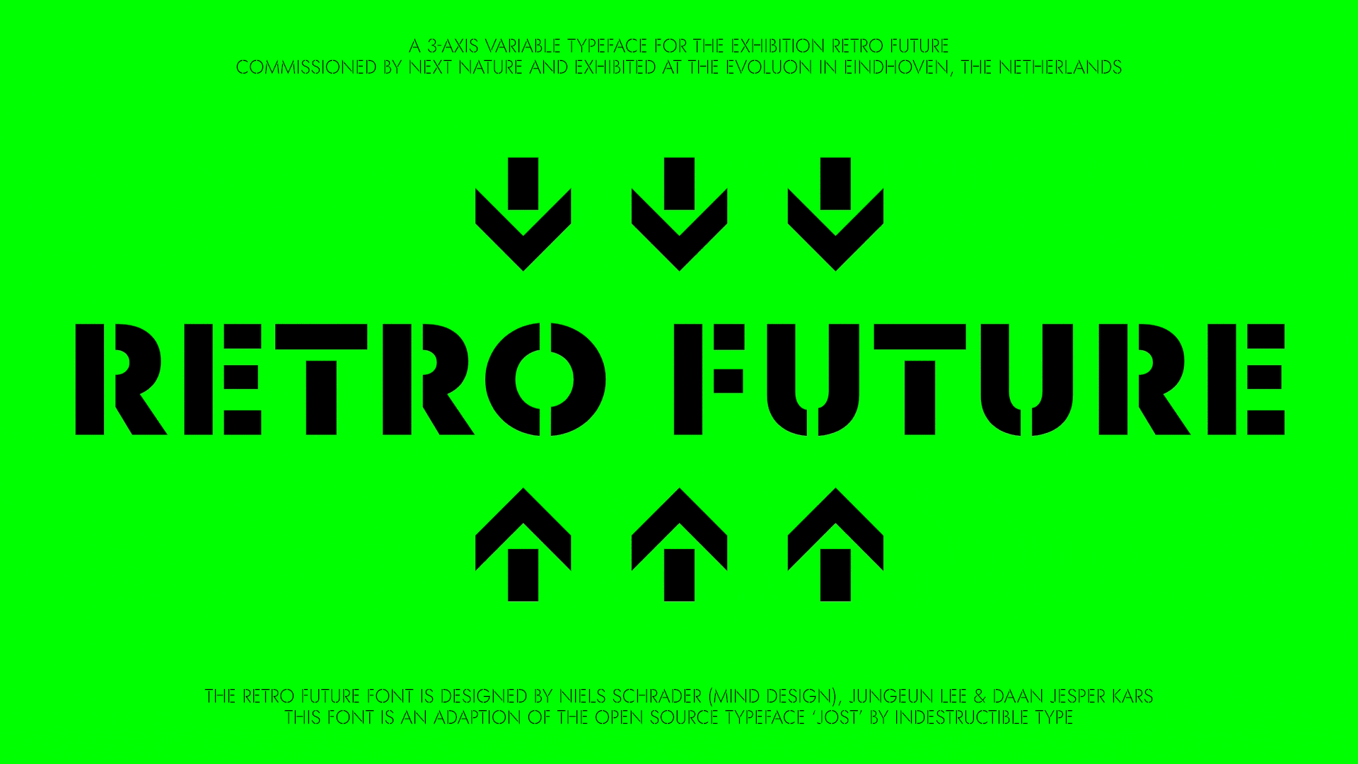


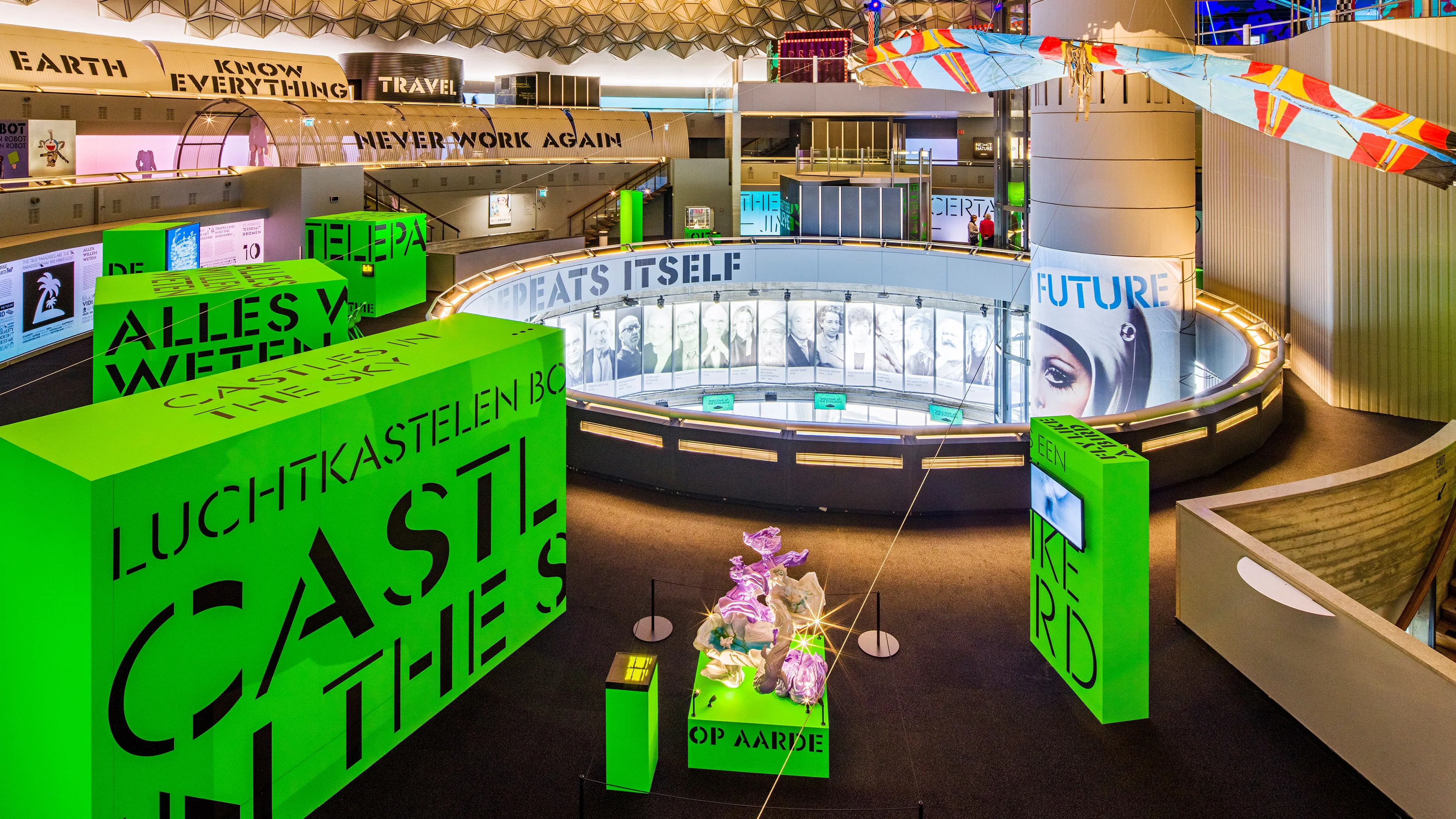
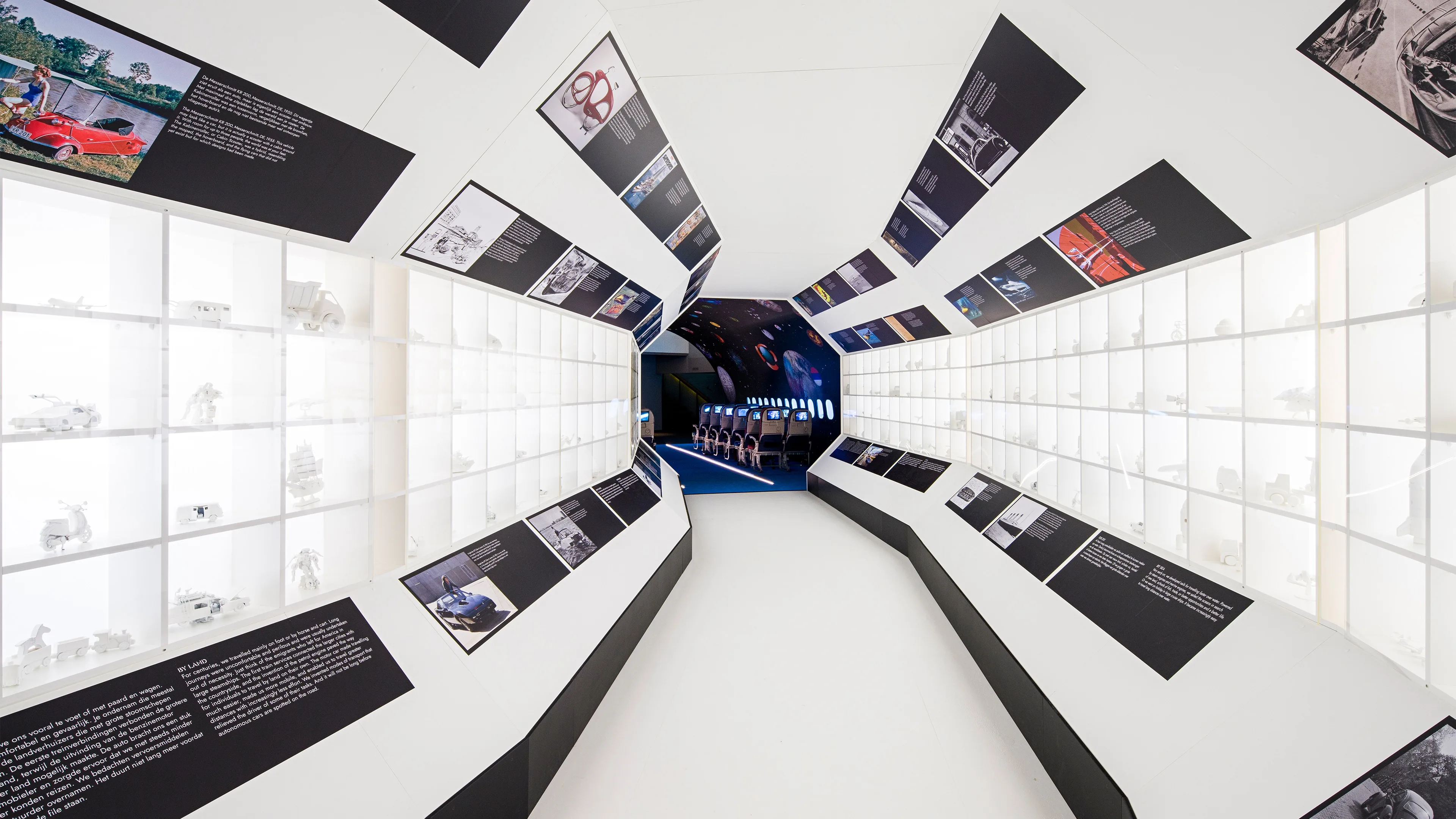
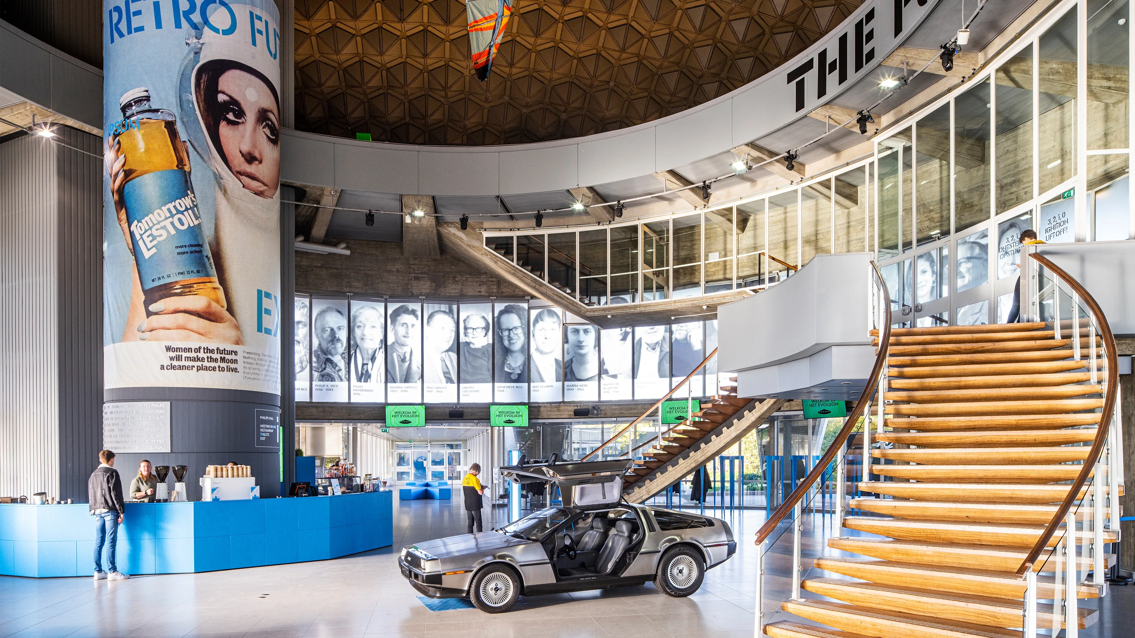
Retro Future
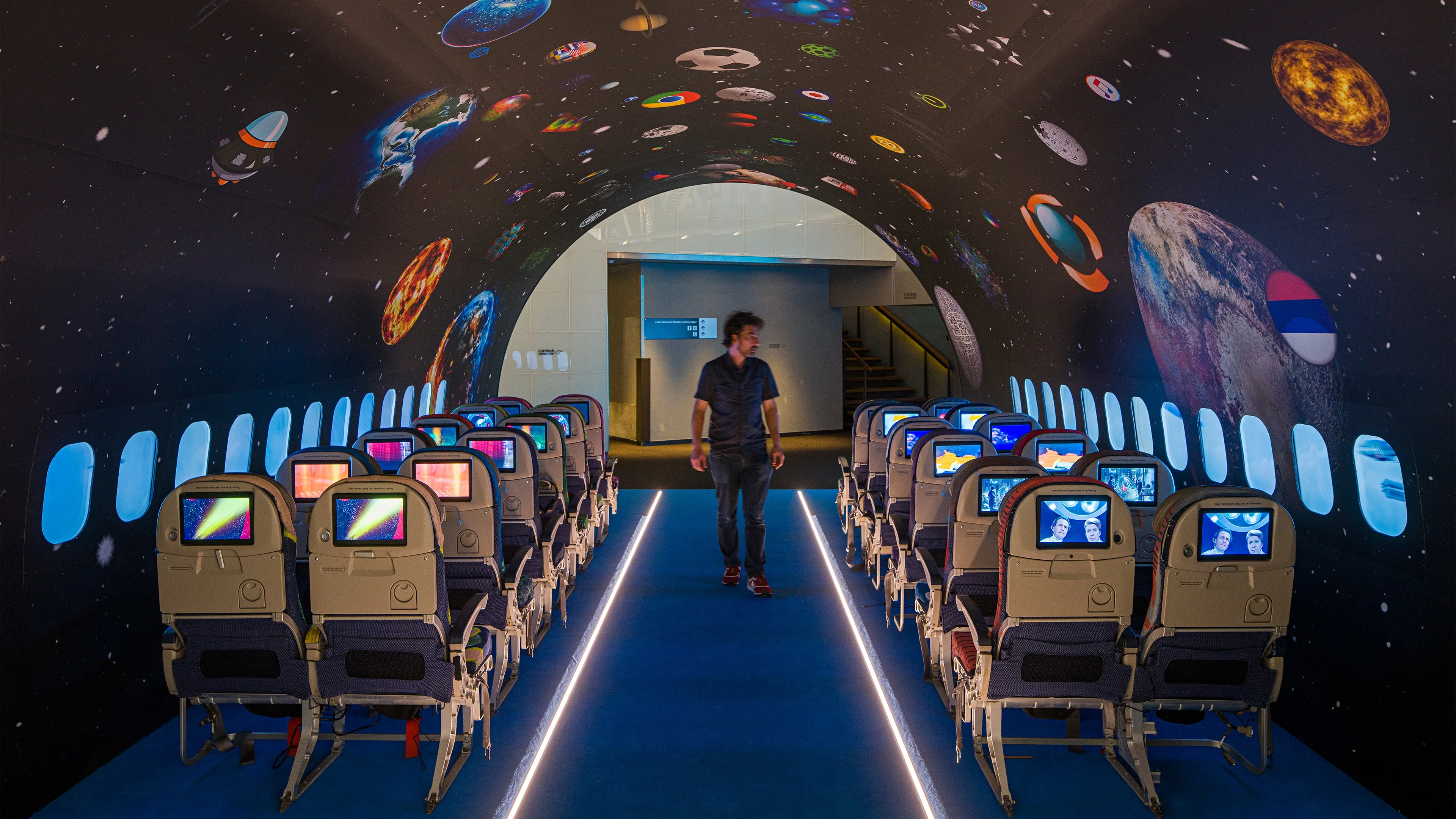
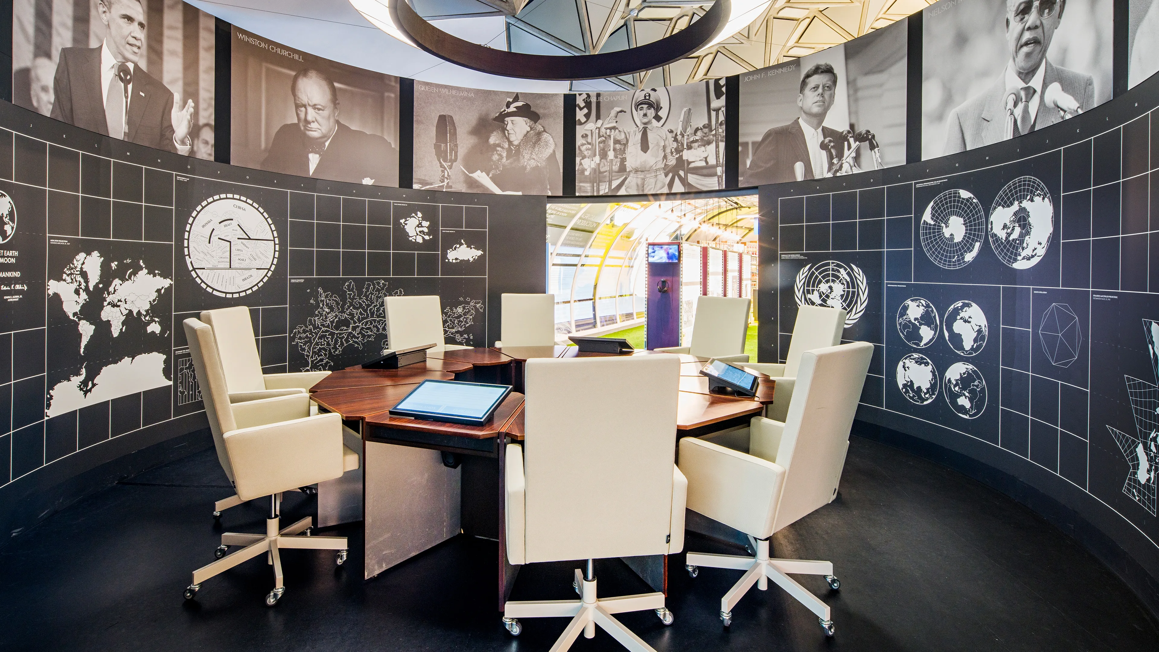
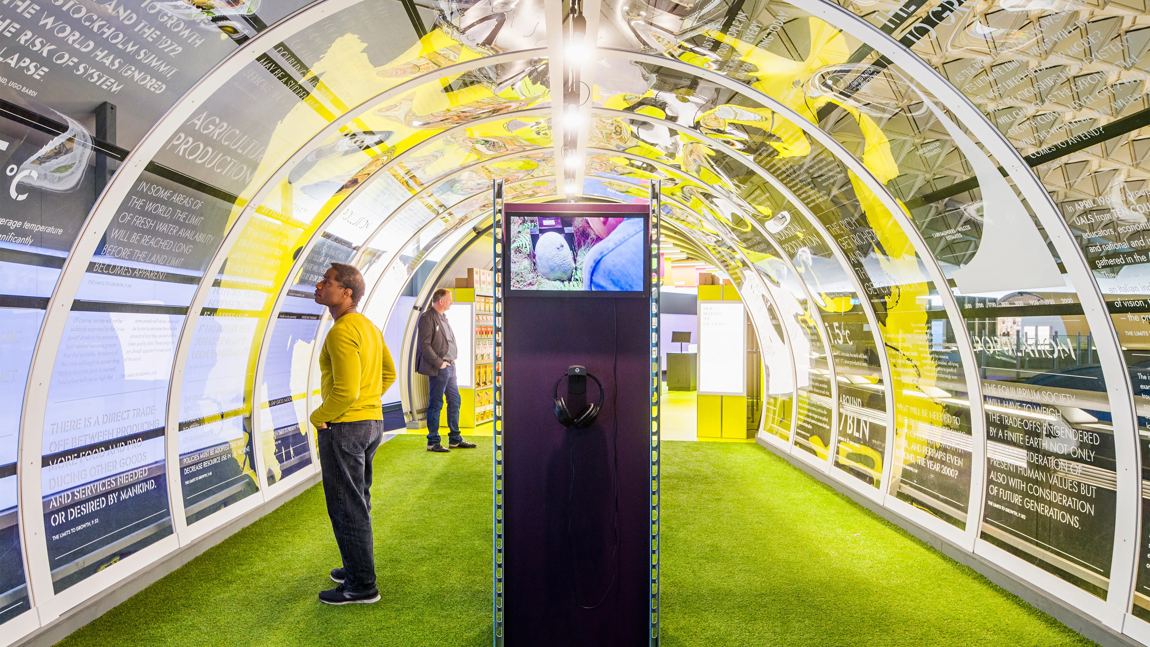
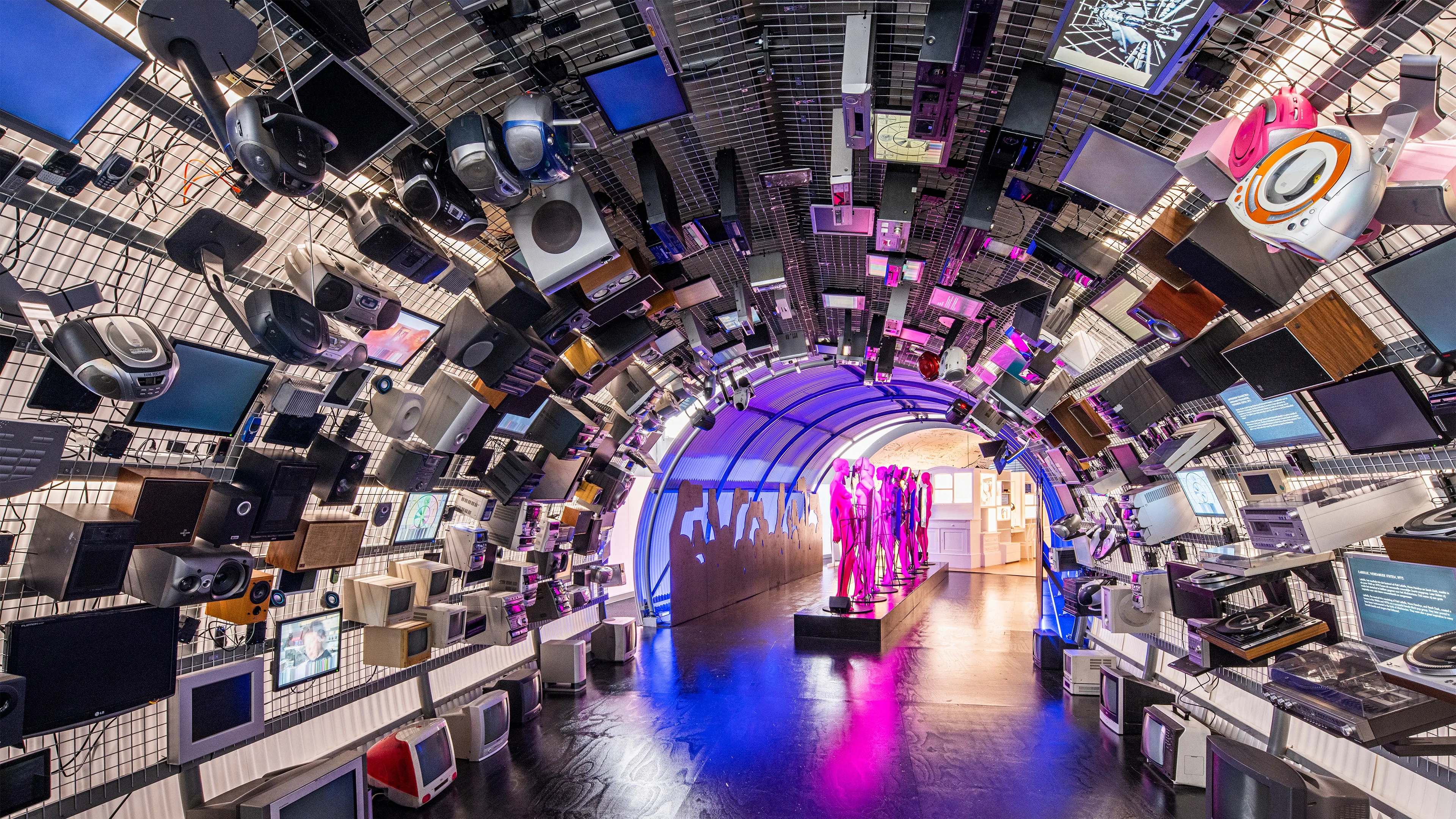
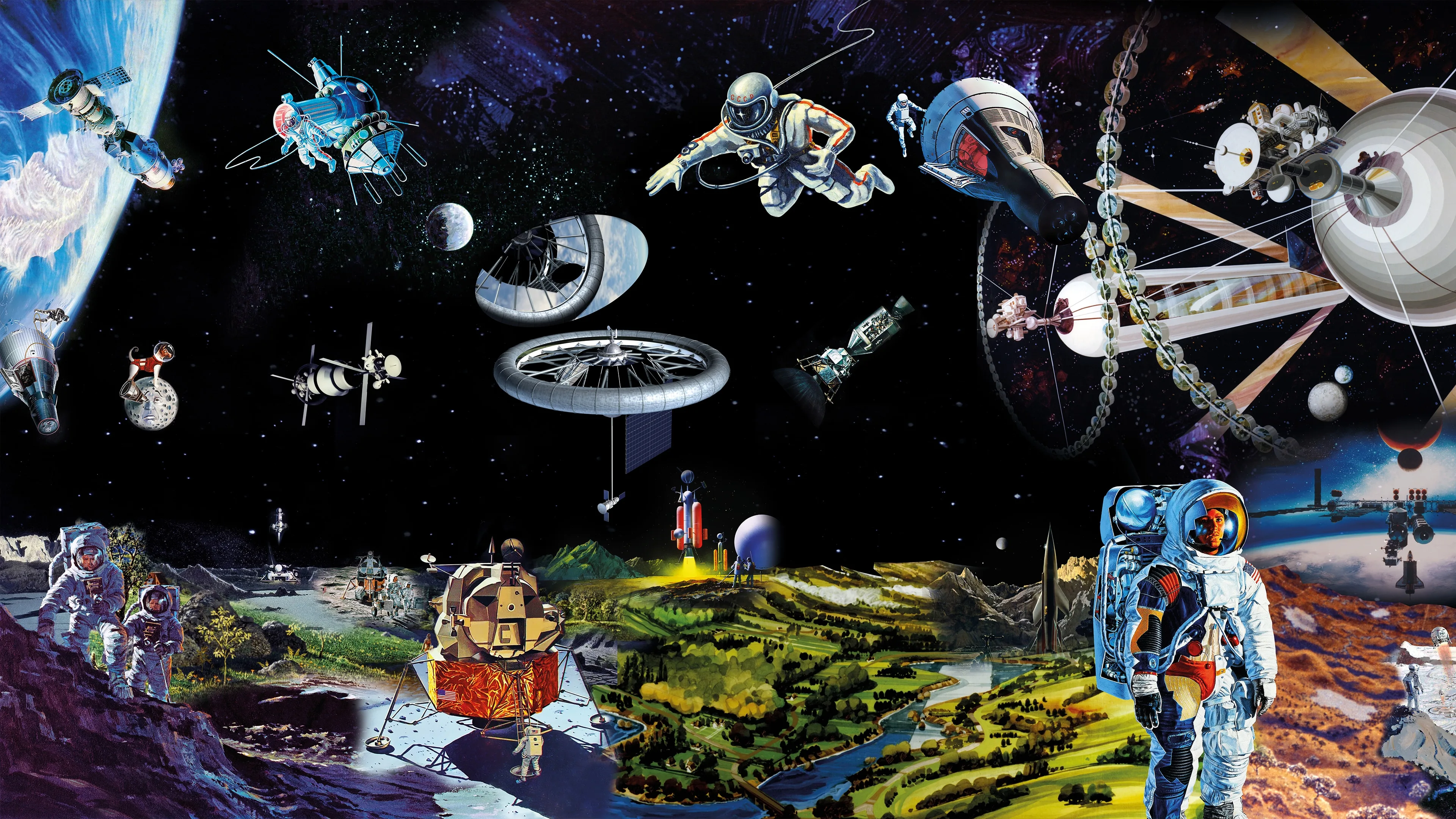
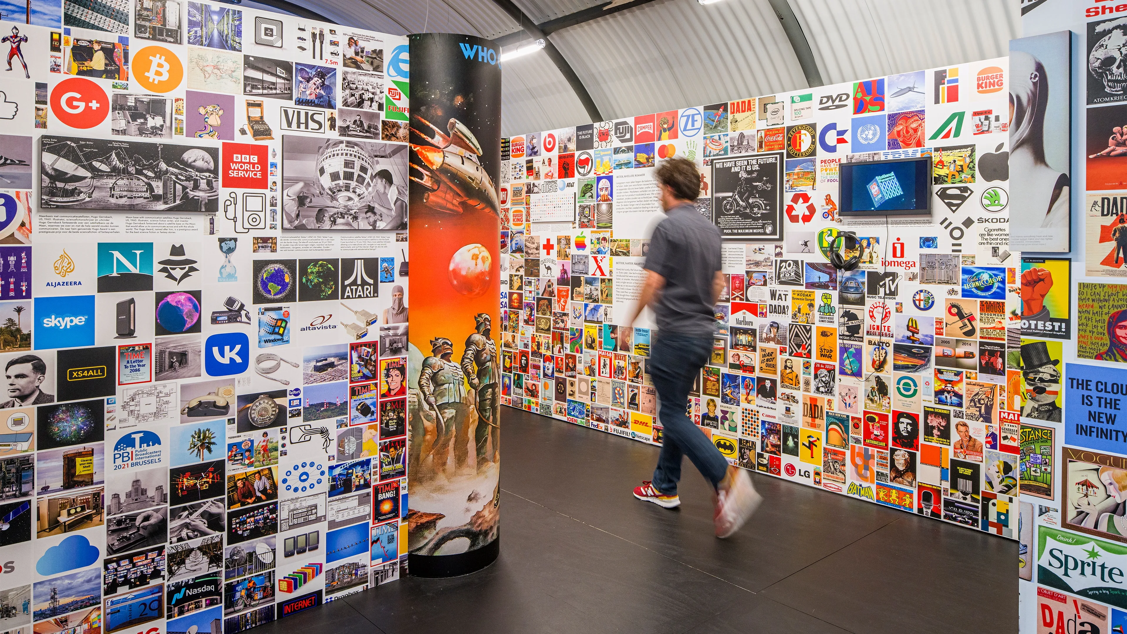
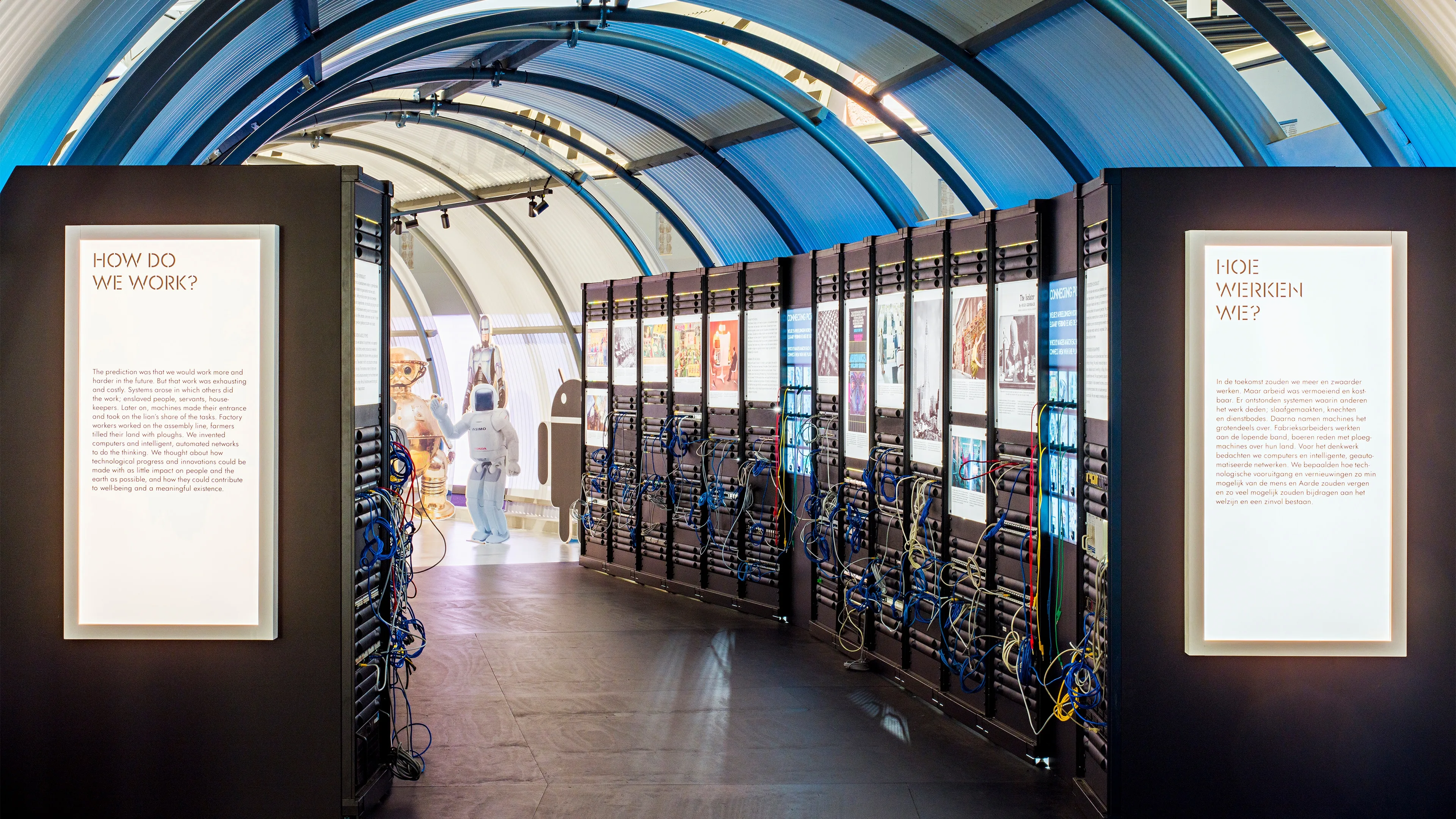
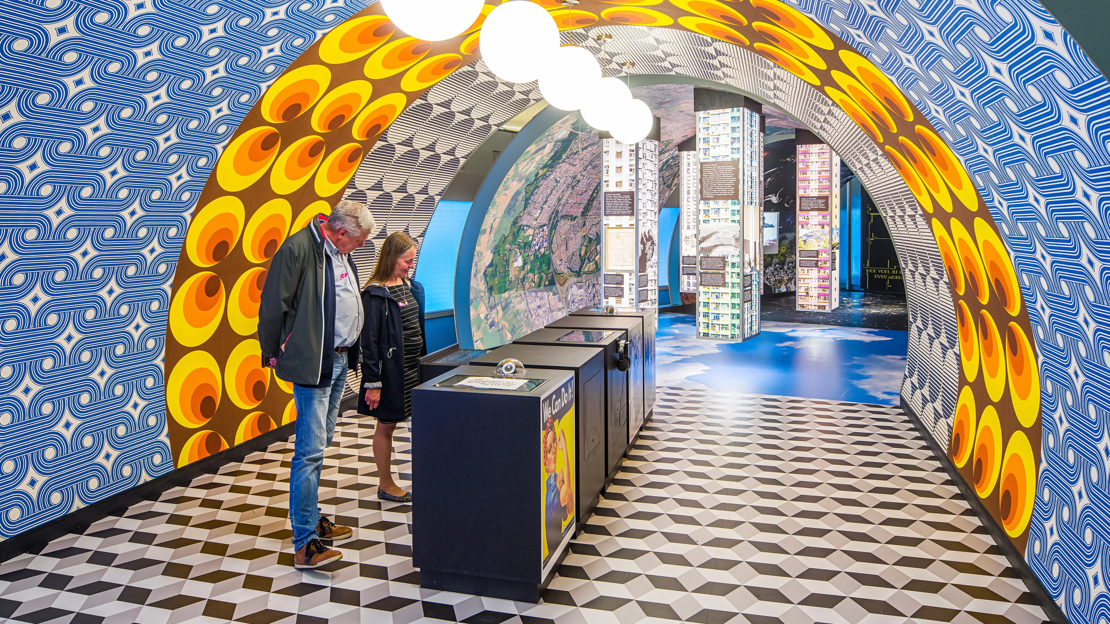
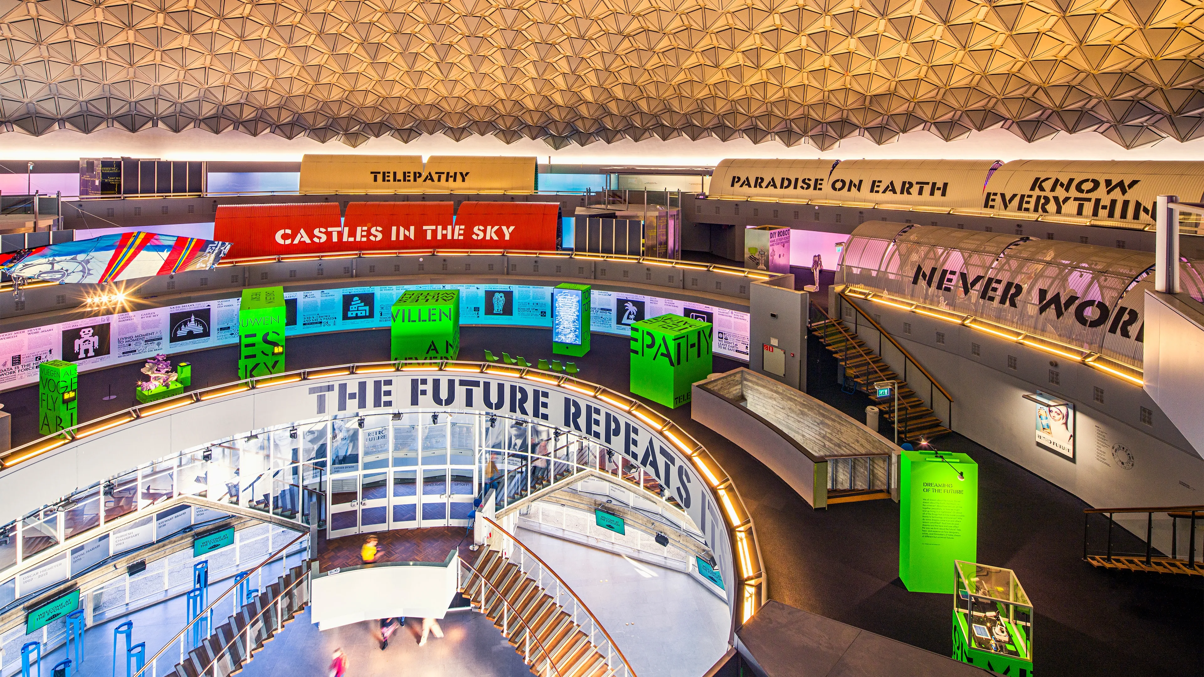
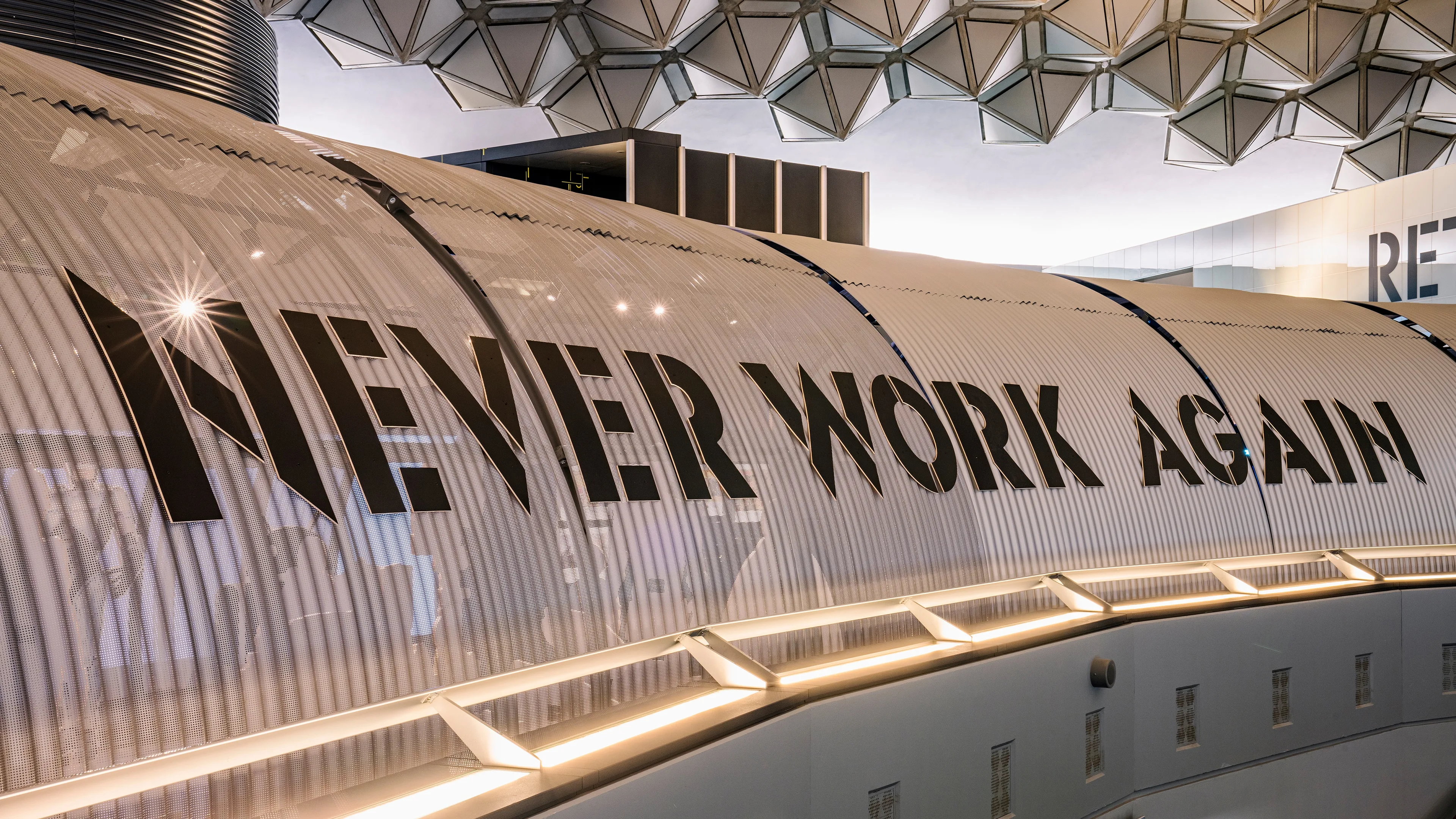
Exhibition design by Niels Schrader (Mind Design), Marco Broeders, Wouter van Dillen and Mieke Gerritzen (Next Nature). Retro Future is an exhibition about the future of the past. Three rings containing an artists exhibition and ten tunnels, asking ten questions about the future. Each tunnel is designed to give an insight to questions such as: ‘How do we work?’, ‘How do we live?’, ‘How do we travel?’, ‘How do we communicate?’. For this exhibition I was part of the graphic design and type design team.
Exhibition photos by Roel Backaert


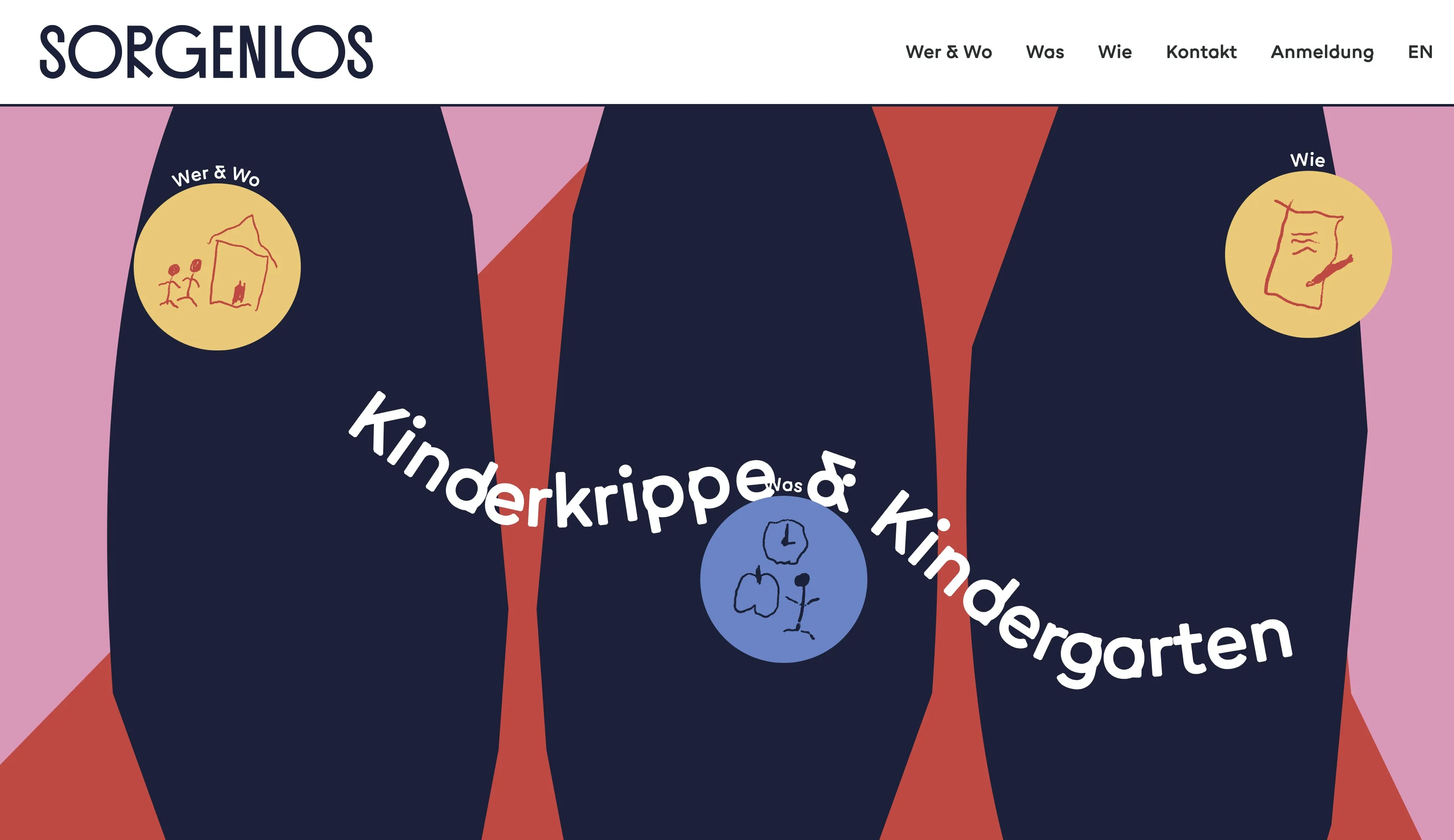
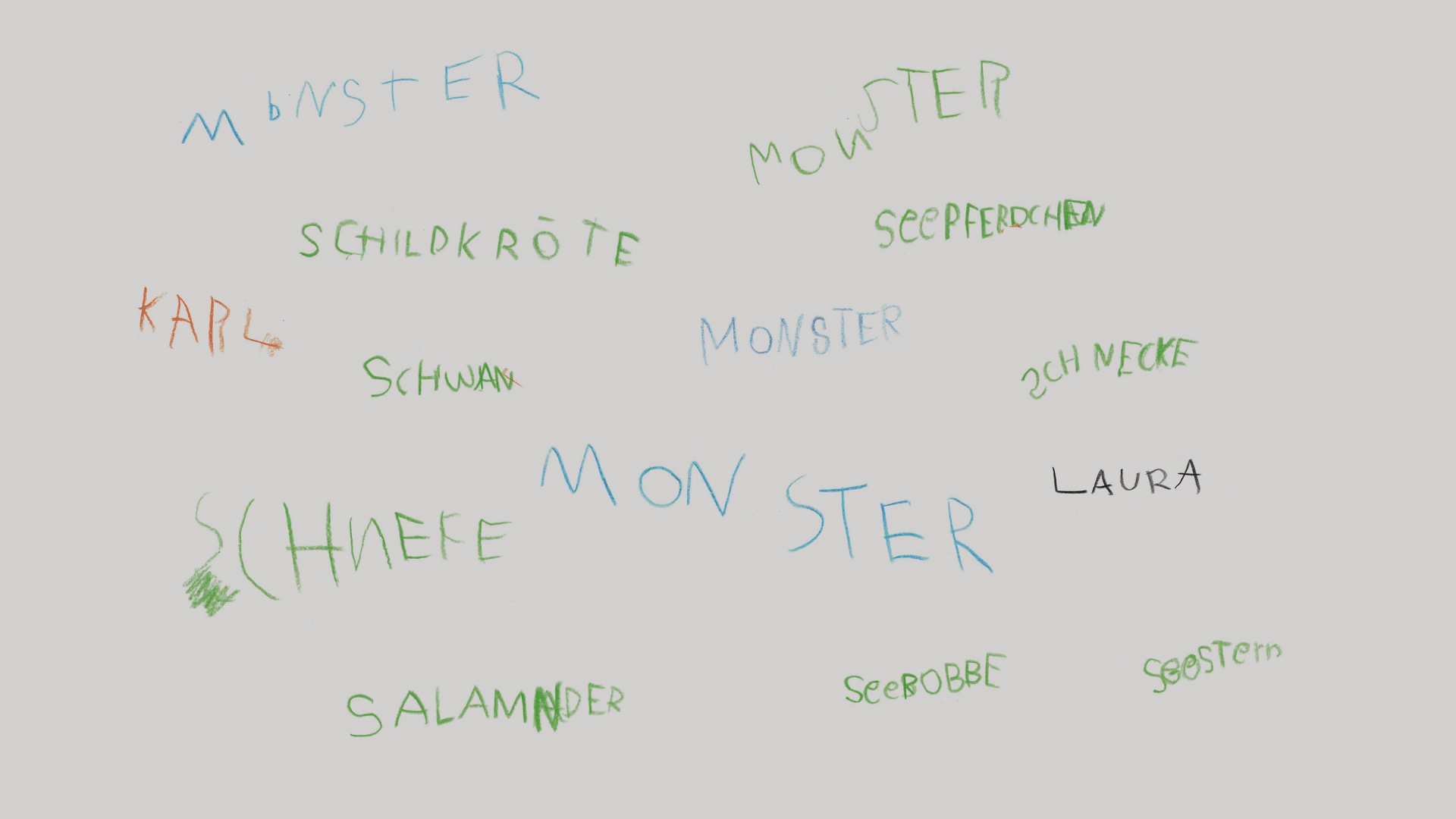
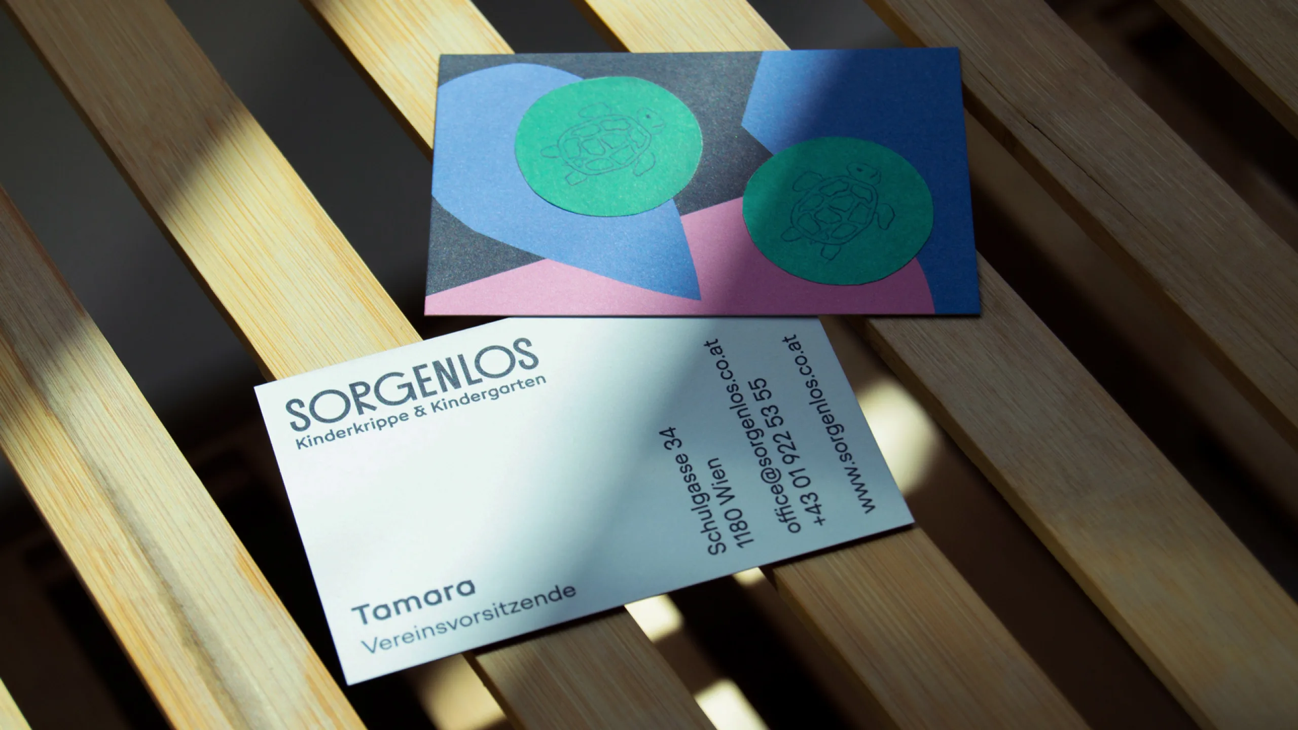
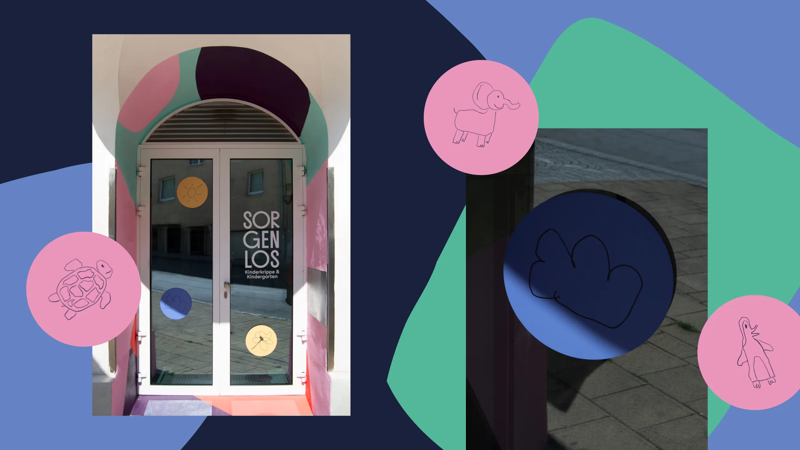
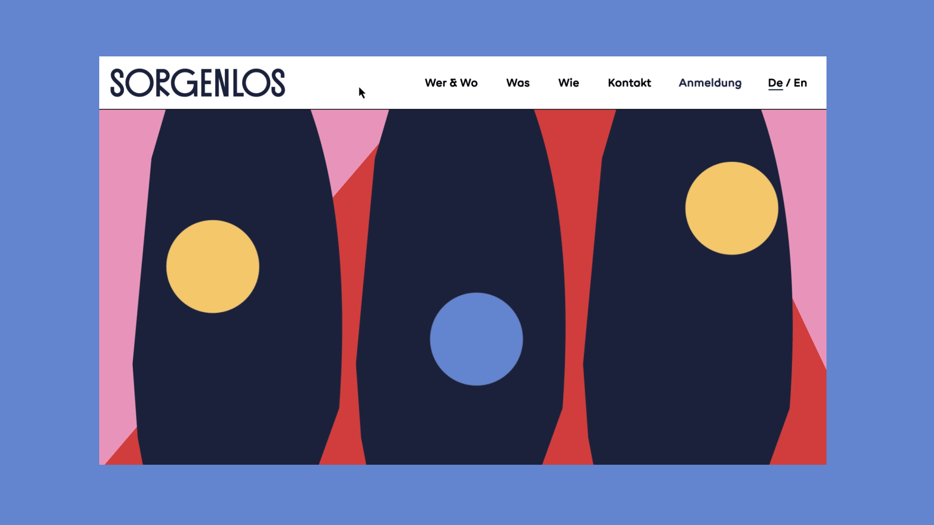
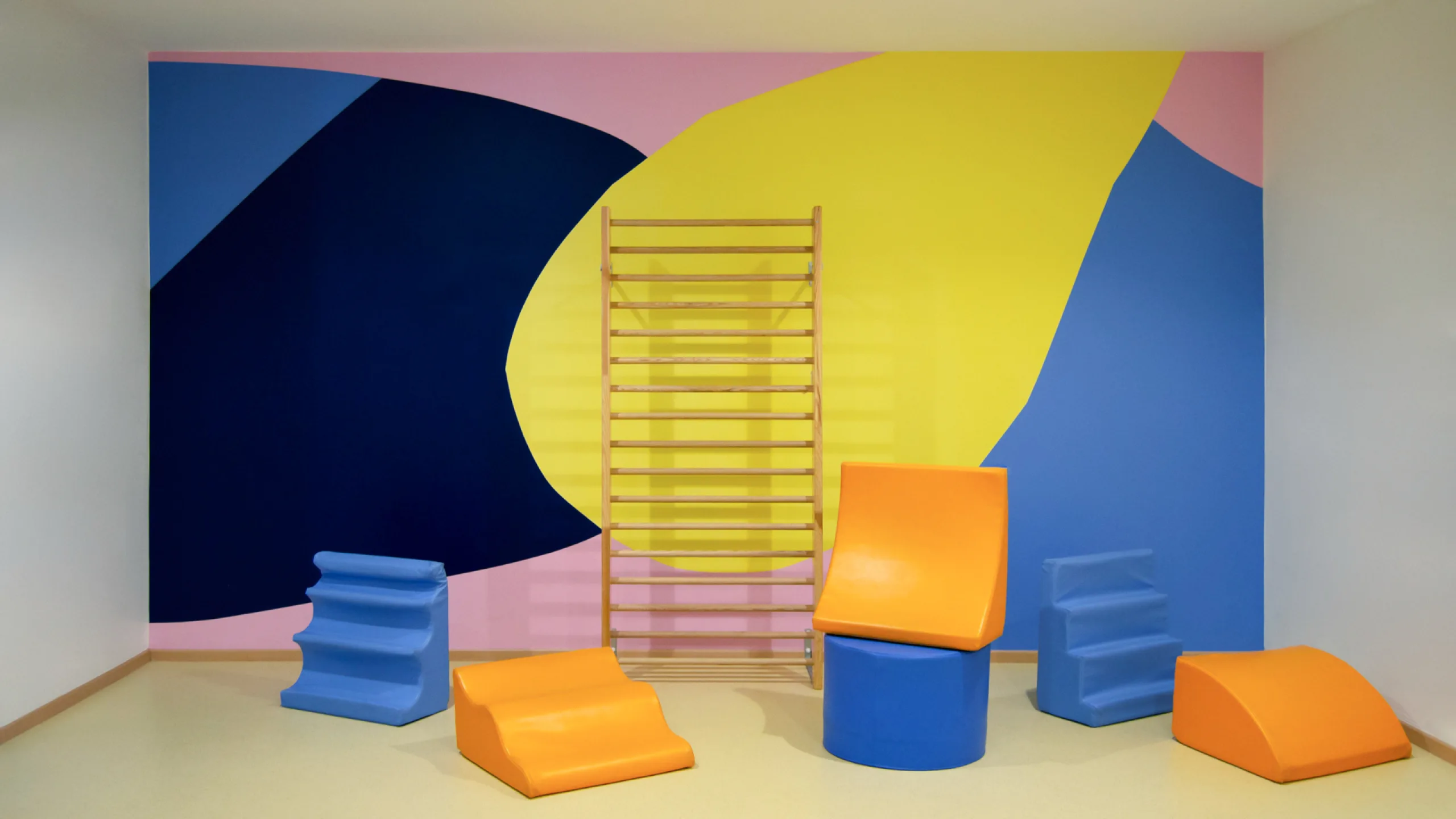
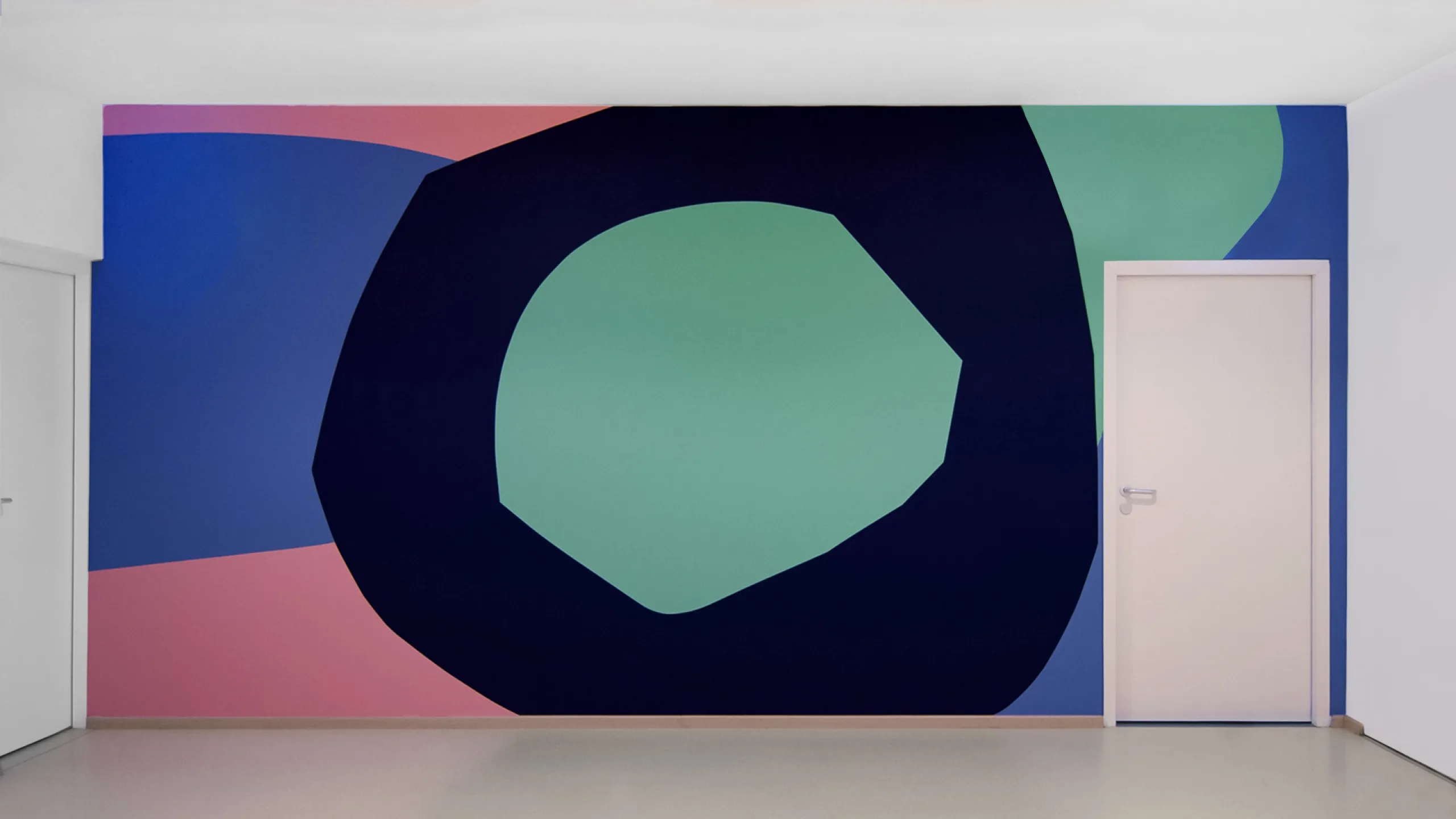
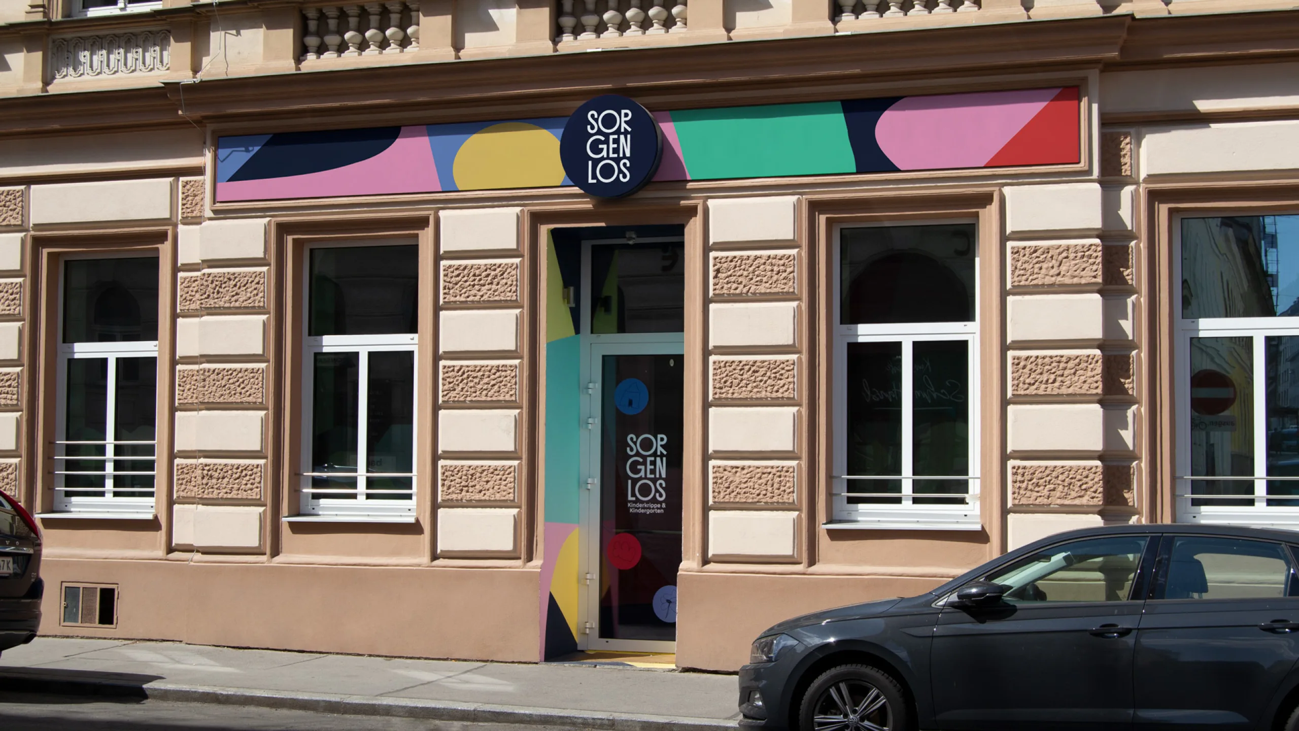
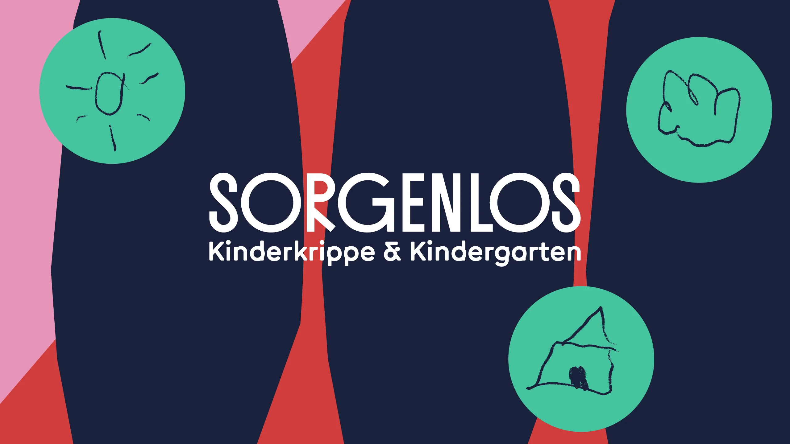
Sorgenlos
Lukas Ullsperger & Evelyn Leiter at RAAR
Brand identity for the kindergarten Sorgenlos in Vienna. The contrast between the world of kids and the world of parents set the main pilars for the design system of Sorgenlos: Playfulness & Informative. It’s the kids set the tone of the kindergarten so we implemented that same principle in the design for the logotype and brand elements.
www.sorgenlos.co.at


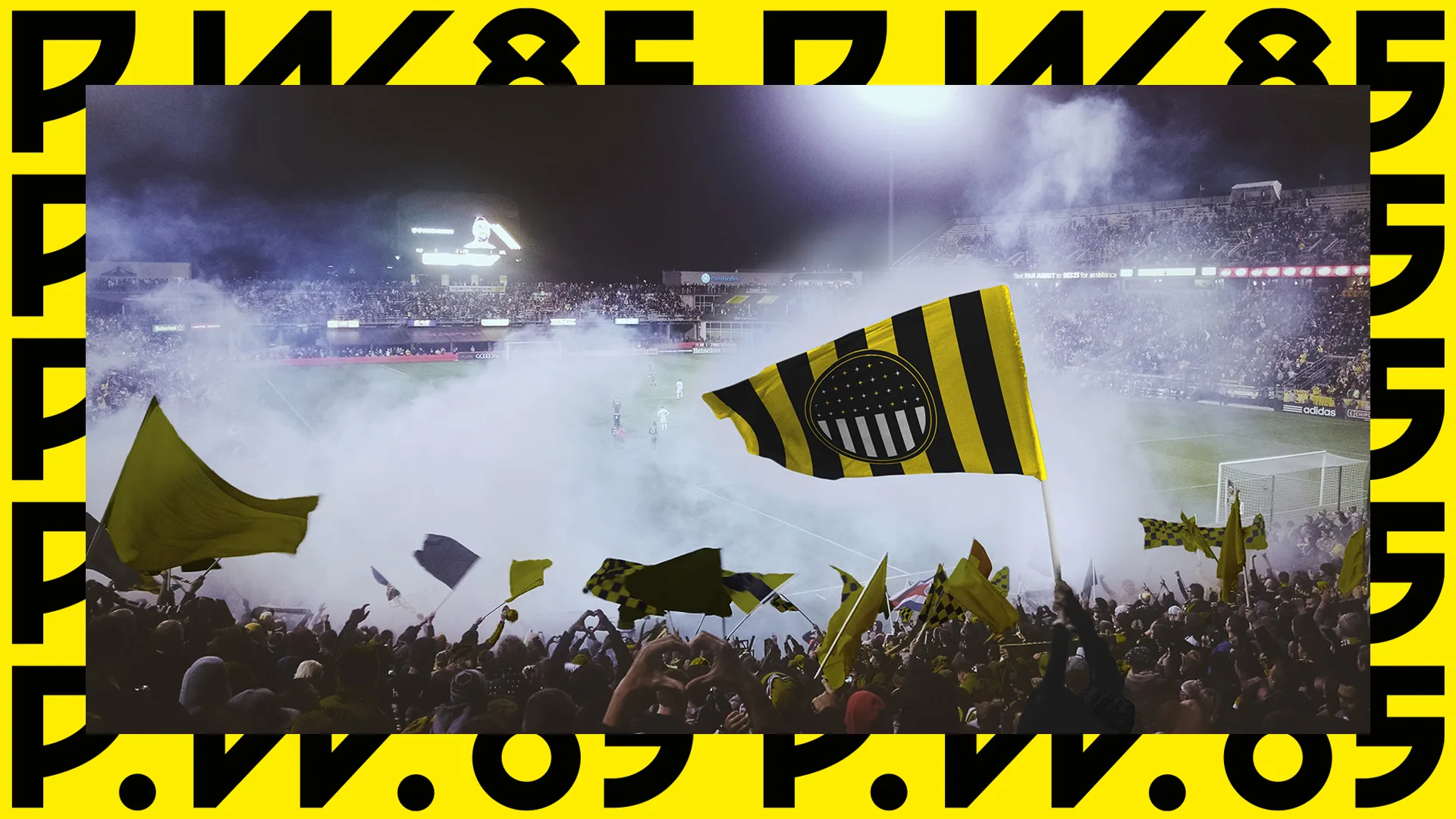
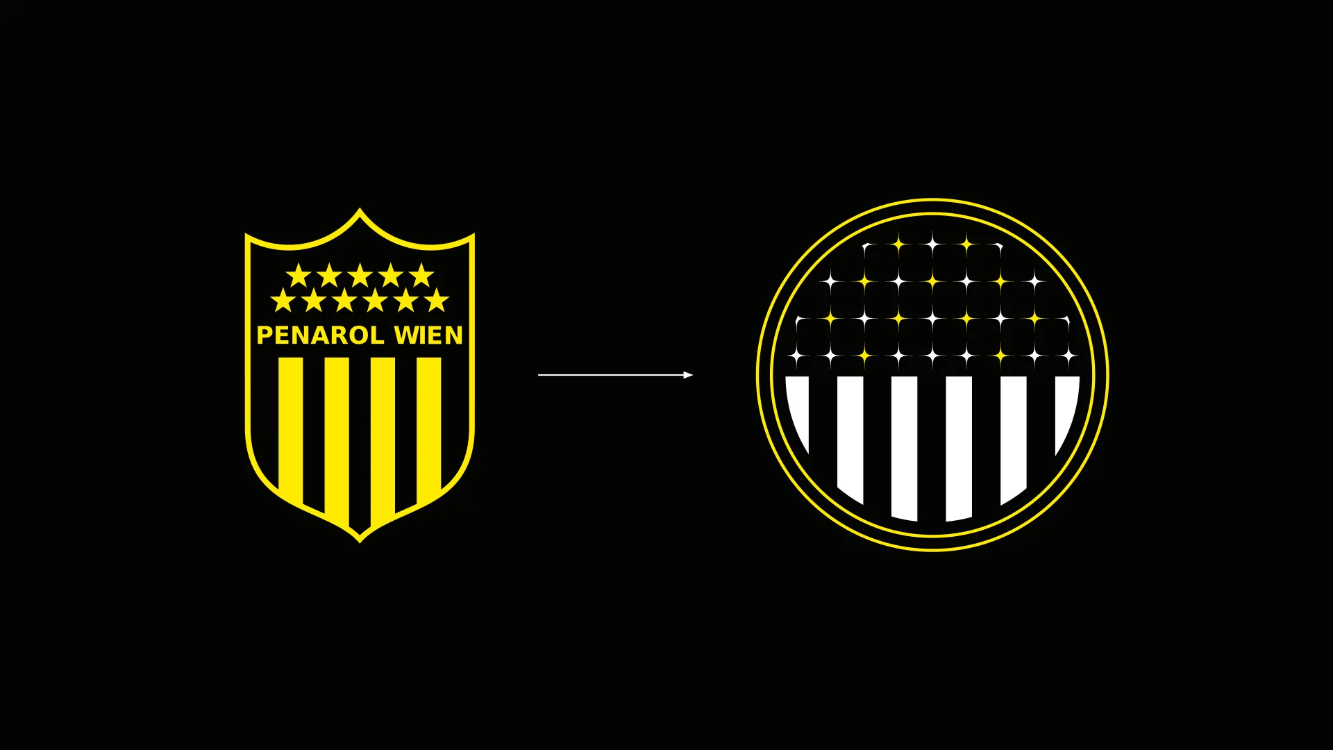
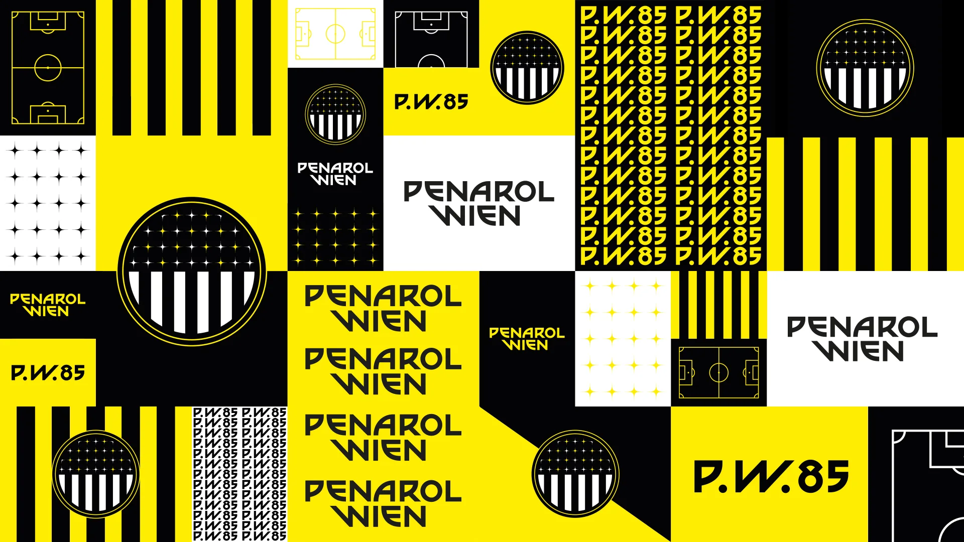
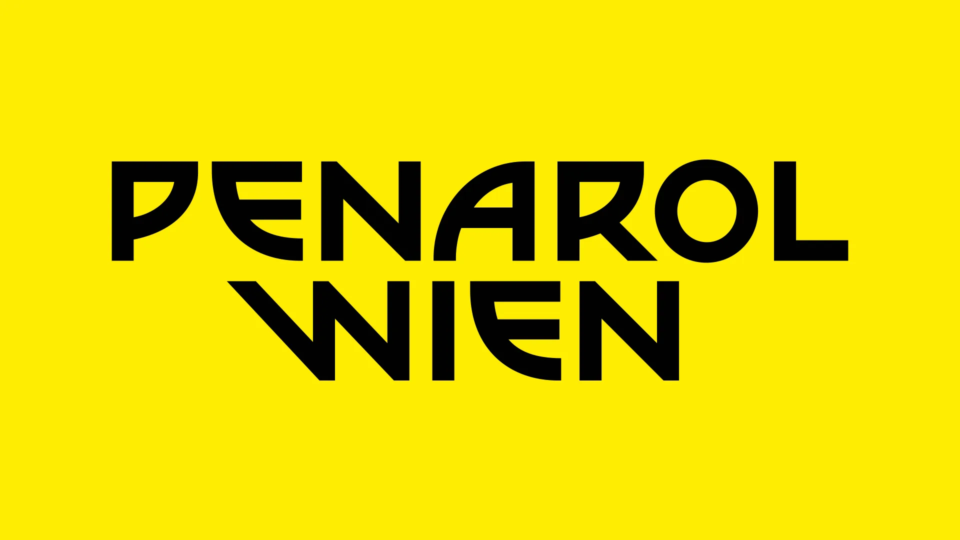
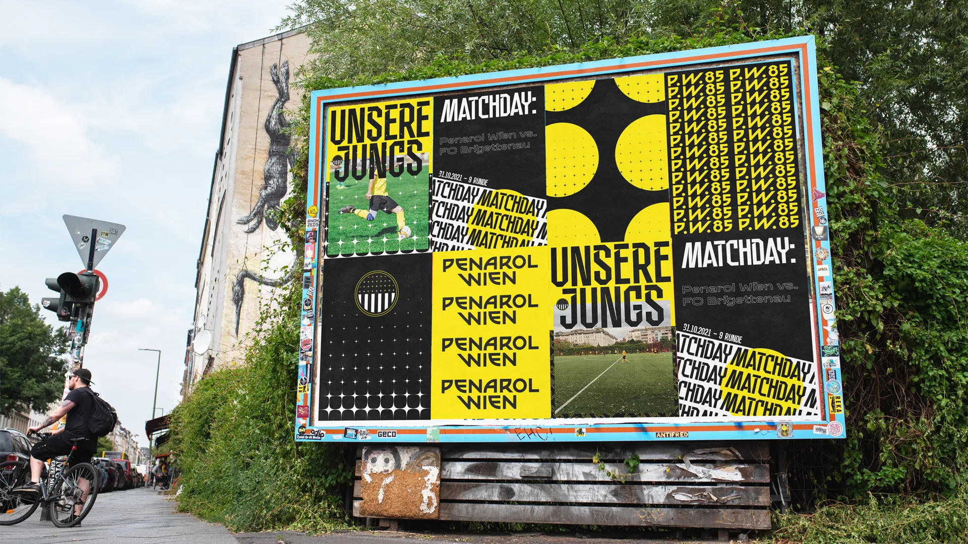
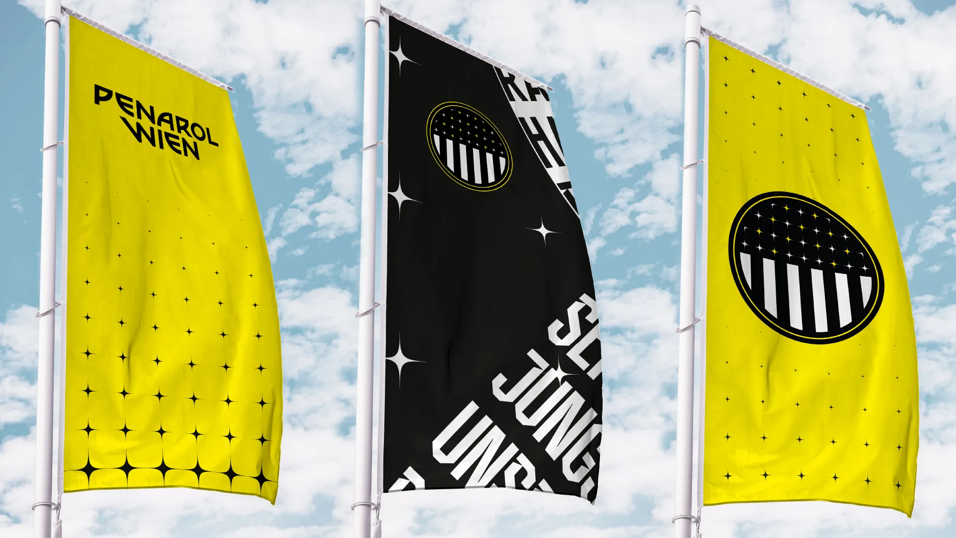
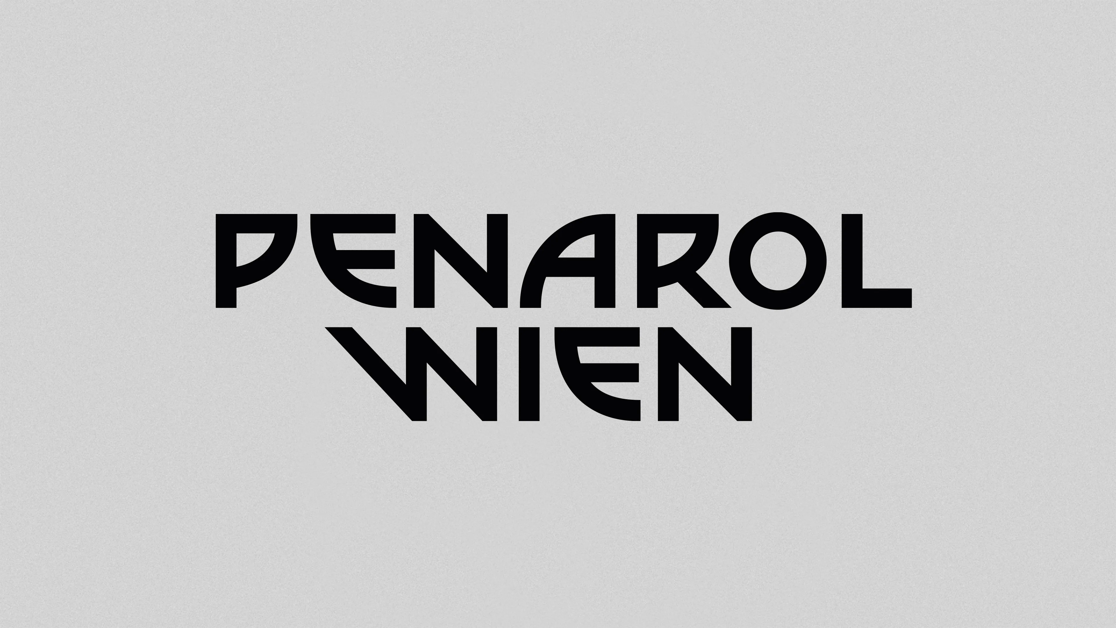
Penarol Wien
Lukas Ullsperger at RAAR
New identity for the Viennese football club Penarol Wien. A football club that is more than just football, it’s a community, it’s family. Blood, sweat & beers!

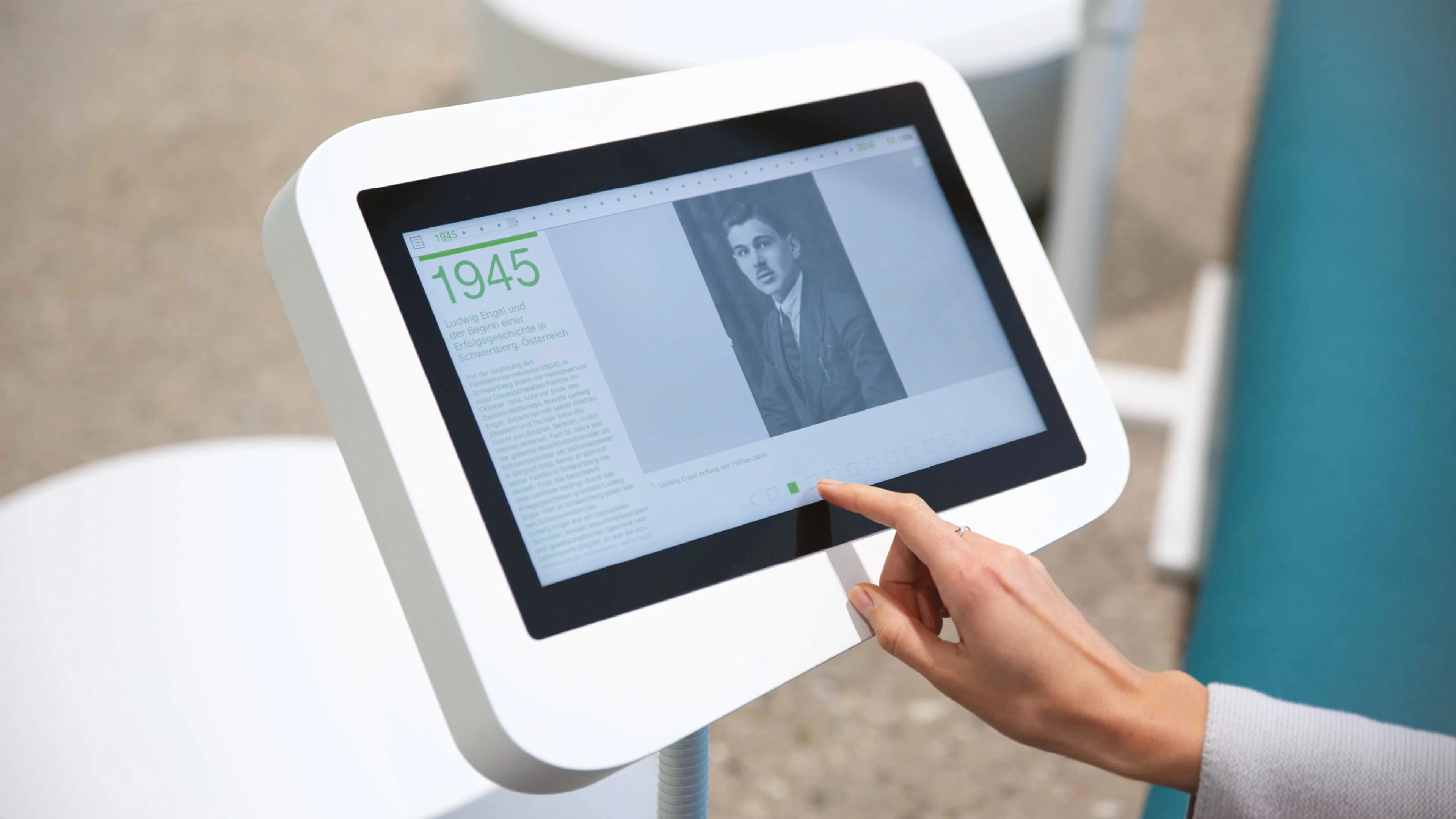
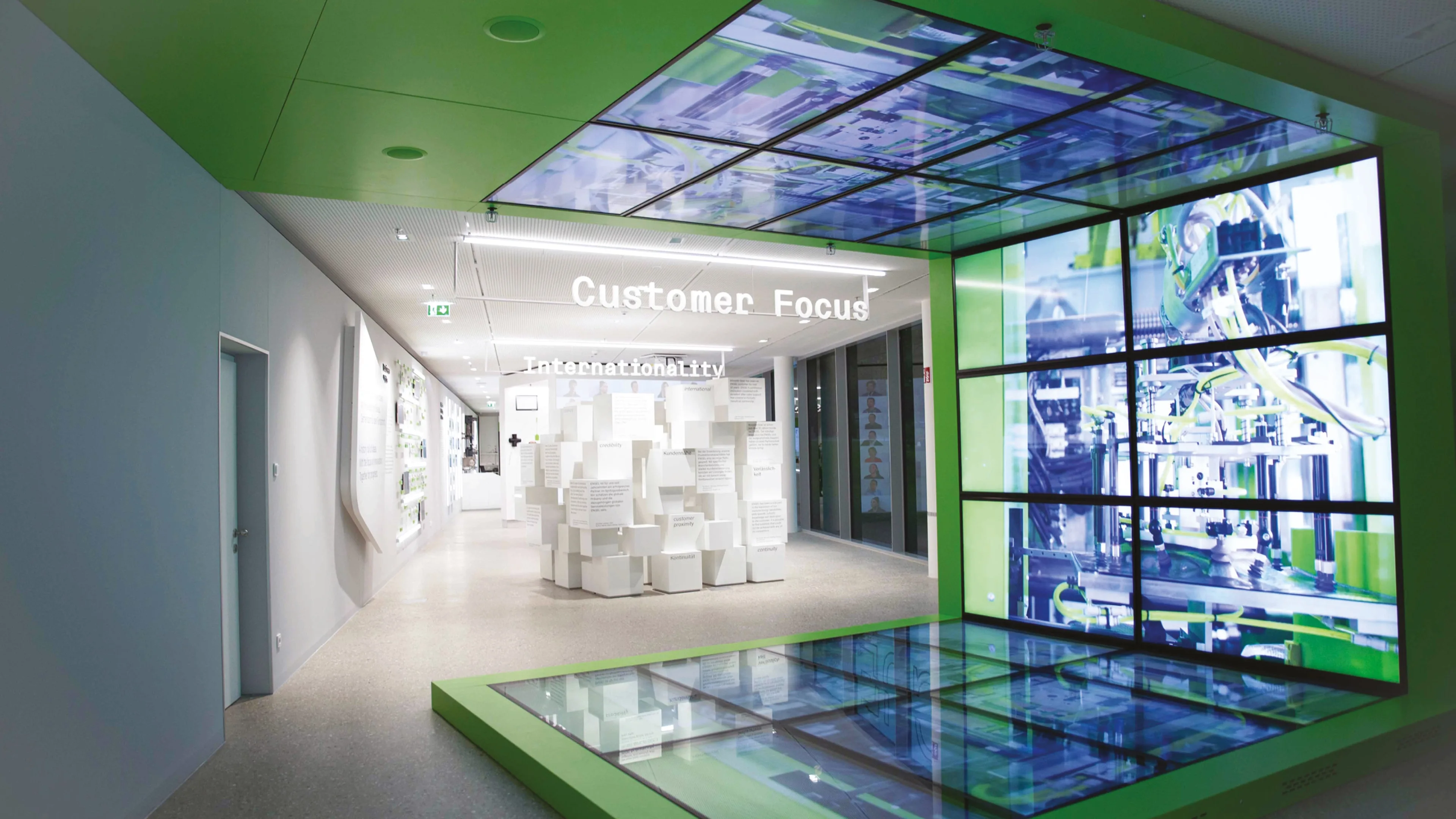
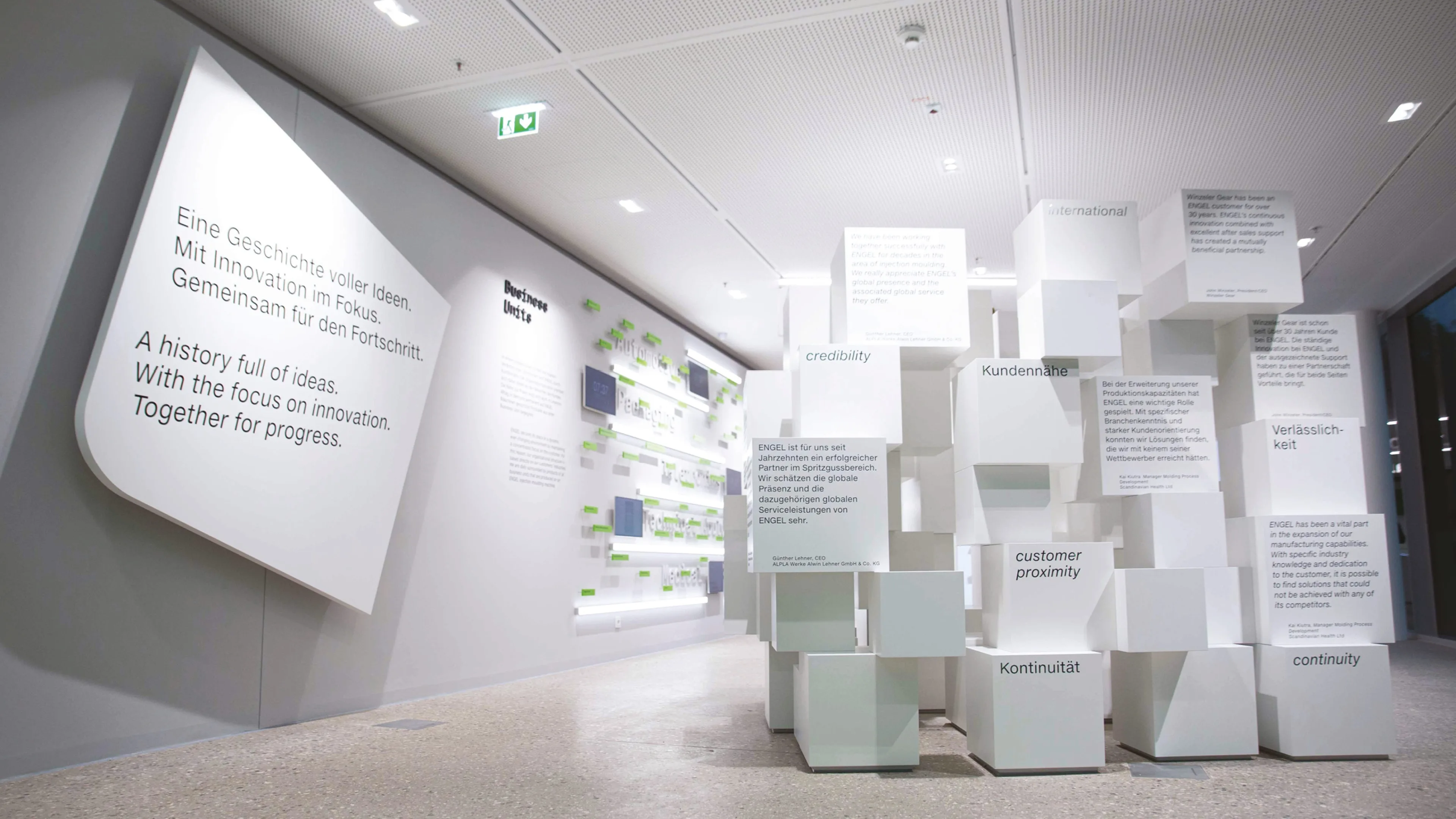
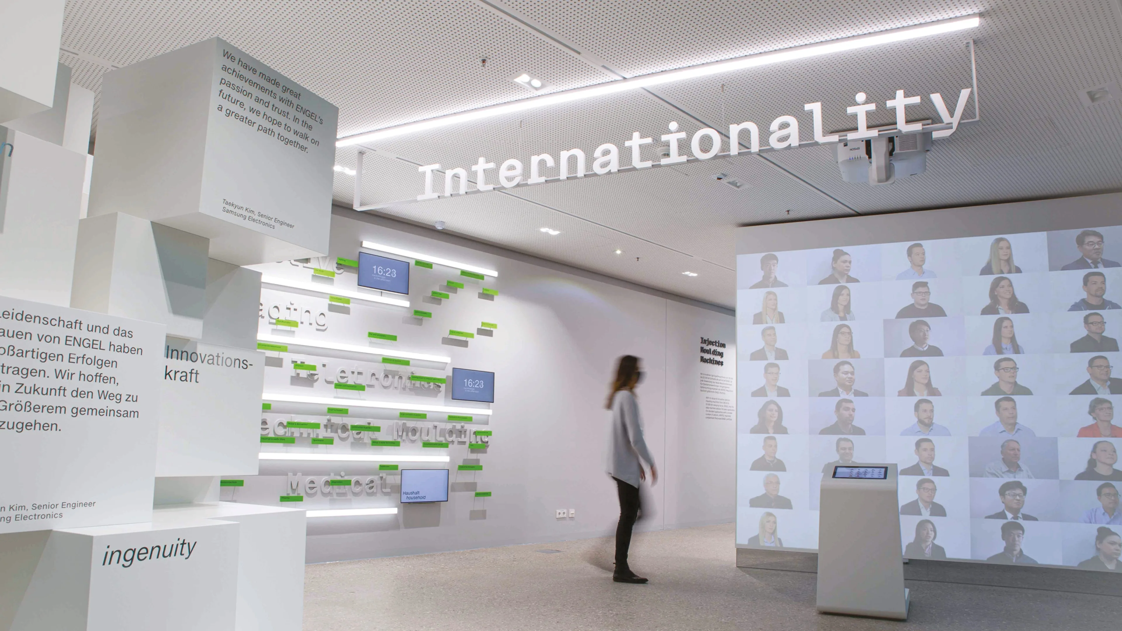
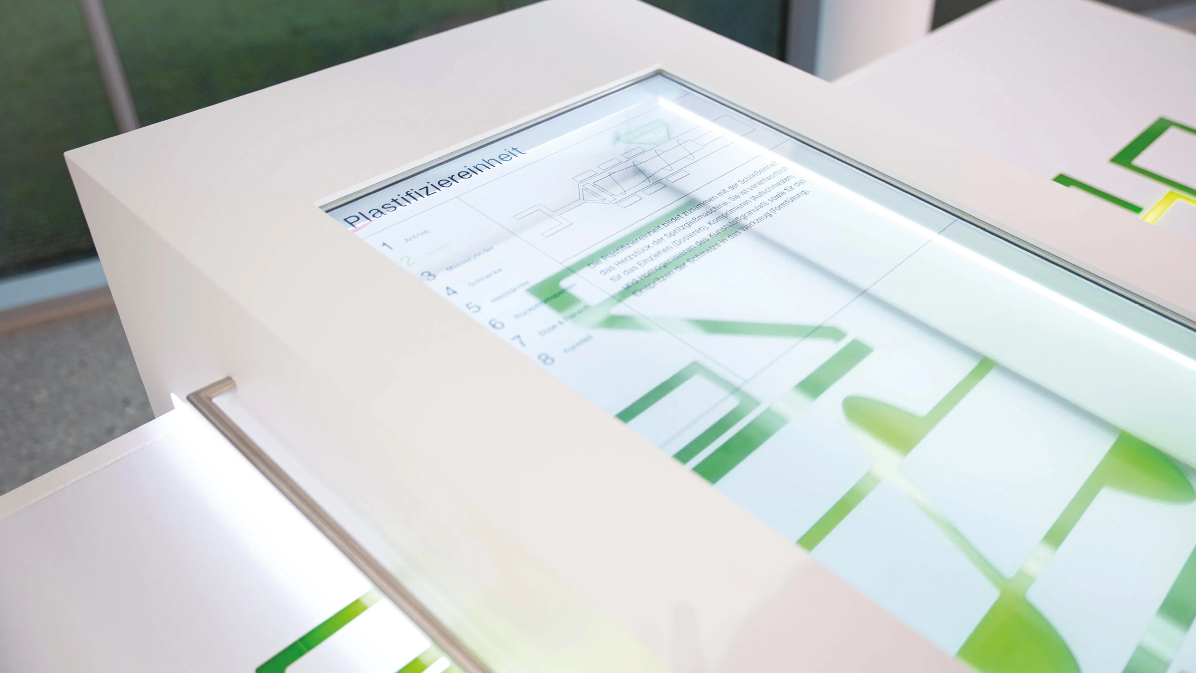
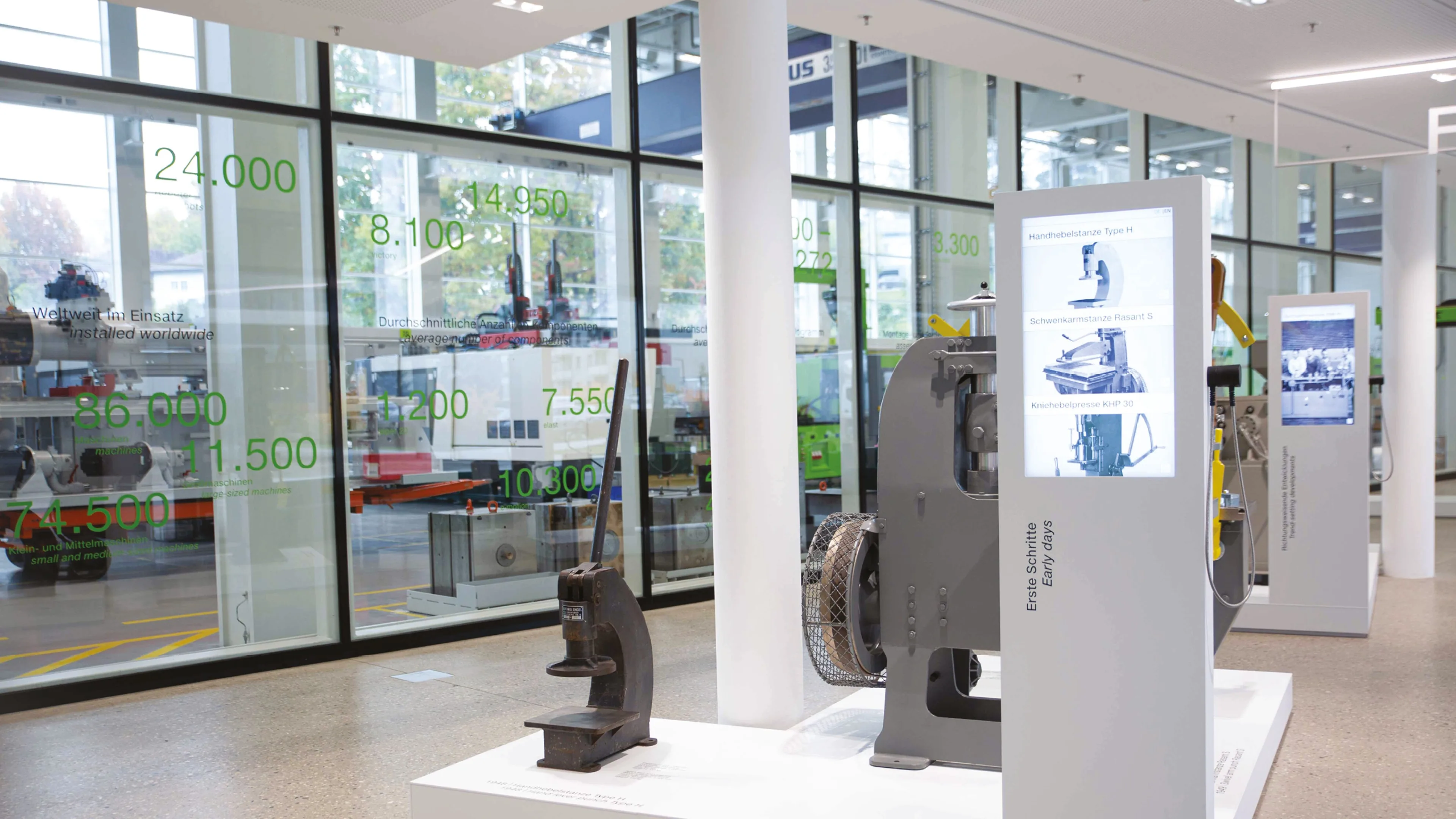
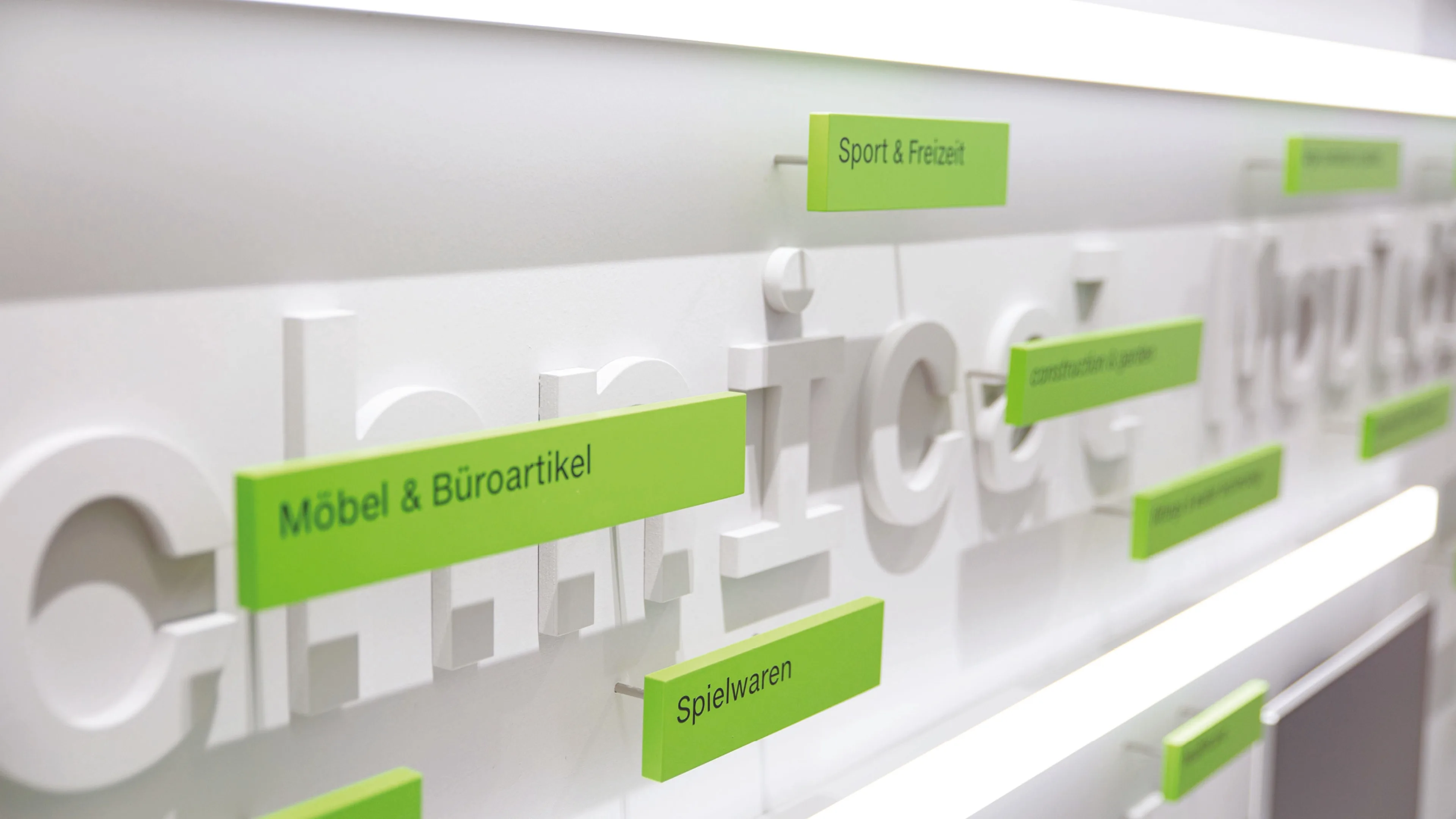
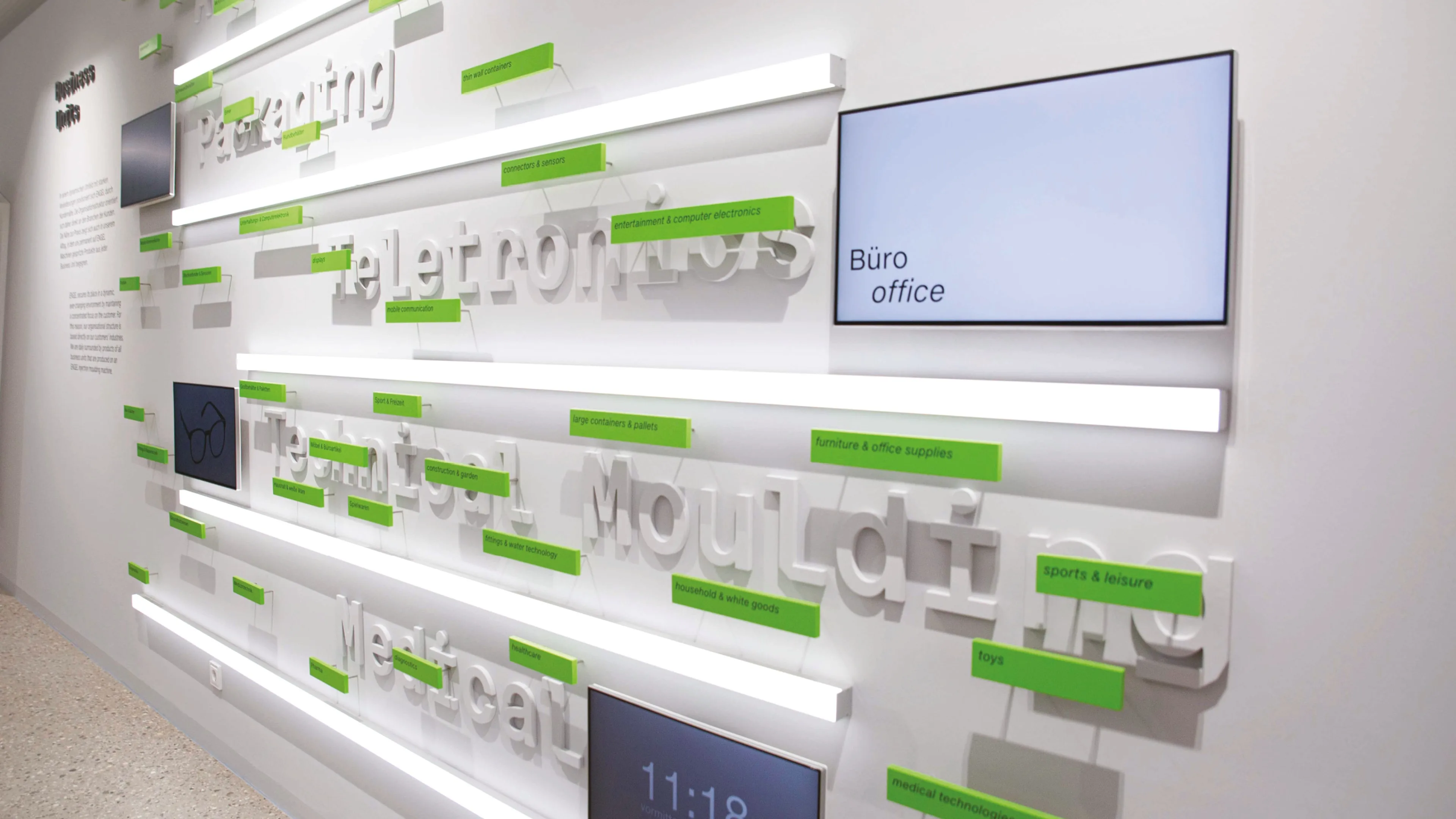
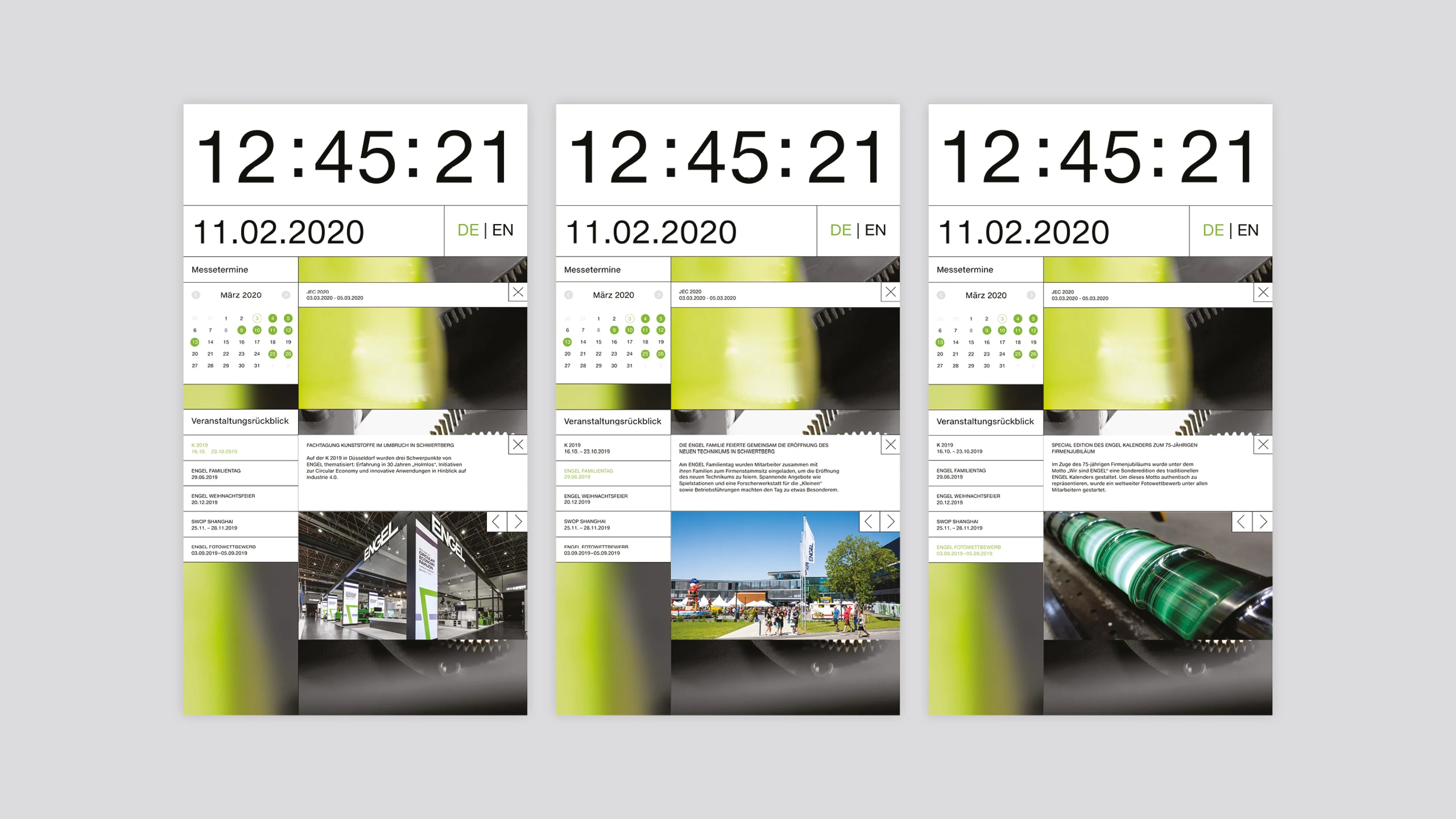
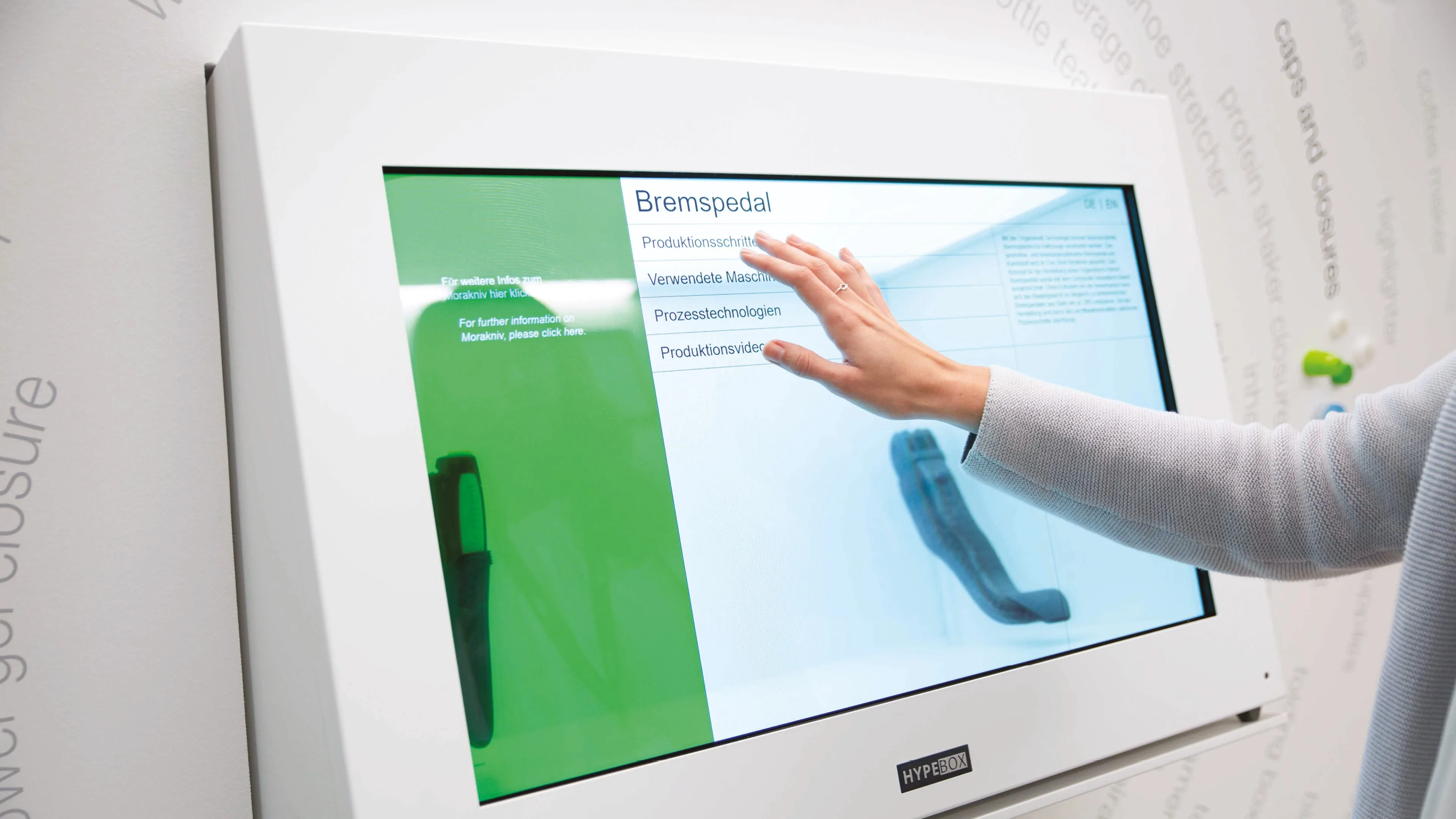
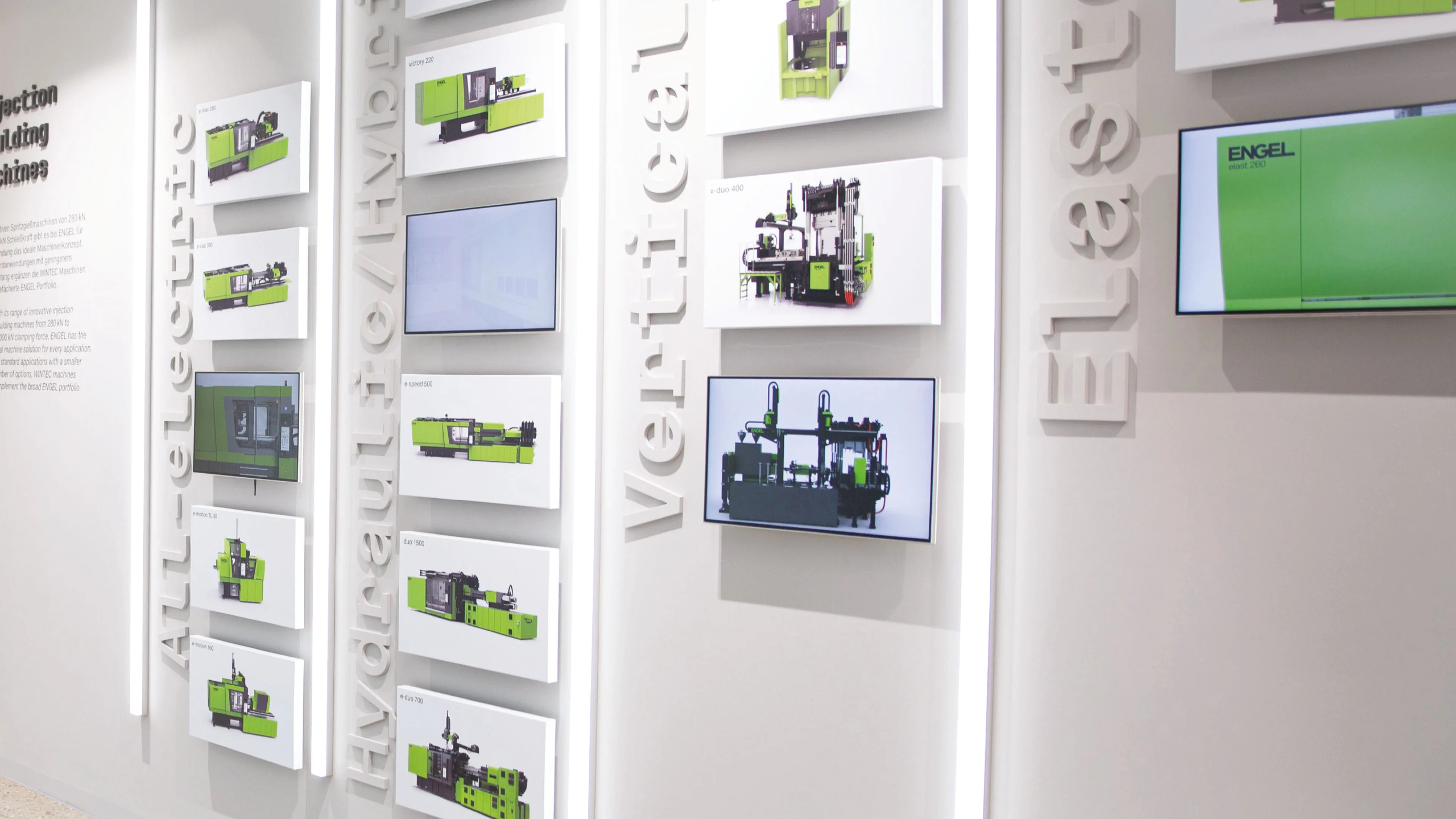
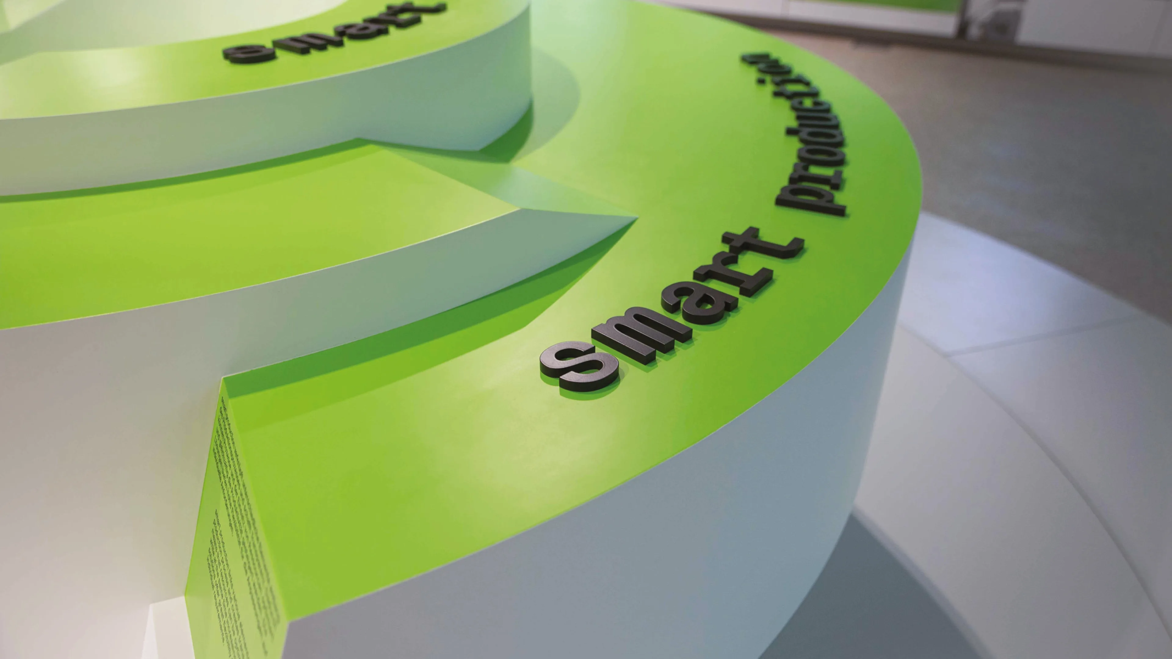
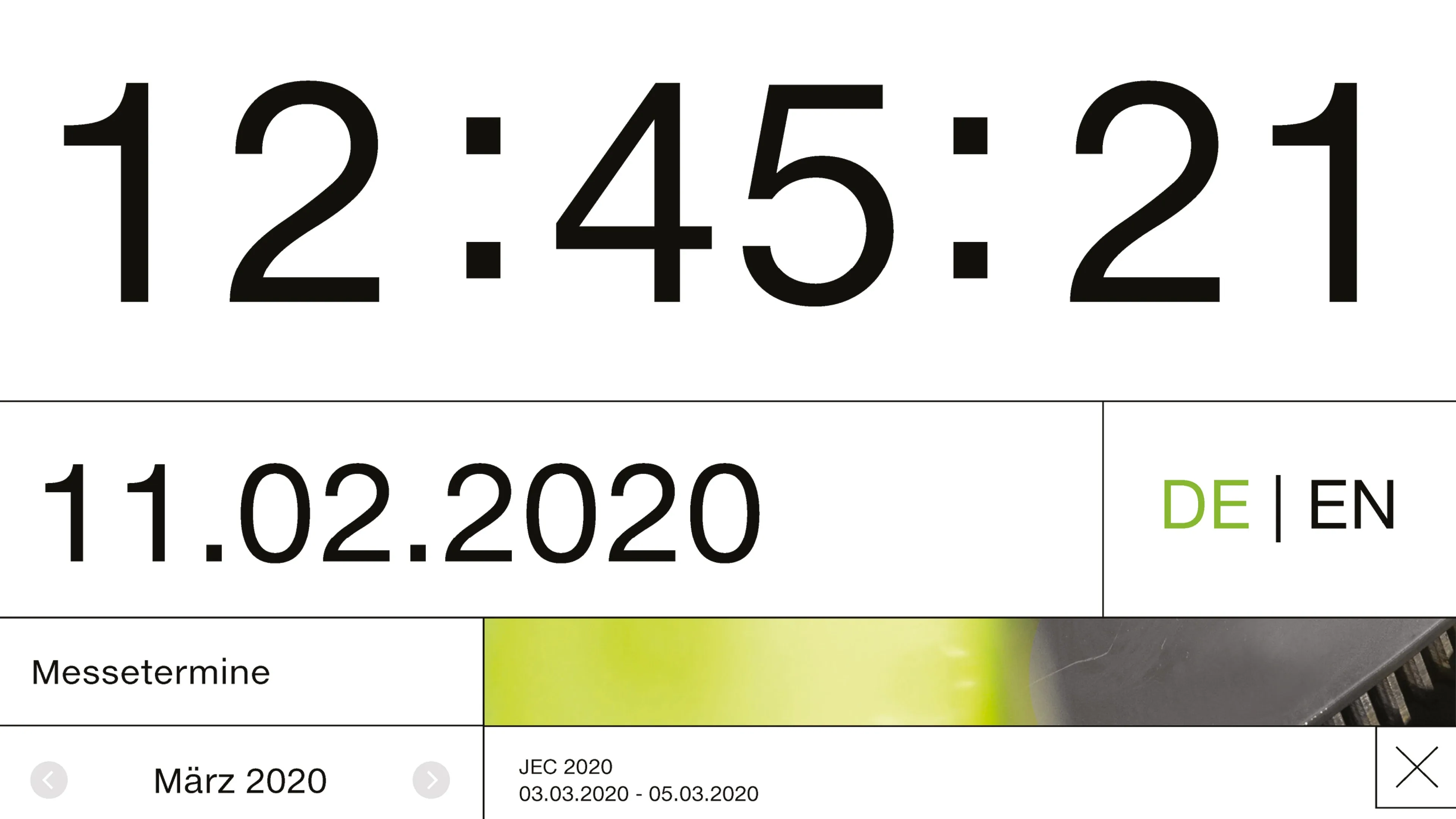
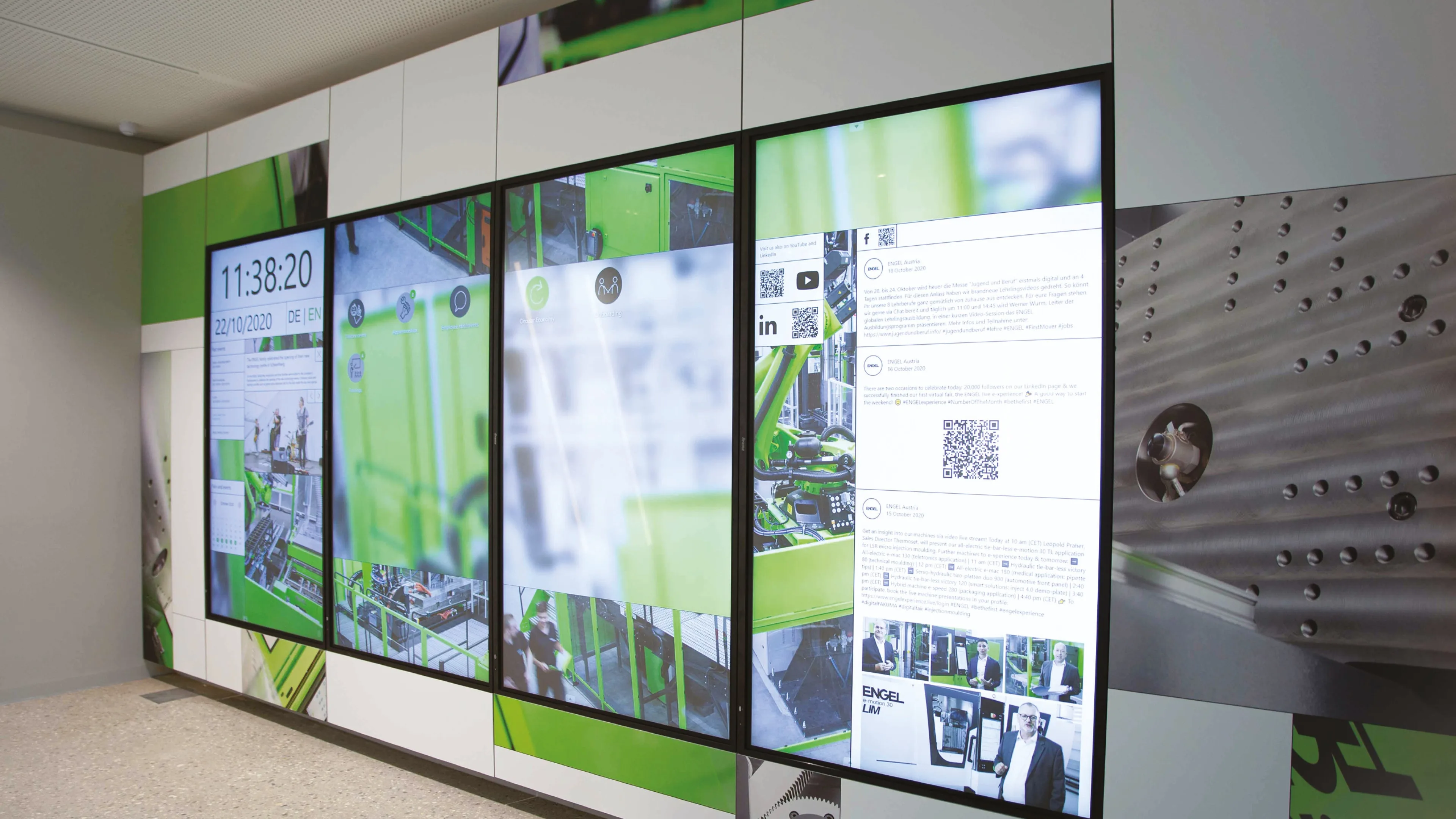
ENGEL Dialogue
The exhibition ENGEL Dialogue (at the ENGEL Headquarters in Schwertberg, Austria) was architecturally designed as an open and transparent machine unit with an exciting sequence of different thematic islands explaining the companies philosophy and achievements. The company Responsive Spaces accompanied the realisation of all multimedia exhibits whose technological spectrum ranges from transparent and movable displays to head-mounted augmented reality.
Exhibition photos by Nofrontiere


↕
A
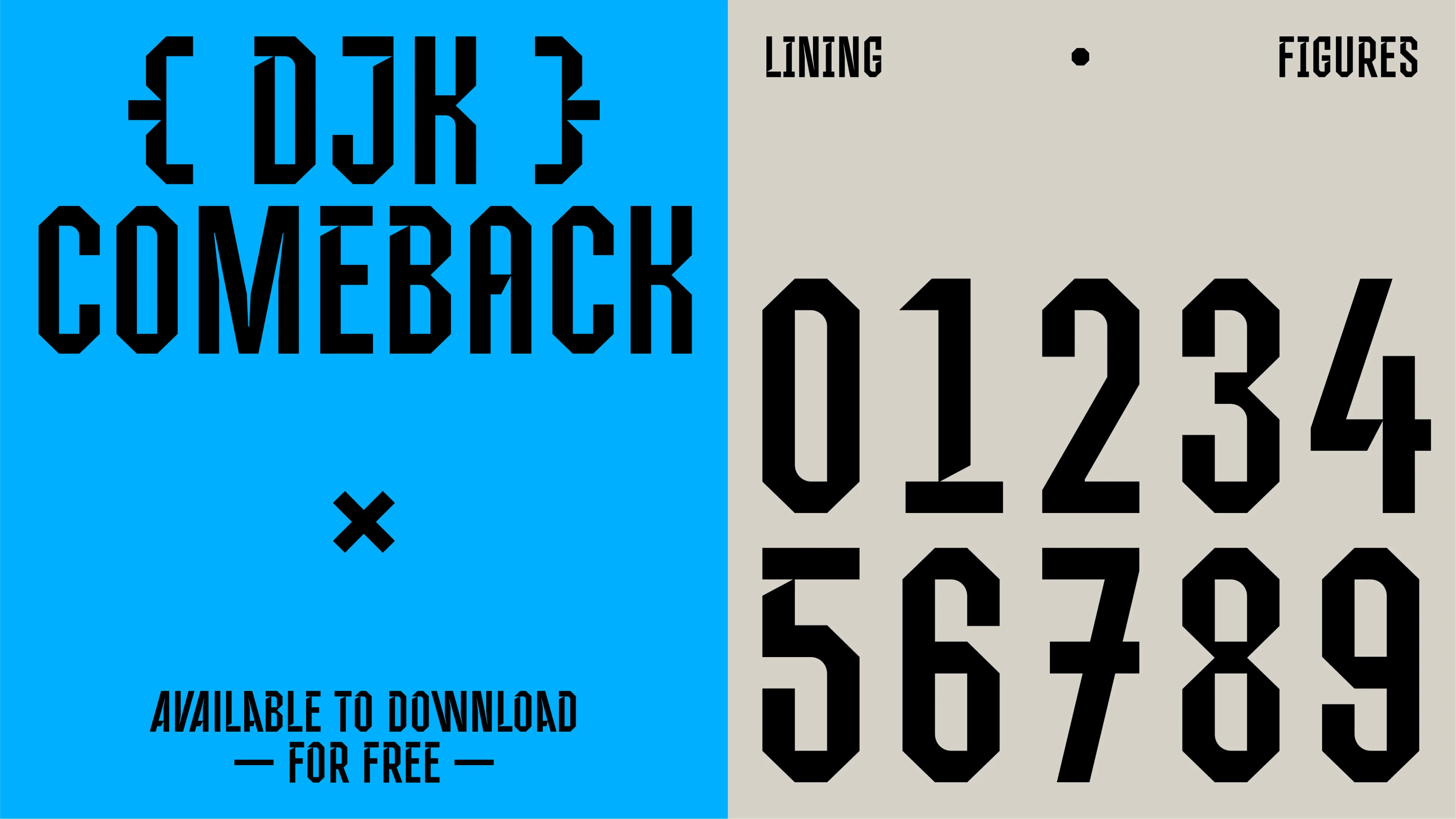
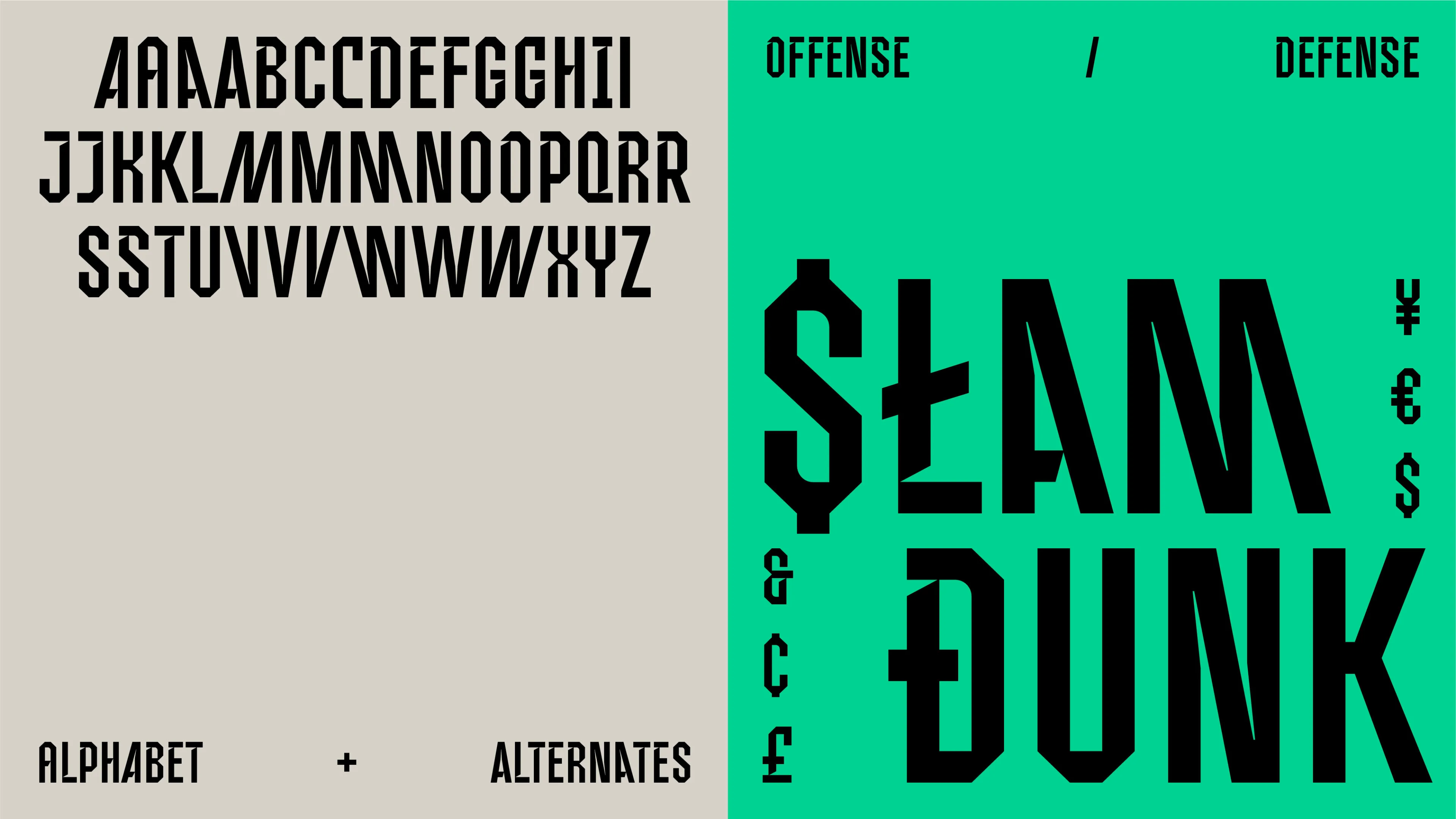
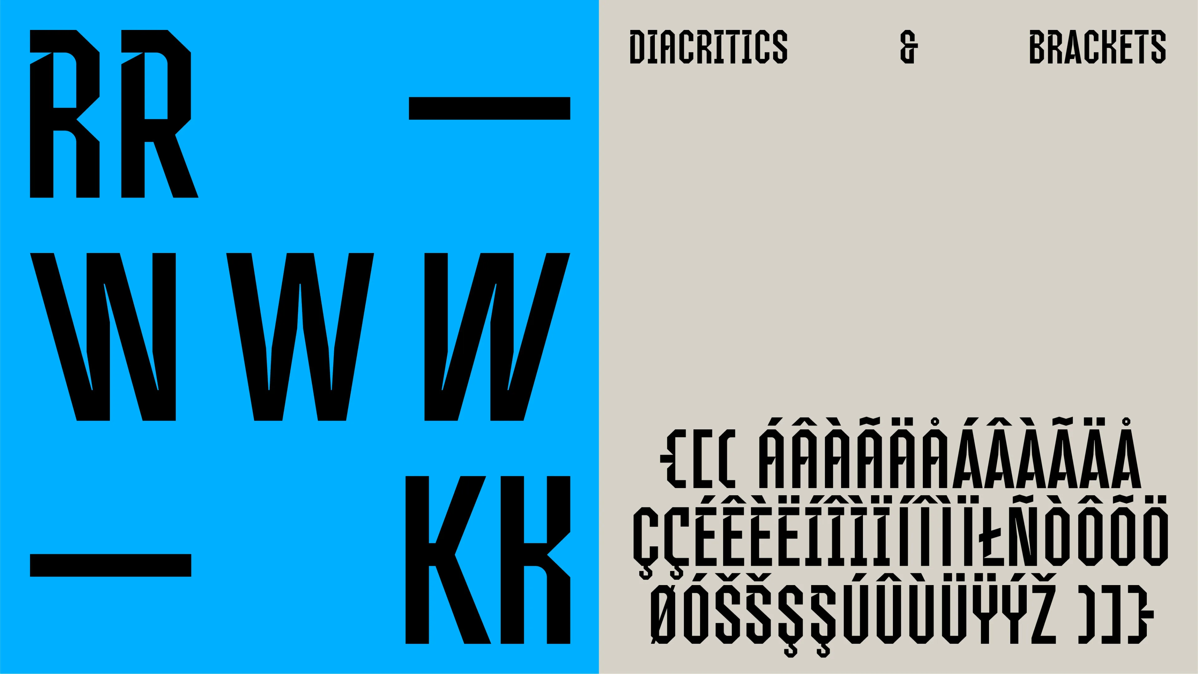
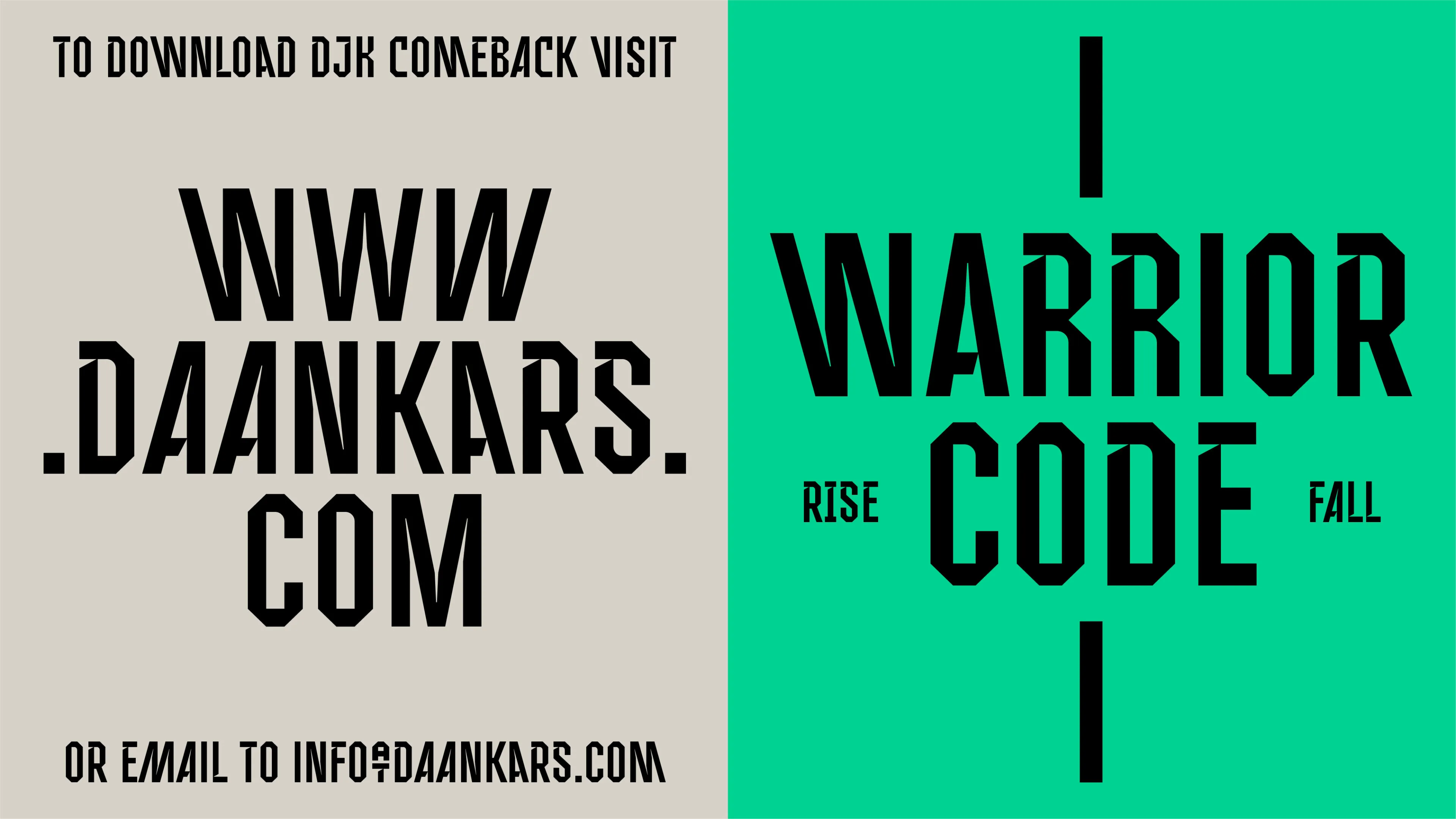
DJK Comeback
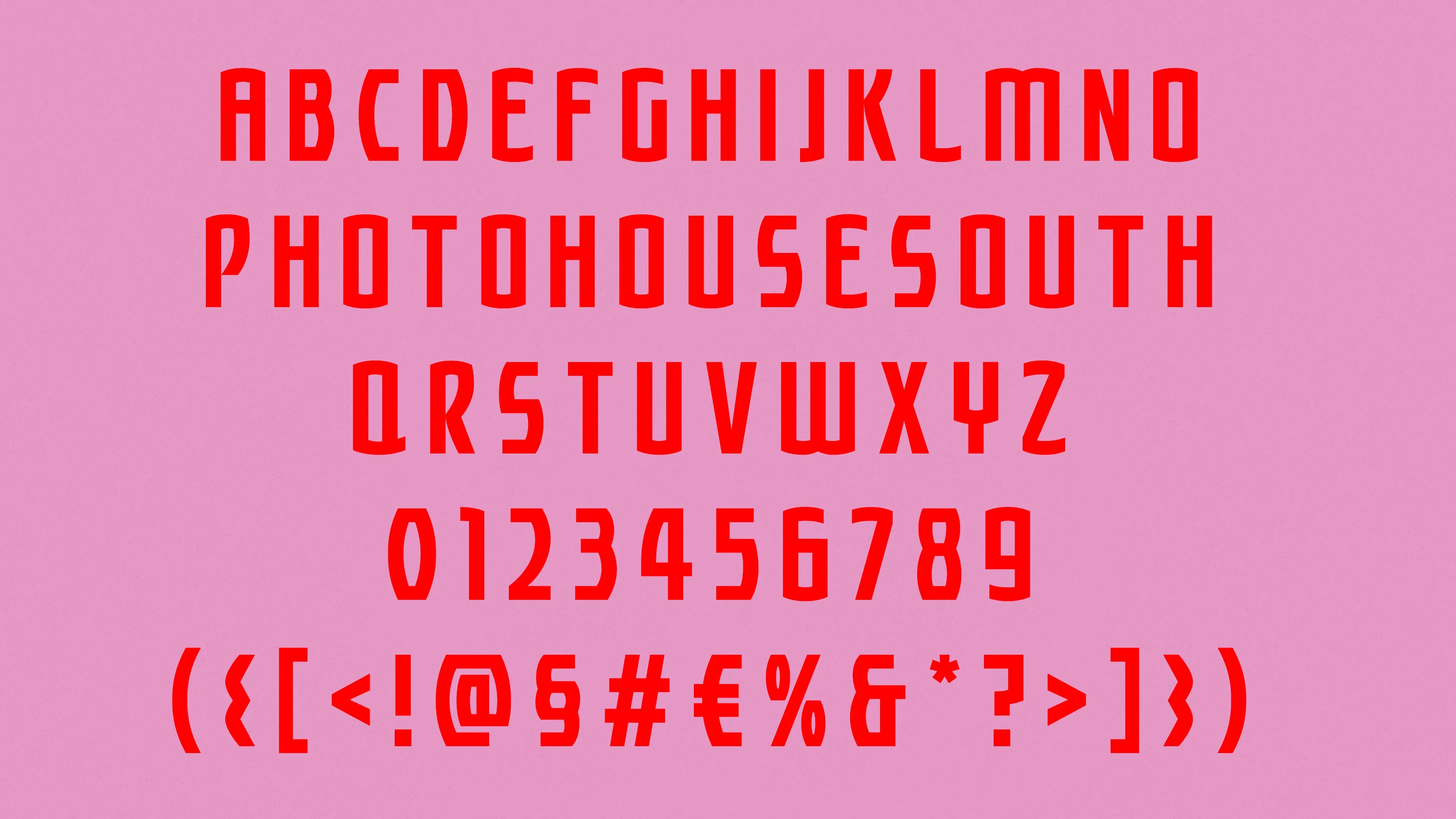
Inspired by American football and college sports typography, DJK Comeback visually represents an energetic and bold attitude. It includes a few opentype features to play around with while typesetting. The font is licensed under the SIL Open Font License, Version 1.1.
Free Download:
DJK_Comeback.zip
Posters (2016–Present)


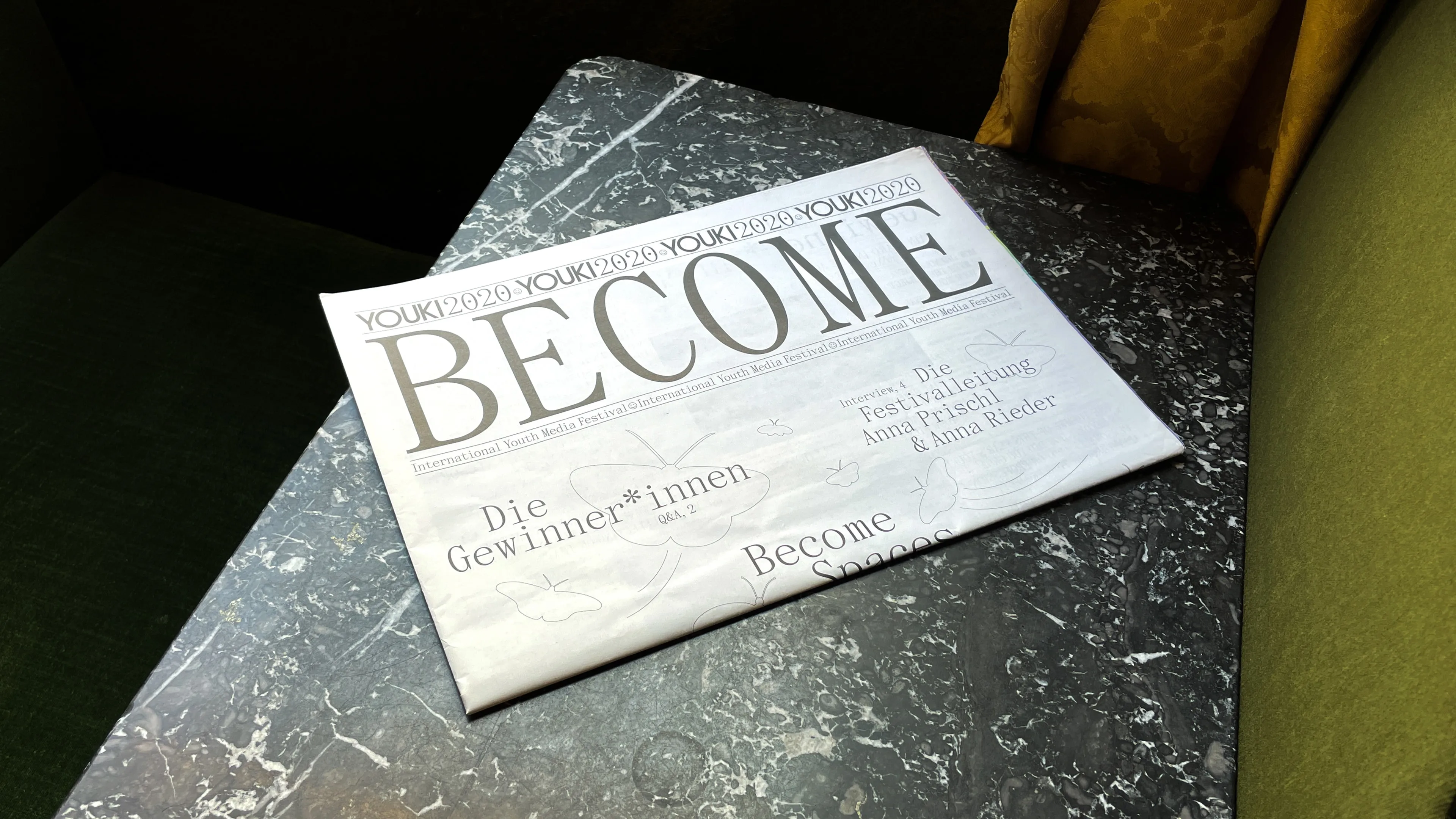
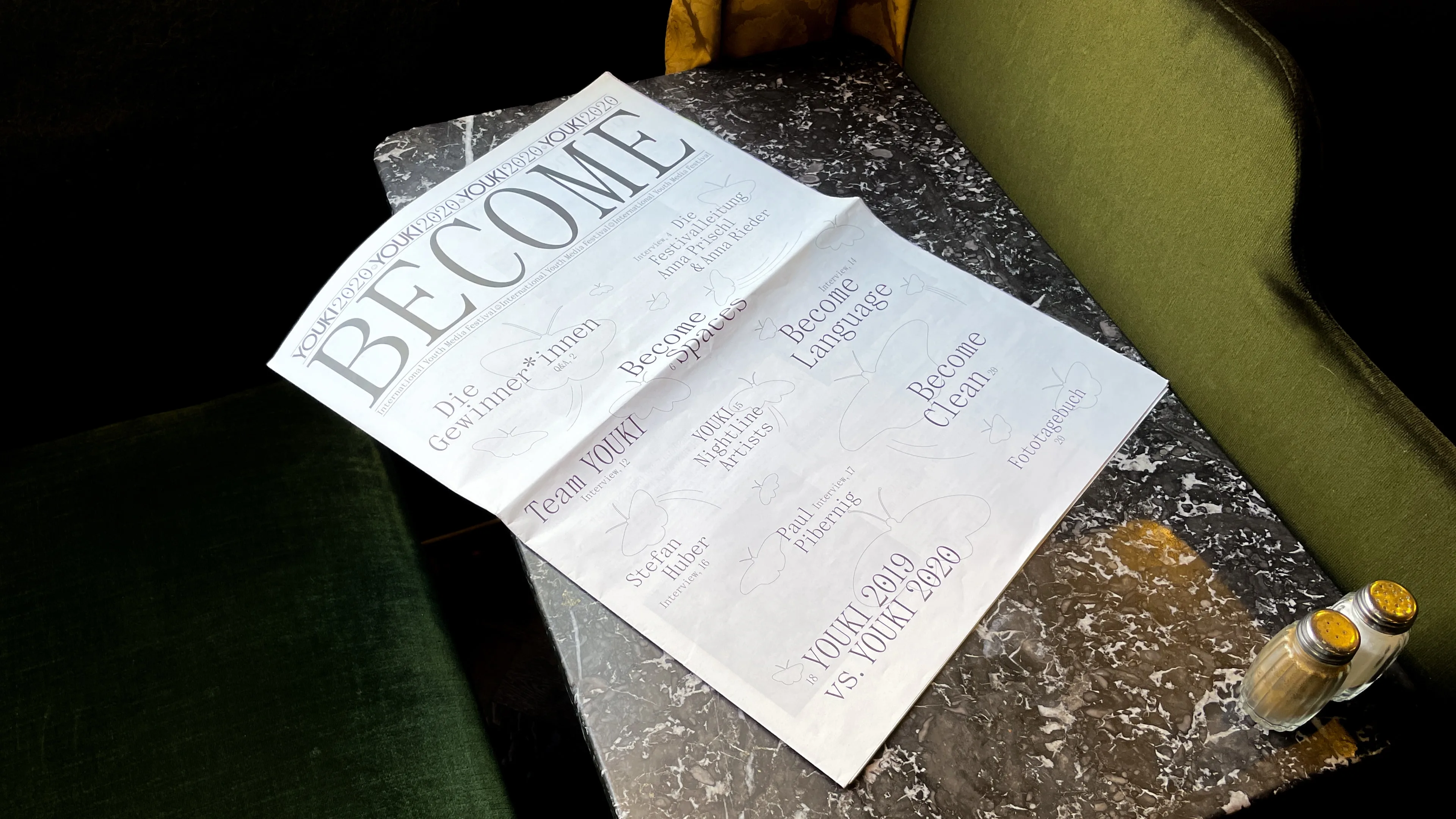
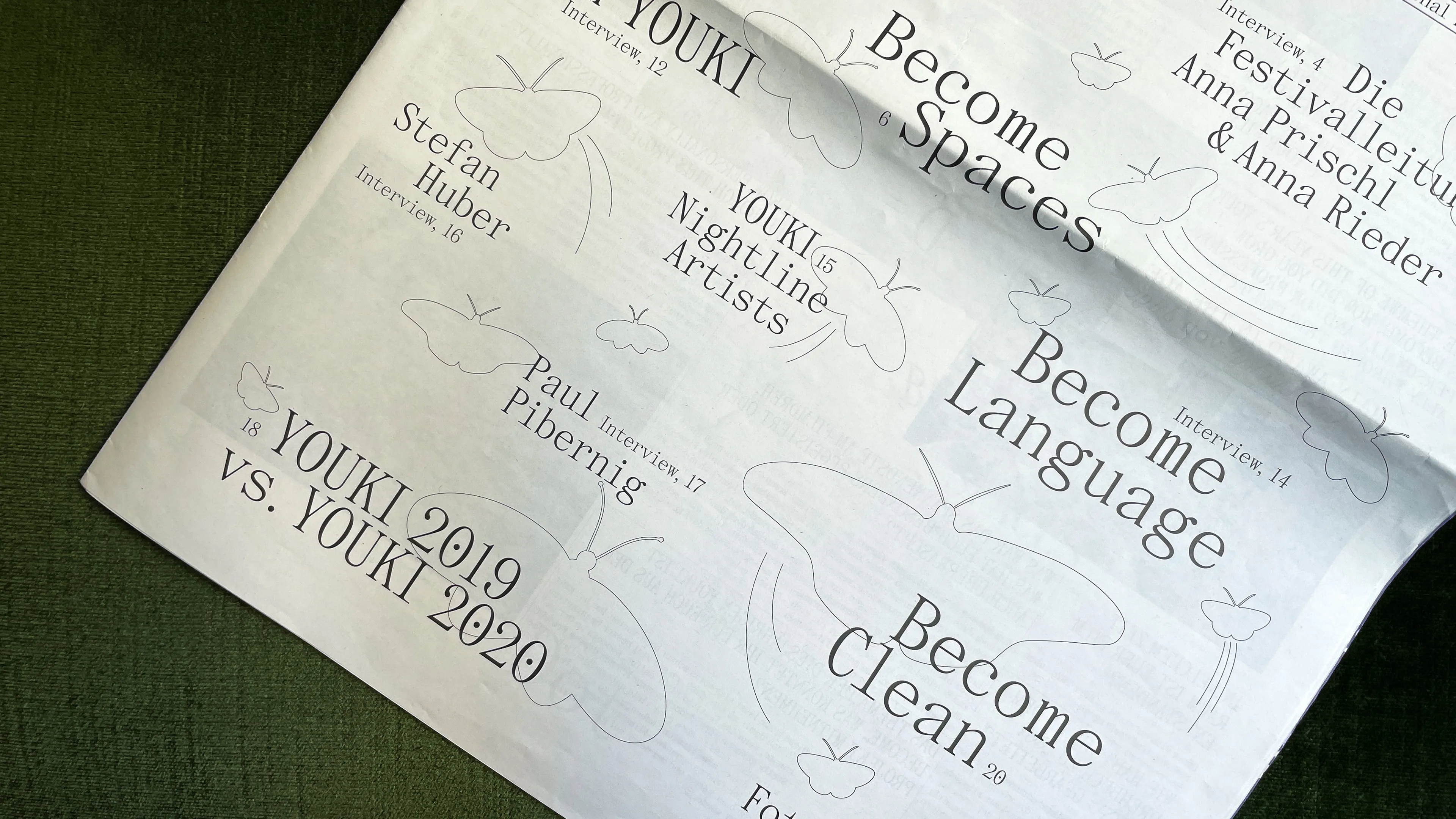
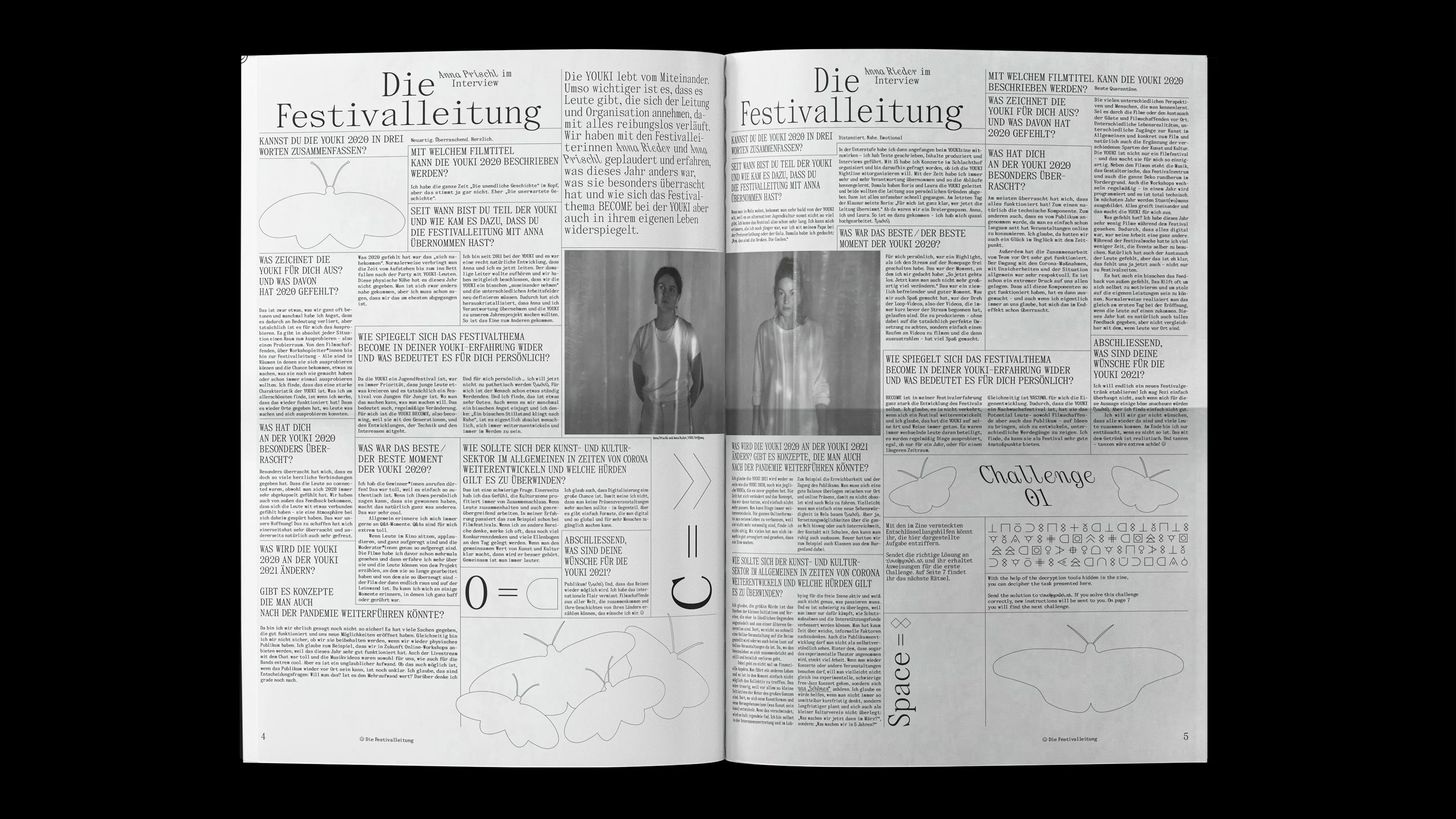
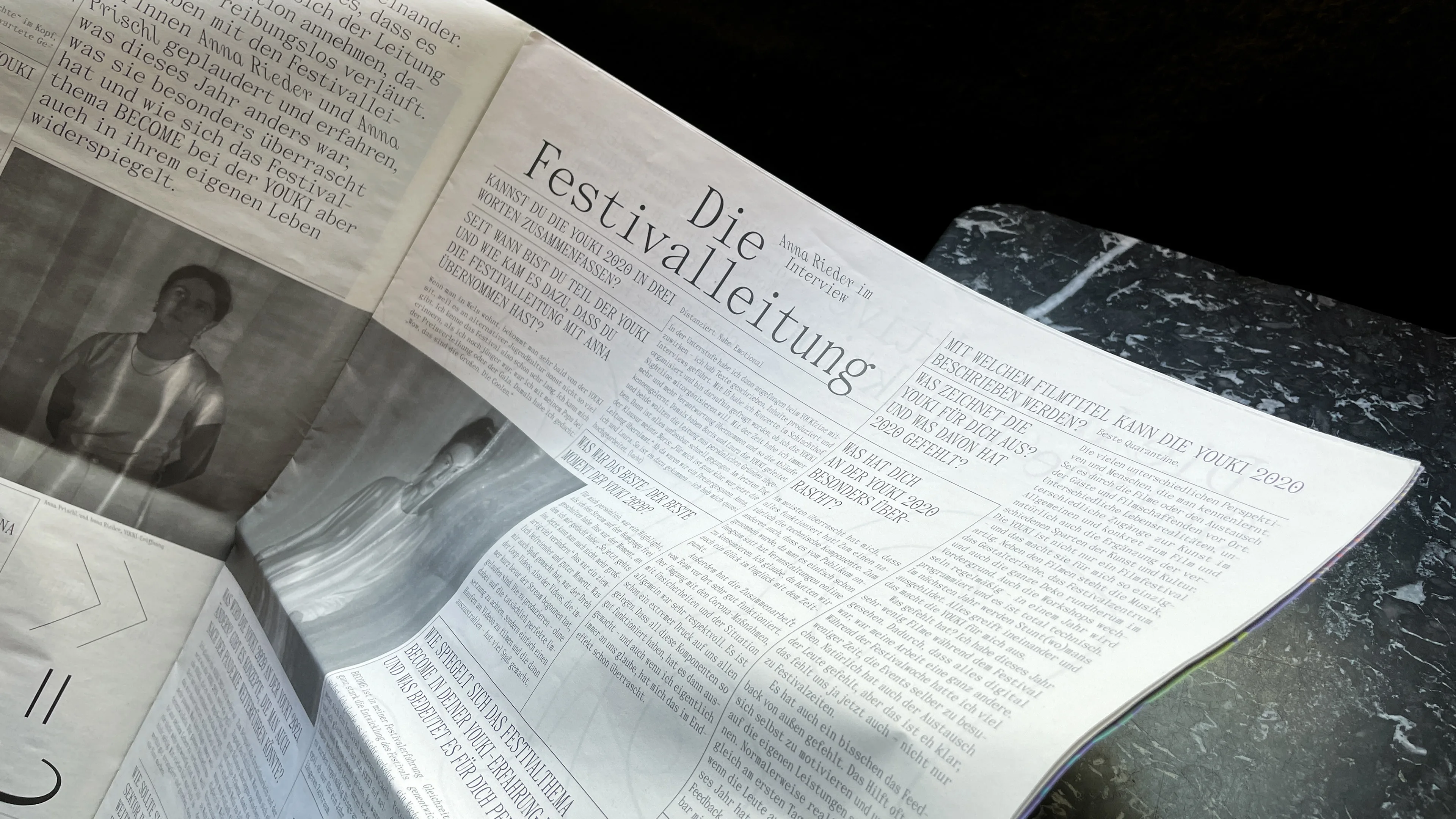
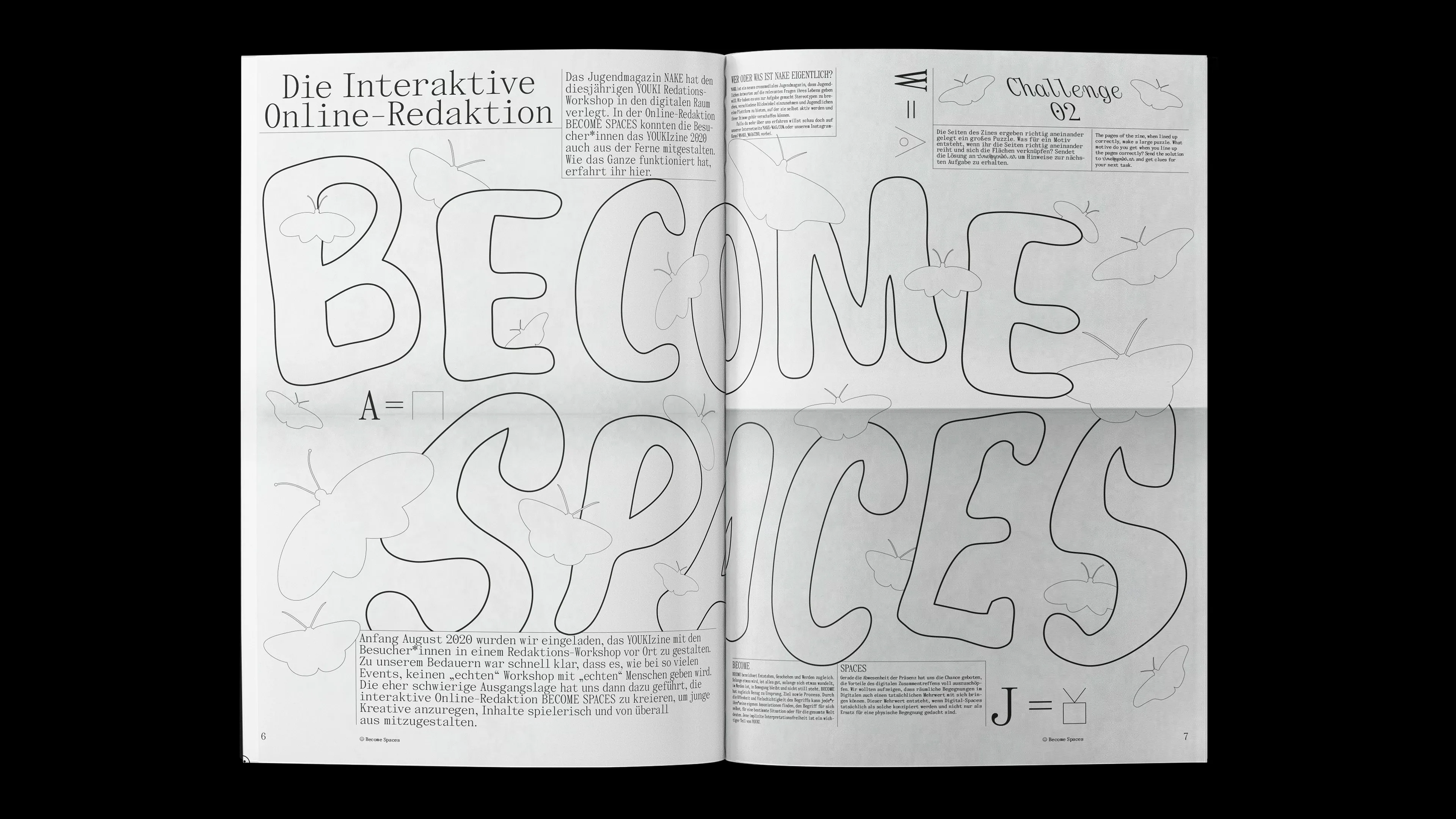
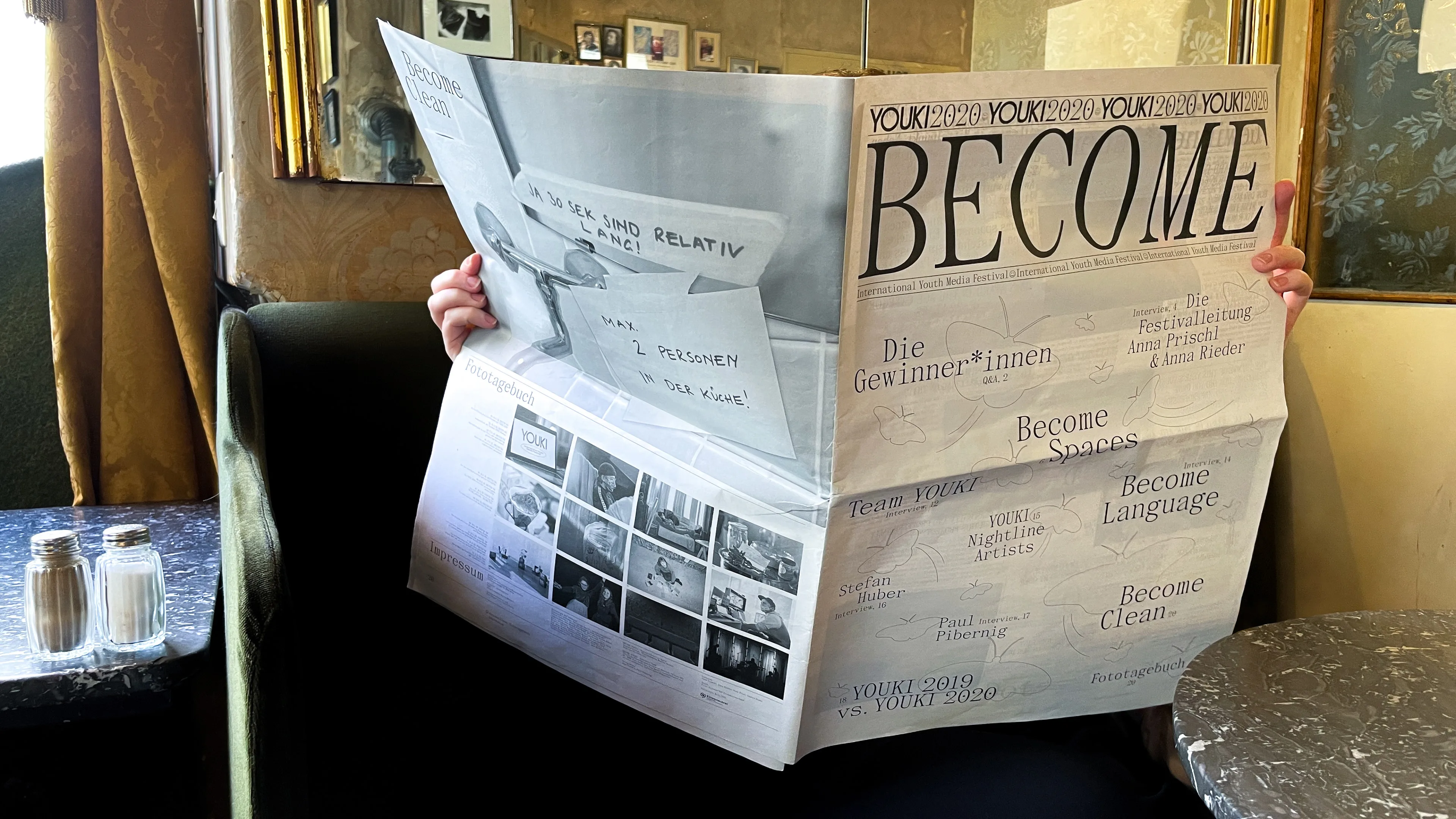
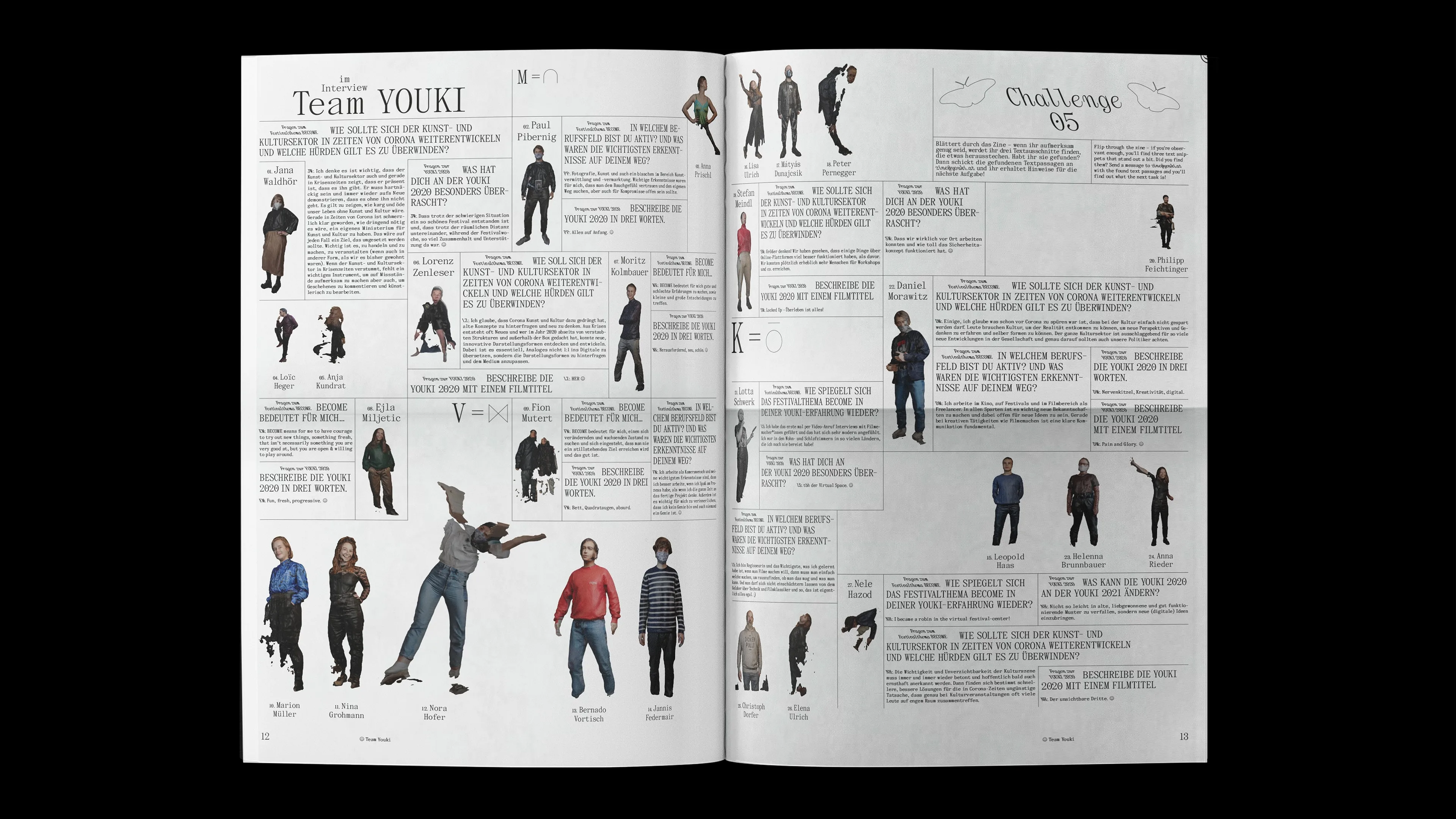
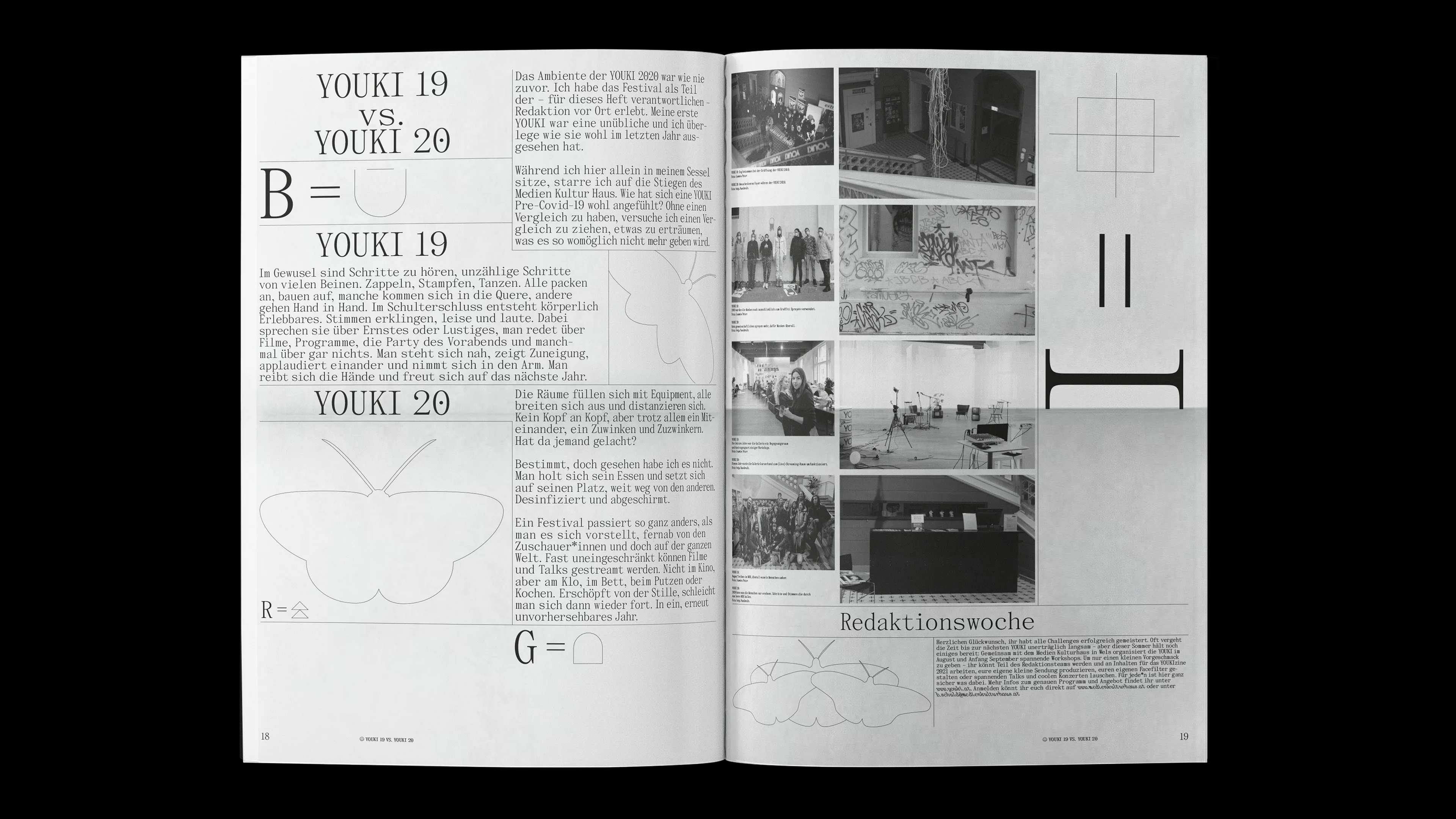
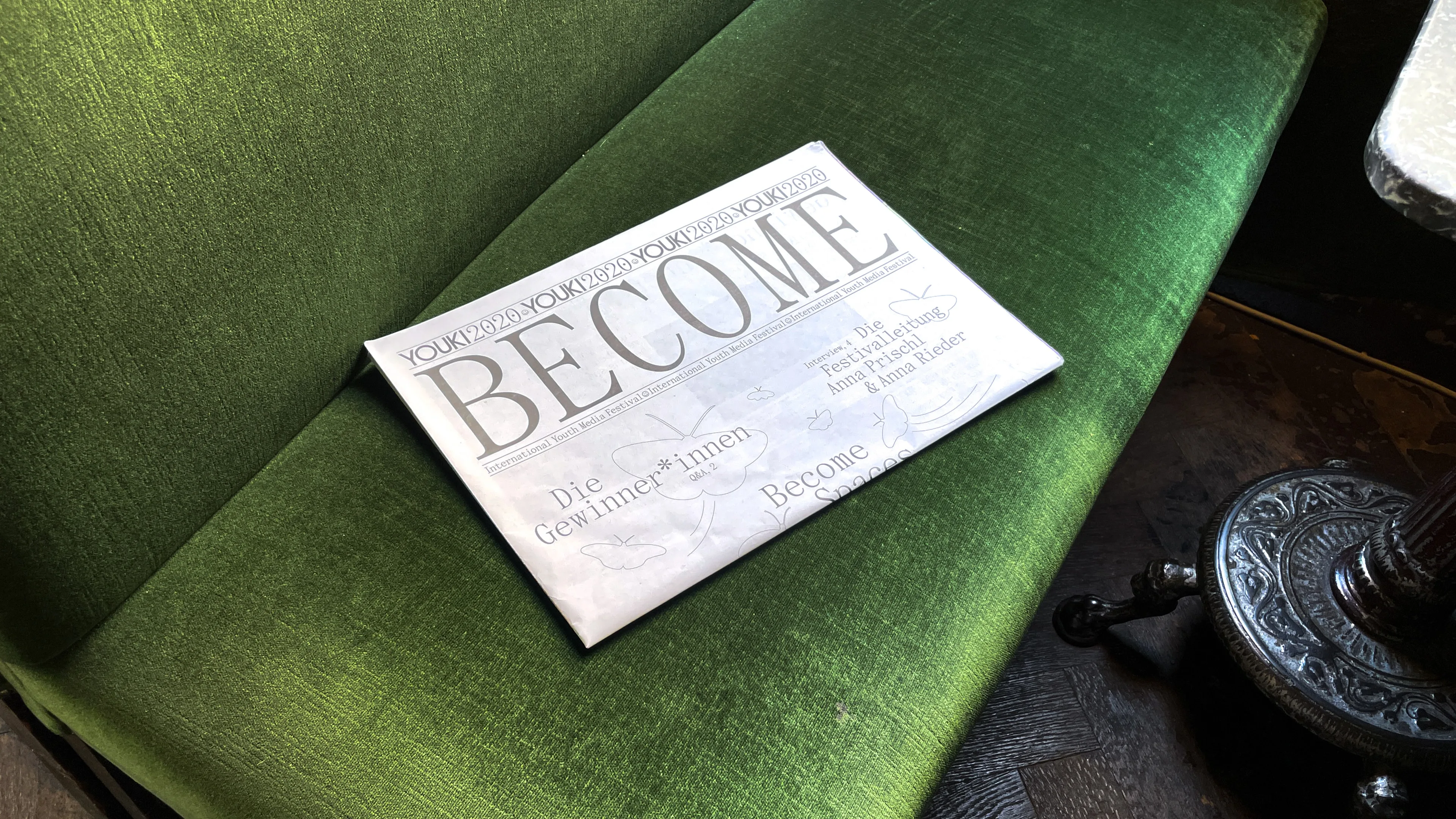
YOUKIzine
How can digital worlds be made physically palpable? The YOUKI Festival 2020 had to take place solely online due to the pandemic. It was essential to translate this digital space in the annual print edition and make it physically palpable. An immersive large scale zone was created – an analogue correspondent to the online festival, in which there are possibilities to get lost during reading and thus find new paths and spaces.
www.youki.at


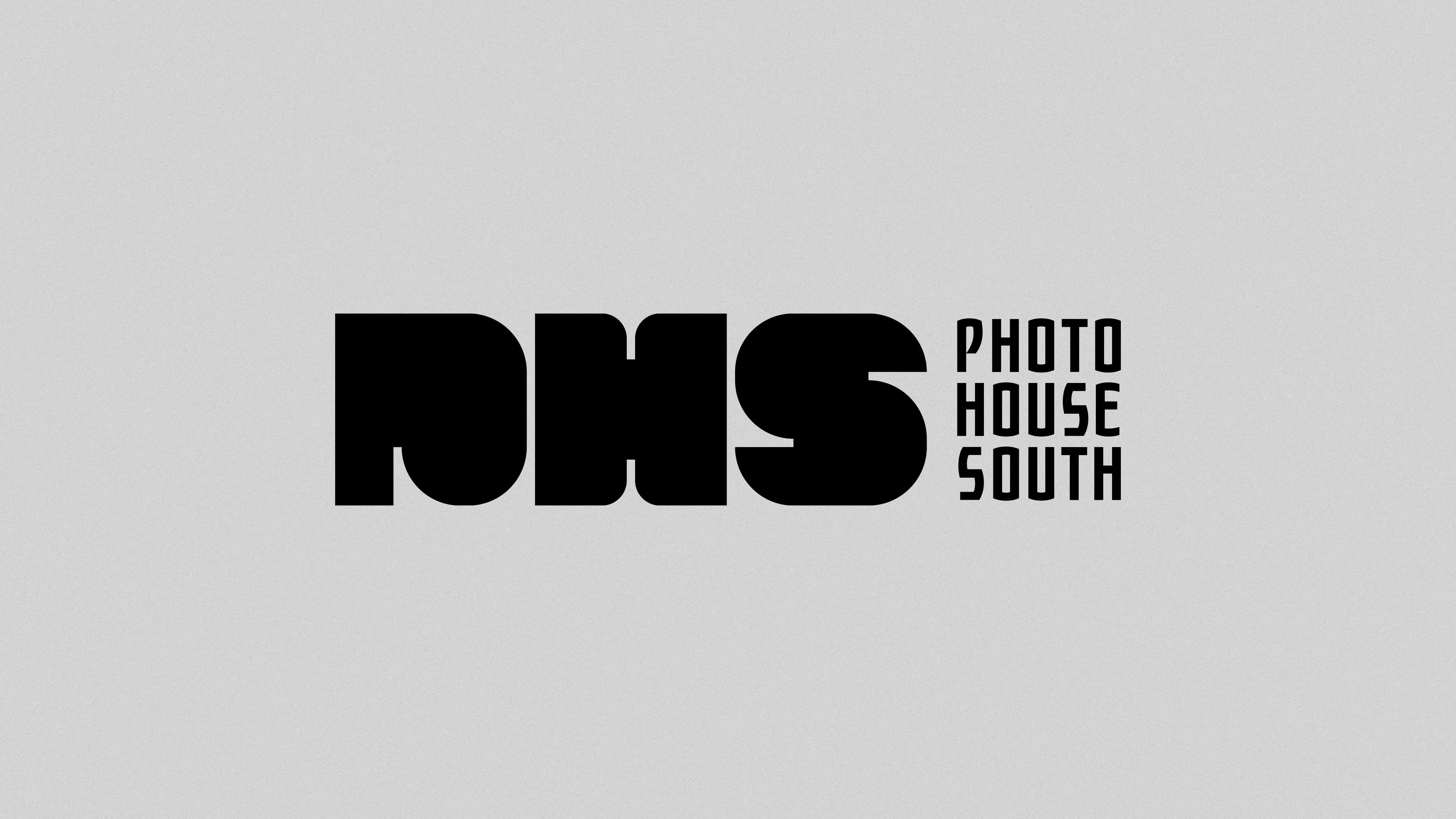
DJK Photo House South
↕
A
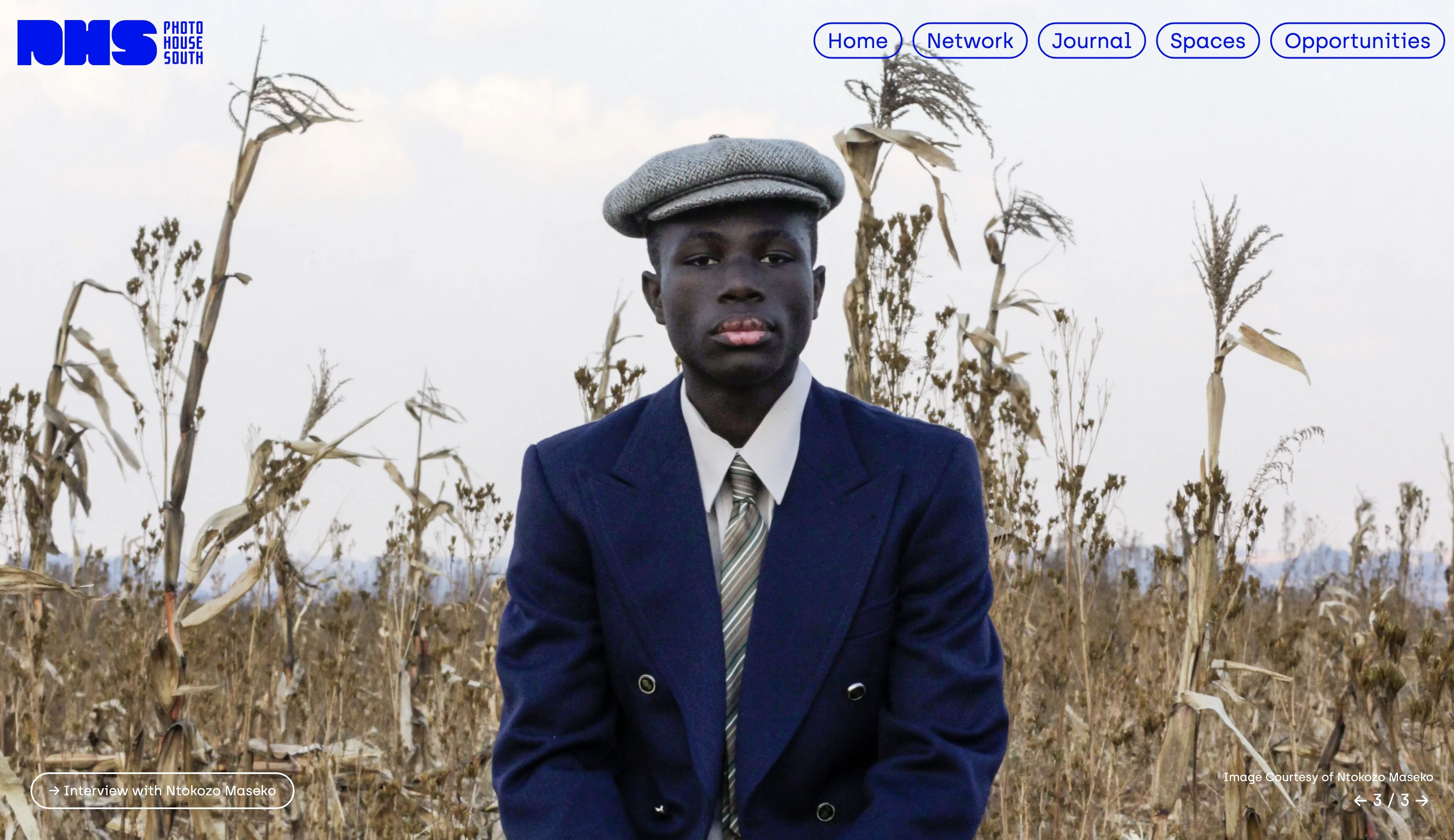
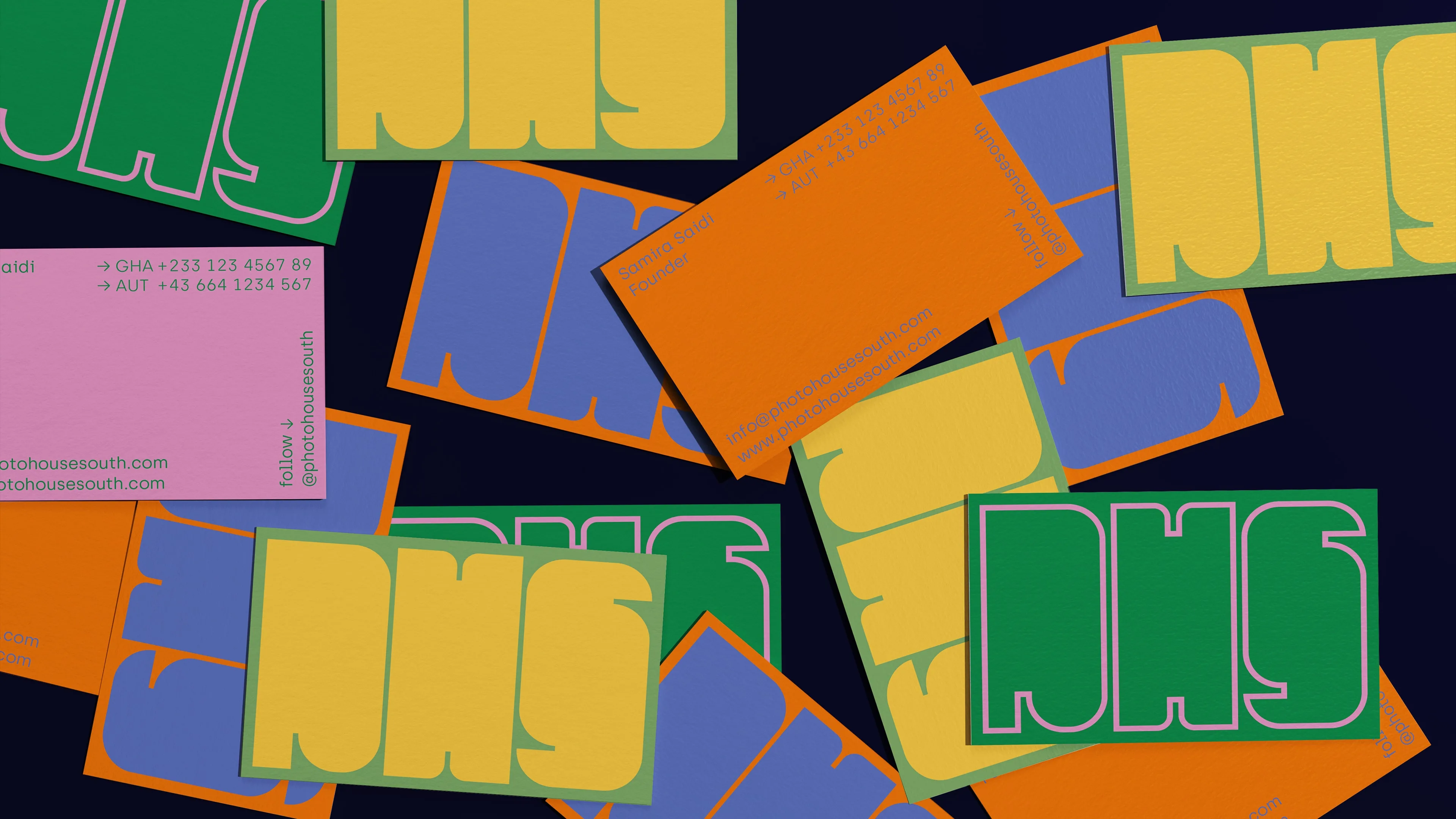
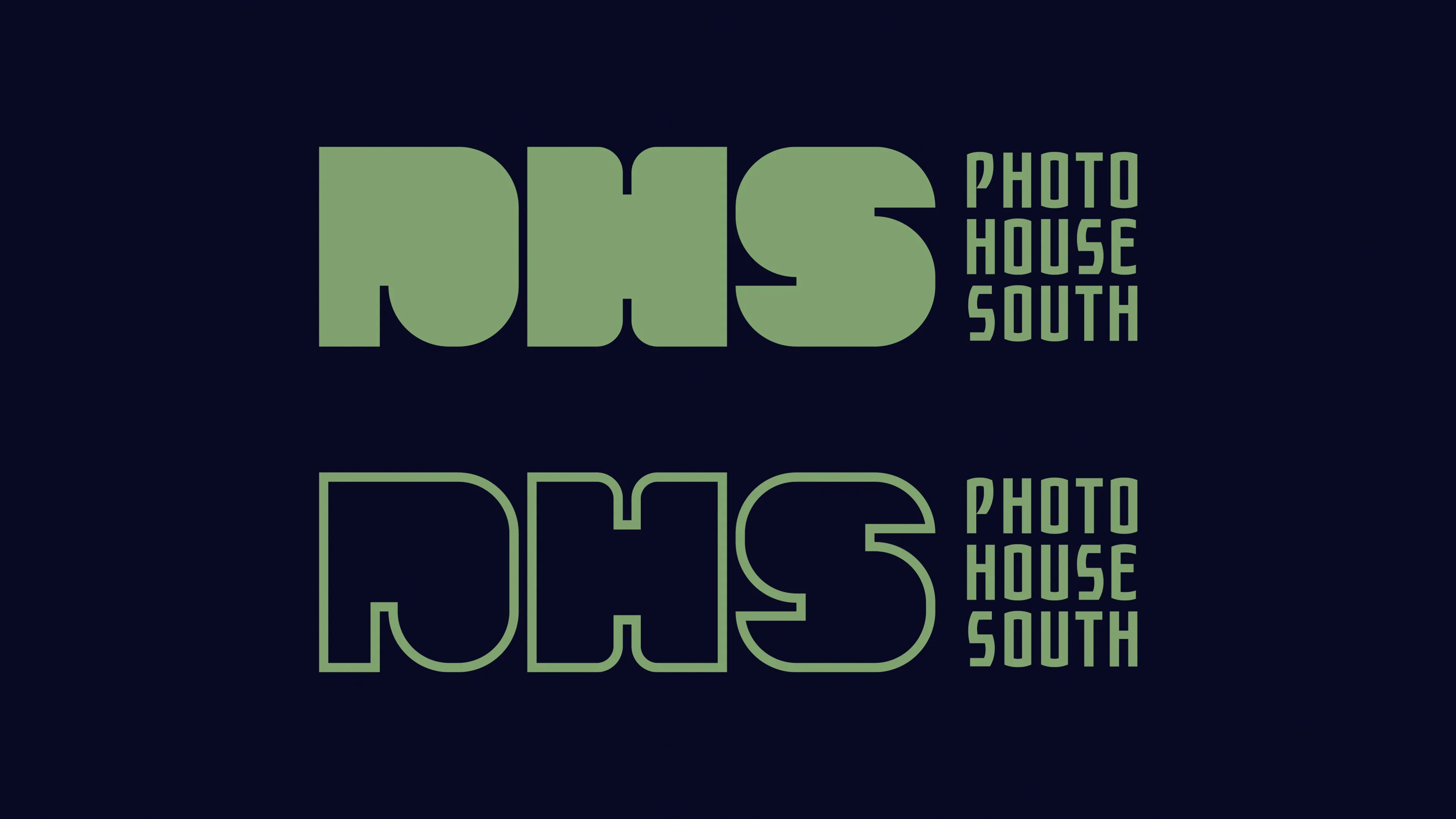
Photo House South
Kay Pisarowitz
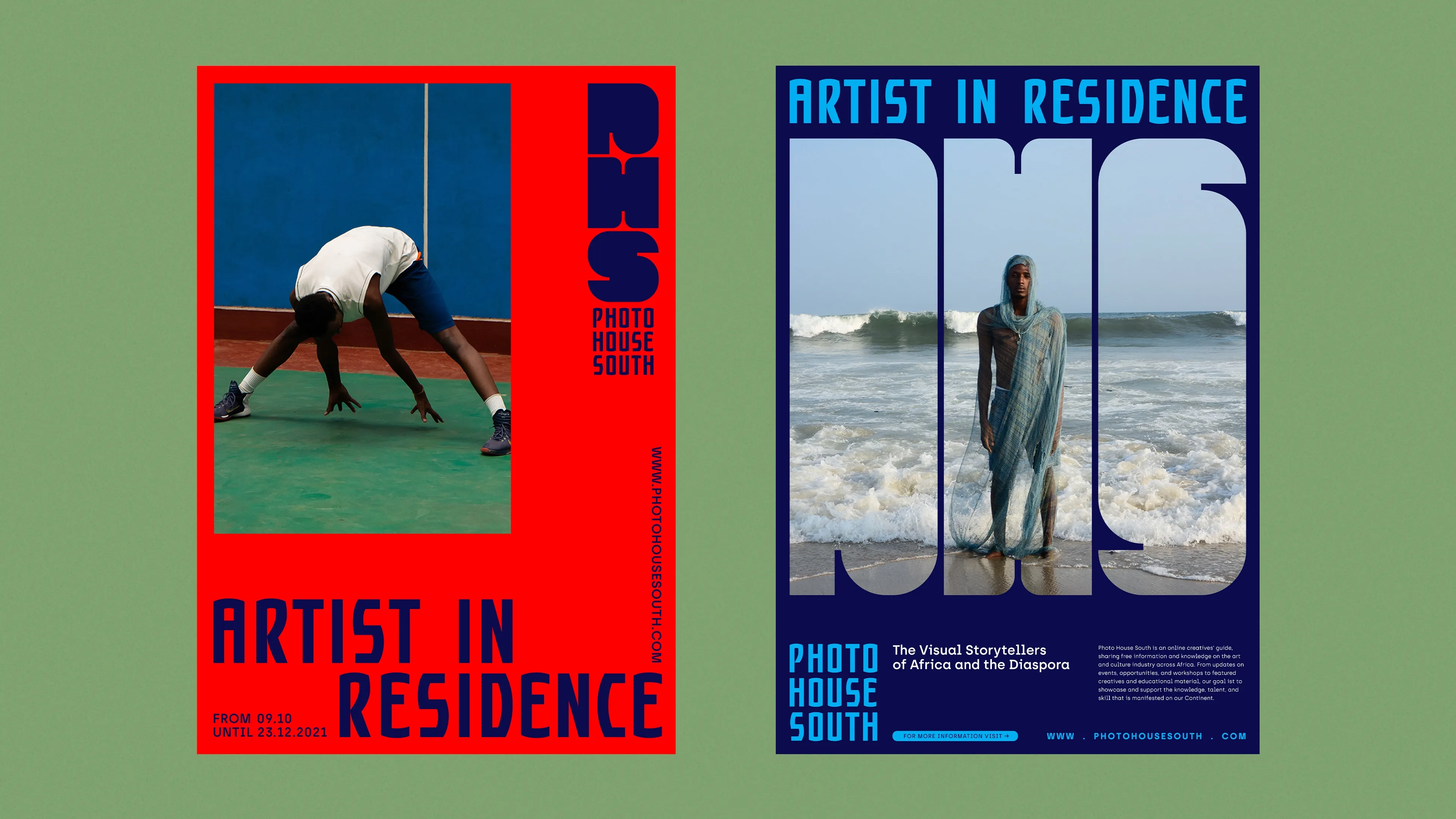
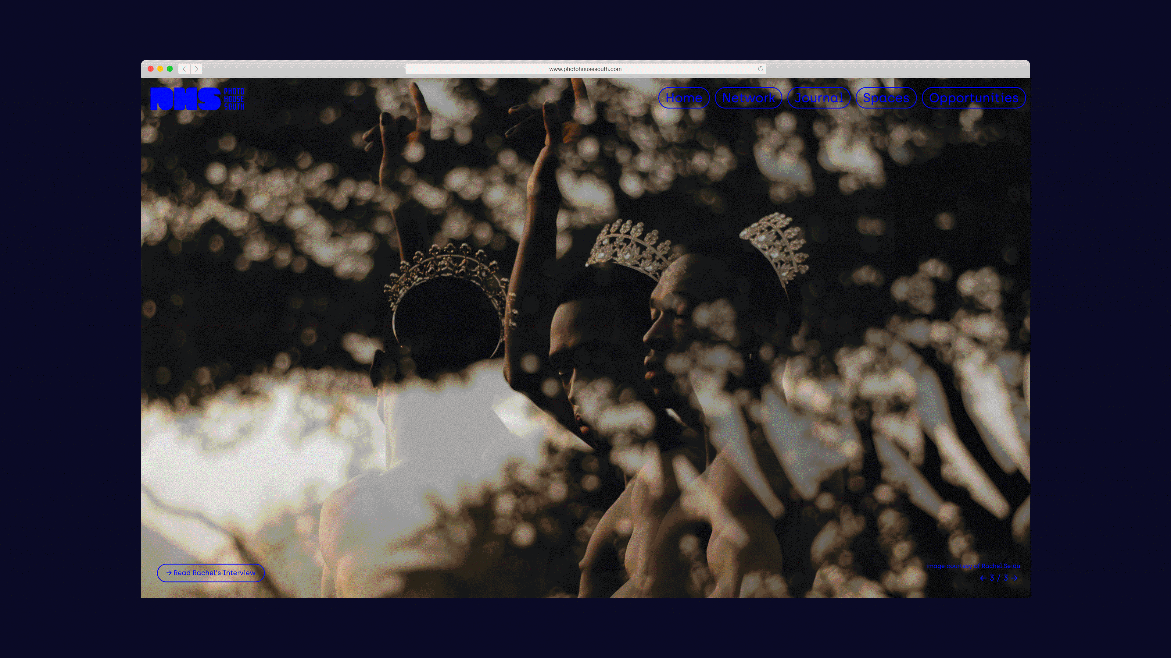
Empowerment Starts with Representation — Photo House South is a creatives’ guide focusing on visual journalists from Africa and the Diaspora. Celebrating creative excellence in visual storytelling whilst embracing the talent and skill that has manifested on the Continent. Elevating the space by sharing free educational and informative material is our mission to offer and maintain accessibility in the realm of visual content creation and its industry.
www.photohousesouth.com

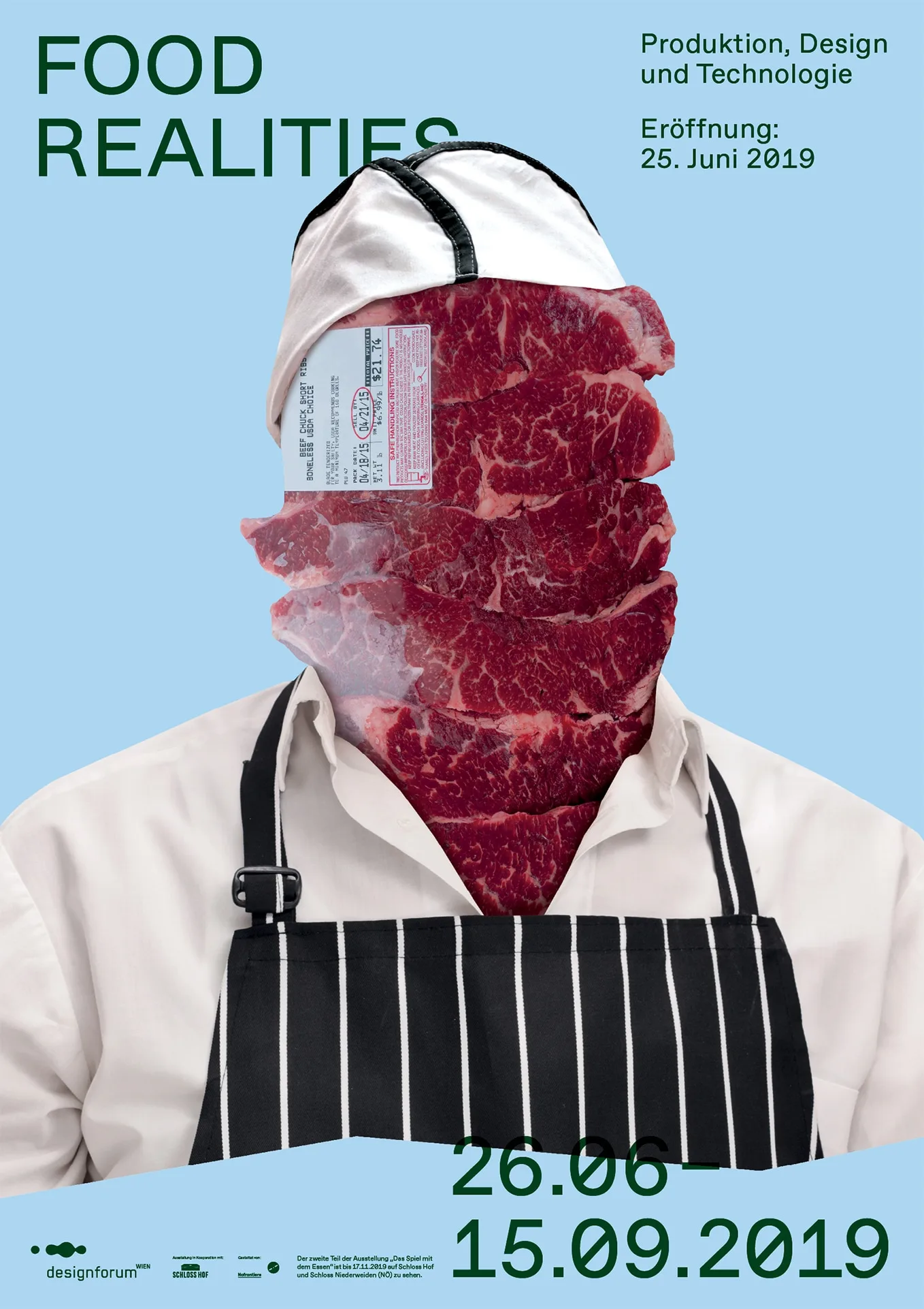
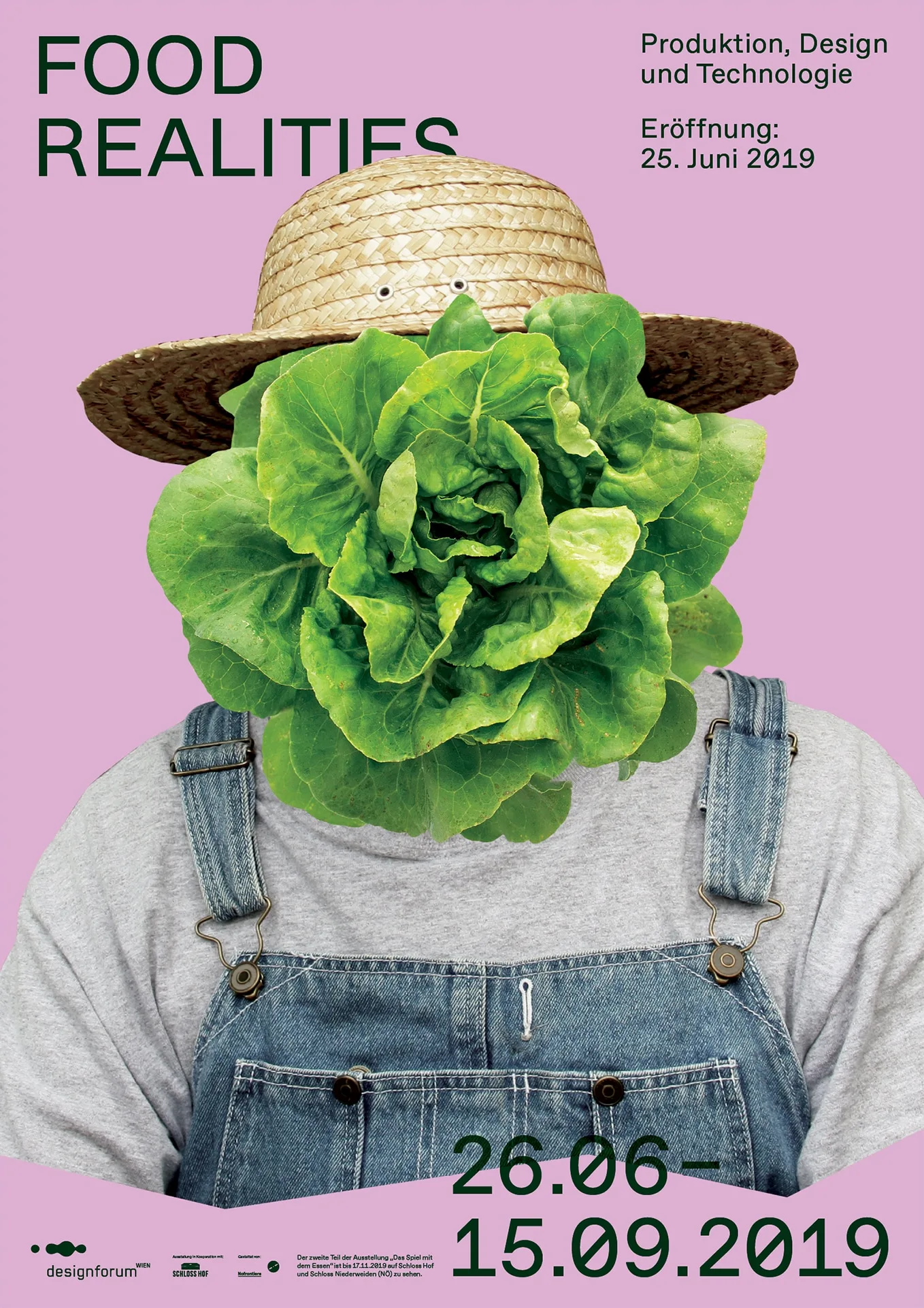
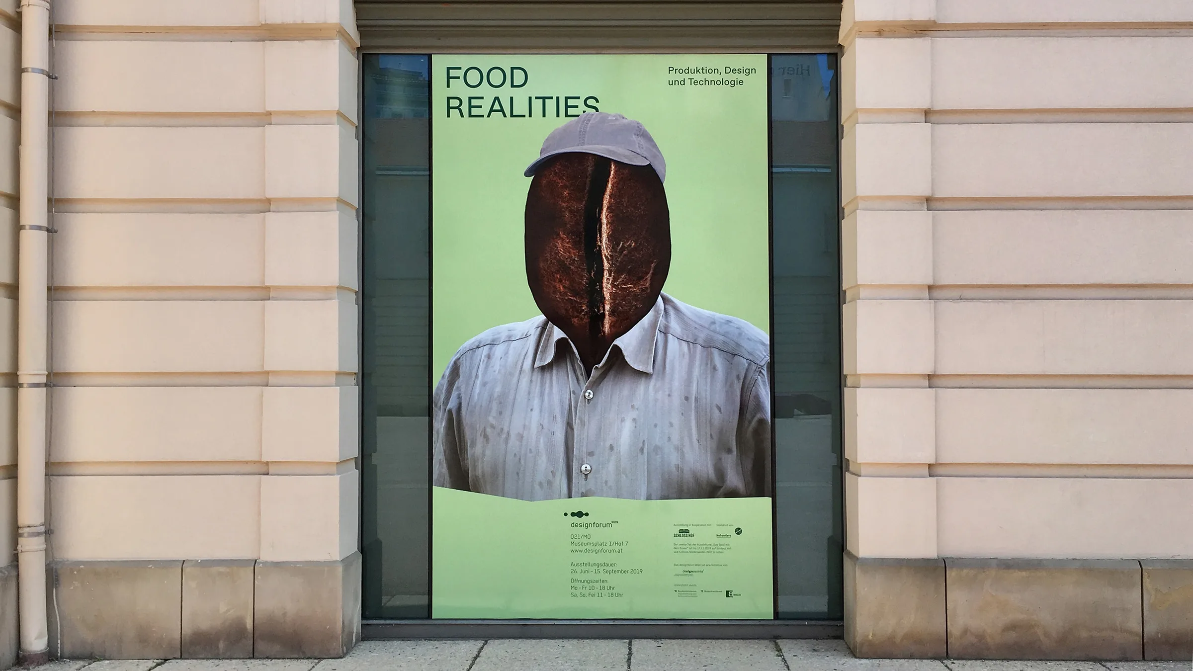
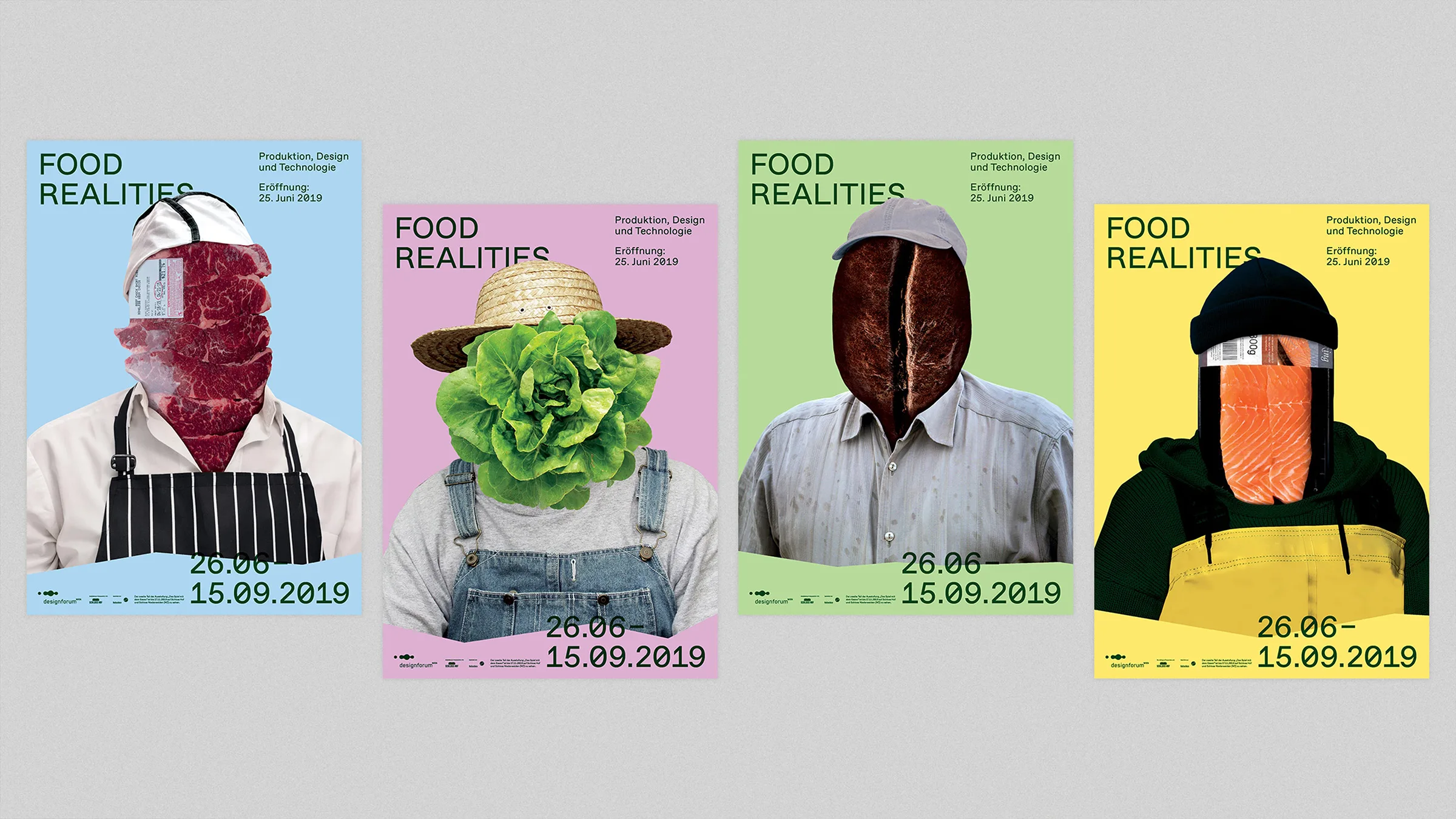
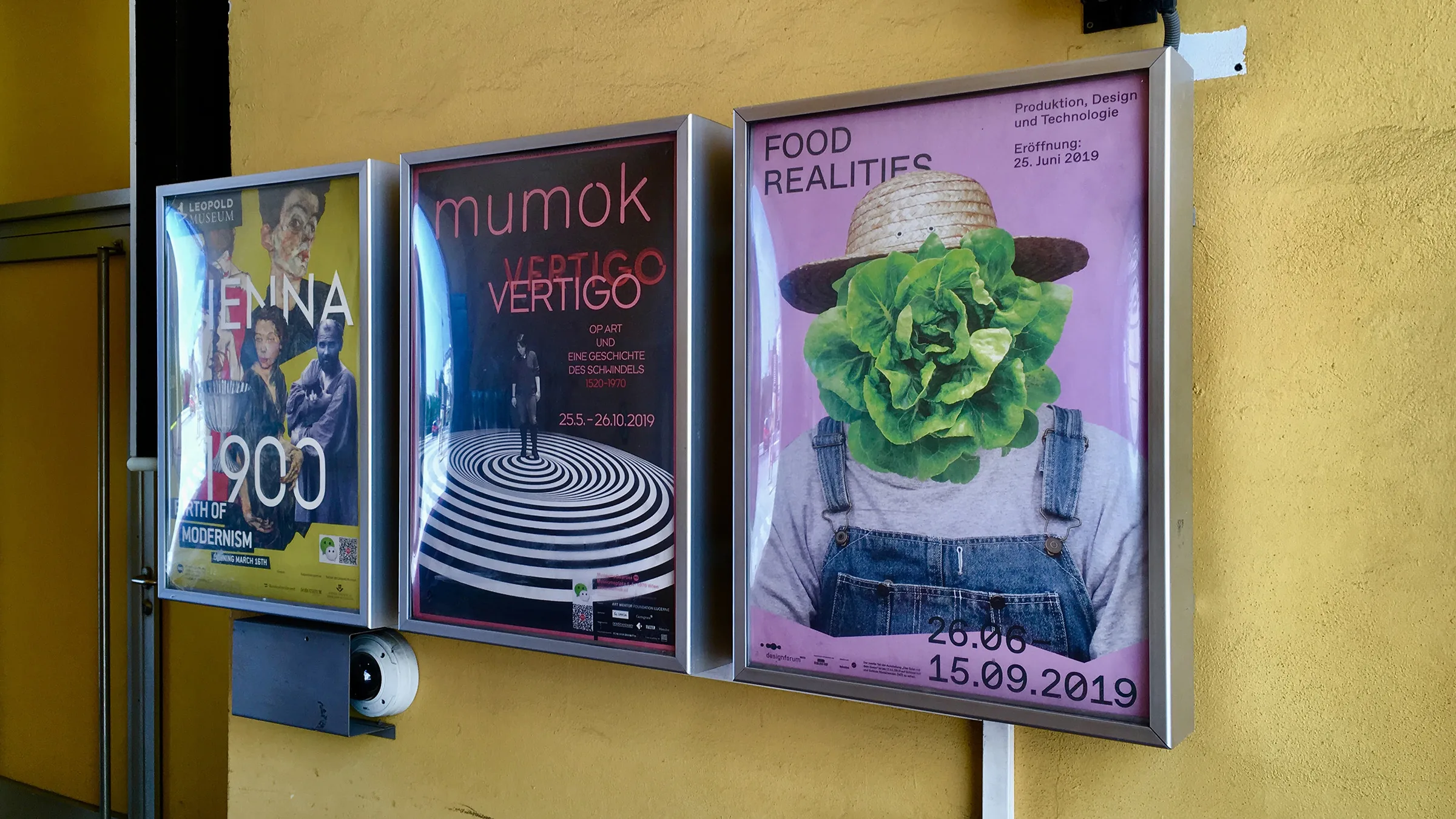
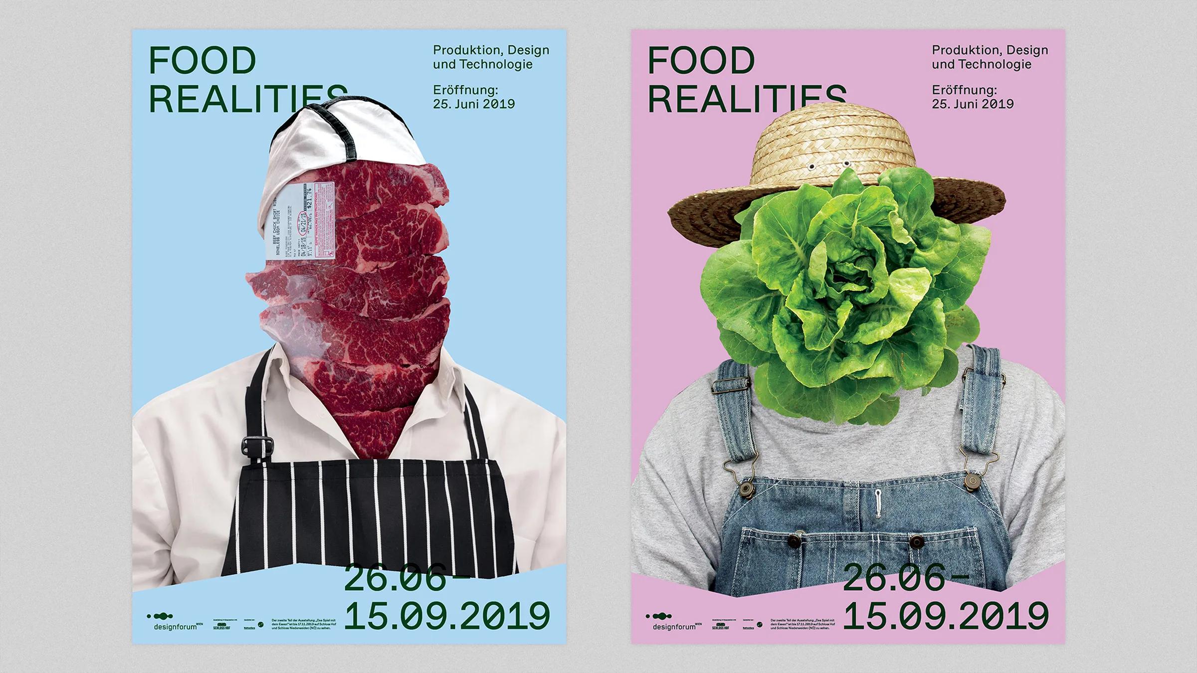
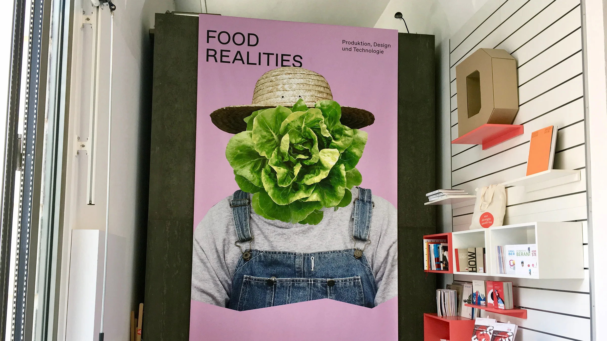
Food Realities
A visual identity for the exhibition about food and supermarket products at DesignForum Wien. An image series based on the road from the origin of a product to the market & beyond was created for the identity. The series portrait the people who ‘work behind the scenes’ as workers/producers of the food and products which we come across daily.


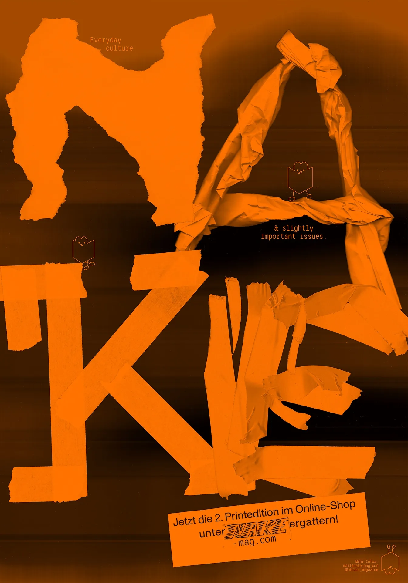
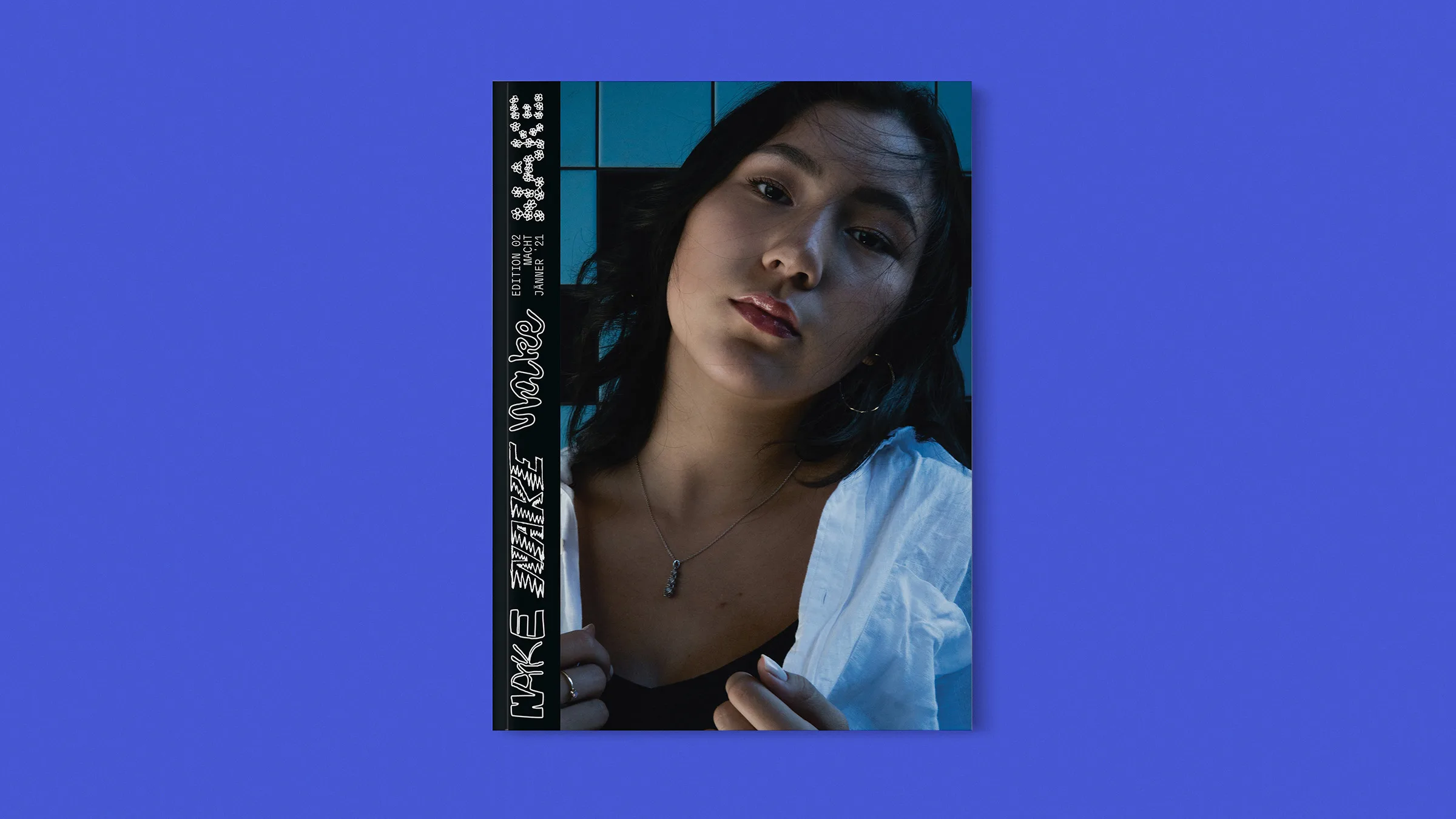
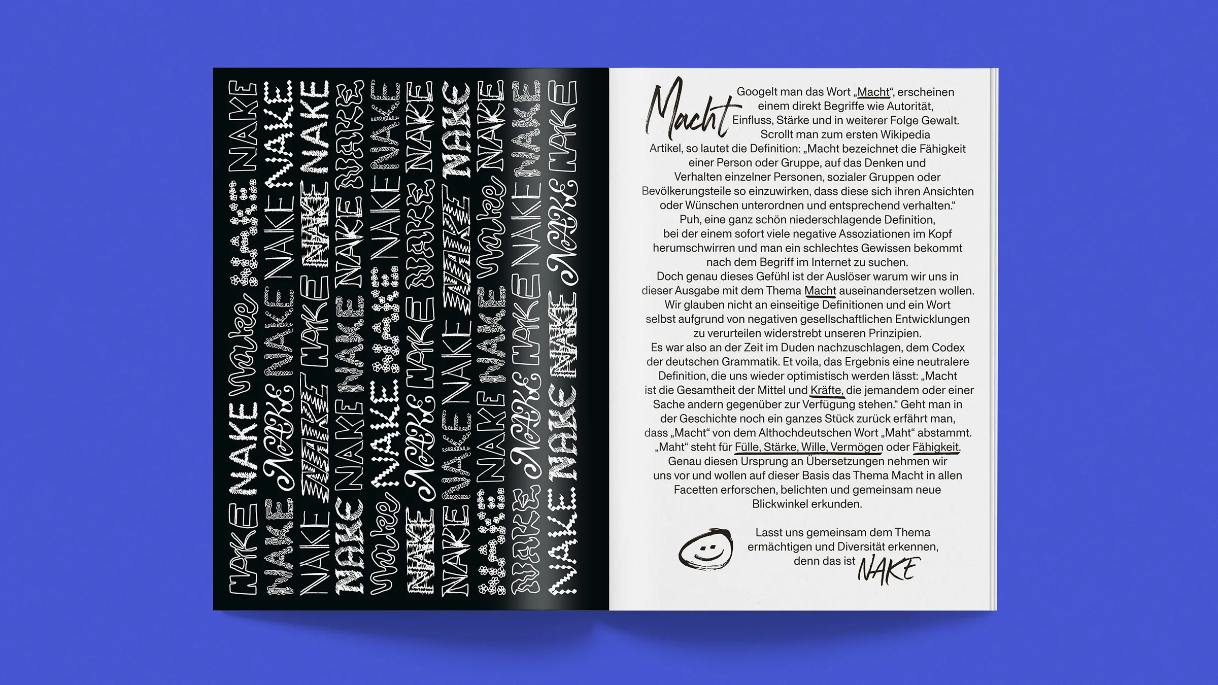
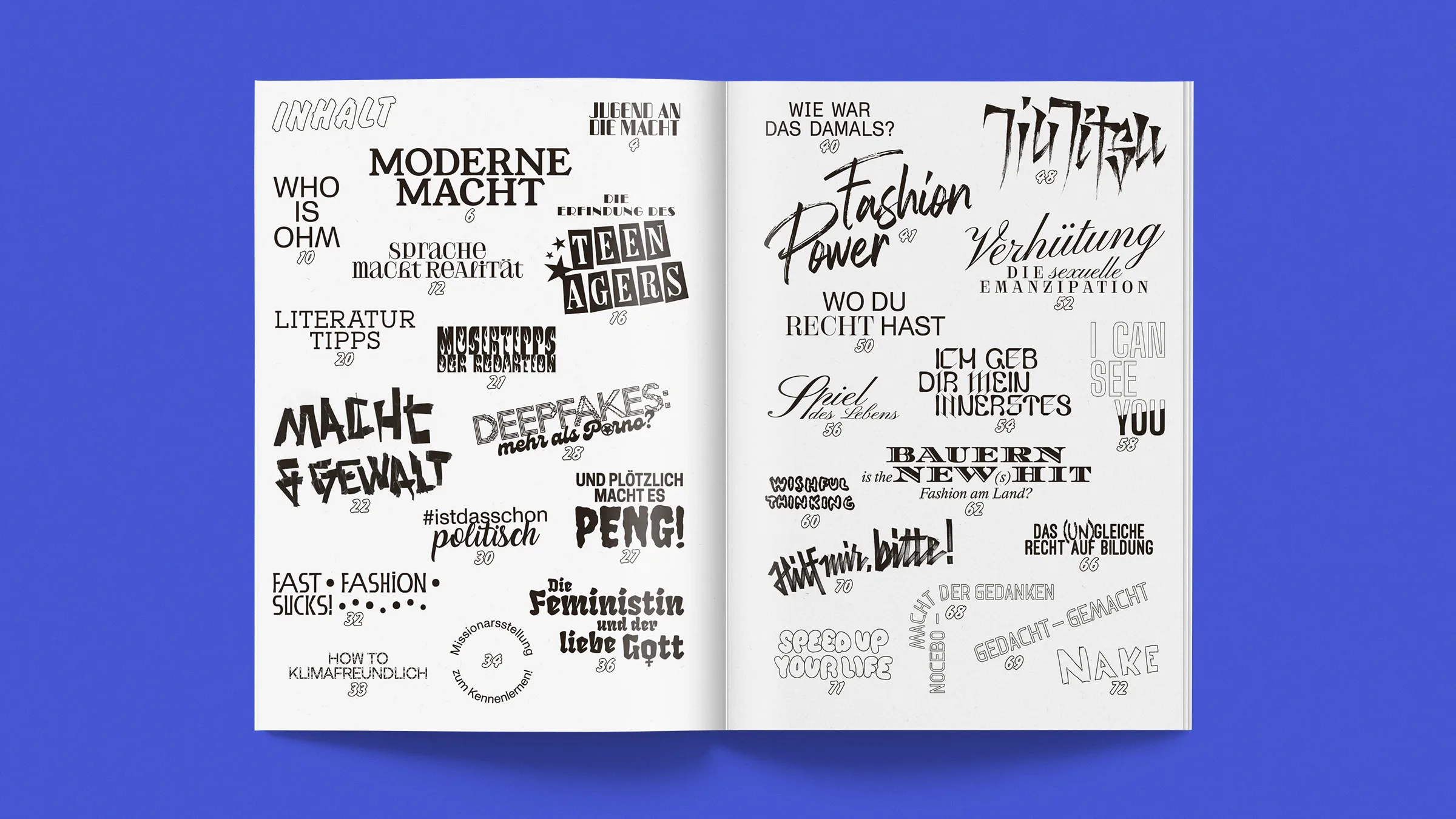
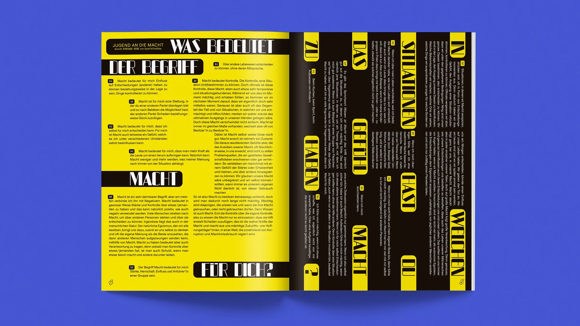
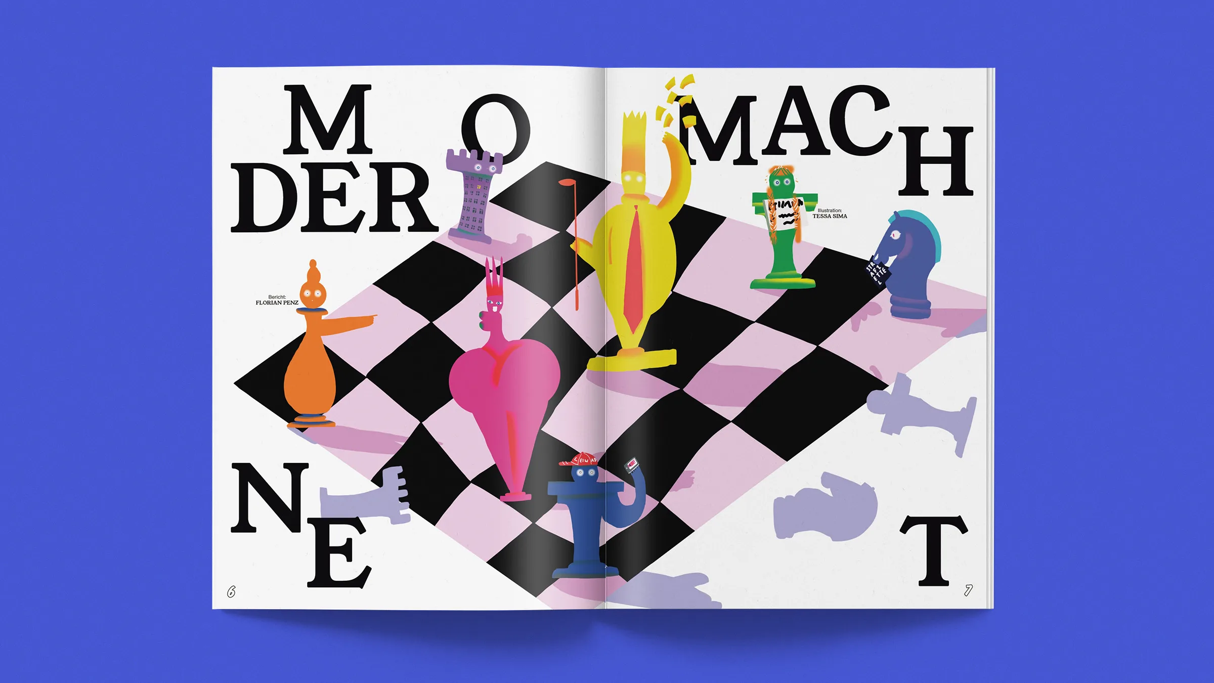
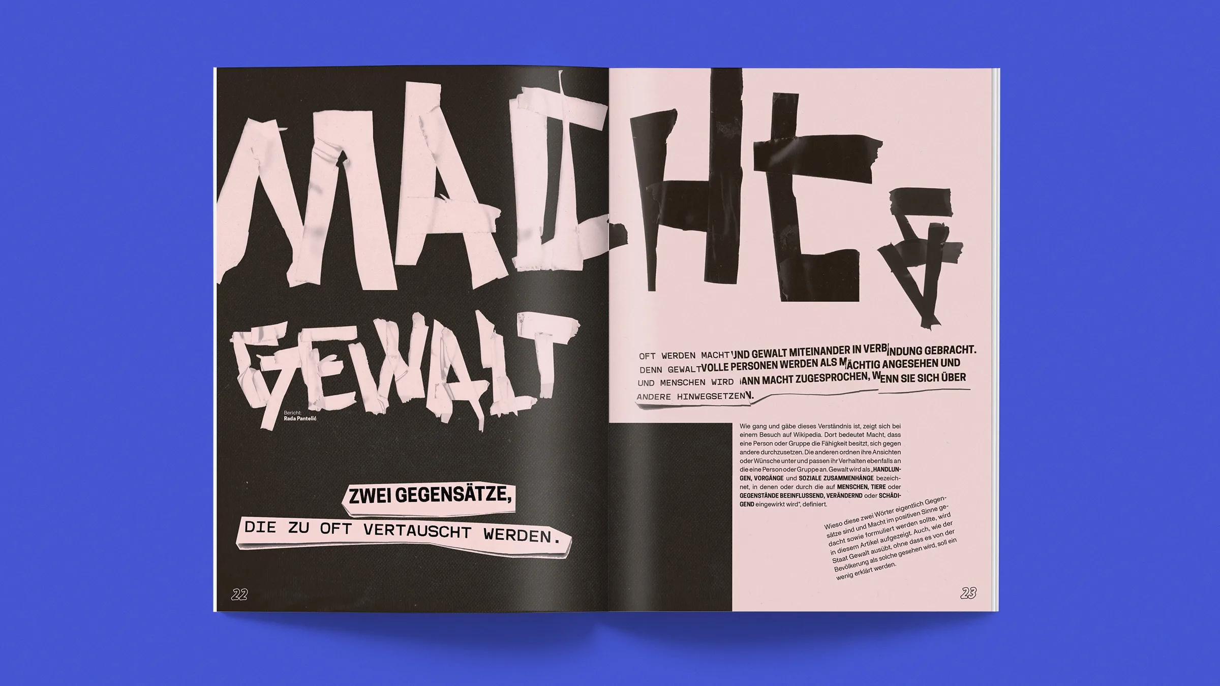
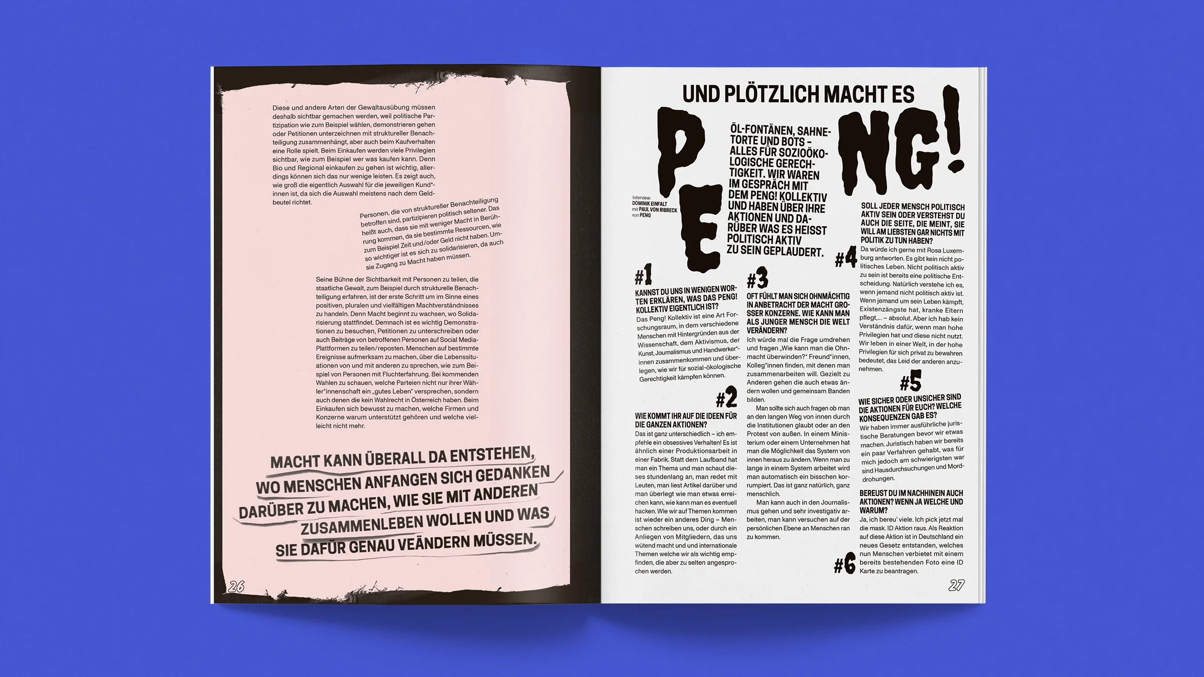
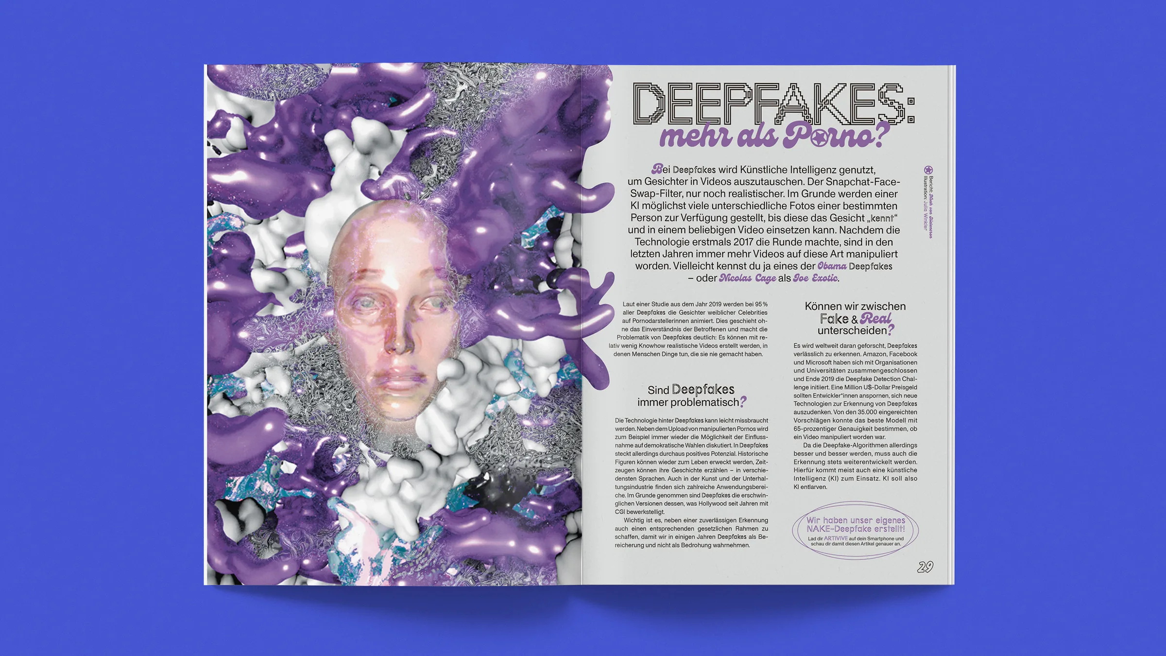
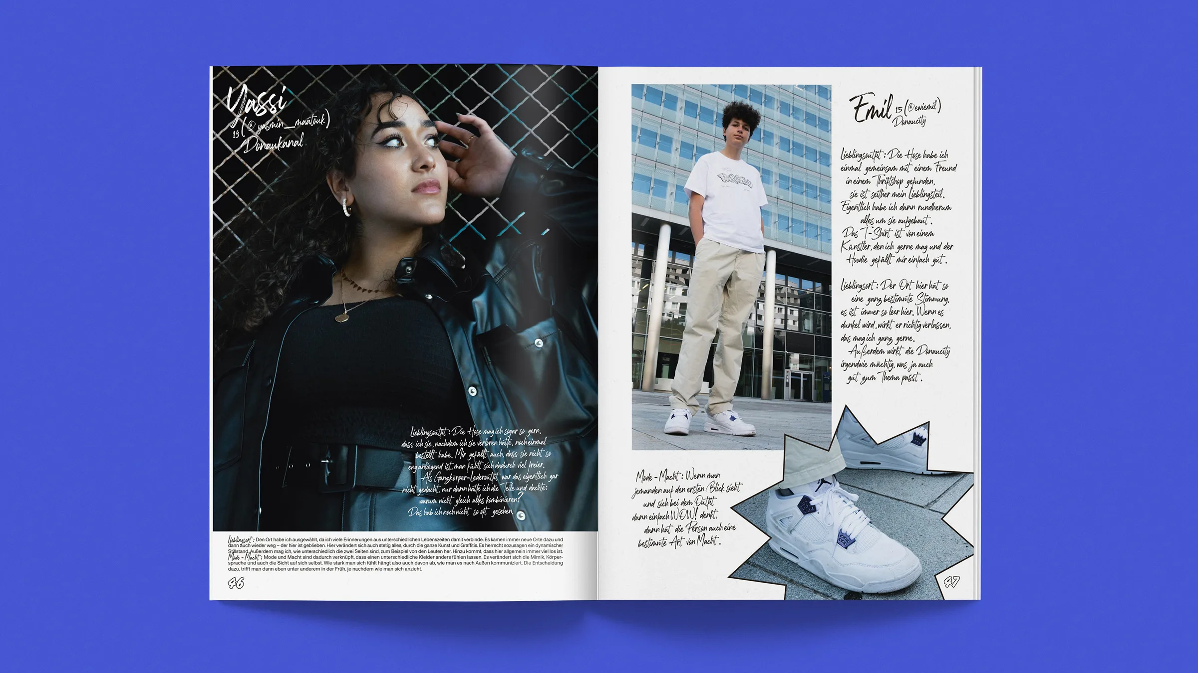
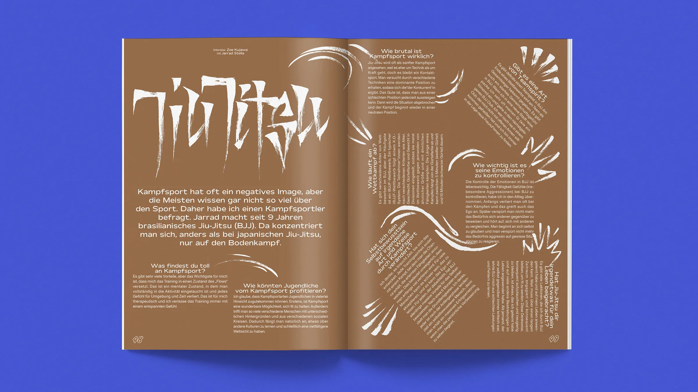
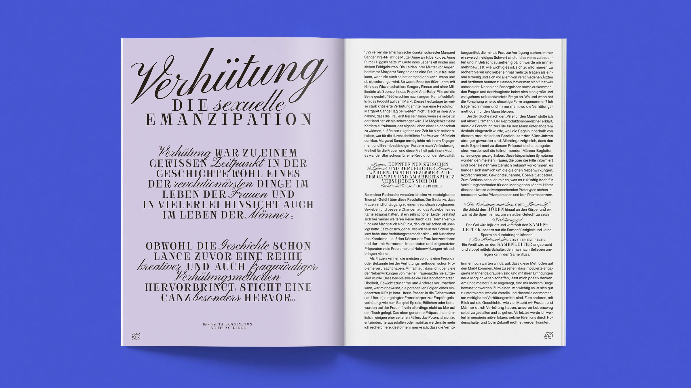
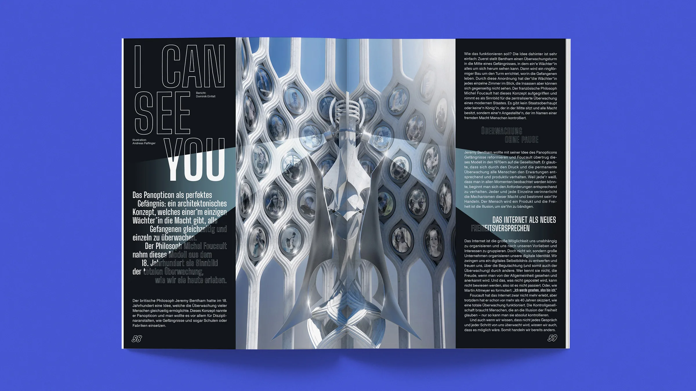
NAKE Magazine No. 2
The second edition of NAKE Magazin is focussed on the topic of ‘power’. The word ‘power’ is often connected with terms such as authority, influence, strength and even violence. NAKE however, wants to disconnect from the negative terms, and shine a new light upon the topic. This is why the second edition is more focussed on the questions such as: What is power? What power does the fashion industry have on nowadays society? What role does power have in martial arts? What can you learn about relationships, communication and trust through BDSM?


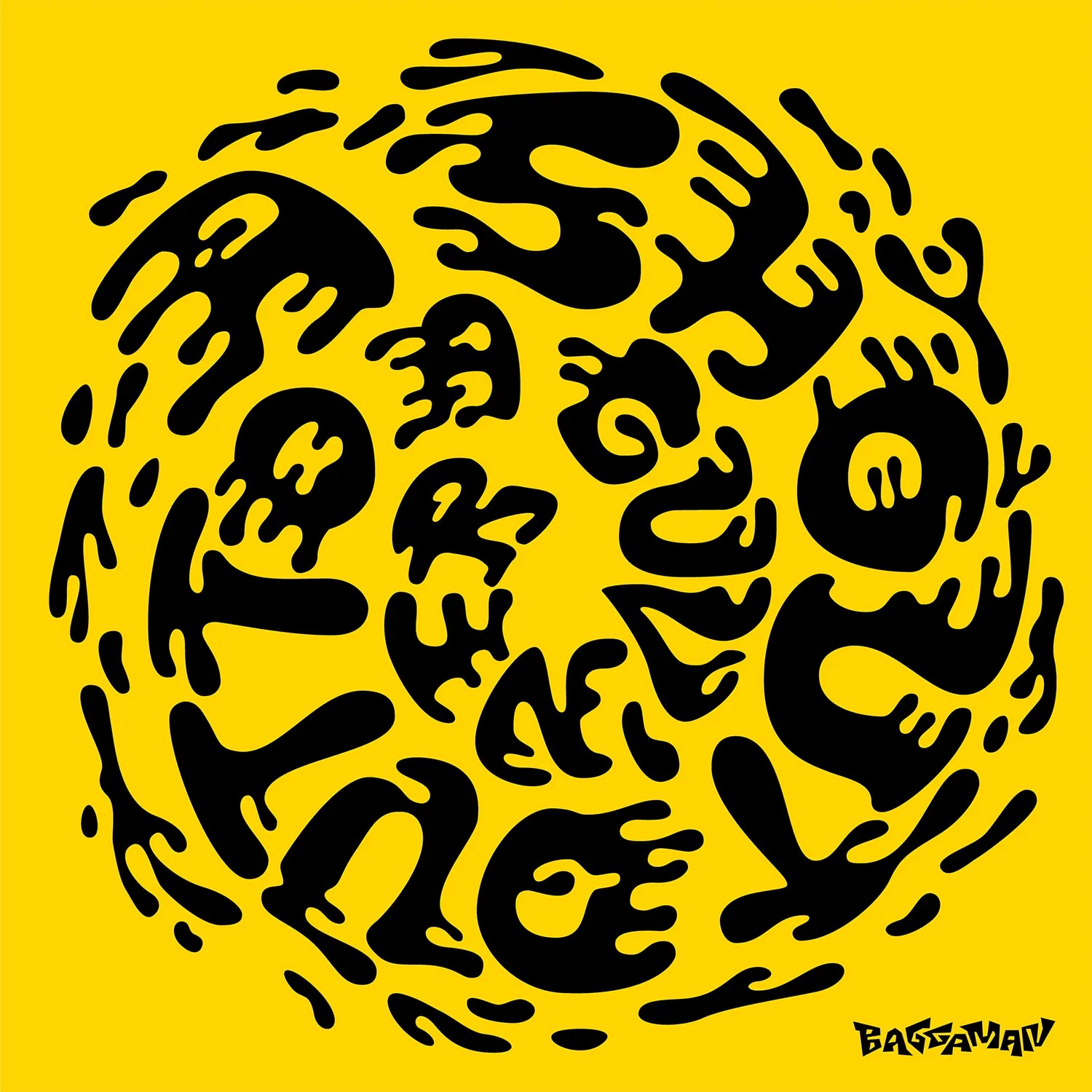
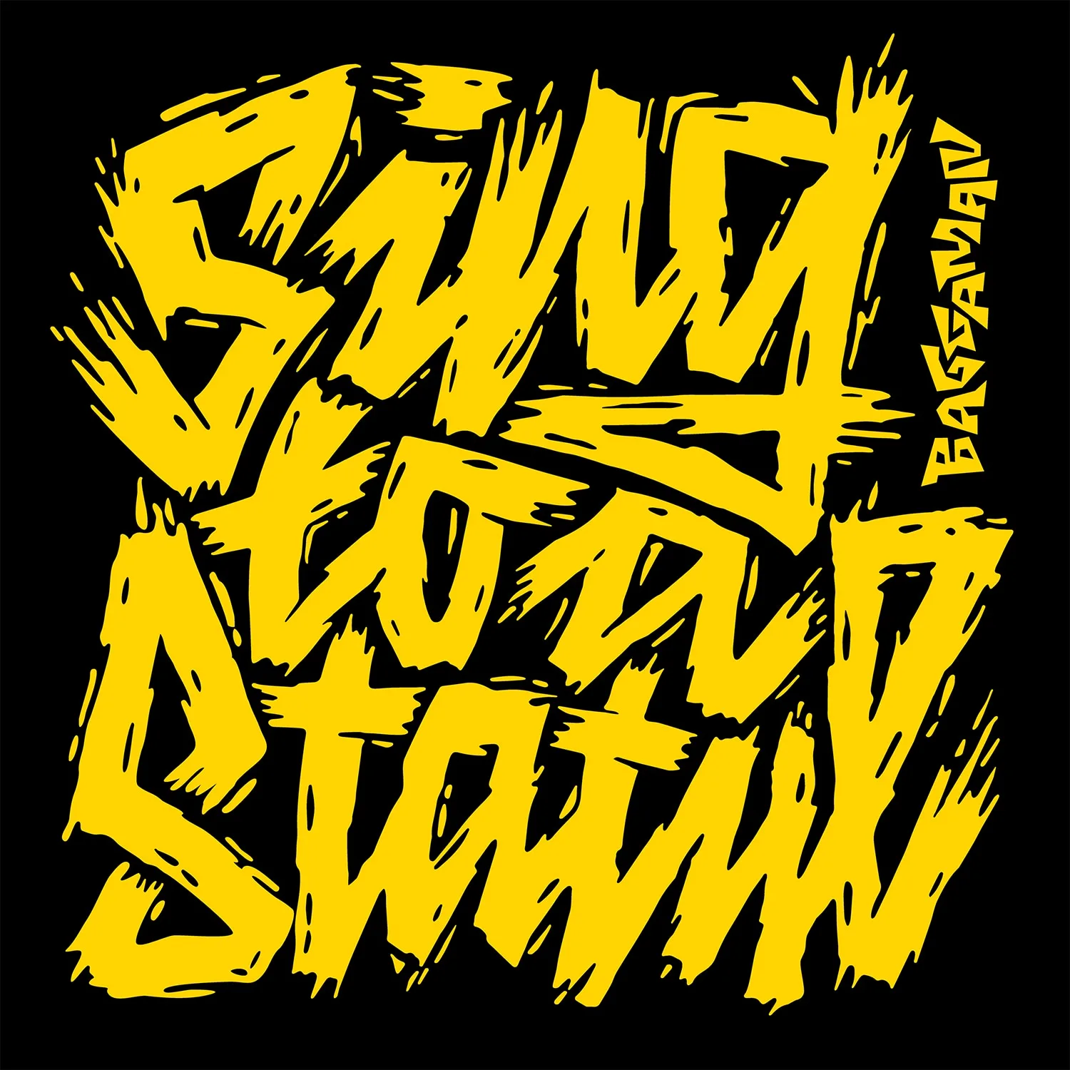
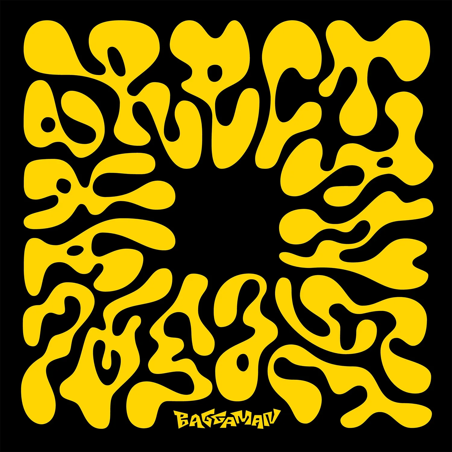
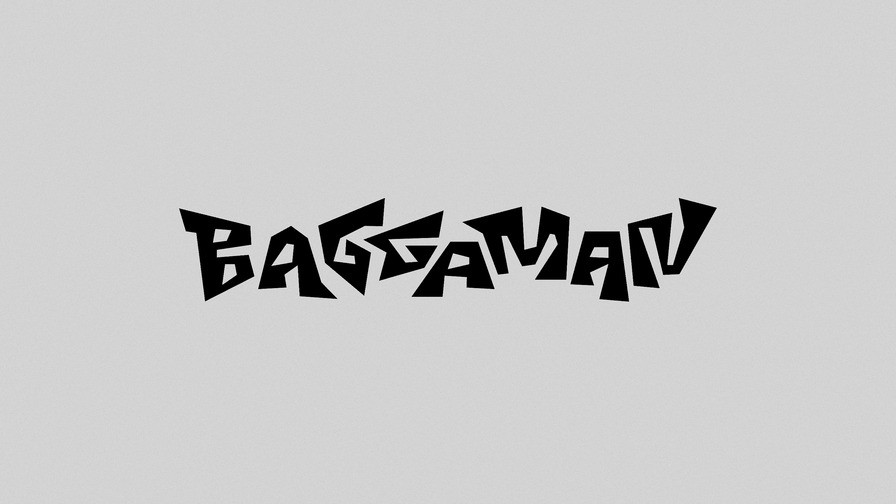
Baggaman – Record Covers


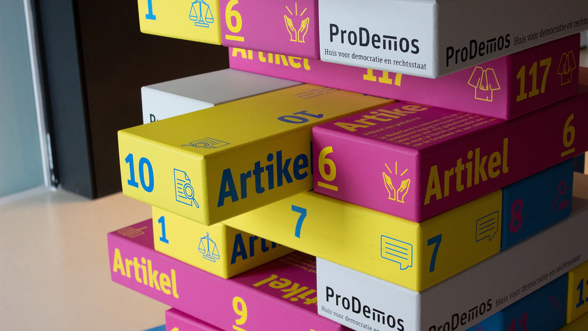
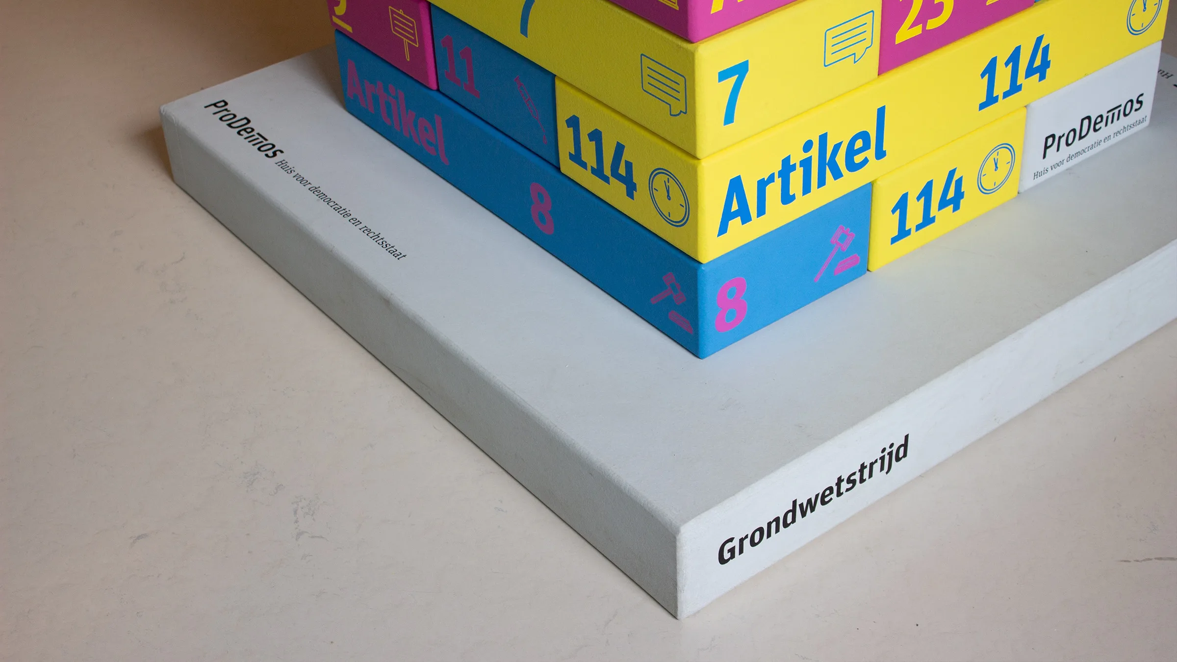
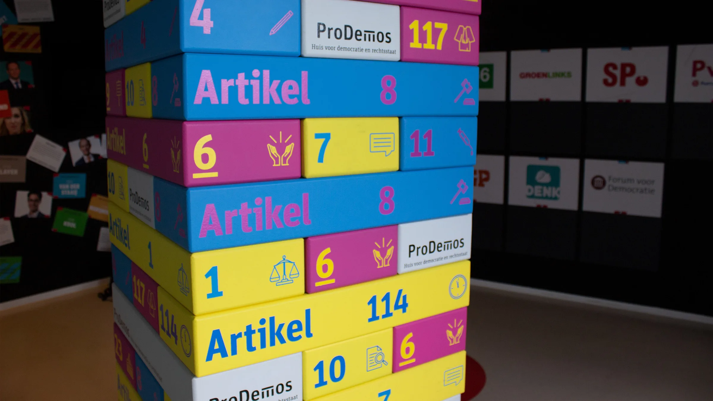
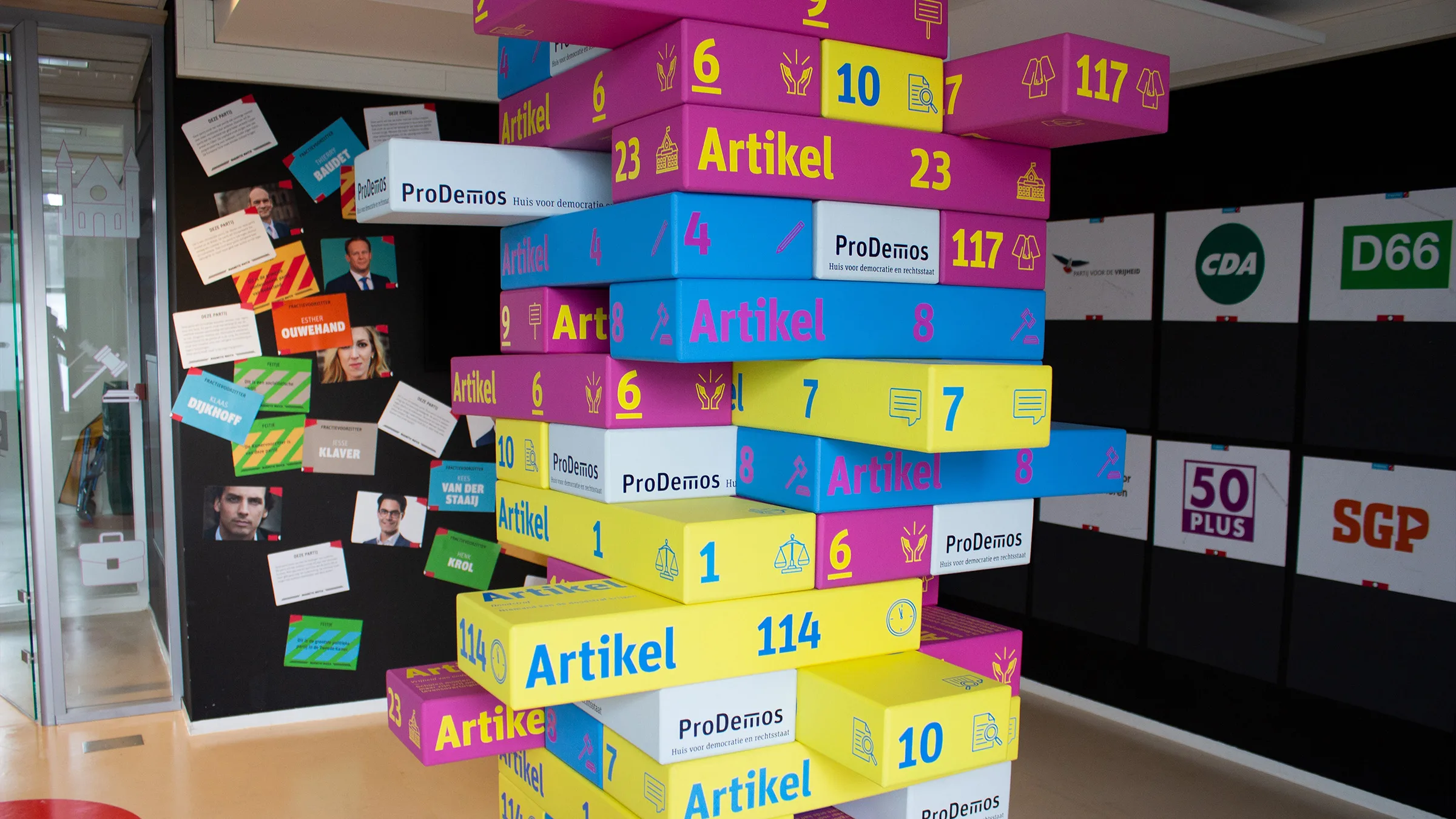
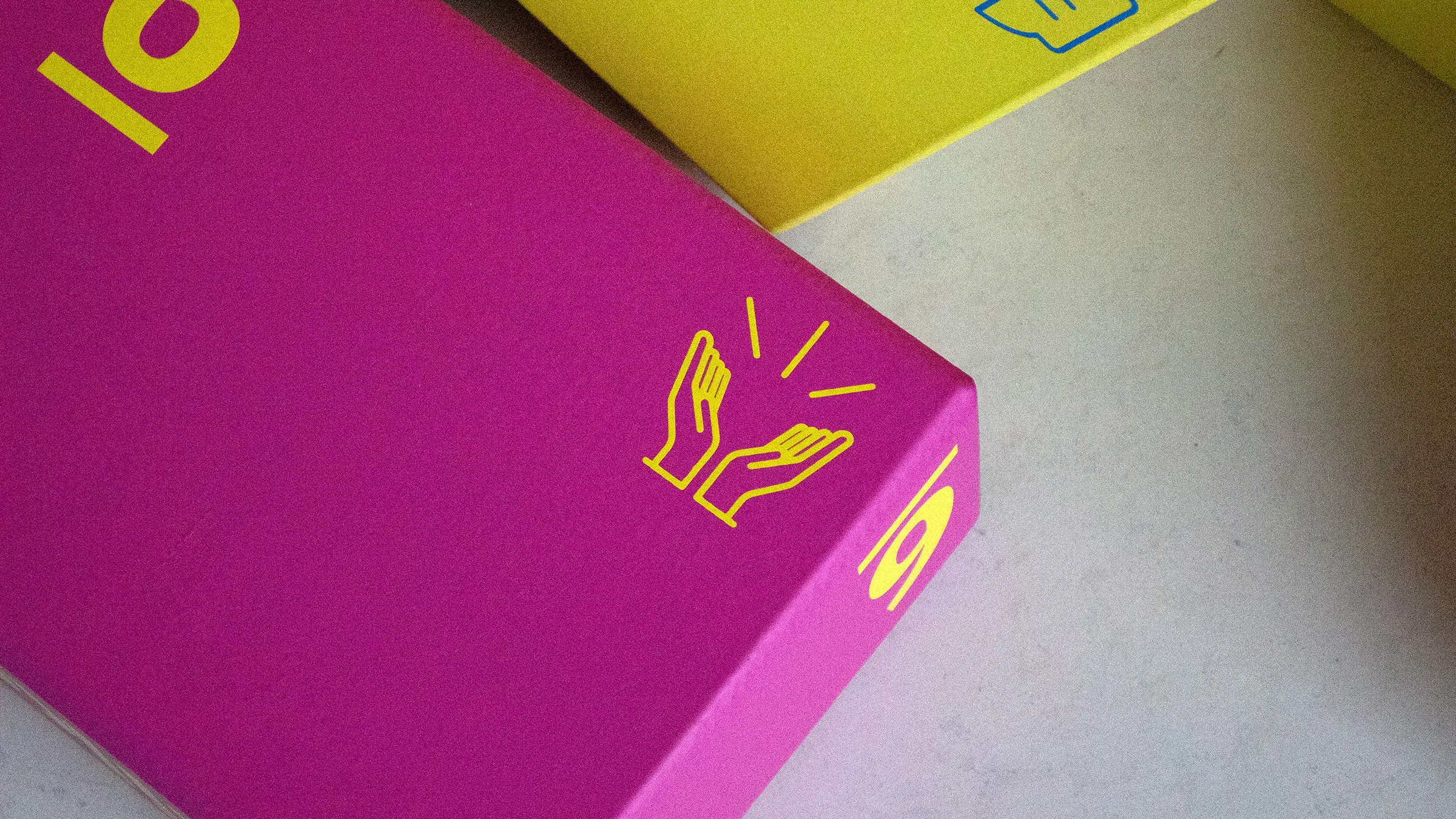
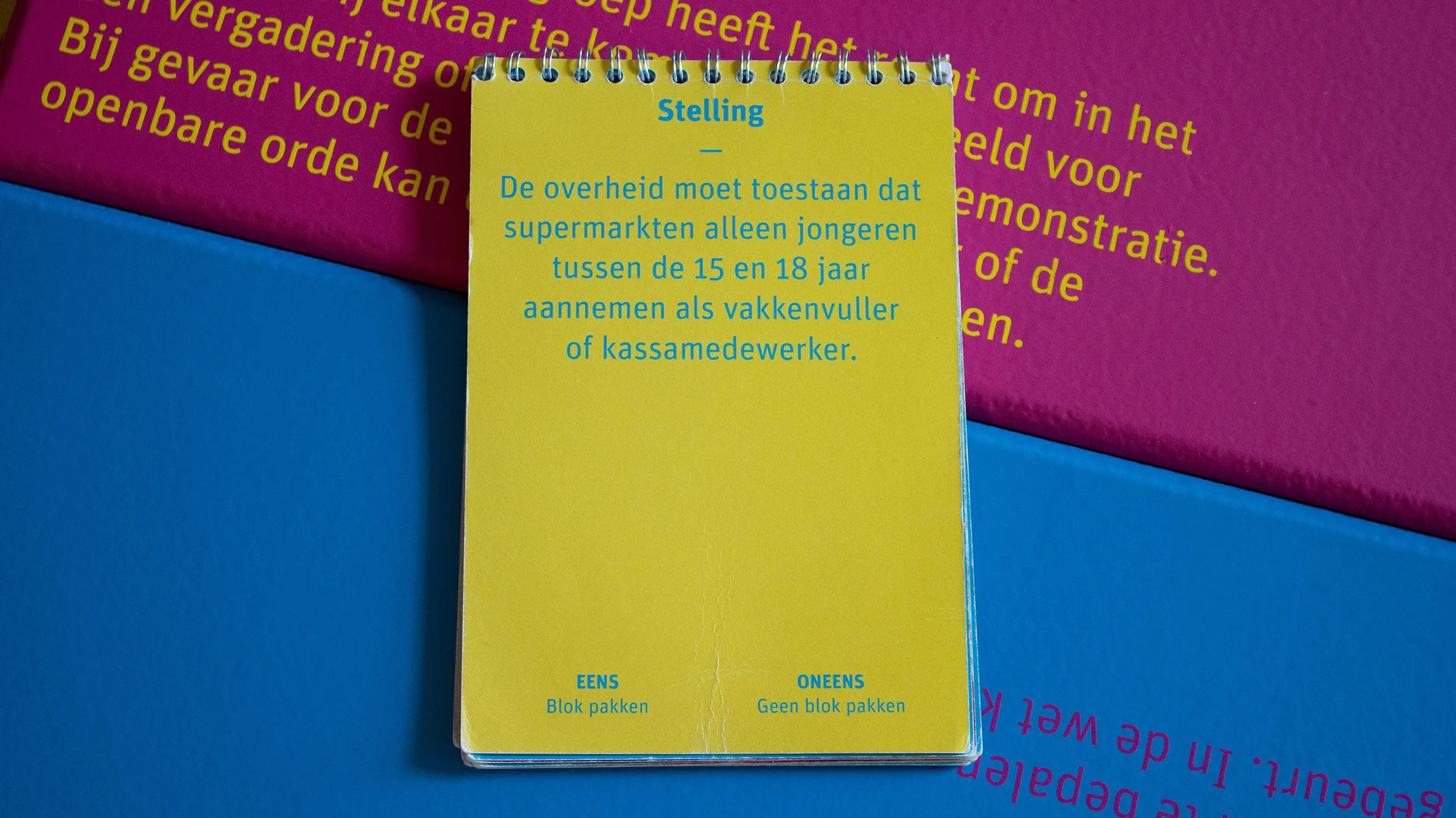
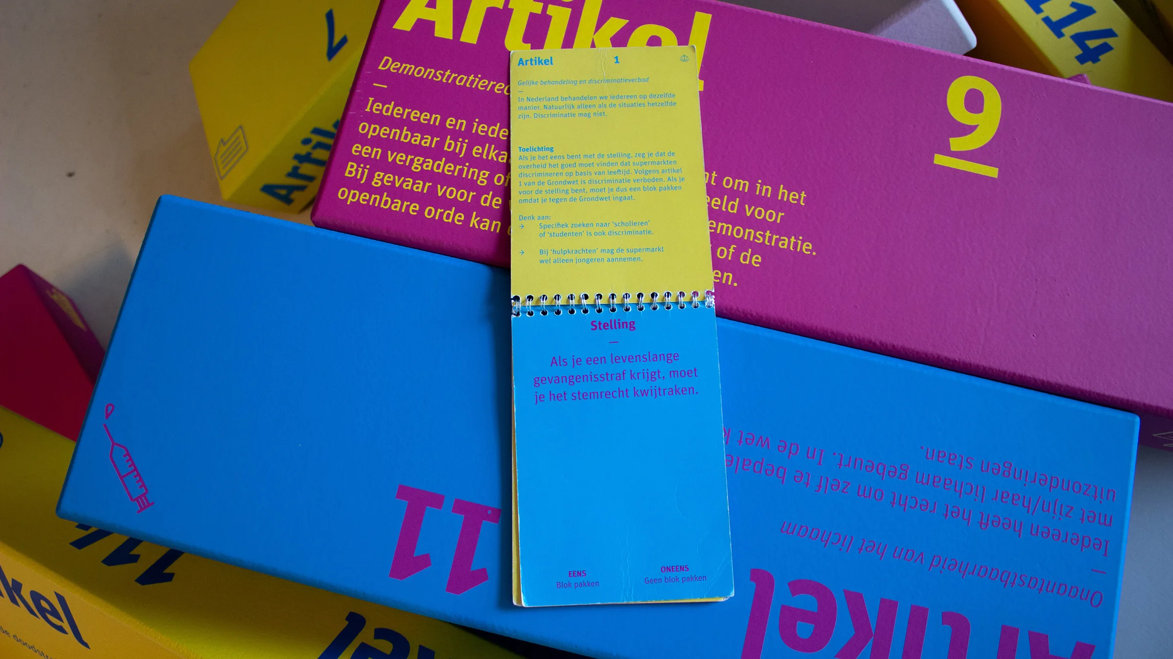
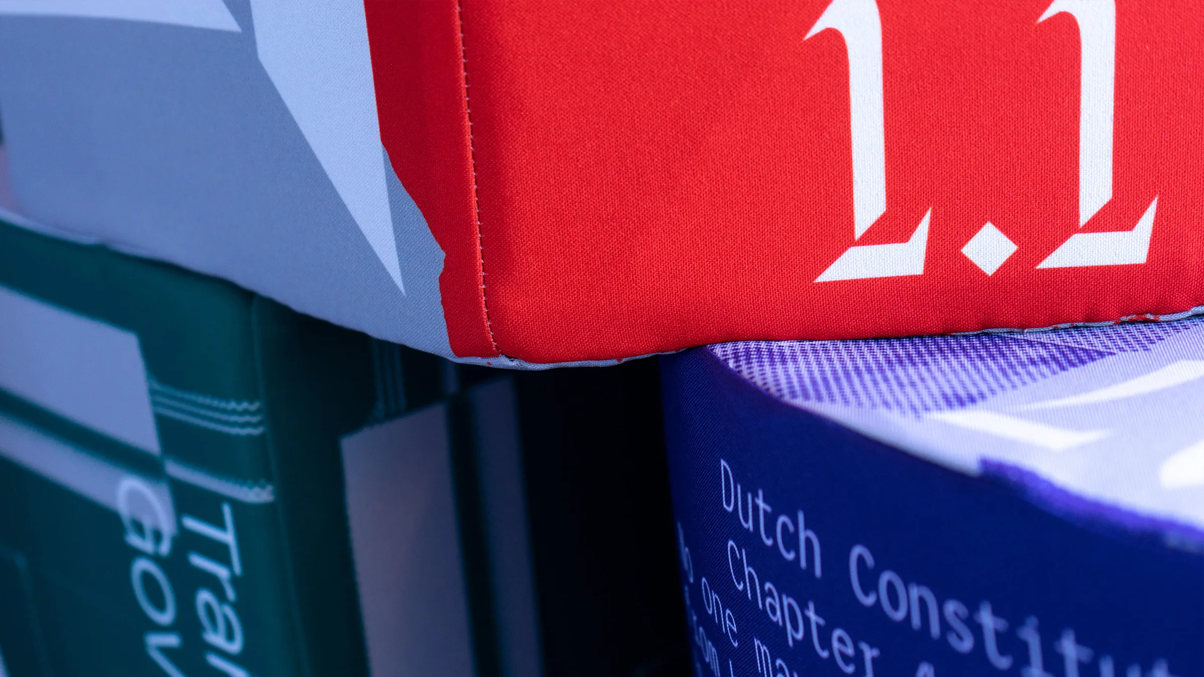
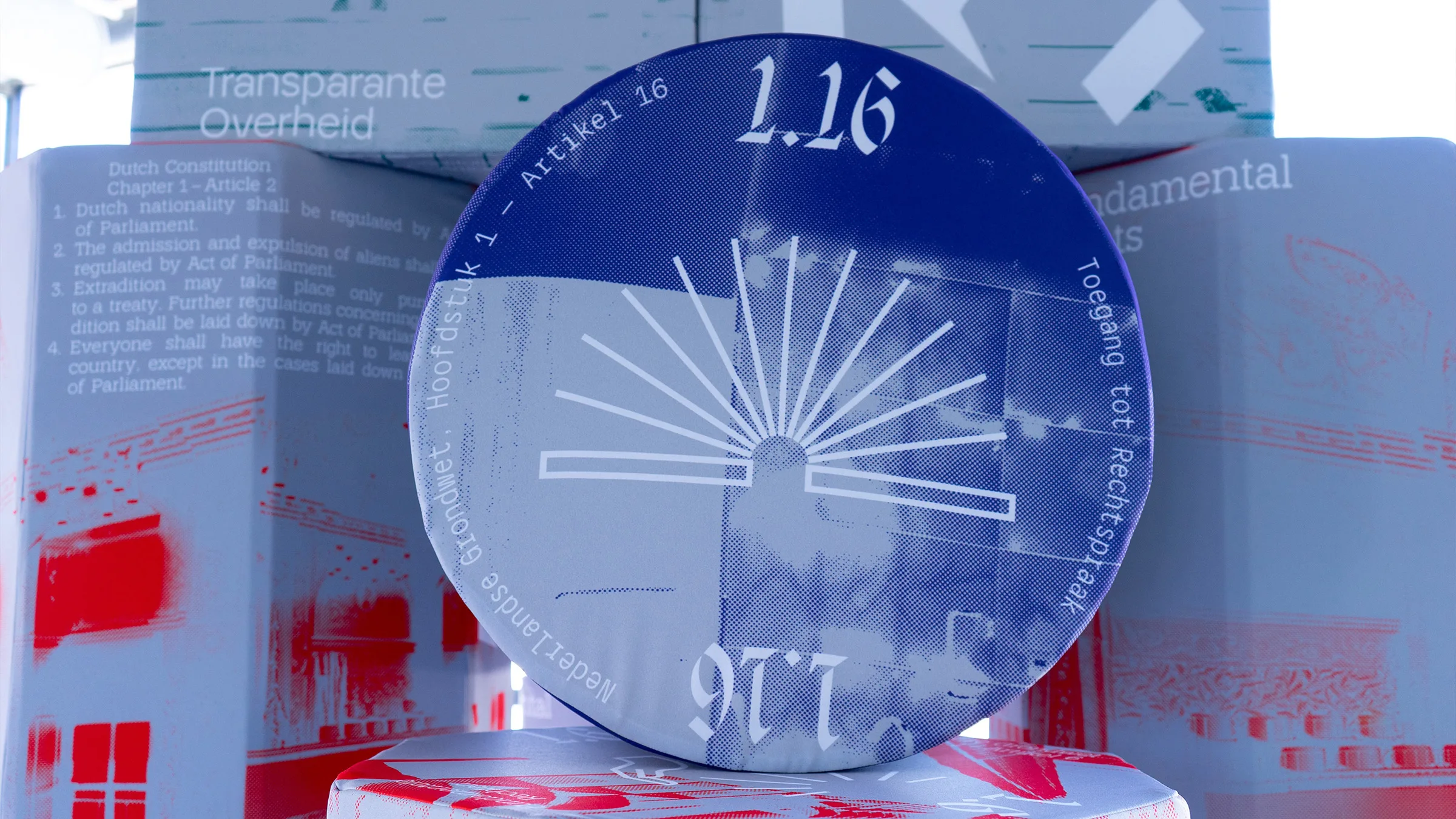
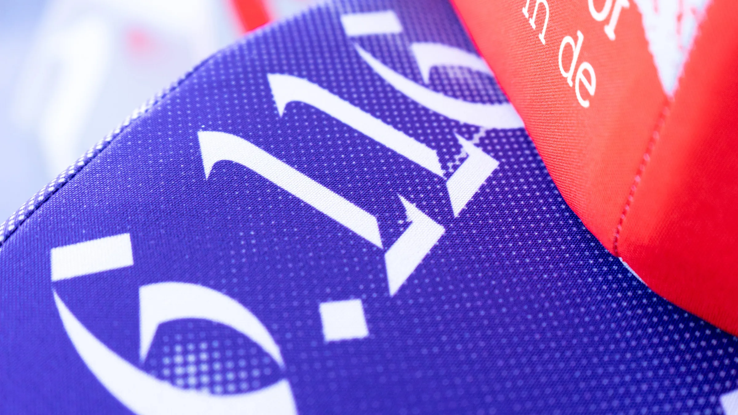
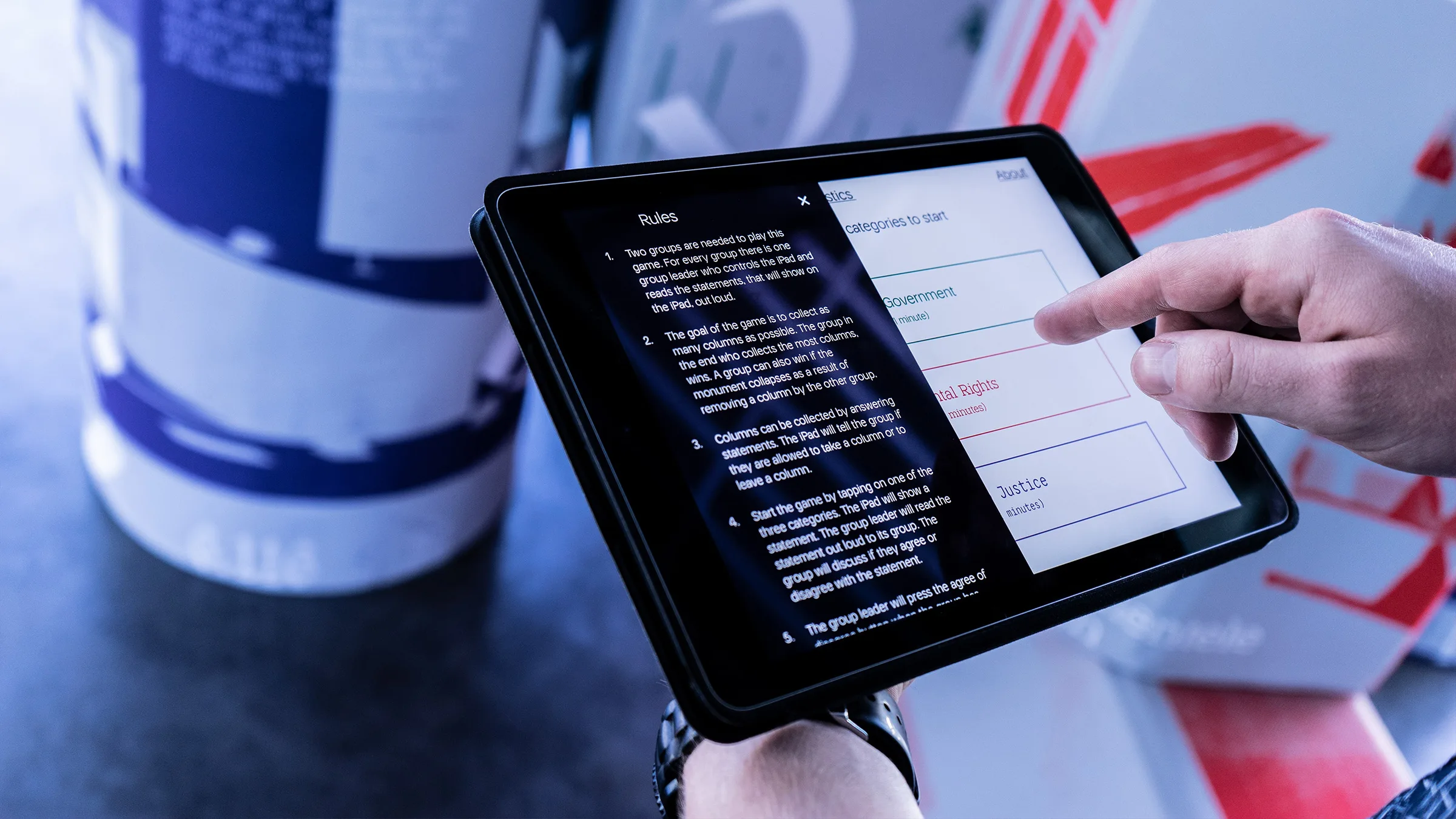
Grondwetstrijd
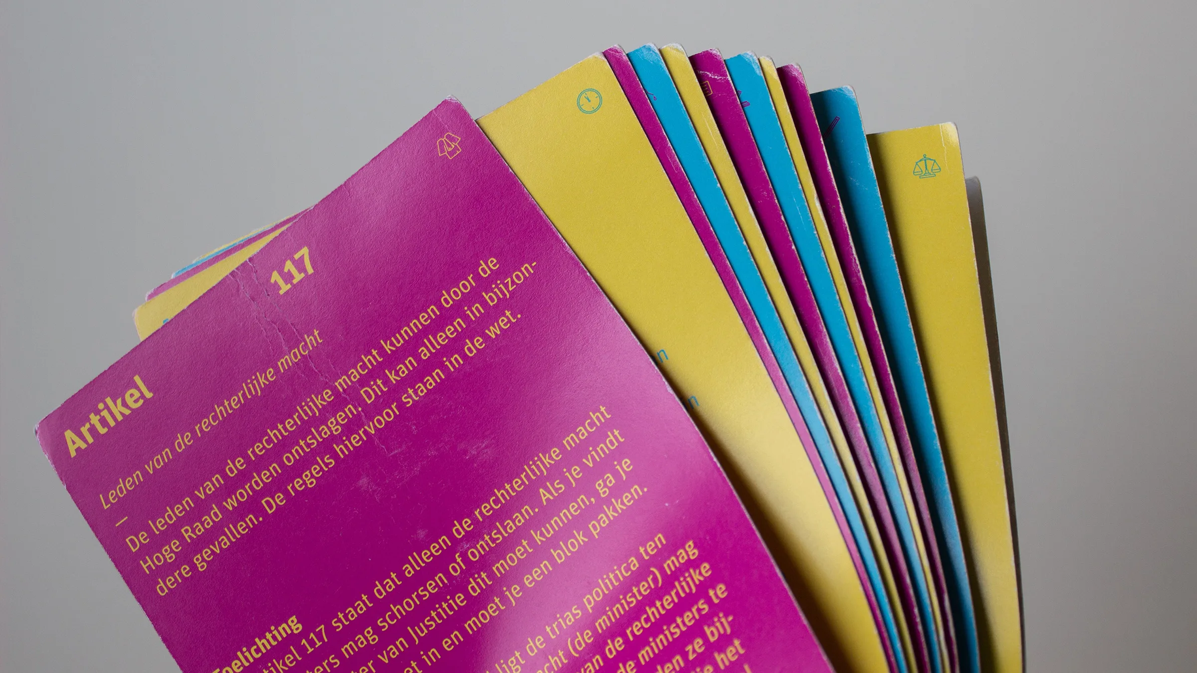
ProDemos
The constitutional articles together form the pilar of democracy. For every article, a statement was written to which students agree or disagree. Based on their opinion they have to take or remove a block from the pilar. By playing, the students learn about the importance of the Dutch contitution. When you ignore/remove too many articles, the pilar will be damaged or even fall. This doesn’t mean however, that the constition is unchangeable.


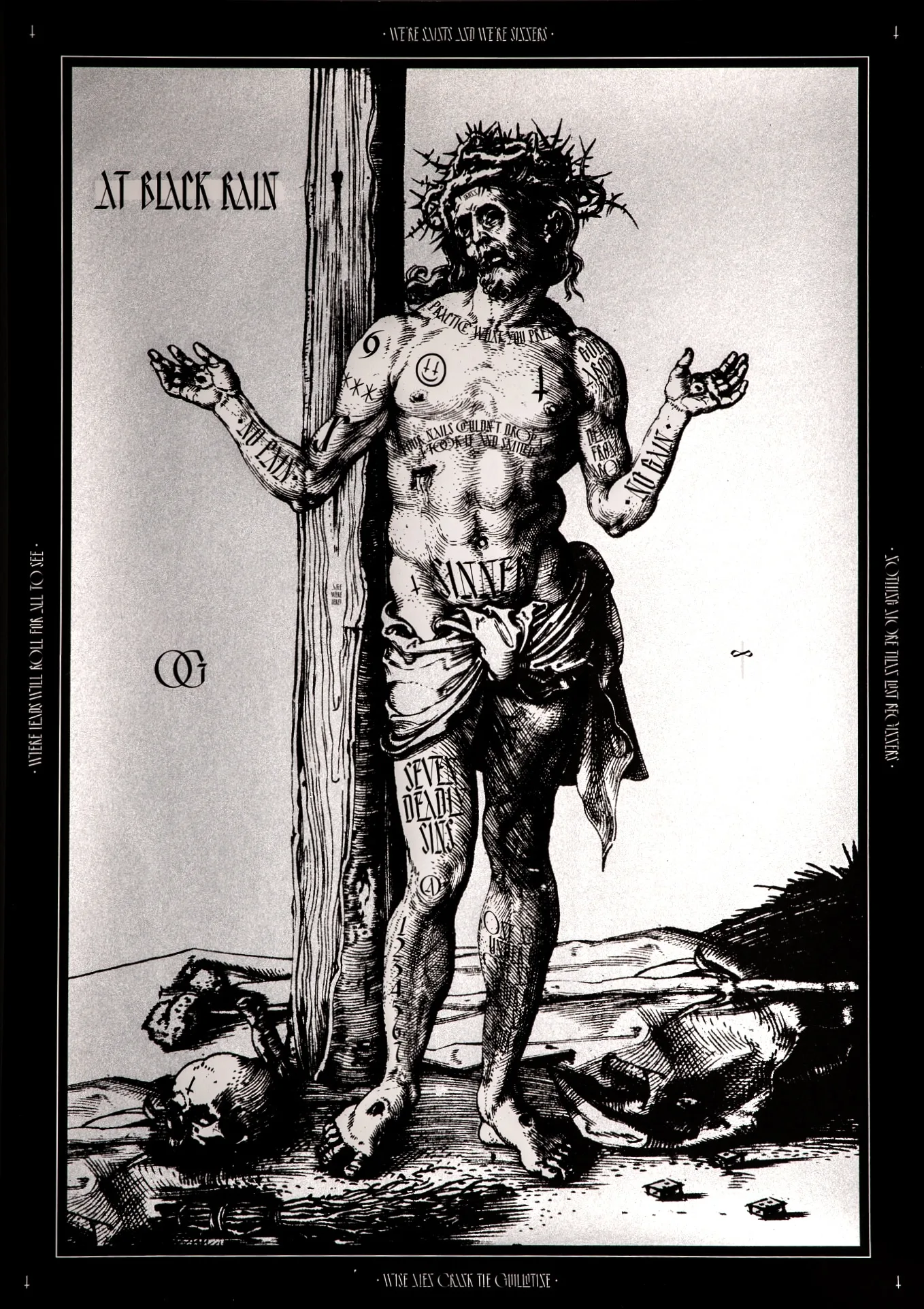
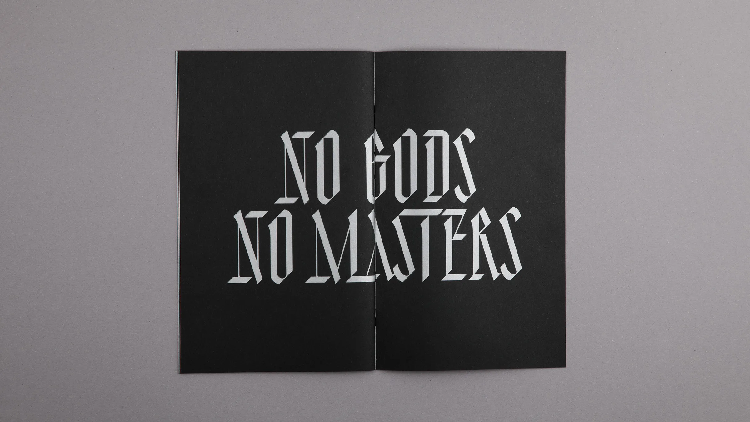
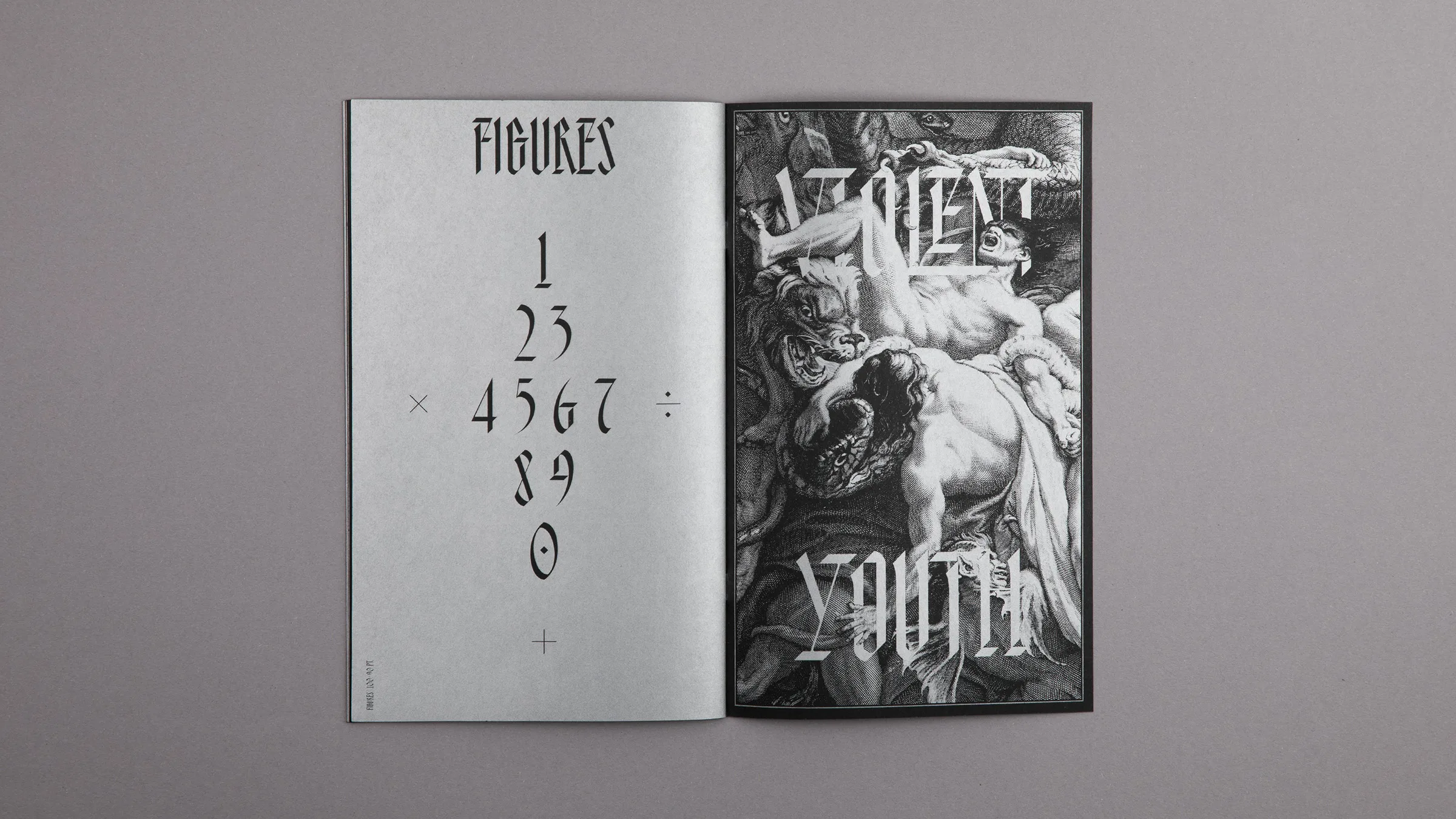
AT Violent Youth
attak.co/atviolentyouth
↕
A
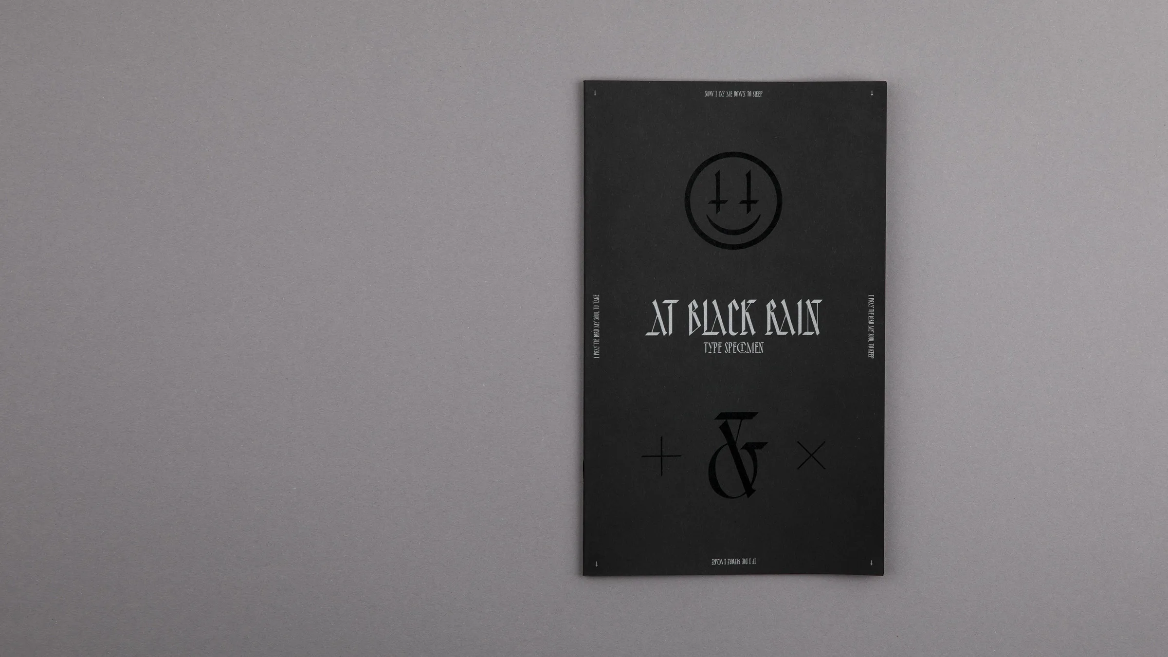
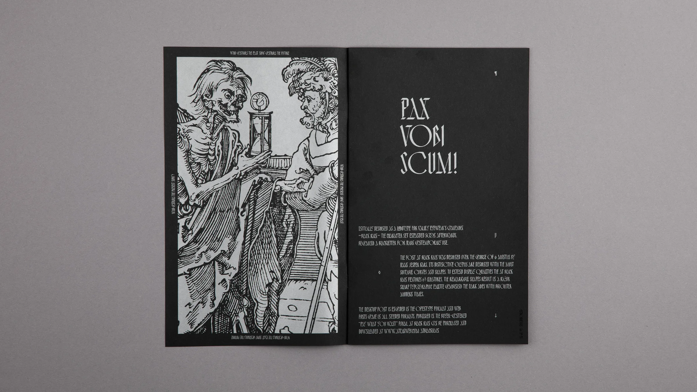
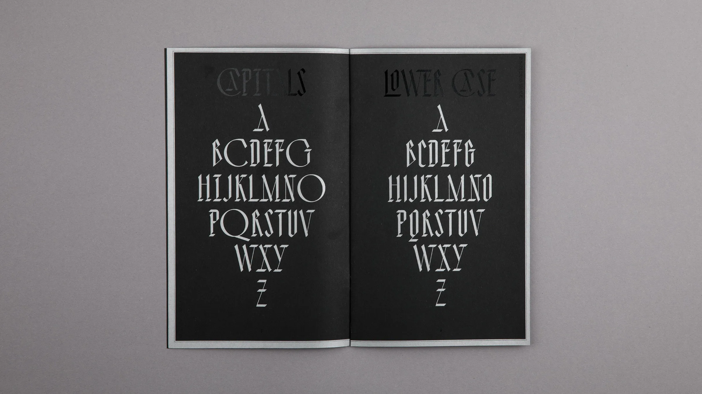
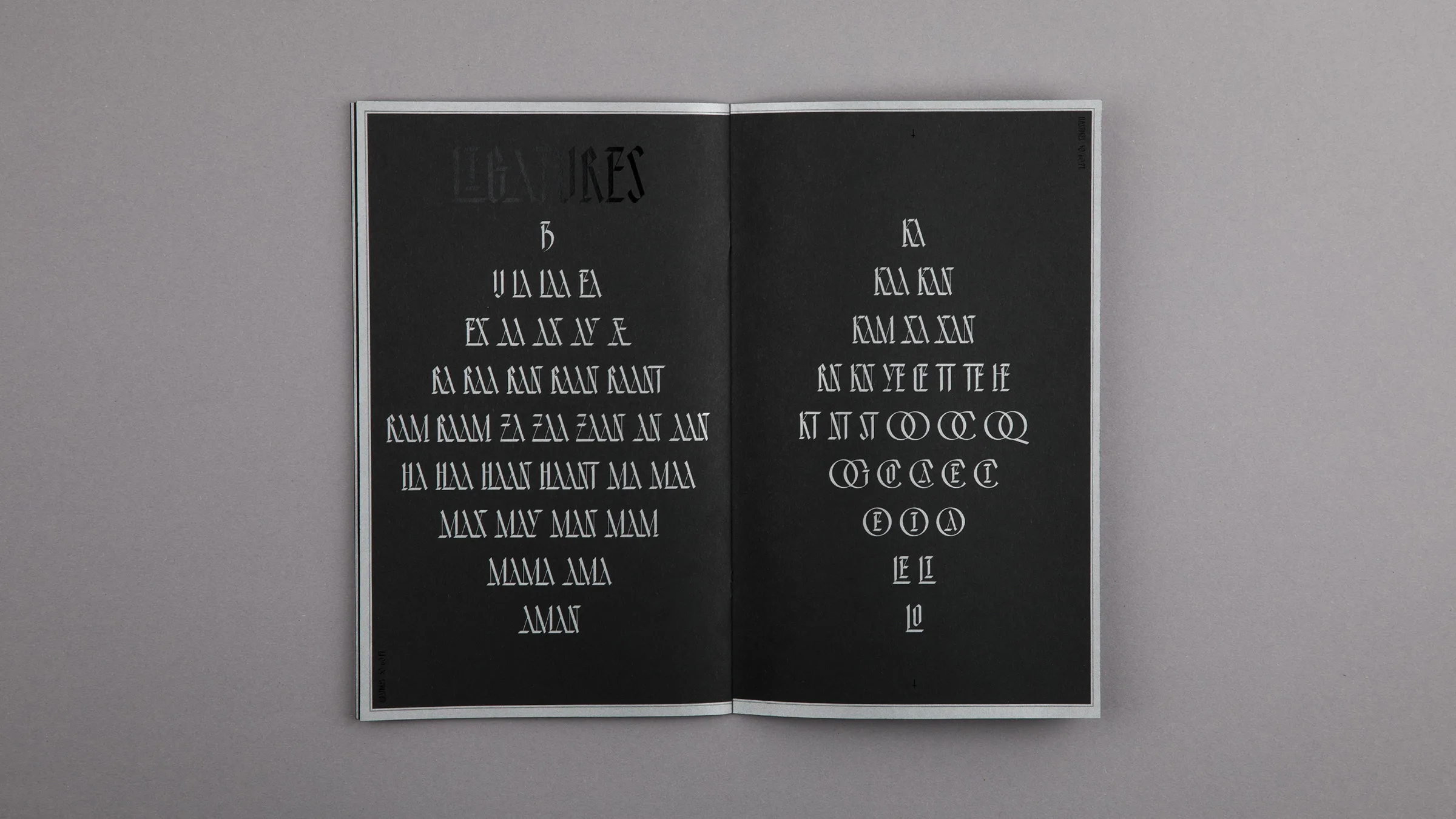
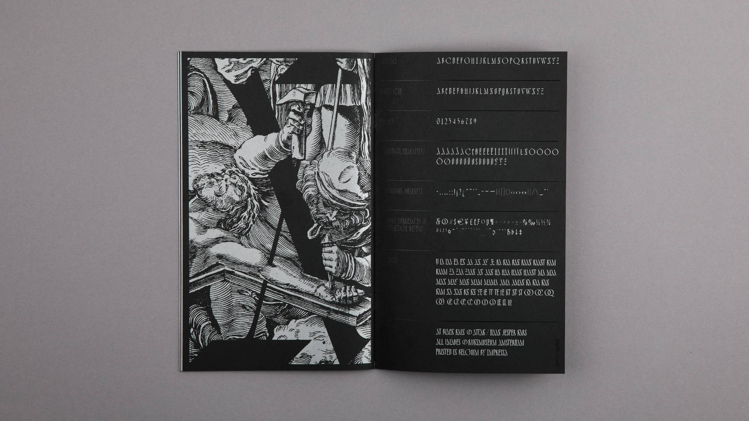
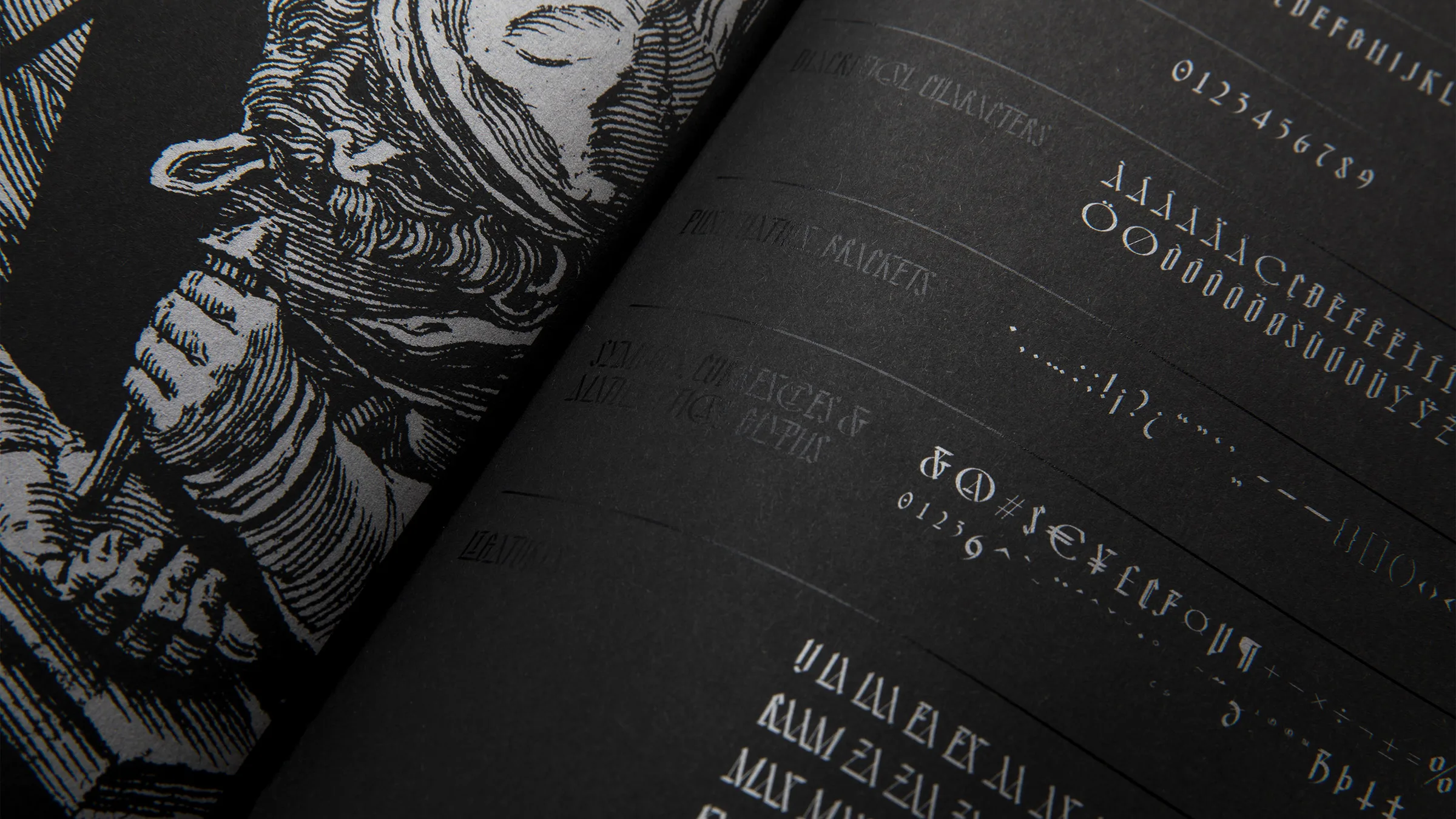
AT Violent Youth Specimen
ATTAK
The font AT Violent Youth (previously known as AT Black Rain) was designed over the course of 6 months during my internship at ATTAK. Its distinctive glyphs are designed with the most suitable curves and shapes. To extend display qualities the AT Black Rain features 65 ligatures. The remarkable shapes result in a razor sharp typographic palette combining the dark ages with brighter modern times. Printed with black and silver ink on black paper.
Check out the online type specimen here: attak.co/atviolentyouth


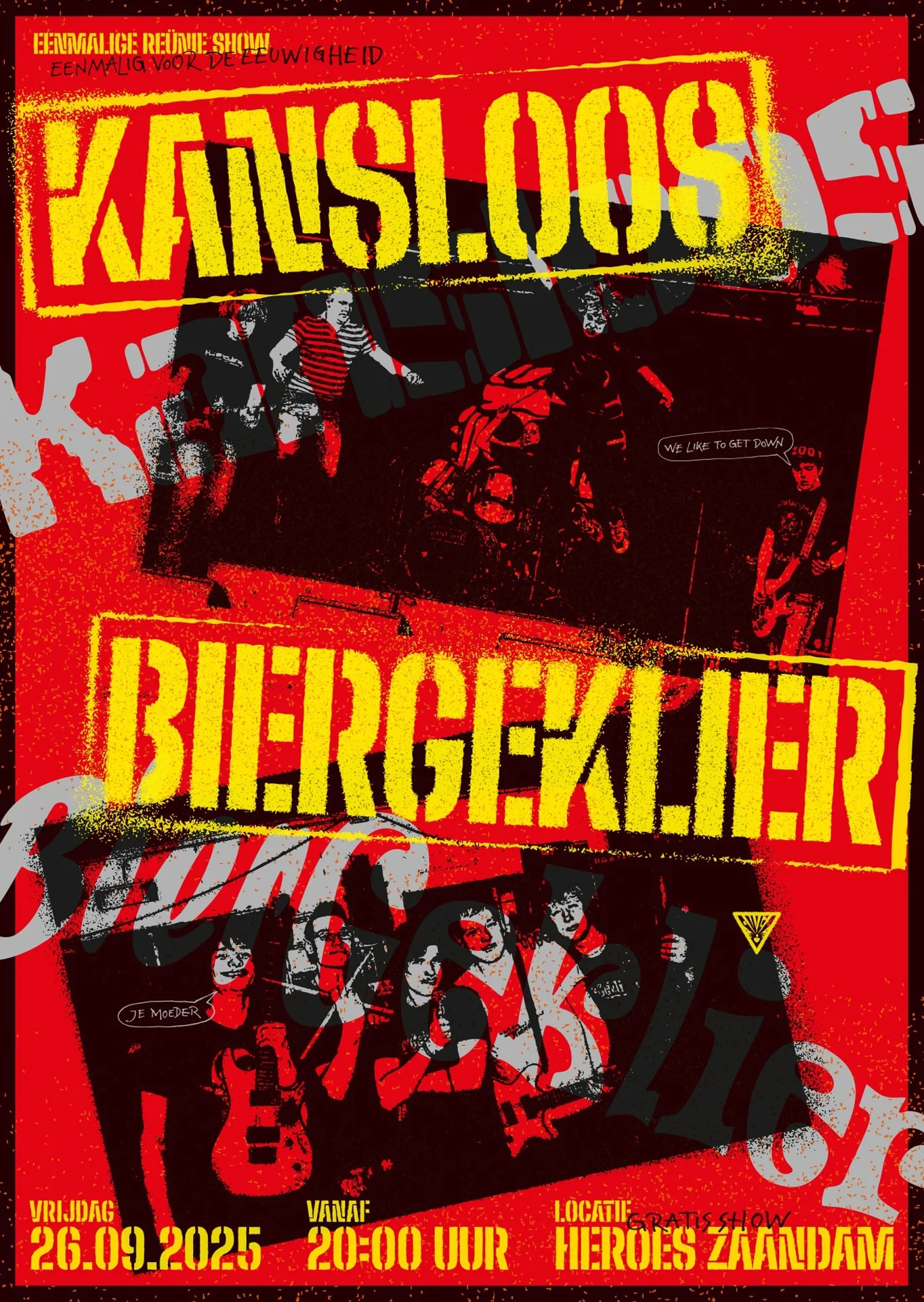
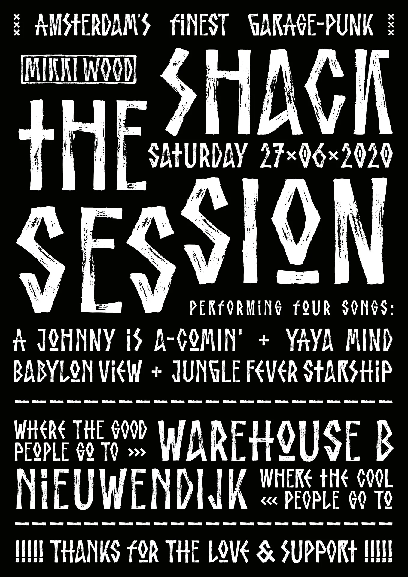
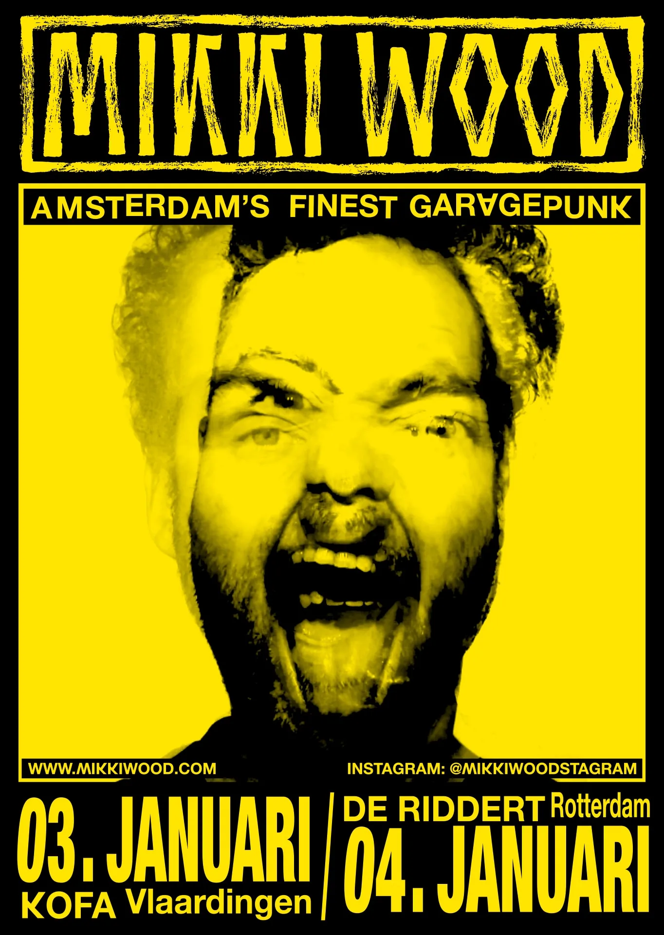
Mikki Wood – Record Covers
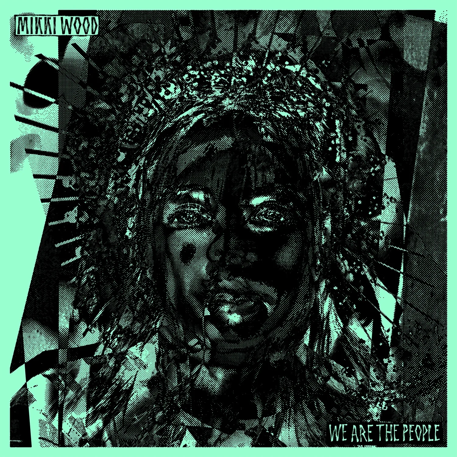

DJK Mikki Wood
↕
A
Mikki Wood – 7 Inch
First EP of the Amsterdam based garage-punk band Mikki Wood. The artwork represents the 1% who fuel on other peoples misery.
www.mikkiwood.com
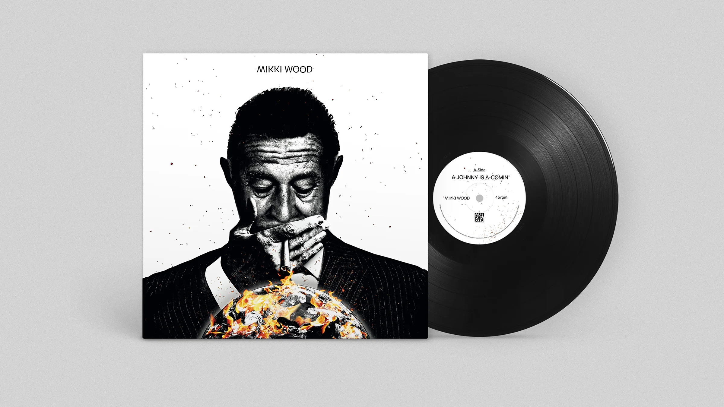
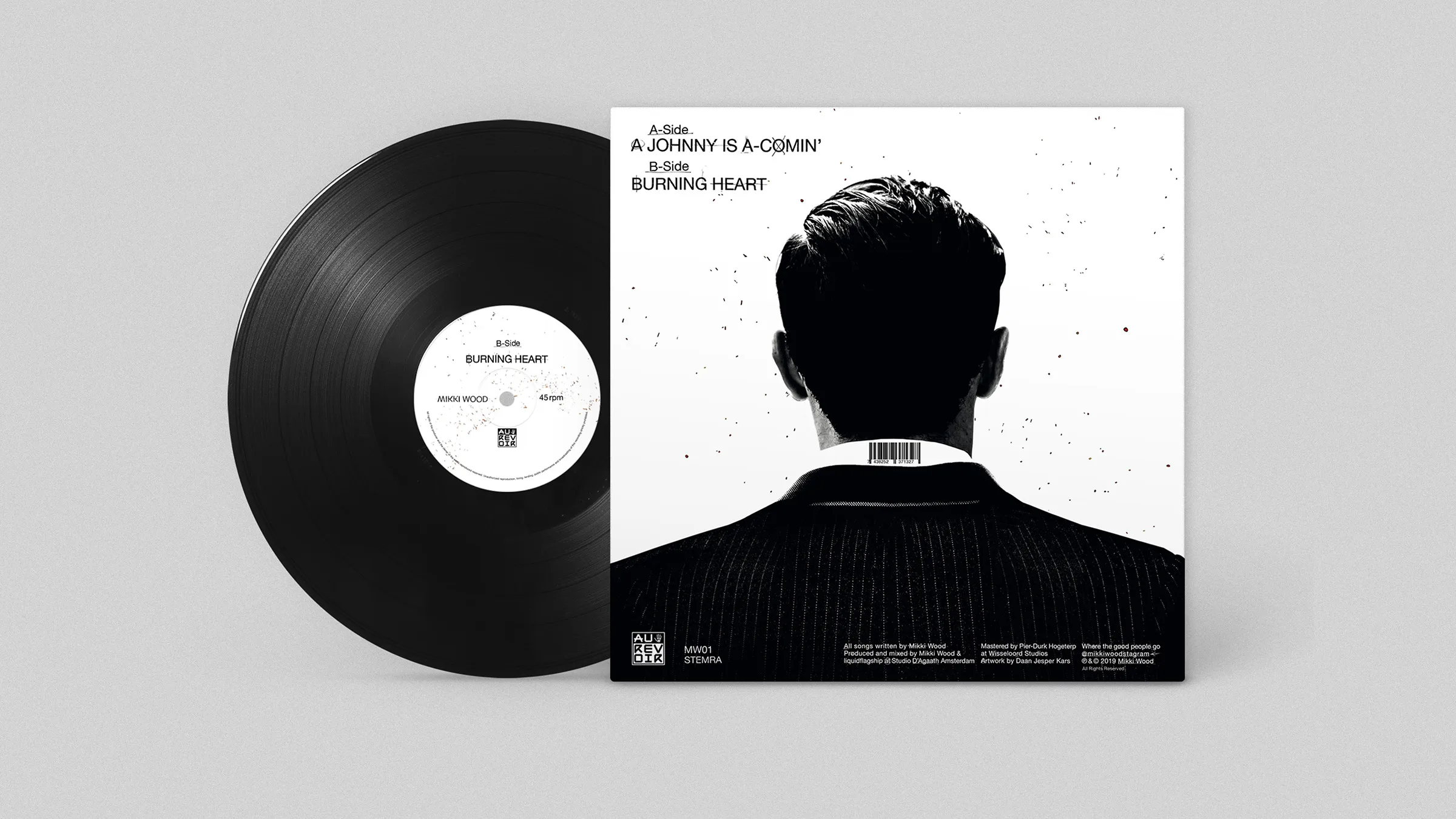
A Johnny is A-Comin’
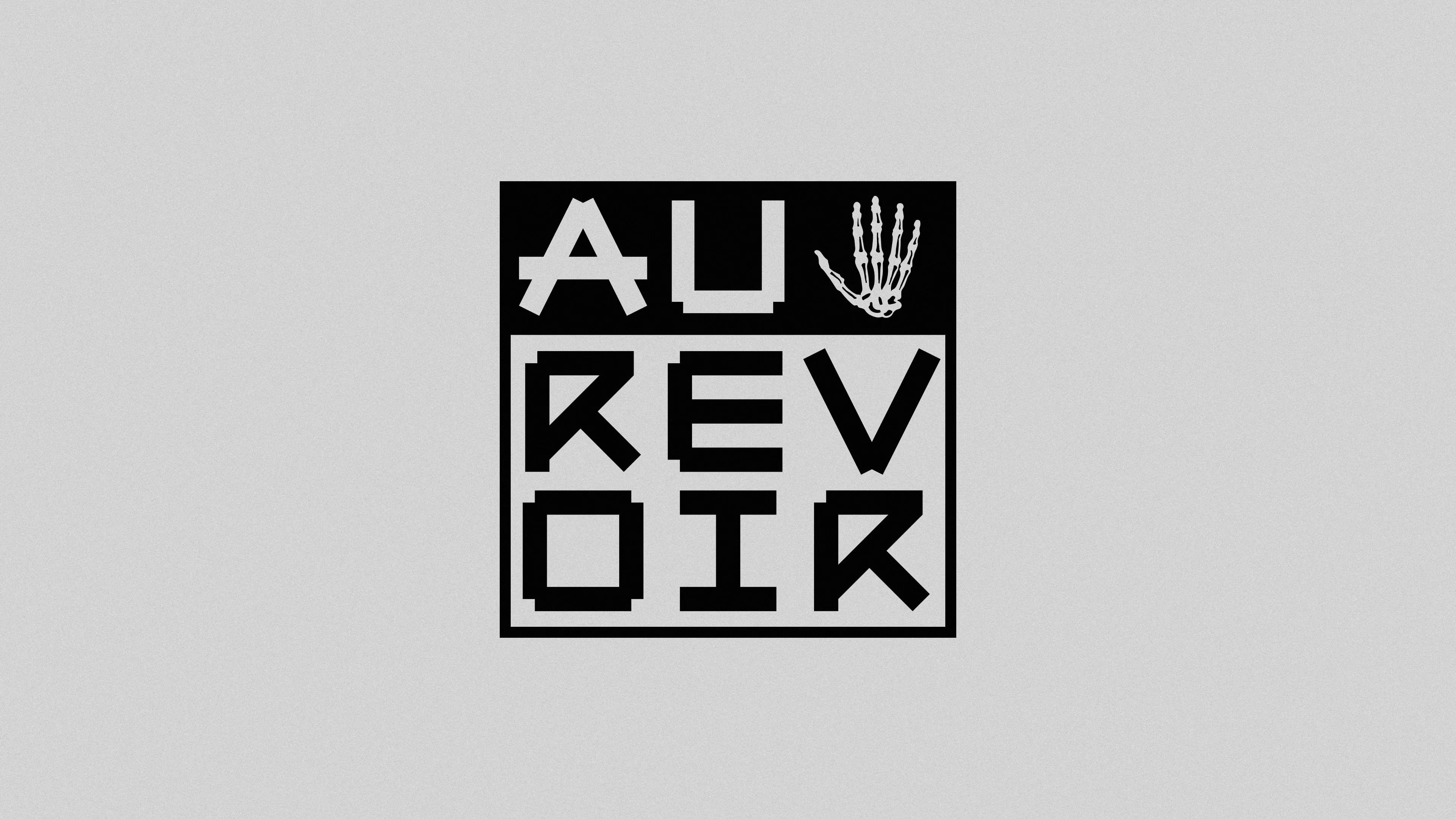
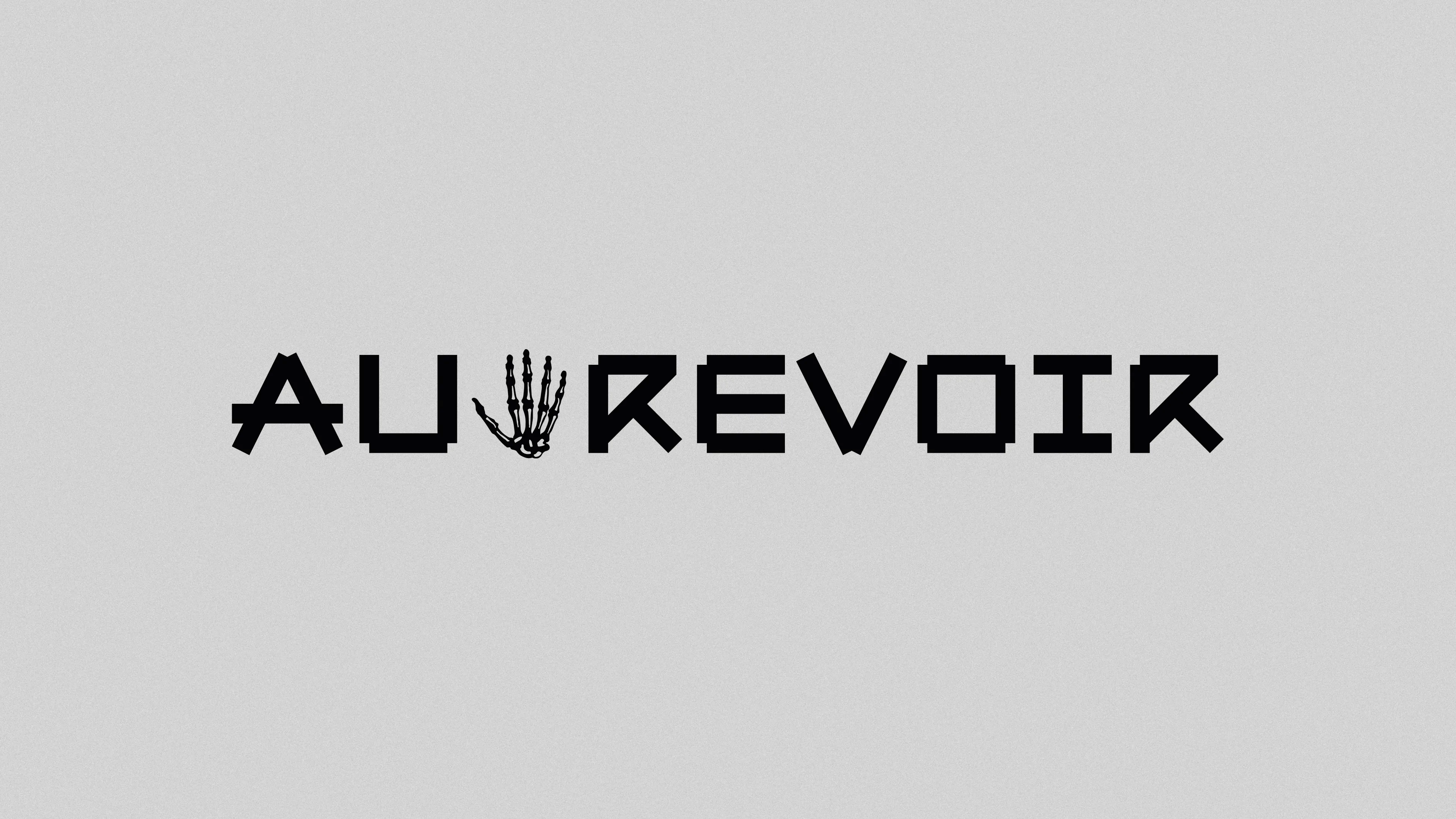
Au Revoir
Logofolio
A selection of logos created between 2015 and present day.


Camp High Gain — Blue Blood
I Hereby Pledge My Allegiance
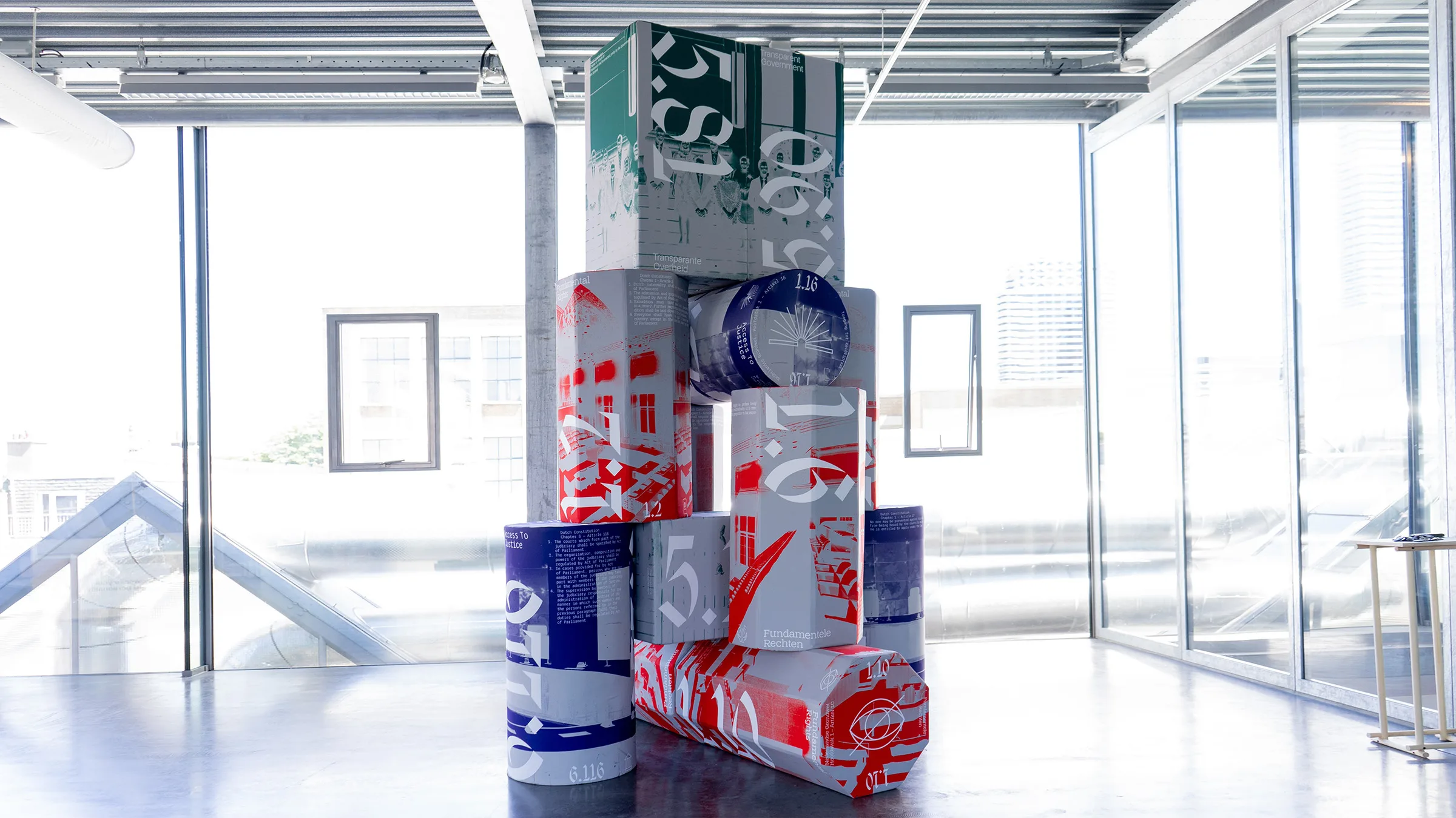
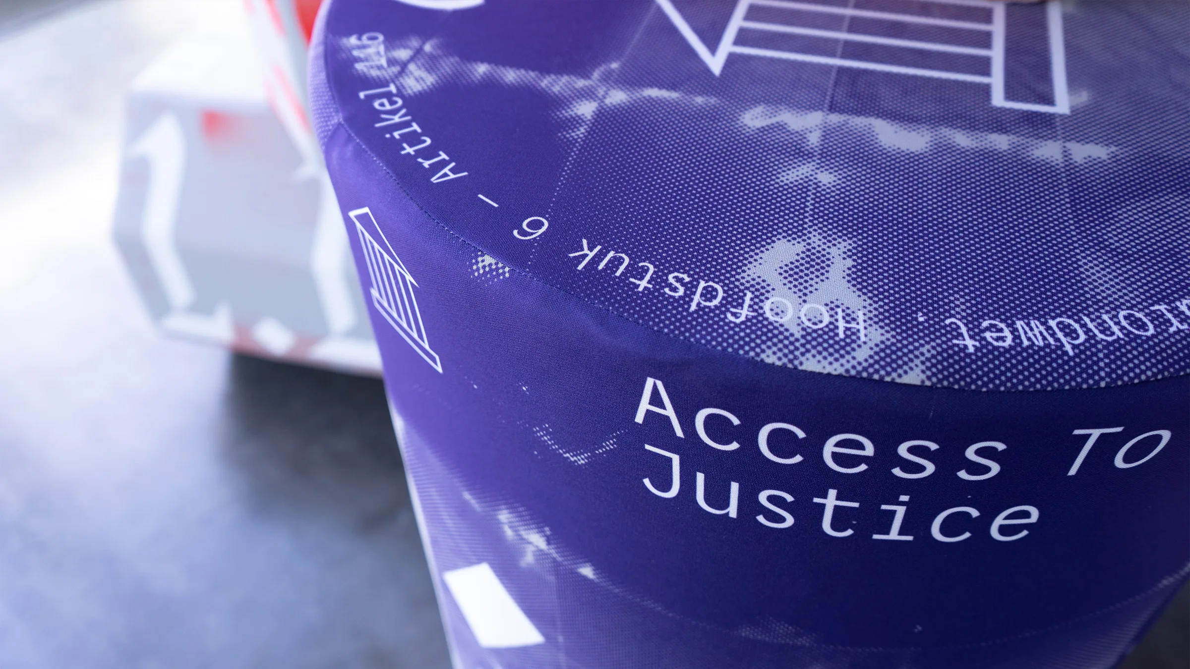
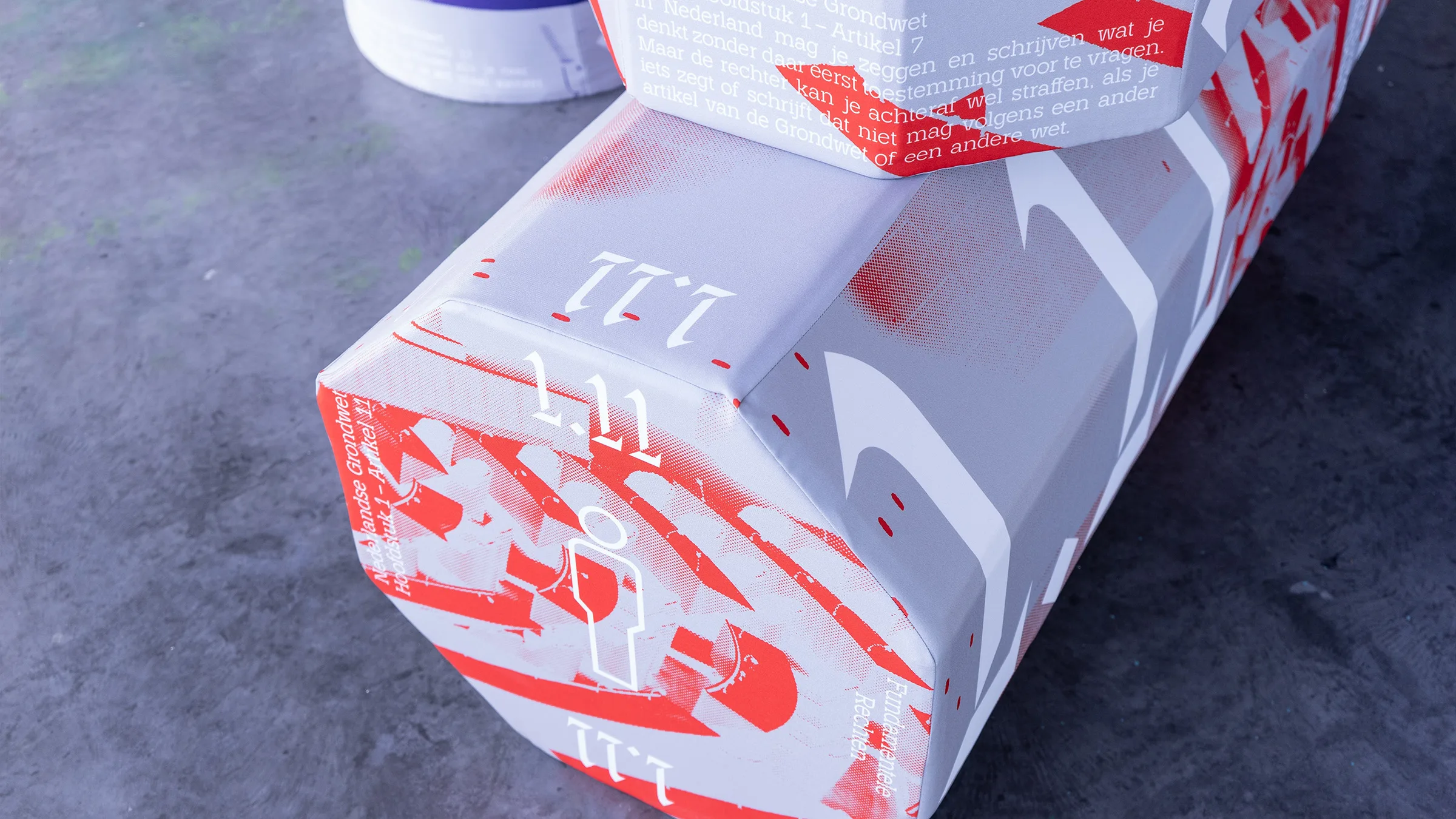
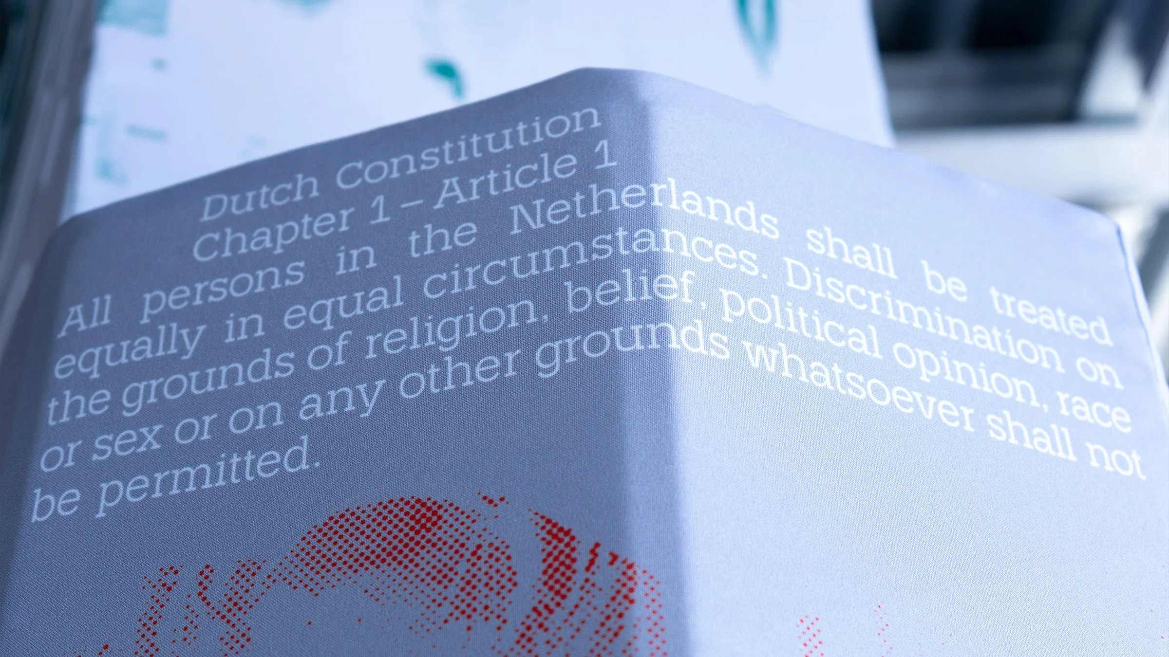
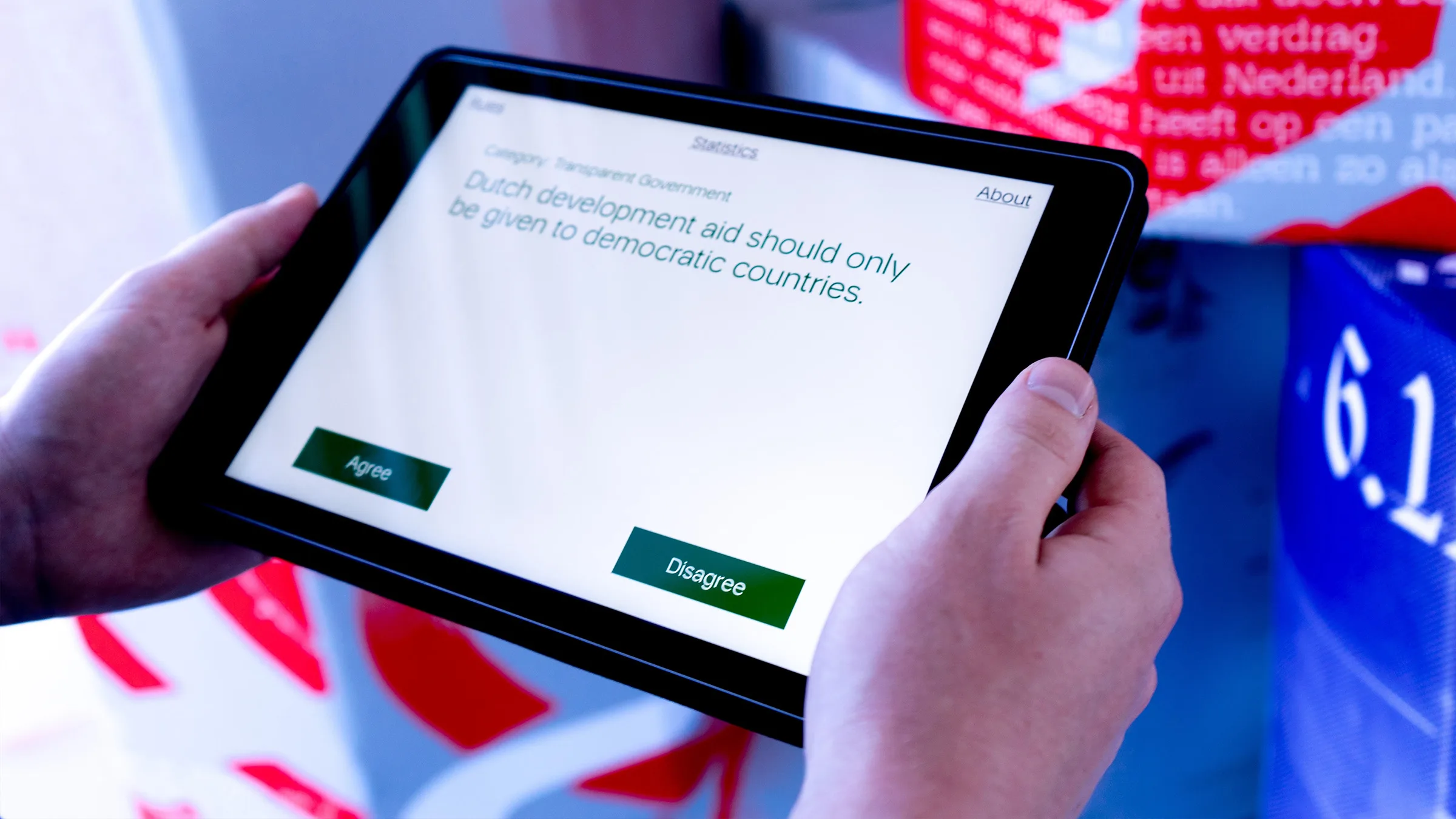
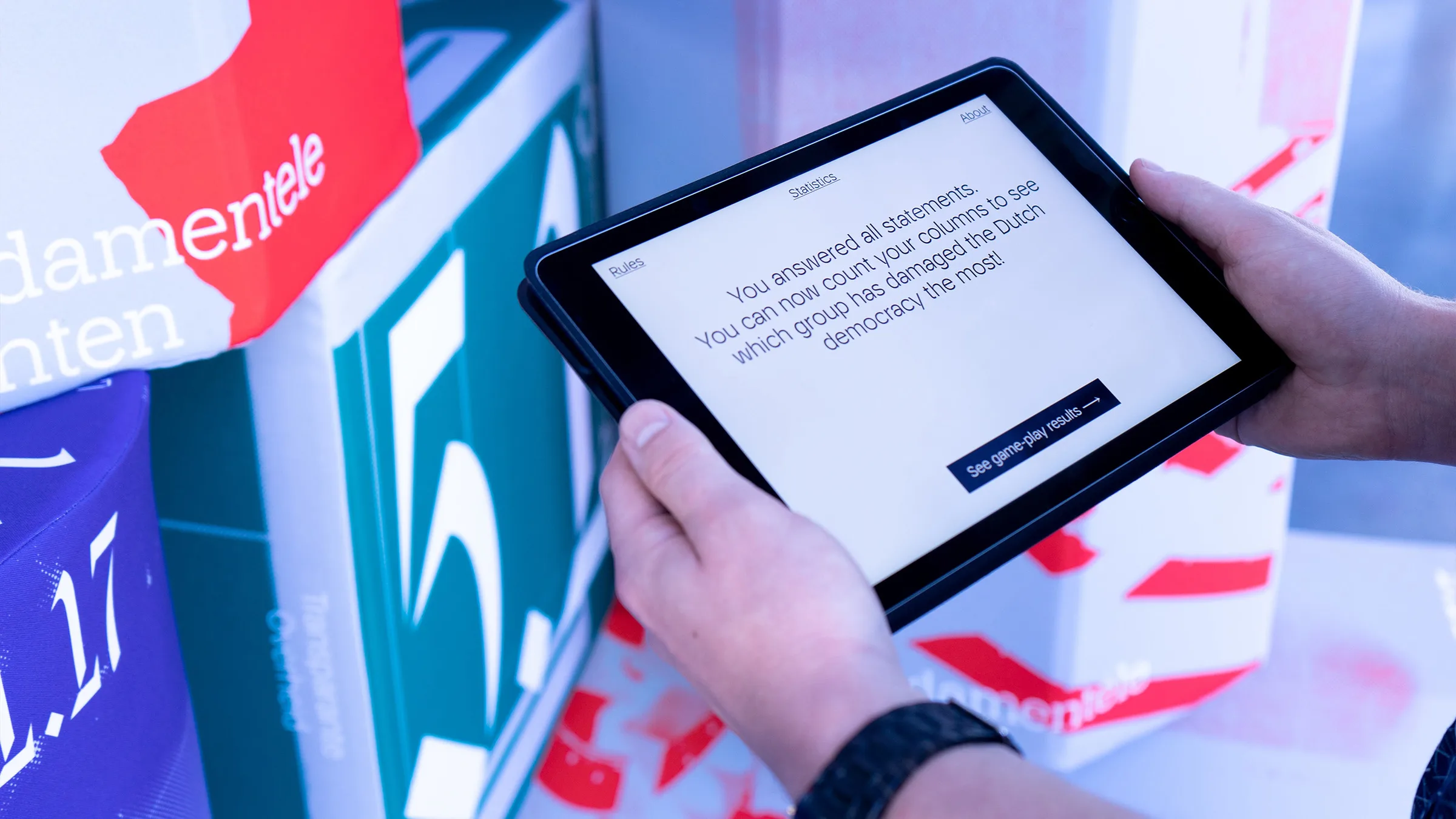
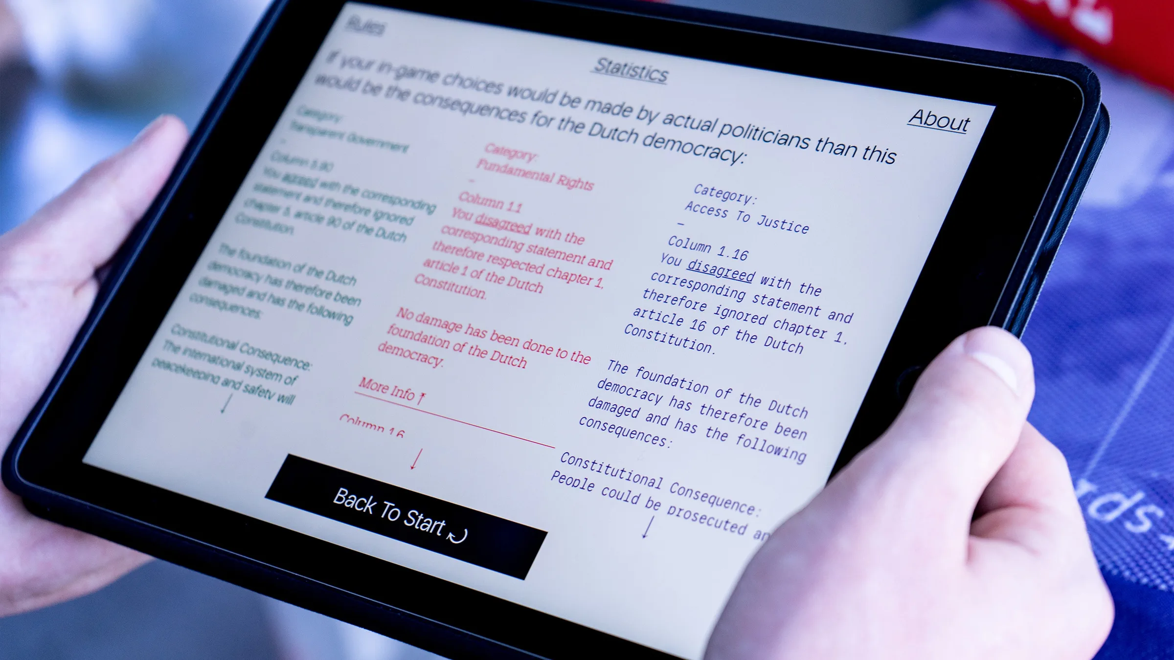
The 2017 election programs of the Dutch political parties contain 41 statements which are in direct violation of constitutional articles. I Hereby Pledge My Allegiance is a dynamic installation which portrays the impact and consequences for Dutch citizens or politicians ignoring the constitution. Presented as a game the installation invites the visitors to act as politicians and experience how their choices can either weaken or strengthen the constitution.

↕
A
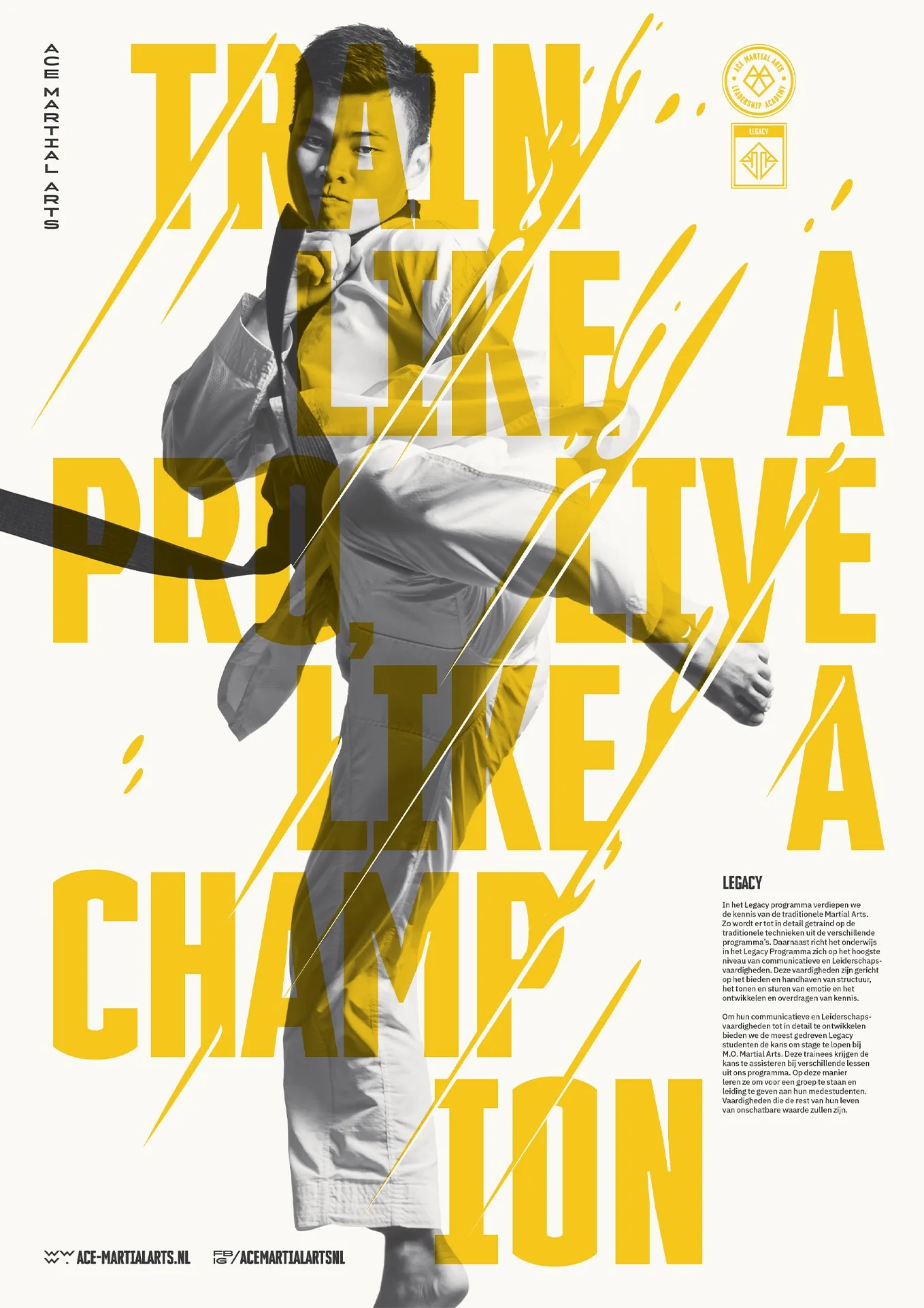
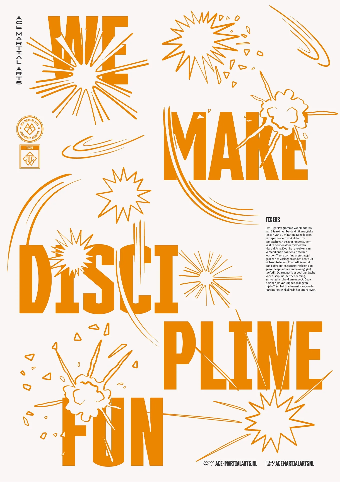
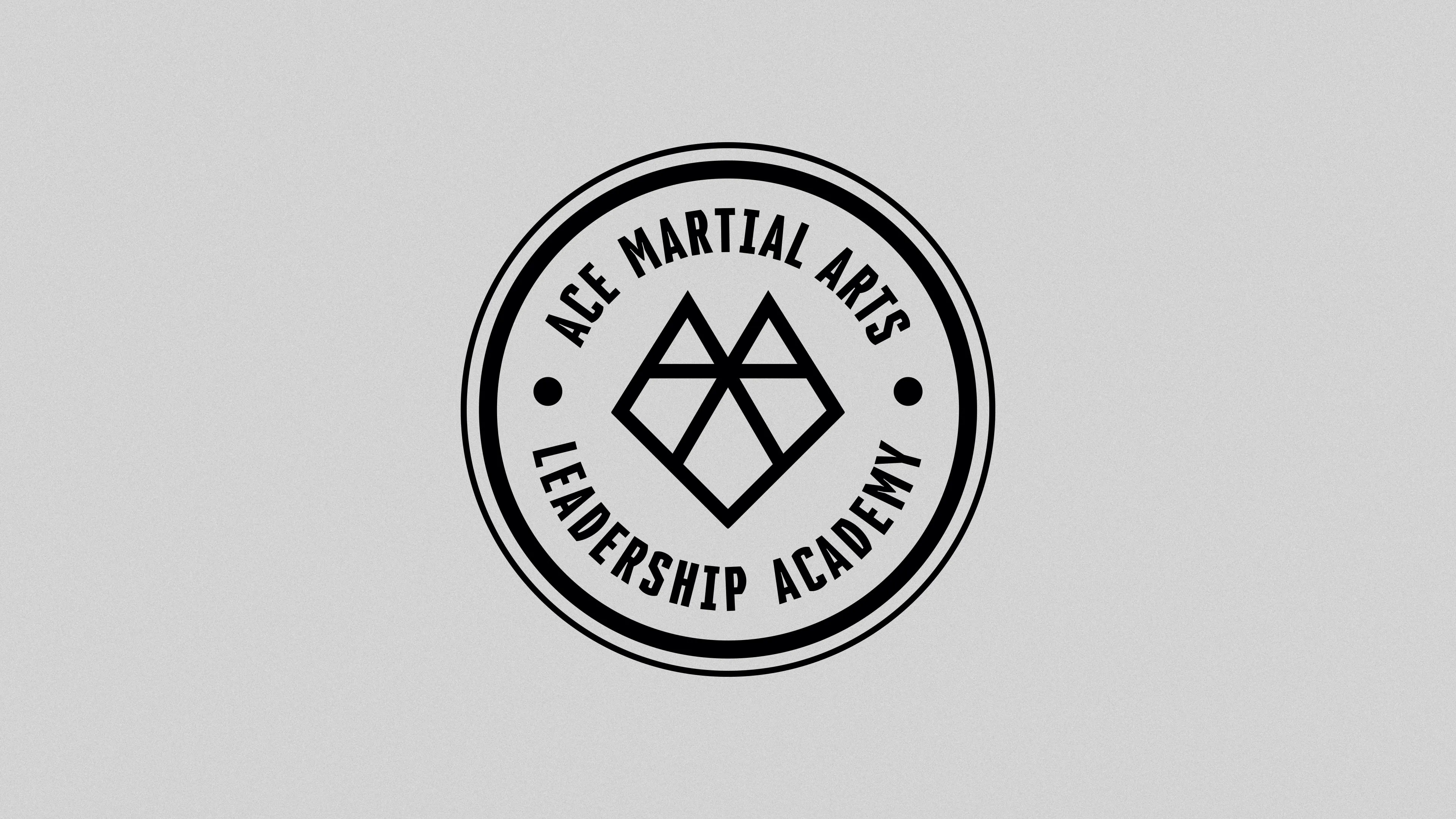
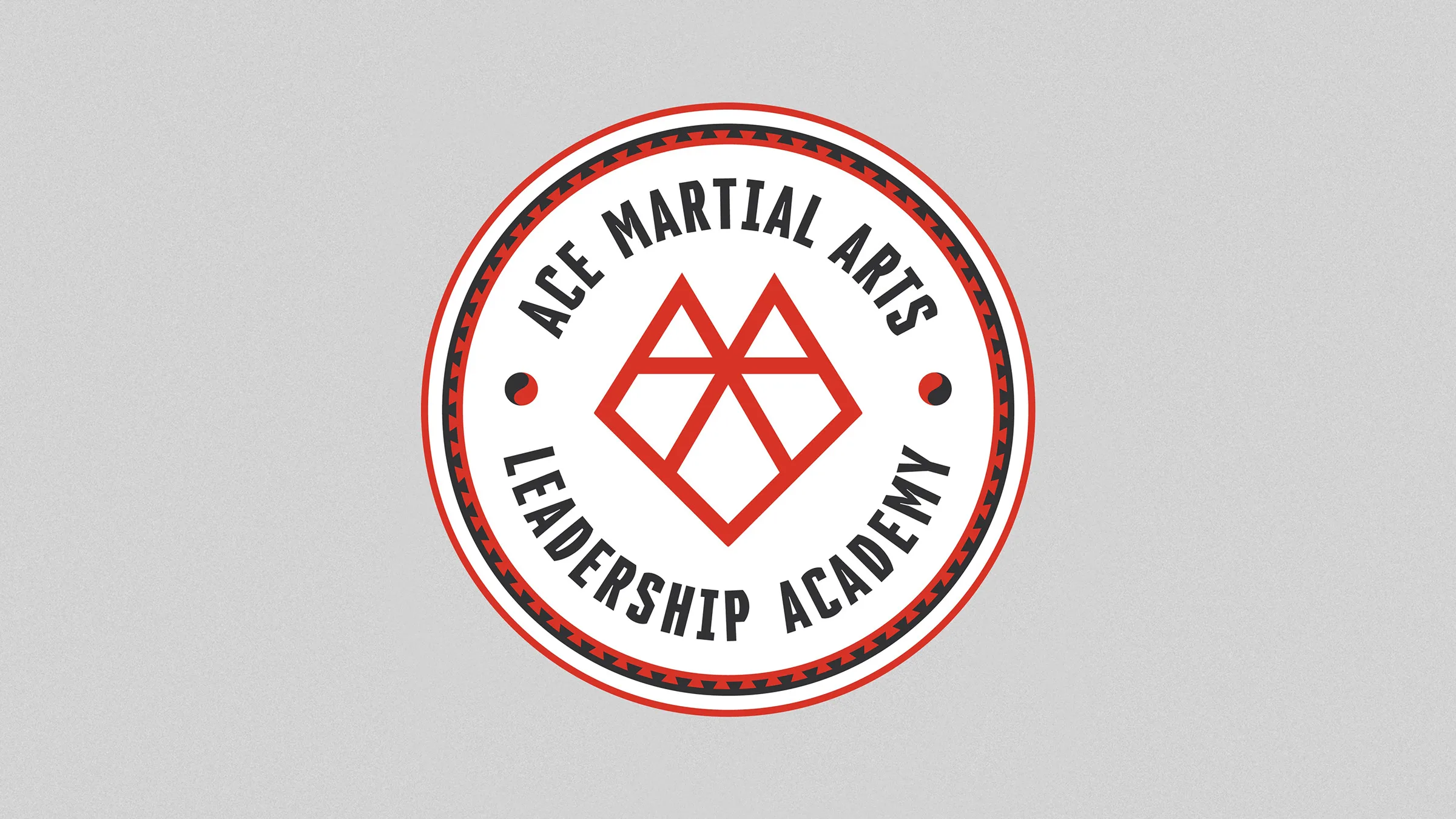
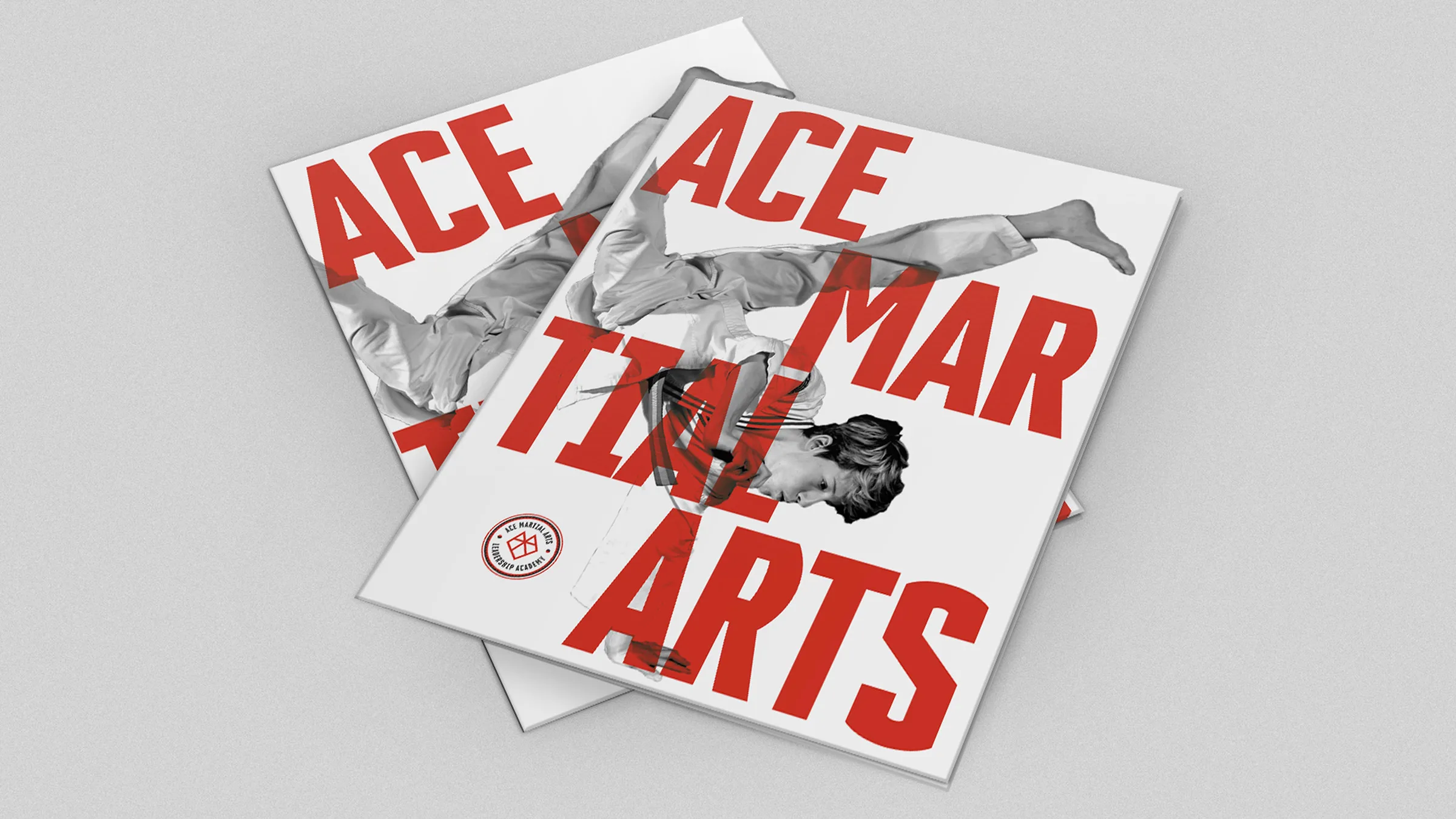
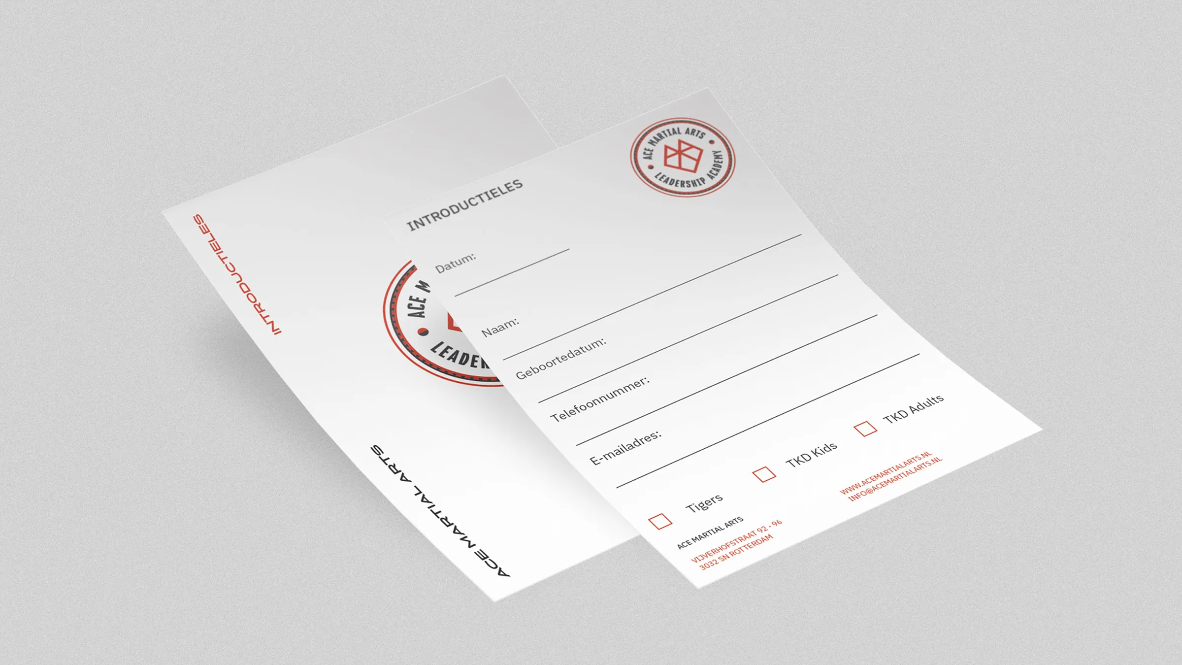
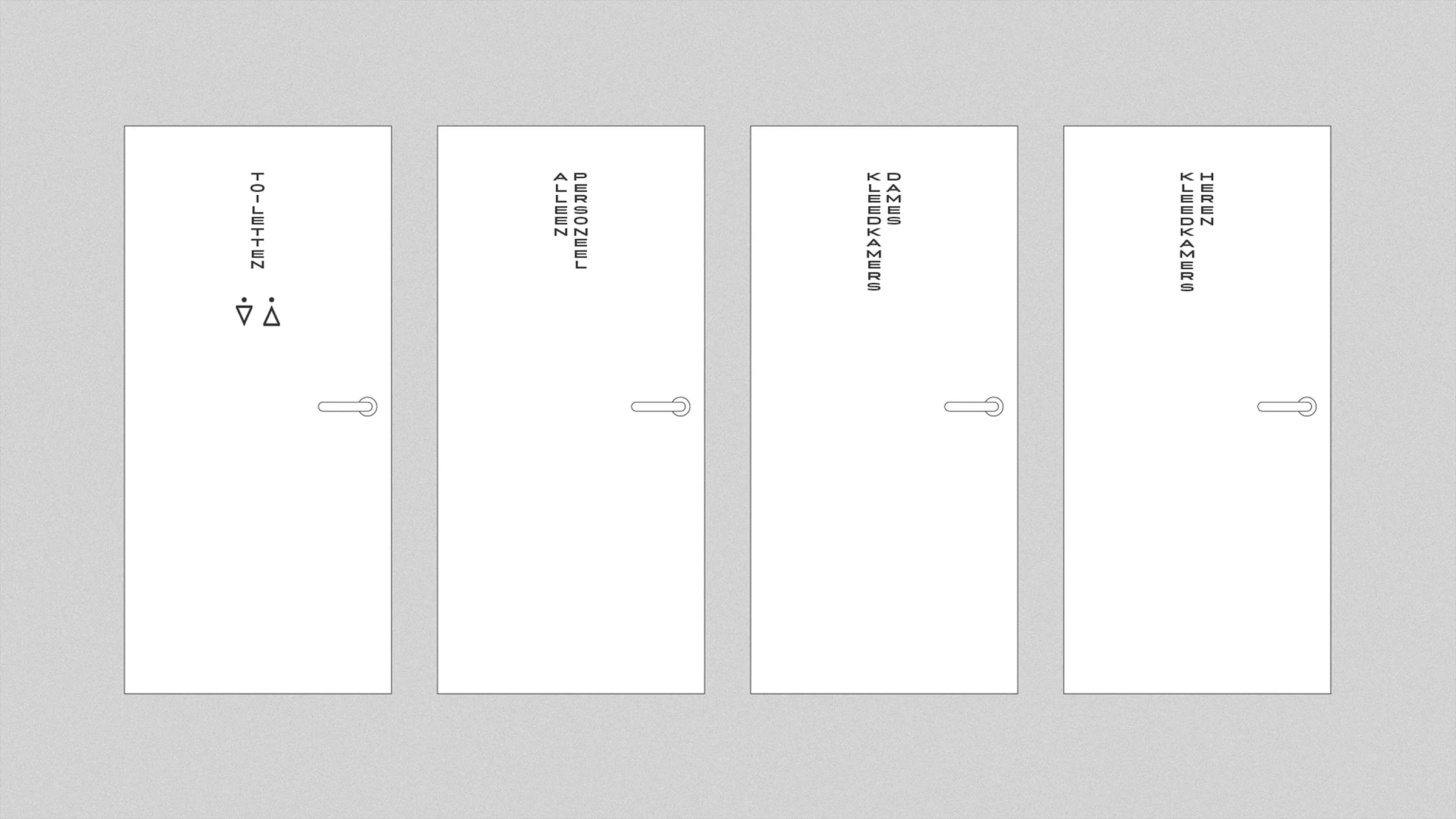
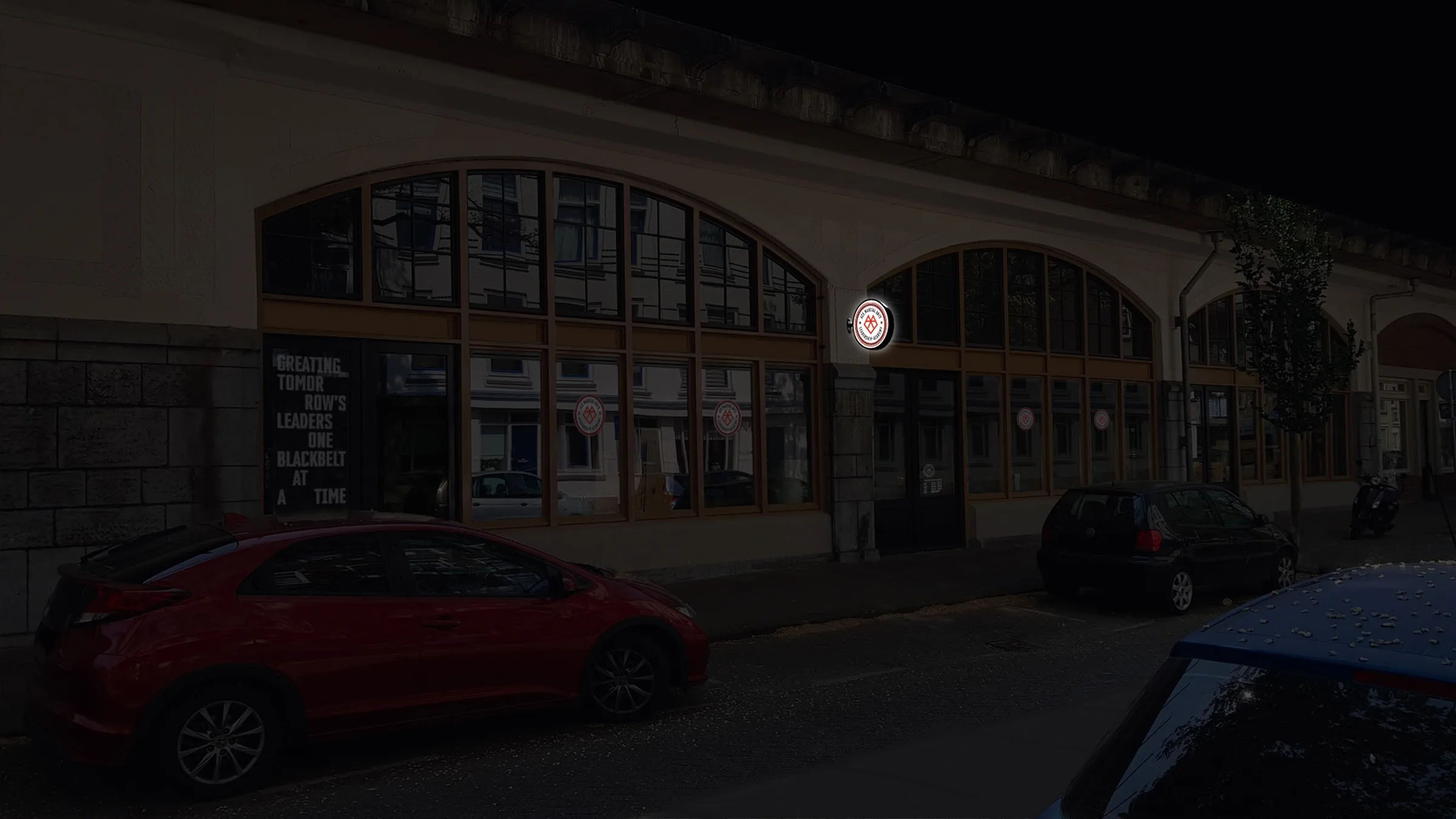
ACE Martial Arts
ATTAK
ACE Martial Arts is a Martial Arts studio based in Rotterdam. For their new name, a visual identity was developed ranging from logos to signage. The logos were inspired by old traditional stamps and spirit animals. For the posters a more expressionist visual language was created to drag the attention of the public. The illustrative layers on top of the images suggest the impact of Martial Arts.


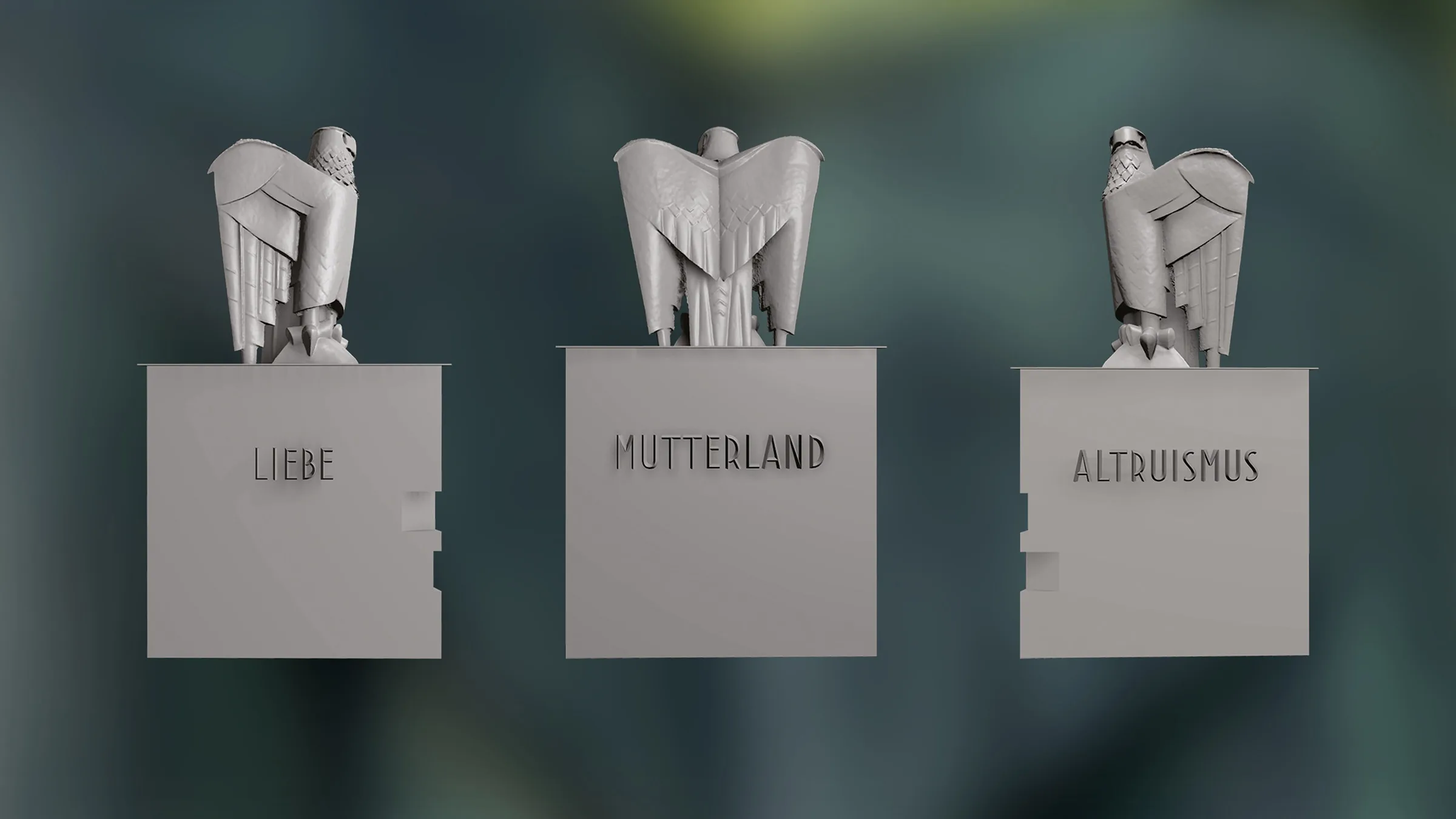
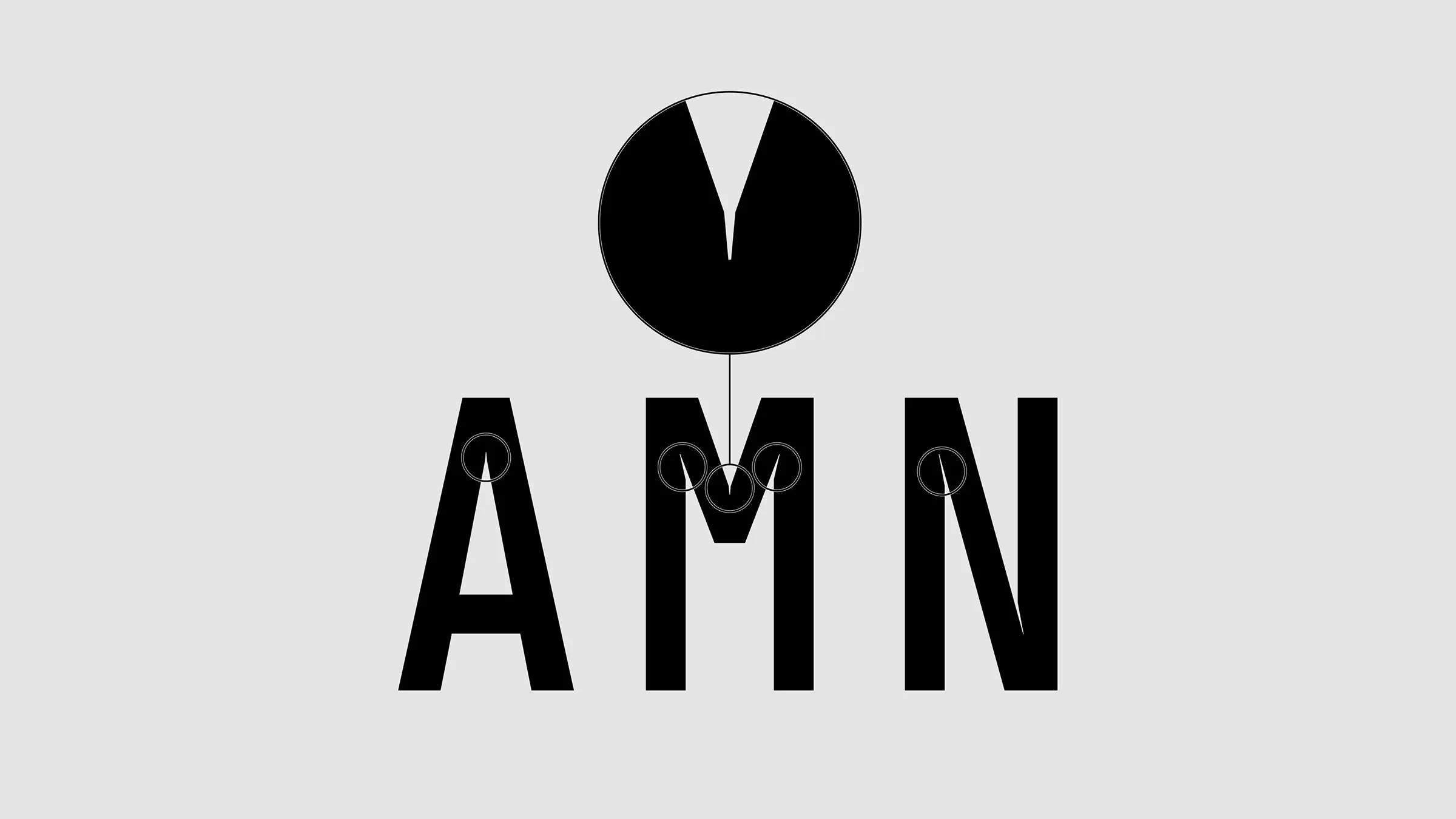
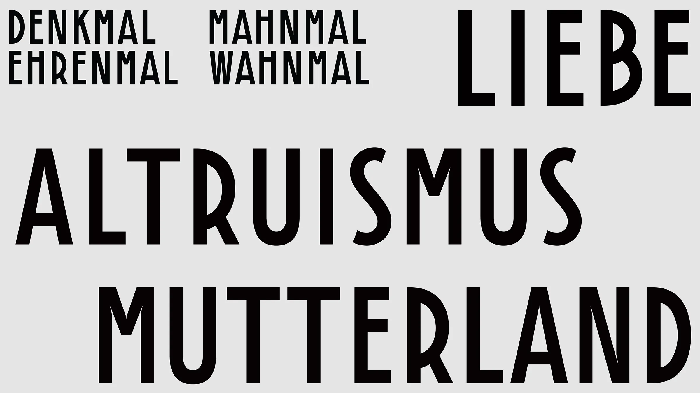
Innsbruck Memorial
Ronald van Tienhoven
A project to analyse and interpret the typography on the Innsbruck memorial. The original typeface was typical of the Art Deco period, but there is always a world to win to look deeper into the typeface’s history and essence. For the ‘appendix memorial’ Ronald van Tienhoven was planning to develop, an optimised revival typeface was created.
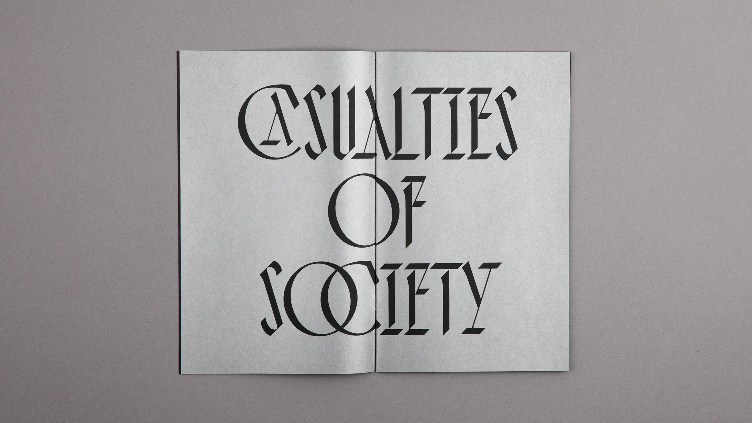
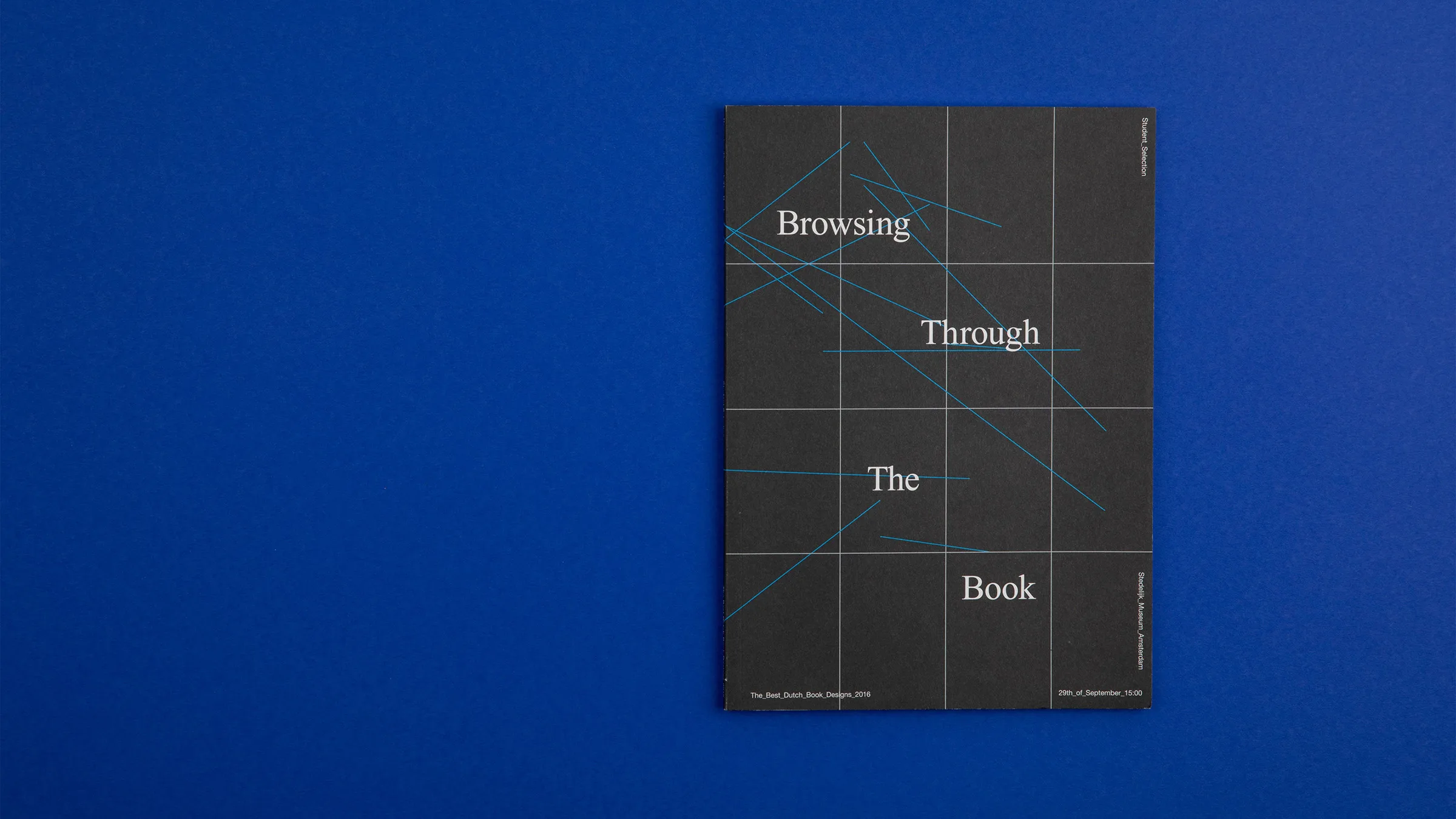
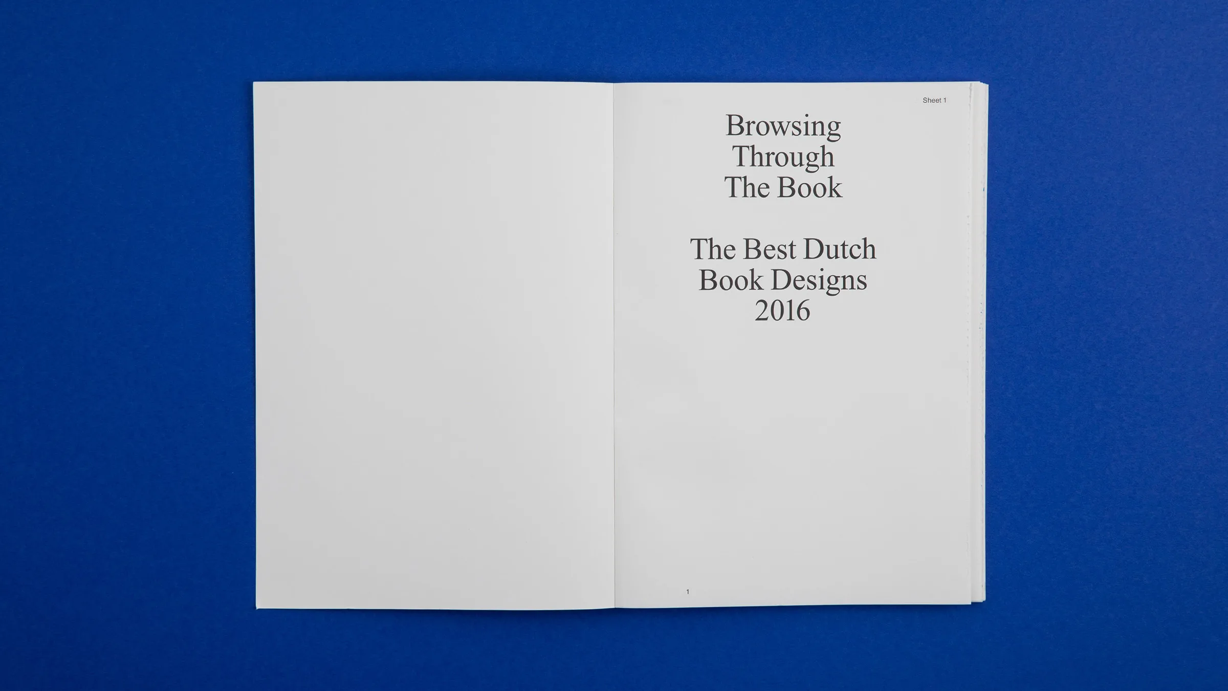
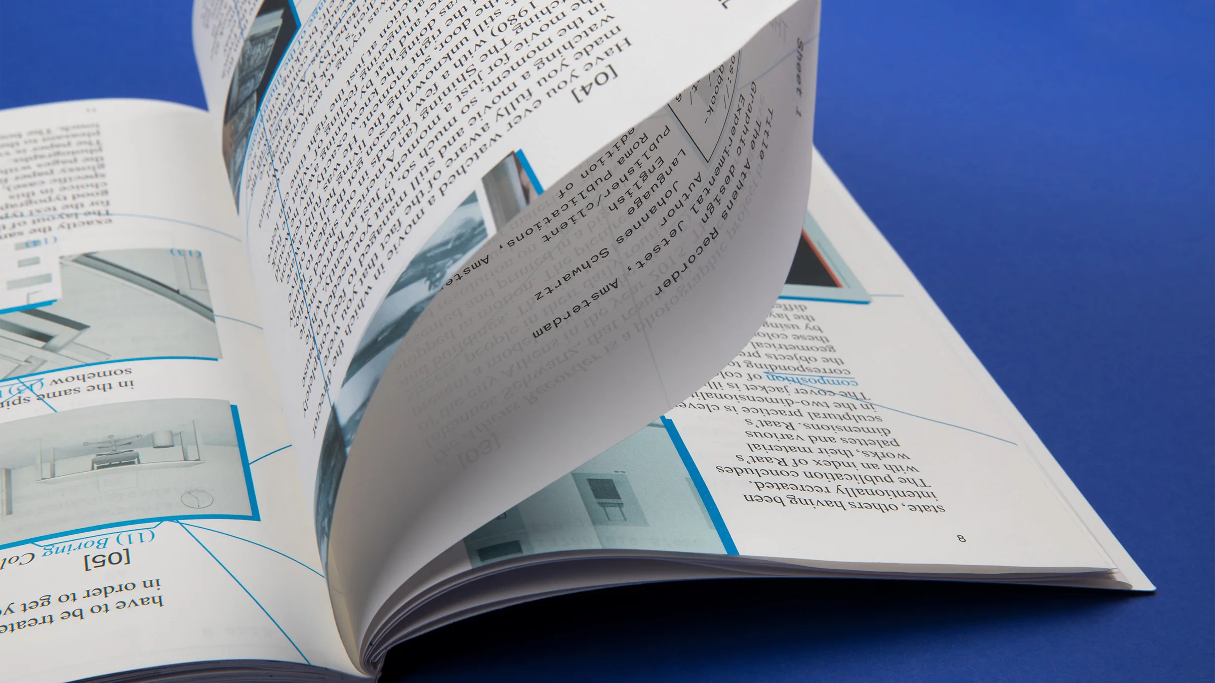
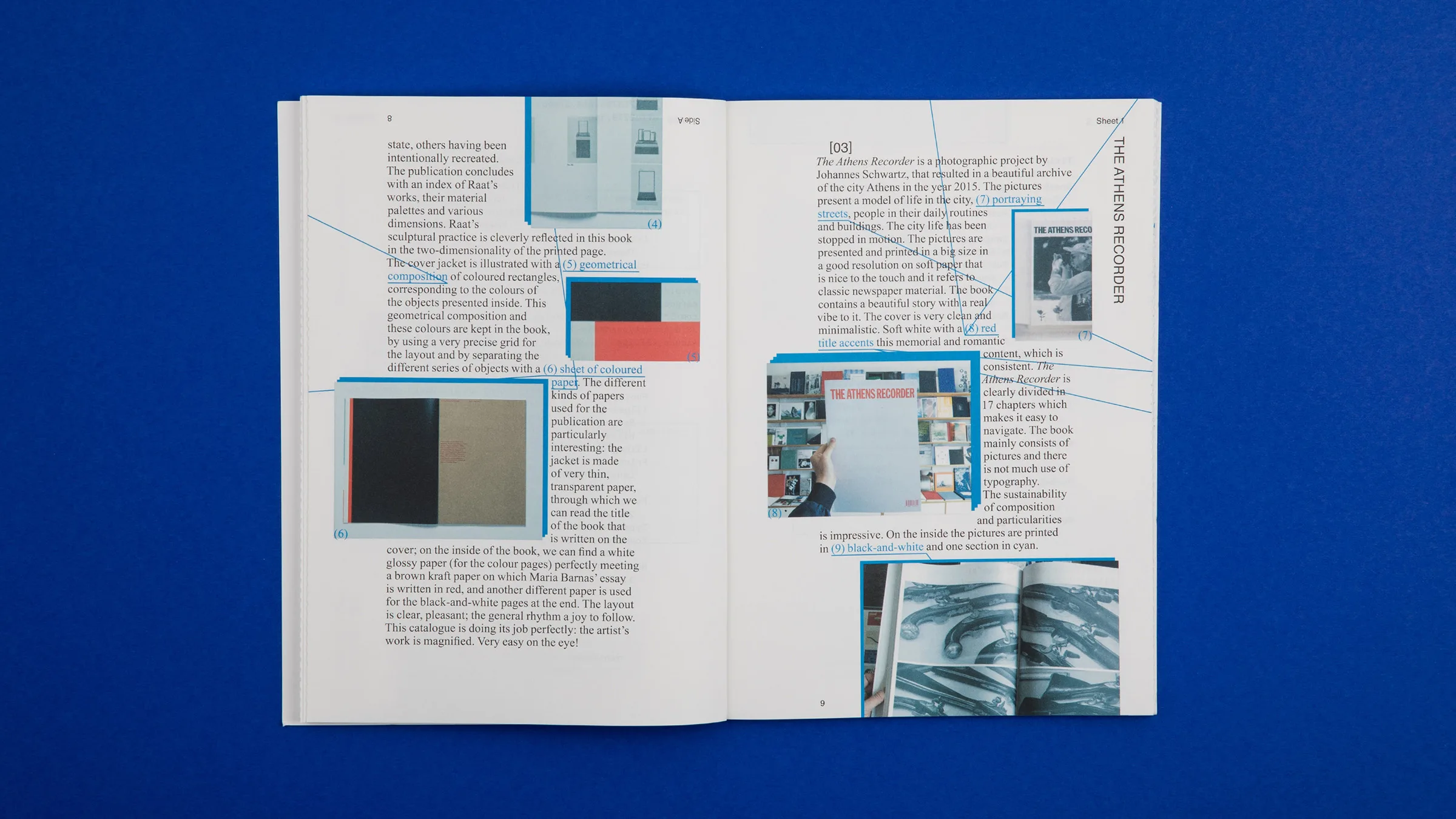
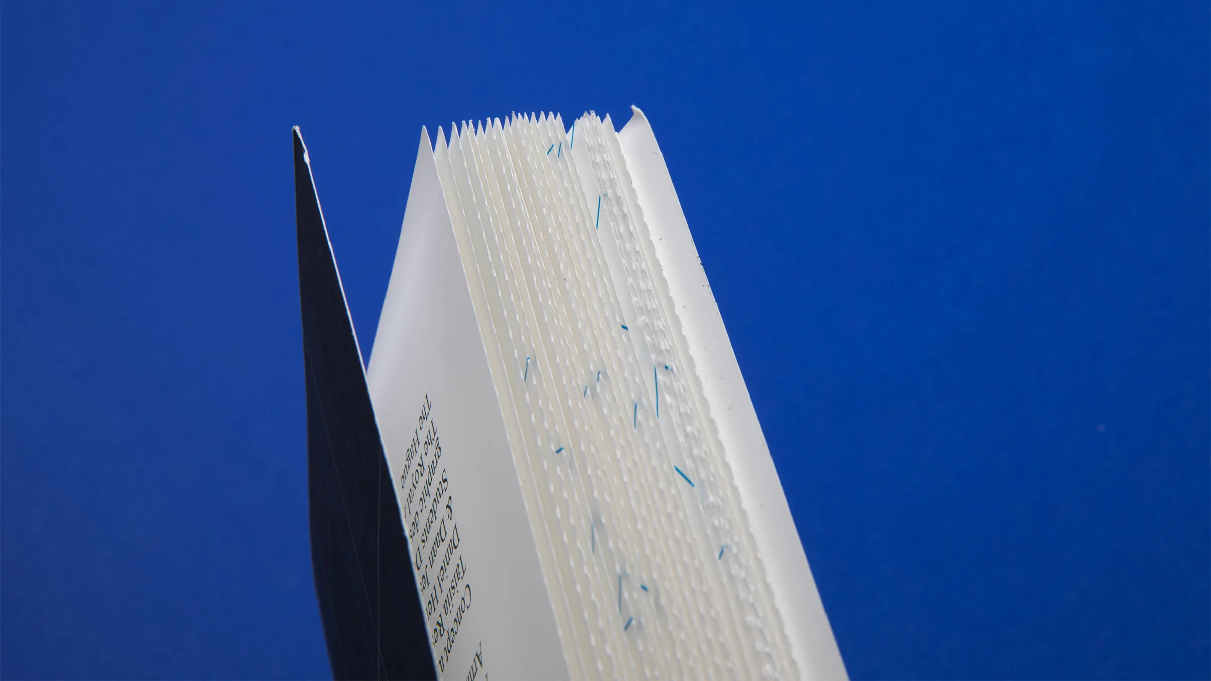
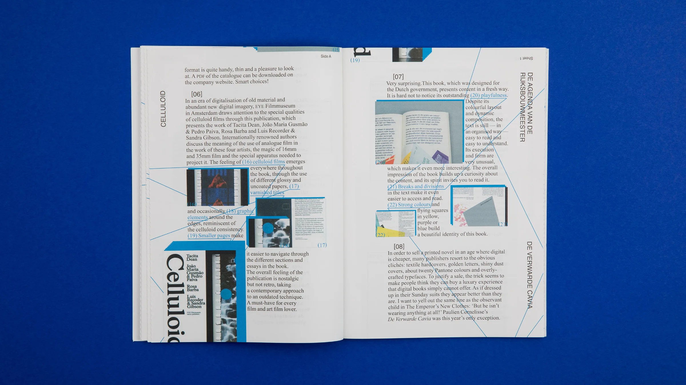
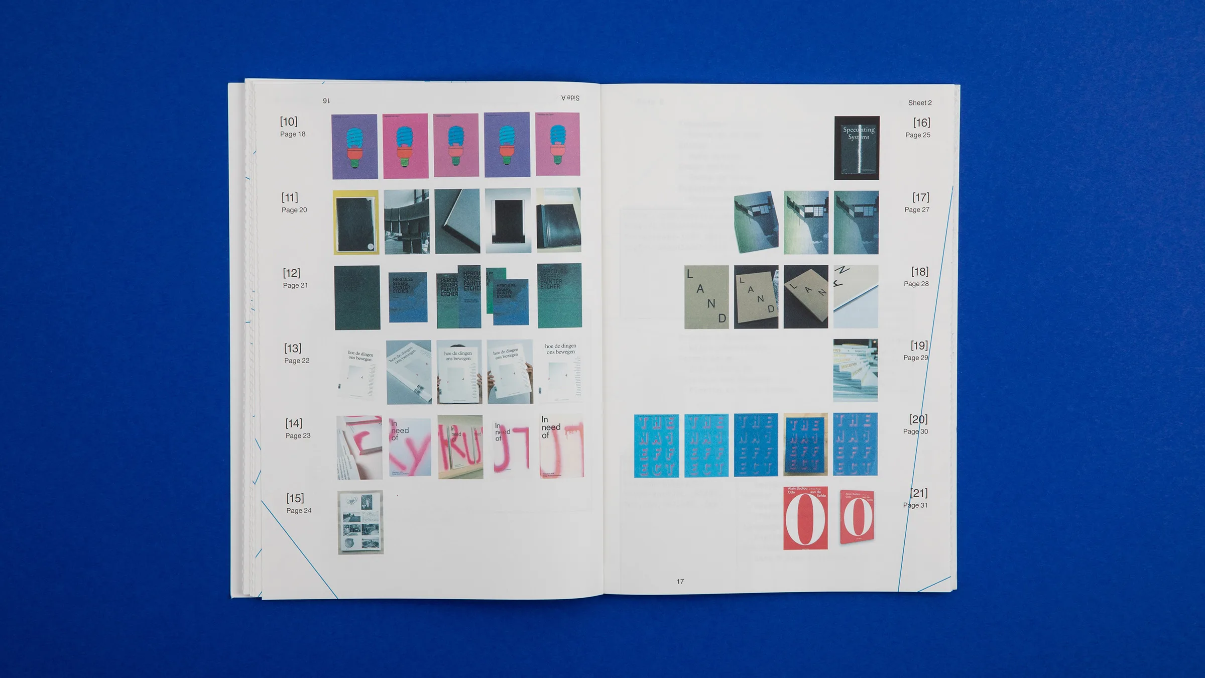
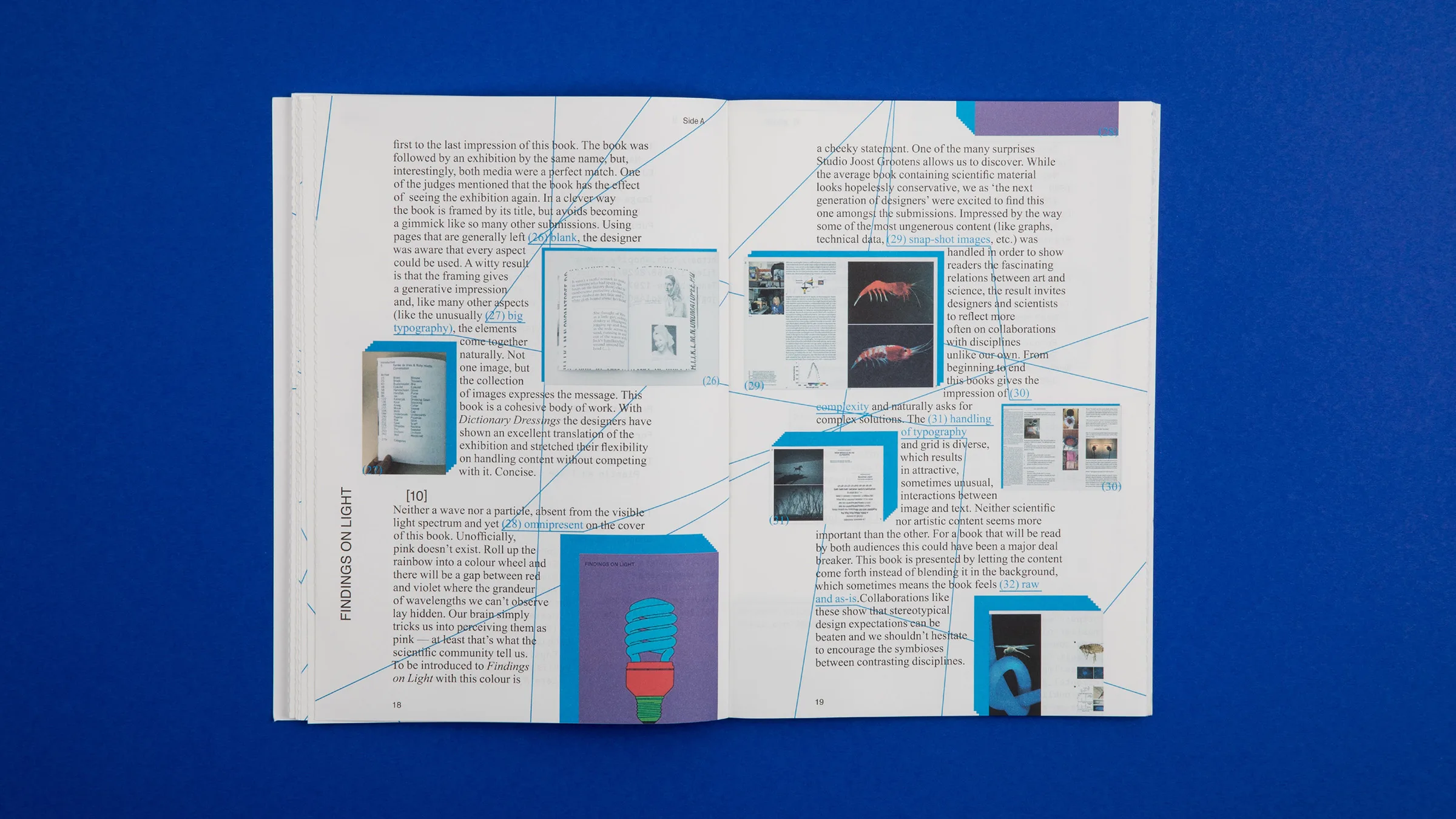
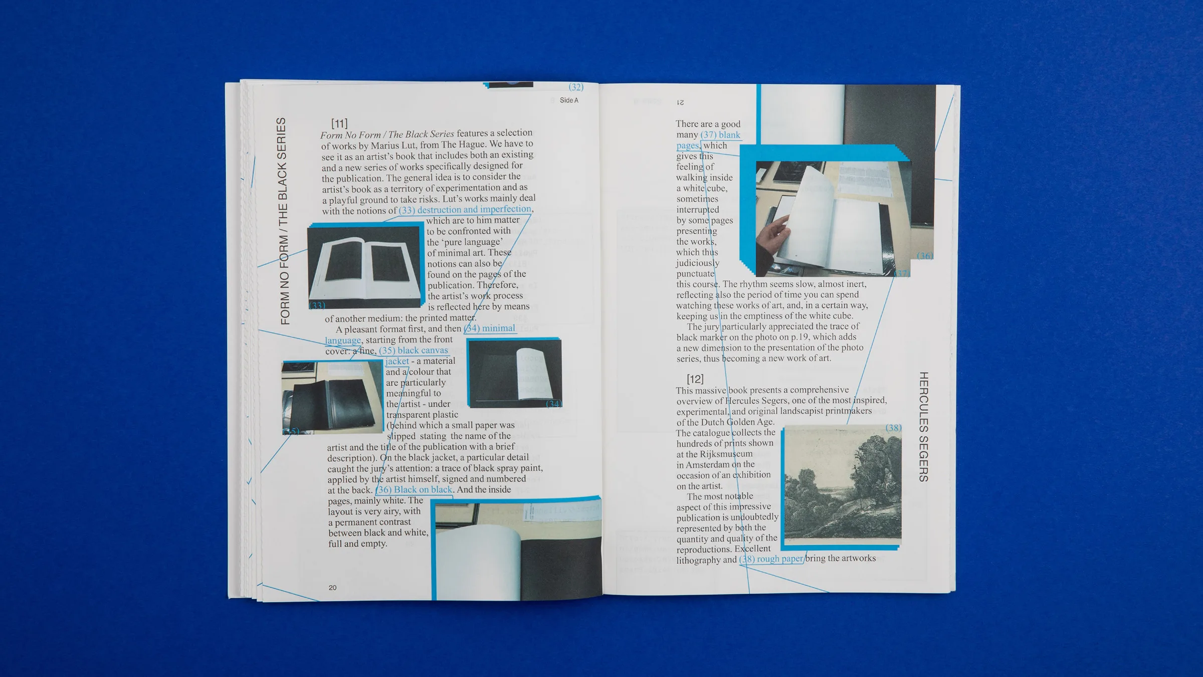
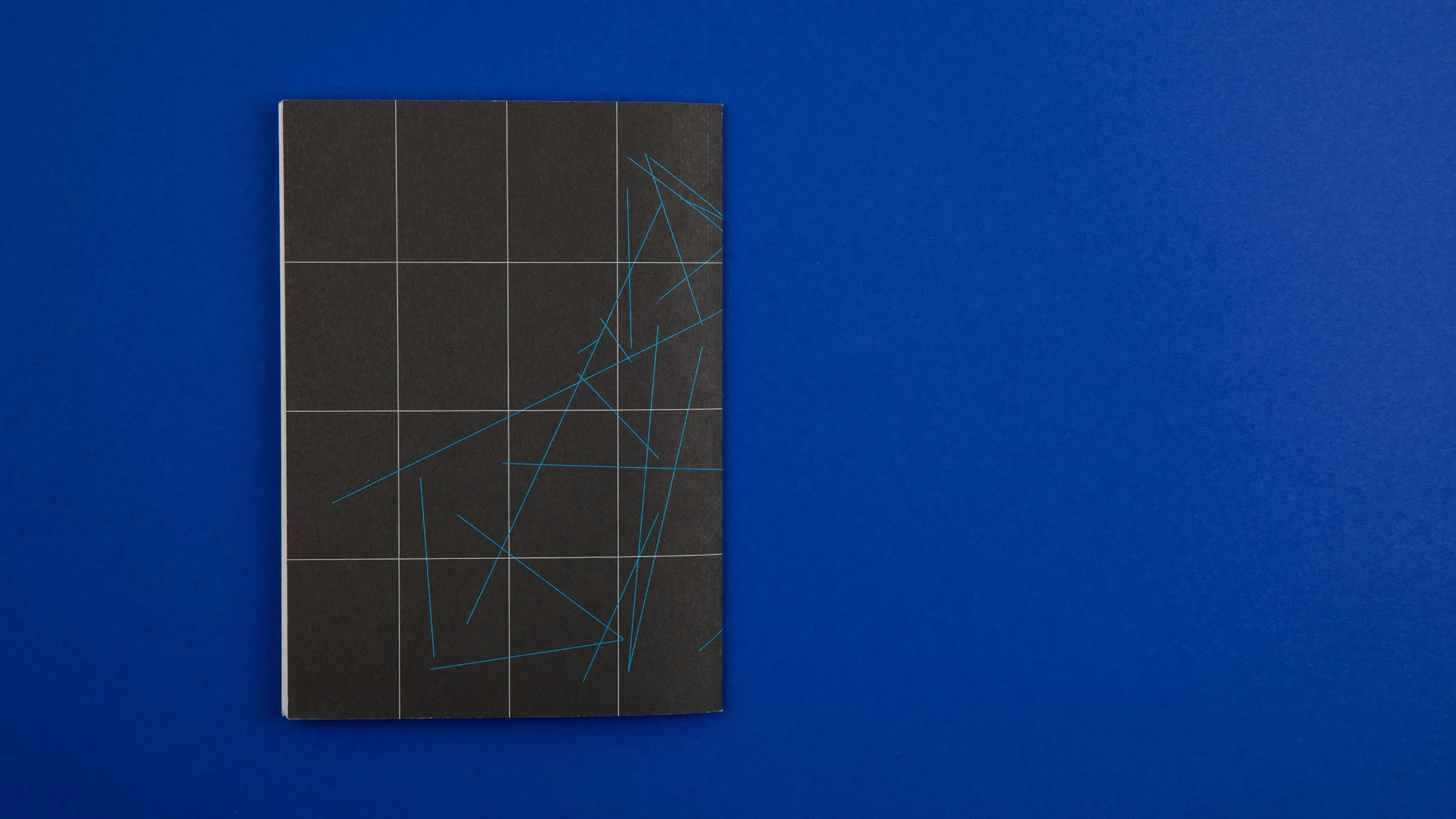
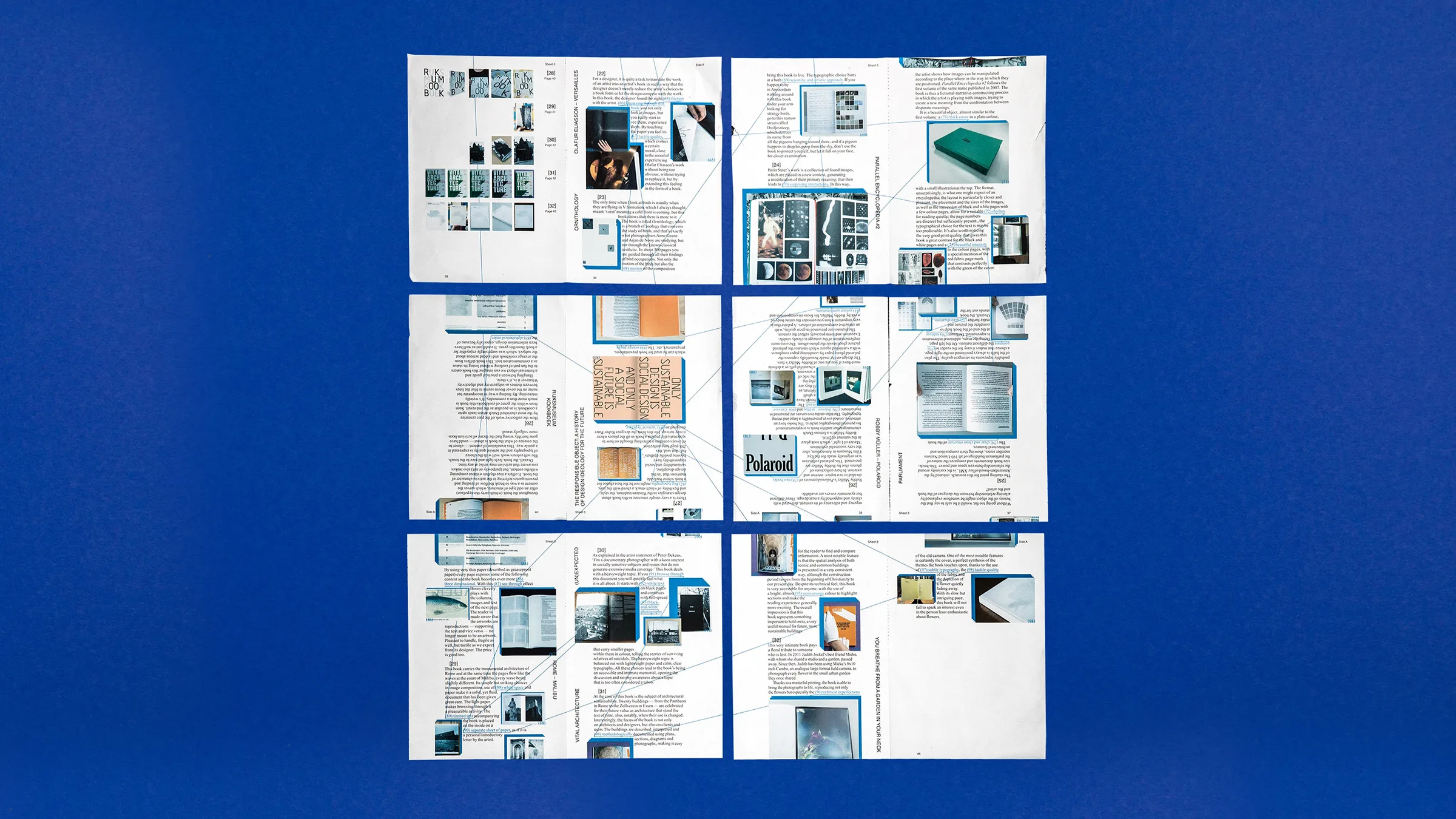
Best Dutch Book Designs 2016 (SE)
Looking at the selected books, a certain pattern appears: a book is not just a source of information, but an object. With it’s image-based editorial approach, tactility, choice of paper, typography and final presentation, the selection of 2016 is telling a lot about how our perception of printed matter is being influenced by the electronic media. The catalogue was displayed at the Stedelijk Museum Amsterdam amongst other books as part of the Best Dutch Book Designs 2016.


Camp High Gain – No Dead Ends
ATTAK
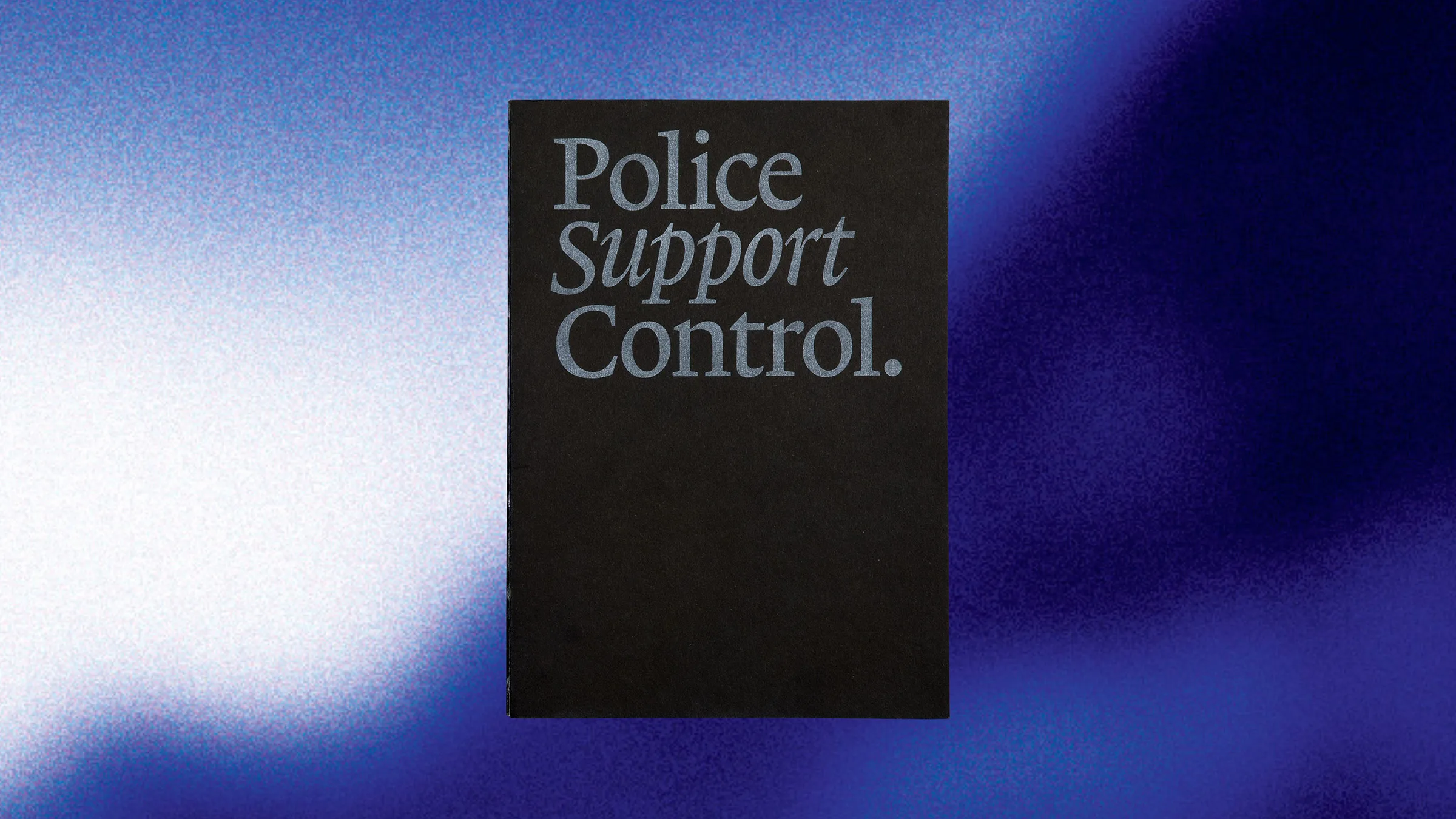
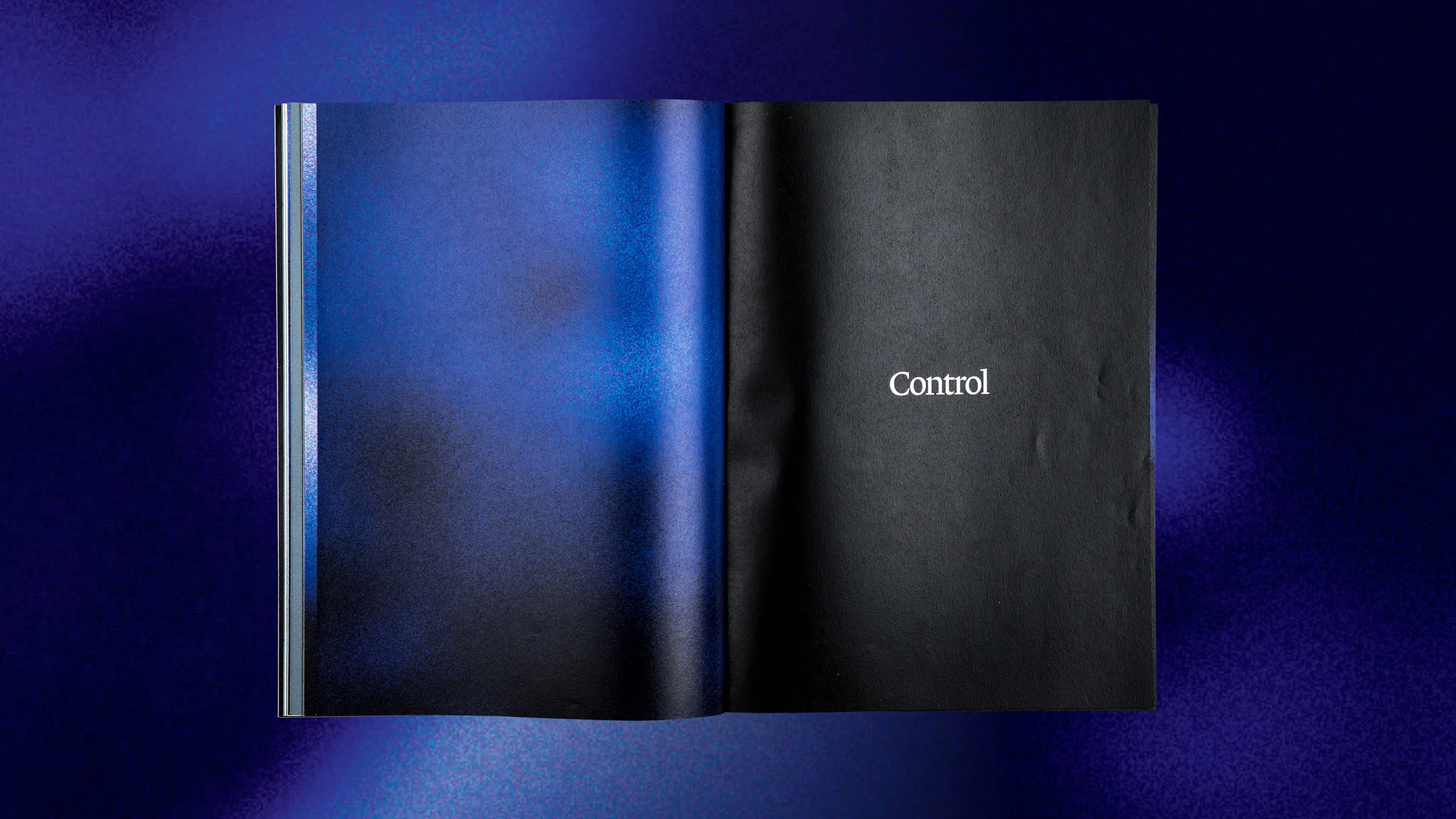
Police. Support. Control.
A typographic reader which contains three shuffled, open-source texts. The reader has three different approaches to read the publication. The first text is about the police, the second text about governmental support and the third text is about control within a government. The publication is made to shine light upon police officers who see themselves as governing power instead of being equal to others.


↕
A